Marketing Site Development on Framer
Maham Vohra
🚀 Project Overview
A marketing agency needed a website that practiced what they preached. Their old site was slow, outdated, and didn't reflect the quality of work they delivered for clients. The brief was clear: build something fast, modern, and conversion-focused on Framer.
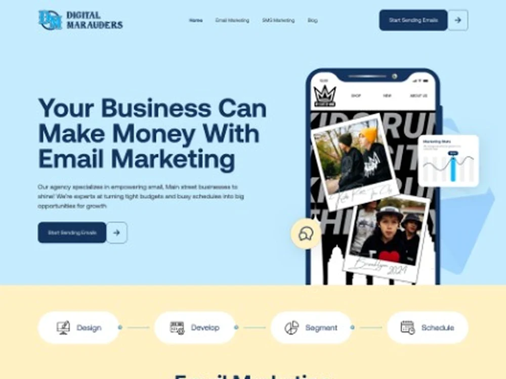
Marketing Site on Framer
Framer was chosen for its combination of design flexibility, built-in CMS, and performance. The agency's team needed to publish case studies and blog posts without developer involvement, and Framer's CMS made that possible while maintaining design integrity.
💡 The Challenge
Marketing agencies have a unique problem: their website is both a portfolio and a sales tool. It needs to showcase creative work while simultaneously converting visitors into leads. Most agency sites lean too far in one direction, either beautiful but hard to navigate, or functional but forgettable.
The specific challenges:
The existing site had a 4.8-second load time and a 67% bounce rate
Case studies were buried 3 clicks deep with no filtering or categorization
The contact form had a 0.8% completion rate
Mobile experience was essentially broken (no responsive design)
The team published blog content weekly but the CMS was so painful they'd fallen 3 months behind
SEO was nonexistent: zero organic traffic for their target keywords
🔍 Research & Discovery
I analyzed 20 agency websites across their competitive set, scoring each on navigation clarity, case study presentation, lead generation flow, and mobile experience. The patterns were revealing.
The top-performing agency sites shared three traits: they led with results (not process), they made contacting the agency effortless from any page, and they treated case studies as their primary content, not an afterthought.
I also reviewed the agency's Google Analytics data from the previous 12 months. The data showed that case study pages had the highest engagement (4:30 average time on page) but the lowest traffic (only 8% of total visits). The opportunity was clear: make case studies more discoverable and the site would perform dramatically better.
User flow analysis revealed that visitors who viewed 2+ case studies were 5.7x more likely to submit a contact form. This insight shaped the entire navigation and internal linking strategy.
🎨 Creative Process
The design direction needed to feel contemporary without being trendy. Agencies that chase design trends end up redesigning every 18 months. I aimed for a visual system with a 3-5 year shelf life.
The typography system used a single font family (a versatile geometric sans) at multiple weights, creating hierarchy through size and weight rather than font switching. This kept the design cohesive and reduced font loading overhead.
Color was used strategically. The primary palette was monochromatic (black, white, and grays) with a single vibrant accent color for CTAs and interactive elements. This approach kept the agency's colorful case study work as the visual centerpiece rather than competing with the site's own design.
Layout followed a modular system. Every section was built as an independent module that could be rearranged, duplicated, or removed without breaking the page. This gave the agency flexibility to A/B test different page structures without design support.
📐 Animation & Interaction Design
Framer's animation capabilities were a key reason for choosing the platform. I designed a layered animation system:
Level 1 (subtle): Fade-in on scroll for text and images (0.3s duration, ease-out)
Level 2 (engaging): Parallax effects on hero sections and case study cards
Level 3 (impressive): Custom cursor interactions, magnetic buttons, and smooth page transitions
The rule was: animations should feel natural and purposeful. Nothing moves just because it can. Every animation either guides attention, provides feedback, or creates a sense of polish.
Page transitions were particularly important. Instead of hard page loads, I implemented smooth crossfade transitions that made the site feel like a single-page application while maintaining proper URL routing and SEO.
🔧 Technical Build
Platform: Framer with CMS
Performance: 97 Lighthouse score on desktop, 93 on mobile
CMS Collections: Case Studies, Blog Posts, Team Members, Services, Testimonials
Animations: Native Framer animations (no external libraries)
Forms: Custom multi-step contact form with conditional logic
Integrations: HubSpot CRM, Google Analytics 4, Google Search Console
SEO: Dynamic meta tags, Open Graph images, XML sitemap, structured data
The CMS was structured so that publishing a new case study automatically updated the homepage featured work section, the case studies archive page, and the relevant service page. One publish action, four page updates.
📦 Key Deliverables
Fully responsive Framer website (12 unique page templates)
CMS with 5 collections and automated cross-referencing
Complete Figma design system (28 components)
Animation library (18 custom interactions)
Multi-step contact form with CRM integration
SEO foundation and technical optimization
CMS training documentation with video walkthroughs
Performance monitoring dashboard setup
📊 Results & Impact
The new site launched on a Monday. By the end of the first week, the team had already published 2 backlogged case studies (the old CMS had been too painful to use).
First 90 days:
Page load time: 1.2 seconds (down from 4.8 seconds)
Bounce rate: 31% (down from 67%)
Case study views: 340% increase (better discoverability)
Contact form submissions: 4.2% completion rate (up from 0.8%)
Organic traffic: 180% increase (SEO improvements)
Blog publishing cadence: Back to weekly (CMS friction eliminated)
Average session duration: 3:45 (up from 1:20)
The agency reported that 3 new client relationships in the first quarter were directly attributed to prospects who found them through organic search and engaged with case studies before reaching out.
🧠 Key Takeaways
The biggest lesson from this project: a marketing agency's website is their most important case study. If the site itself doesn't demonstrate the quality of their work, nothing else on it matters. Every performance metric, every interaction, every load time is a live demonstration of what they can do for clients.
Framer proved to be the right platform choice. The combination of design control, CMS flexibility, and native performance optimization meant we could build something that looked custom-coded but could be maintained by a non-technical team.
Like this project
Posted Apr 20, 2026
🚀 Marketing agency site built on Framer. Clean navigation, fast load times, scroll-driven animations, and a CMS the client actually uses. Designed to generate leads, not just look good. 🎯💻✨
Likes
0
Views
4