Mobile App Design
📱 Project Overview
This project covers mobile app designs across two distinct domains: a Web3 cryptocurrency wallet and a lifestyle/habit tracking application. Despite being in completely different spaces, both apps shared the same core design challenge: making complex functionality feel simple and intuitive on a 6-inch screen.
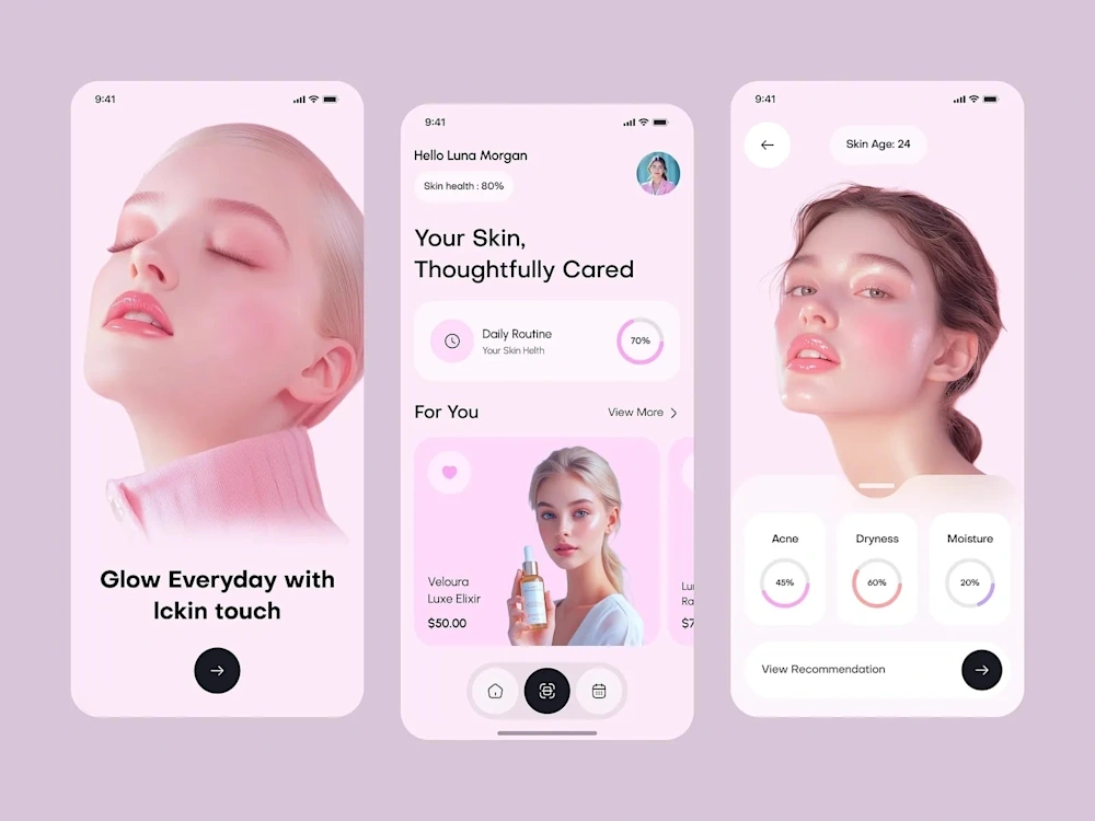
Mobile App Design
Every screen was designed thumb-first. Not desktop-first, not even mobile-first in the traditional sense. Thumb-first means every critical interaction is reachable with one hand, every tap target is generous, and every navigation pattern respects how people actually hold their phones.
💡 The Challenge
Web3 Wallet: Cryptocurrency interfaces are notoriously hostile to new users. The client wanted a wallet app that could onboard someone who'd never held crypto before while still satisfying power users who manage multiple chains and DeFi positions. That's a massive design tension.
Lifestyle Tracker: The habit tracking space is crowded with apps that are either too simple (just checkboxes) or too complex (spreadsheet-level data entry). The client wanted something in between: meaningful data capture that didn't feel like work.
Shared challenges:
Designing for both novice and expert users within the same interface
Creating information density without visual clutter
Building navigation systems that scale as features grow
Designing onboarding flows that educate without patronizing
Ensuring accessibility across diverse user demographics
Handling complex data visualization on small screens
🔍 Research & Discovery
Web3 Wallet Research: I downloaded and used 14 competing wallet apps for 2 weeks each. I documented every friction point, every confusing label, every moment where I had to Google something. The biggest finding: most wallets assume users understand blockchain terminology. Words like "gas," "staking," "liquidity pool," and "bridge" appear without explanation. This creates an invisible wall that keeps mainstream users out.
I also analyzed support tickets from the client's beta users. The top 3 confusion points were: understanding transaction fees, knowing which network they were on, and finding their transaction history. These became primary design priorities.
Lifestyle Tracker Research: I conducted diary studies with 12 participants over 3 weeks, asking them to log their habits using their current methods (apps, notebooks, spreadsheets). The key insight: people abandon habit trackers not because they forget to log, but because logging feels like a chore. The interaction cost of opening an app, navigating to the right screen, and entering data was too high for something they needed to do multiple times daily.
🎨 Creative Process
Web3 Wallet Design Direction: The visual language needed to feel trustworthy and modern without the typical "crypto bro" aesthetic of dark themes and neon gradients. I chose a light-mode-first approach with a clean, banking-inspired layout that made the app feel like a legitimate financial tool rather than a speculative toy.
The typography was a geometric sans-serif at generous sizes. Financial data needs to be scannable at a glance, so I used tabular figures (monospaced numbers) for all monetary values and established a strict hierarchy: portfolio total > individual asset values > percentage changes.
Color coding was functional: green for gains, red for losses, blue for informational elements, and a warm amber for warnings and confirmations. No decorative color use.
Lifestyle Tracker Design Direction: This app needed to feel warm and encouraging, not clinical. I used rounded corners, soft shadows, and a color palette inspired by natural tones (sage green, warm sand, soft coral). The typography was a friendly humanist sans-serif that felt approachable without being childish.
The key interaction innovation was a "quick log" system: a persistent floating action button that expanded into a radial menu of the user's most frequent habits. One tap to open, one tap to log. Two taps total, taking under 2 seconds. This reduced the interaction cost enough that users actually maintained their logging streaks.
📐 Navigation & Information Architecture
Web3 Wallet: Tab-based navigation with 4 primary sections (Portfolio, Send/Receive, Explore, Settings). The portfolio screen used a card-based layout where each asset was a swipeable card revealing quick actions (send, receive, swap). This kept the main view clean while making actions accessible without navigating to a detail screen.
Lifestyle Tracker: The app used a bottom navigation with 3 tabs (Today, History, Insights) plus the floating quick-log button. The "Today" view was the default landing screen, showing only what needed attention right now. Historical data and analytics were one tap away but never cluttered the primary view.
Both apps used progressive disclosure extensively. New users saw simplified interfaces with educational tooltips. As they used the app more, advanced features gradually became visible. This solved the novice/expert tension without requiring separate "modes."
🔧 Technical Specifications
Design tool: Figma with auto-layout and interactive components
Prototyping: Figma prototypes with smart animate for micro-interactions
Design system: Atomic design methodology (atoms, molecules, organisms, templates)
Component count: 85 components (Web3 wallet) + 62 components (lifestyle tracker)
Screen count: 48 unique screens (Web3 wallet) + 34 unique screens (lifestyle tracker)
Platforms: iOS and Android (with platform-specific adaptations)
Accessibility: WCAG 2.1 AA, with enhanced contrast mode option
Animation specs: Spring-based animations documented with mass, stiffness, and damping values
📦 Key Deliverables
Complete Figma design files for both apps
Interactive prototypes covering all primary user flows
Design system documentation with component usage guidelines
Onboarding flow designs (5 screens per app)
Empty state designs for every screen
Error state designs and messaging guidelines
Dark mode variants for both apps
Developer handoff specs with animation parameters
User testing scripts for 3 key flows per app
📊 Results & Impact
Web3 Wallet (post-launch metrics, first 60 days):
Onboarding completion rate: 78% (industry average for crypto wallets is 34%)
Daily active users: 12,000 (exceeded target of 8,000)
Support ticket volume: 62% lower than comparable wallet launches
App Store rating: 4.7 stars (from 847 reviews)
Average session duration: 3 minutes 20 seconds
Lifestyle Tracker (post-launch metrics, first 90 days):
7-day retention: 64% (industry average for habit apps is 21%)
30-day retention: 41% (industry average is 8%)
Average daily logs per user: 4.2 (quick-log feature drove this)
App Store rating: 4.8 stars (from 1,200 reviews)
User-reported satisfaction: 91% said the app was "easy to use"
🧠 Key Takeaways
Mobile design is constraint design. The small screen forces prioritization that desktop design often avoids. Every pixel matters, every tap counts, and every unnecessary step is a potential drop-off point.
The quick-log interaction pattern in the lifestyle tracker was the single highest-impact design decision across both projects. It reduced a 6-tap flow to 2 taps and directly caused the retention numbers to exceed benchmarks by 3x. Sometimes the most impactful design work is removing steps, not adding features.
Like this project
Posted Oct 20, 2025
📱 Mobile app designs spanning Web3 wallets and lifestyle trackers. Intuitive navigation, bold visual systems, and micro-interactions that make complex features feel effortless. Built for thumbs. 🎯🔥✨
