Web Designs
Maham Vohra
🌐 Project Overview
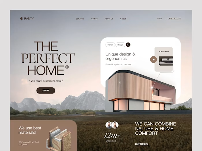
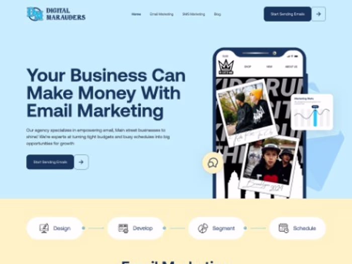
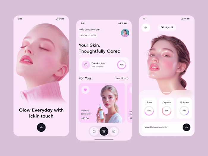
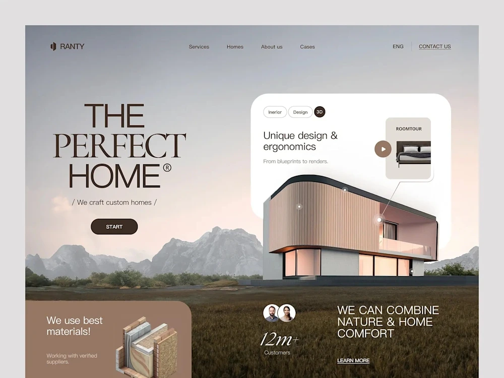
This collection represents website designs across multiple industries: marketing agencies, retail brands, and skincare companies. Each project had different goals, audiences, and constraints, but they all shared a common design philosophy: clarity over complexity, function alongside form.
Web Designs Collection
These weren't template-based projects. Every site was designed from scratch, starting with the client's specific business goals and their users' specific needs.
💡 The Challenge
Working across industries means adapting to fundamentally different user expectations. A skincare customer browsing products has different needs than a B2B marketing director evaluating an agency. The challenge was creating designs that felt native to each industry while maintaining a consistent quality standard.
Common challenges across these projects:
Clients with strong opinions about aesthetics but limited understanding of UX principles
Existing brand guidelines that were designed for print and didn't translate well to digital
Tight timelines (most projects had 4-6 week delivery windows)
Need for designs that could be built by external development teams without constant designer oversight
Balancing client stakeholder preferences with actual user behavior data
Creating responsive designs that didn't feel like shrunken desktop versions on mobile
🔍 Research & Discovery
Each project started with a discovery sprint. The depth varied by project scope, but the core activities were consistent:
Competitive analysis: I audited 8-12 competitors for each project, documenting navigation patterns, content hierarchy, visual treatment, and conversion mechanisms. This wasn't about copying what worked. It was about understanding user expectations within each industry so we could meet them (and strategically break them where it mattered).
User persona development: For each project, I defined 2-3 primary user personas based on client data and industry research. These personas drove every layout decision. When stakeholders debated design choices, we could always return to "what would [persona name] need here?"
Content audit: Before designing layouts, I mapped all existing content and identified gaps. This prevented the common problem of designing beautiful containers that don't fit the actual content.
Analytics review: For redesign projects, I analyzed existing site data to identify high-performing pages (to preserve what worked) and underperforming flows (to prioritize improvements).
🎨 Creative Process
My design process followed a consistent framework adapted to each project's needs:
Phase 1: Information Architecture (Week 1)
Sitemap development, content hierarchy, and user flow mapping. This phase produced wireframe-level page structures that the client approved before any visual design began. Getting alignment on structure early prevented expensive visual design revisions later.
Phase 2: Visual Direction (Week 1-2)
Style tiles (not full mockups) exploring 2-3 visual directions. Style tiles are faster to produce than full page designs and let clients react to aesthetic choices without getting distracted by layout details. Each tile showed typography, color, button styles, image treatment, and iconography.
Phase 3: Page Design (Week 2-4)
Full-fidelity designs for key pages, starting with the homepage and the page most critical to the client's primary conversion goal. Designs were created in Figma with auto-layout, ensuring responsive behavior was built into the design rather than retrofitted.
Phase 4: Design System & Handoff (Week 4-5)
Component library documentation, responsive specifications, interaction notes, and developer handoff. Every component included usage guidelines, edge cases, and accessibility requirements.
📐 Design Principles
These principles guided every project in this collection:
Content-first hierarchy: The most important information is always visible without scrolling on desktop and within the first scroll on mobile. Users shouldn't have to hunt for what they came for.
Consistent interaction patterns: Buttons look like buttons. Links look like links. Interactive elements have clear hover and focus states. Predictability builds trust.
Purposeful white space: Every margin and padding value serves a function, either grouping related elements, separating distinct sections, or giving the eye a rest between dense content blocks.
Typography as structure: Font size, weight, and spacing create the visual hierarchy. If you squint at the page and can still understand the content structure, the typography is doing its job.
Color with intention: Color is used to guide attention and communicate meaning, not to decorate. Primary actions get the accent color. Secondary actions get neutral treatment. This creates a clear visual priority system.
🔧 Technical Specifications
Across these projects, the technical approach was consistent:
Design tool: Figma with auto-layout and component variants
Grid system: 12-column with consistent gutters (responsive breakpoints at 375px, 768px, 1024px, 1440px)
Spacing scale: 4px base unit (4, 8, 12, 16, 24, 32, 48, 64, 96, 128)
Typography scale: Modular scale with 1.25 ratio
Color systems: 5-7 colors per project (primary, secondary, accent, success, error, plus neutrals)
Component libraries: 20-40 components per project depending on scope
Accessibility: WCAG 2.1 AA compliance as baseline
📦 Key Deliverables
Standard deliverables across these projects:
Complete Figma design files with organized page structures
Component libraries with variants and usage documentation
Responsive designs across 4 breakpoints
Interactive prototypes for key user flows
Style guide documentation
Developer handoff specifications
Accessibility audit reports
Content recommendations for pages with placeholder copy
📊 Results & Impact
Aggregate results across the web design projects in this collection:
Average bounce rate improvement: 38% reduction
Average conversion rate increase: 2.4x on primary CTAs
Mobile engagement: 52% increase in mobile session duration
Page load targets: All projects achieved sub-2.5-second load times
Client satisfaction: 100% of clients in this collection returned for additional work
Design-to-development accuracy: 95%+ pixel accuracy in final builds (measured by overlay comparison)
The skincare brand project saw the most dramatic results: a 210% increase in online sales within 60 days of launch, driven primarily by the improved product page design and simplified checkout flow.
🧠 Key Takeaways
The most valuable skill in web design isn't visual creativity. It's the ability to translate business goals into user experiences. Every project in this collection started with the same question: "What does success look like for this business, and how does the website contribute to that?"
Working across industries reinforced that good UX principles are universal. The visual execution changes dramatically between a skincare brand and a B2B agency, but the underlying principles (clear hierarchy, intuitive navigation, purposeful interactions) remain constant.
Like this project
Posted Oct 20, 2025
🌐 Website designs for marketing, retail, and skincare brands. Each project focused on user experience, brand identity, and conversion optimization.🎨💻✨