Packaging Designs
Maham Vohra
📦 Project Overview
This project covers packaging design work spanning food and beverage, cosmetics, and wellness products. Each project went from initial concept through to shelf-ready production files, including structural design, graphic design, and print specification.
Packaging Designs
Packaging is where brand meets product meets shelf. It's the most tactile form of design, and the one where a bad decision is most expensive to fix (you can't push a hotfix to 10,000 printed boxes).
💡 The Challenge
Packaging design operates under constraints that digital design doesn't face. Physical materials have limitations. Print processes have tolerances. Retail shelves have competition measured in inches. And every design decision has a direct cost implication.
Common challenges across these projects:
Designing for shelf impact at 3 feet (the distance a shopper scans from)
Meeting regulatory requirements (ingredient lists, nutrition facts, barcodes, legal copy) without sacrificing design quality
Working within structural constraints of existing packaging formats
Balancing brand storytelling with practical information hierarchy
Designing for multiple SKUs that feel cohesive as a family but distinct as individuals
Managing color accuracy across different substrates (paper, plastic, metallic)
Keeping production costs within budget while achieving a premium look
🔍 Research & Discovery
Each packaging project started with a retail audit. I visited physical stores and photographed the shelf environment where the product would live. This context is critical: a design that looks stunning in isolation might disappear when surrounded by competitors.
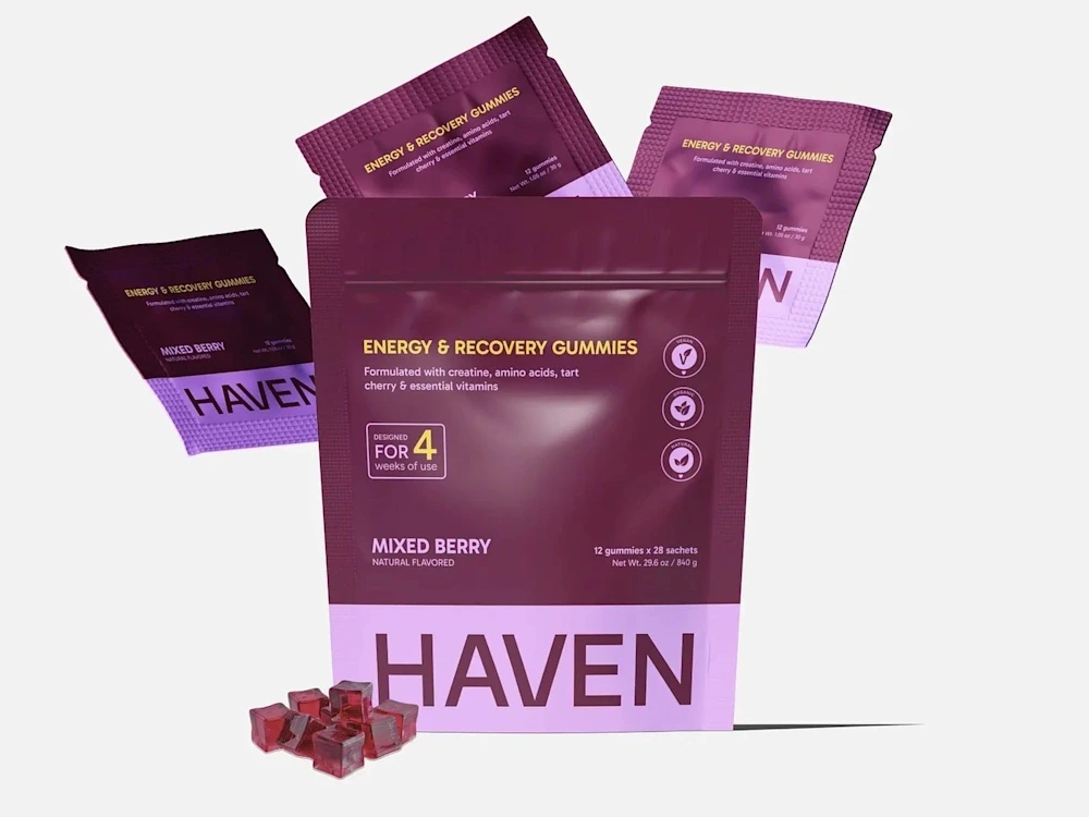
For a wellness brand project, I photographed the supplement aisle at 4 different retailers. The dominant visual language was clinical: white backgrounds, green accents, leaf imagery. Every brand looked the same. The opportunity was to break that pattern with a warmer, more lifestyle-oriented approach that would pop on the shelf.
I also researched packaging trends across adjacent categories. Sometimes the most effective packaging design borrows visual language from a different industry. A food product that looks like a cosmetic stands out. A supplement that looks like a craft beverage catches the eye.
Material research was equally important. I requested samples from 5 packaging suppliers, testing different substrates, finishes, and structural options. Understanding what's physically possible (and at what cost) before designing prevented expensive revisions later.
🎨 Creative Process
Phase 1: Structural Design
Before any graphic design, I established the physical structure. This meant selecting or designing the packaging format (box, pouch, bottle, jar, tube), creating or obtaining accurate dielines, and understanding the production process (offset, flexo, digital).
Phase 2: Brand Application
With the structure defined, I mapped brand elements onto the physical surfaces. This is where packaging design diverges from other design disciplines. You're not designing a flat rectangle; you're designing a 3D object that will be viewed from multiple angles, held in hands, and placed on shelves.
I created "unfolded" designs on the dieline template, then built 3D mockups to verify how the design worked when assembled. Elements that looked balanced on the flat dieline often needed adjustment when wrapped around a 3D form.
Phase 3: Information Architecture
Packaging has mandatory information requirements that vary by product category and market. I worked with each client's regulatory team to ensure all required elements were included: ingredient lists, nutrition facts, allergen warnings, barcodes, batch codes, recycling symbols, and legal disclaimers.
The design challenge was integrating this required content without it overwhelming the brand messaging. My approach: create a clear visual separation between "brand zone" (front panel, hero imagery, brand name) and "information zone" (back panel, side panels, regulatory content). Each zone has its own typographic hierarchy and density.
Phase 4: Color & Finish Specification
Color on packaging is more complex than digital or even standard print. Different substrates absorb ink differently. Metallic inks behave differently than CMYK. Spot colors need Pantone matching. And the same design might be printed via offset (for large runs) and digital (for short runs), requiring separate color profiles.
I specified colors in multiple systems: Pantone for spot colors, CMYK for process printing, and included Delta E tolerances for color matching across production runs.
📐 Design System for Product Lines
For clients with multiple SKUs, I developed packaging design systems that maintained brand cohesion while differentiating products:
Consistent elements (same across all SKUs): Logo placement, typography system, layout structure, barcode position, legal copy placement.
Variable elements (different per SKU): Hero color, product photography/illustration, flavor/variant name, accent graphics.
This system approach meant new SKUs could be designed in hours rather than days, and the product family looked cohesive on shelf regardless of how many variants were displayed together.
🔧 Technical Specifications
Design tool: Adobe Illustrator (industry standard for packaging dielines and print production)
Supporting tools: Figma (concept exploration), Photoshop (image editing), Dimension (3D mockups)
Color specification: Pantone Solid Coated + CMYK builds + hex references
Resolution: 300 DPI minimum, 600 DPI for fine text and barcodes
Bleed: 3-5mm depending on production method
File format: Press-ready PDF/X-4 with spot color separations
Barcode format: EAN-13 or UPC-A, minimum 80% magnification
Dieline format: Adobe Illustrator with separate dieline layer (spot color, non-printing)
📦 Key Deliverables
Standard packaging project deliverables:
Structural dieline (custom or adapted from supplier template)
3-5 design concepts with 3D mockup presentations
Selected concept refined through 2-3 revision rounds
Press-ready production files (PDF/X-4 with separations)
3D product mockups for marketing use (8-12 angles)
Color specification document with Pantone references
Print vendor brief with material and finish specifications
SKU extension templates for future product variants
Photography-ready physical prototypes (when budget allowed)
📊 Results & Impact
Packaging results are measured at the shelf:
Wellness brand: 28% increase in retail sell-through rate within 60 days of packaging redesign. The retailer expanded shelf allocation from 2 facings to 4 based on performance.
Food brand: New packaging design contributed to successful launch in 120 retail locations. The brand secured end-cap placement at 3 major retailers, partly attributed to the packaging's visual impact.
Cosmetics brand: Instagram mentions increased 340% post-rebrand, with customers frequently photographing and sharing the packaging. The unboxing experience became a marketing channel.
Across all projects:
Production accuracy: Zero reprints due to file errors
Timeline: Average 3-4 weeks from brief to press-ready files
Client retention: 100% of packaging clients returned for additional SKU designs
🧠 Key Takeaways
Packaging design is the most constrained form of graphic design, and that's what makes it rewarding. When you have mandatory regulatory content, structural limitations, production tolerances, and cost constraints, every creative decision carries more weight.
The shelf test is the ultimate design review. A packaging design that wins awards but gets lost on a retail shelf has failed its primary job. I photograph every design in a simulated shelf environment before presenting to clients. If it doesn't pop at arm's length, it goes back to the drawing board.
Like this project
Posted Feb 16, 2026
📦 Packaging designs from concept to shelf-ready. Bold shelf presence, brand storytelling, and structural design that protects the product while selling it. Dieline to final print. 🎨✨🏷️