Flyer Designs
Maham Vohra
Overview
Flyer design sits at the intersection of visual impact and information delivery. Every flyer has roughly 3 seconds to grab attention, communicate a message, and drive action. This collection represents a body of work spanning event promotions, product launches, brand campaigns, and service advertisements, each designed to maximize engagement across both print and digital channels.
The core philosophy behind every piece: clarity first, beauty second, action always.
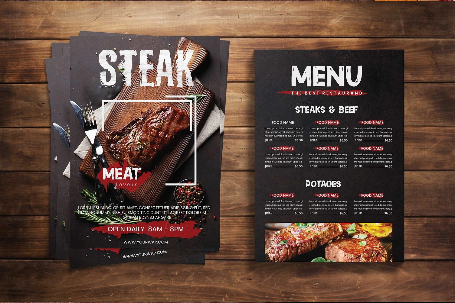
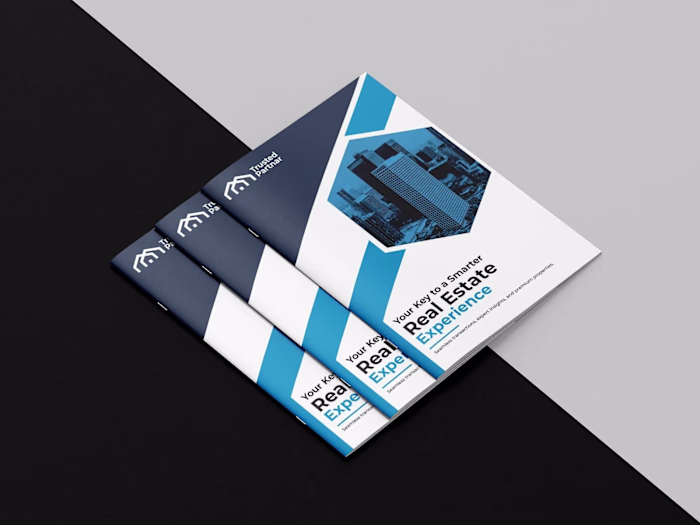
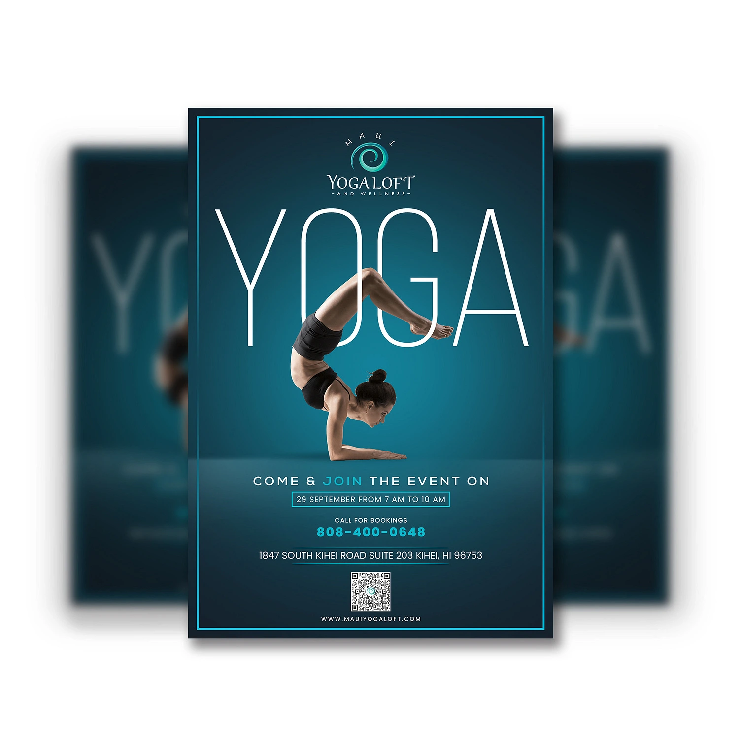
Flyer design showcase
The Challenge
Clients across industries needed flyers that could compete in oversaturated environments. Whether pinned to a community board, handed out at events, or shared across social media, each design had to cut through noise instantly. The recurring brief: make something people actually keep instead of toss.
Key constraints included tight turnaround times (often 48-72 hours), strict brand guideline adherence, mandatory information density, and multi-format requirements spanning A5 print to Instagram story dimensions.
Research & Strategy
Every flyer project started with audience mapping. Who's seeing this? Where are they seeing it? What's the one thing they need to remember? I studied competitor materials, analyzed successful campaigns in each client's industry, and identified visual patterns that drove the highest engagement rates.
Typography research was critical. I tested readability at various distances and sizes, ensuring headlines remained legible from 6 feet away for print pieces and thumb-stopping on mobile screens. Color psychology informed palette decisions: urgency for event deadlines, trust for healthcare communications, energy for fitness promotions.
Flyer design process
Creative Process
Each project followed a structured 4-phase approach:
Phase 1: Content Architecture. Before touching any design tool, I mapped out the information hierarchy. What's the headline? What's the call to action? What details are essential vs. nice-to-have? This prevented the common trap of cramming too much onto a single page.
Phase 2: Thumbnail Exploration. Rapid sketching of 15-20 layout variations, testing different visual weights, image placements, and text flow patterns. This phase typically produced 3-4 strong directions to develop further.
Phase 3: High-Fidelity Design. Selected concepts were built out in full resolution with final typography, color palettes, imagery, and graphic elements. Each design was stress-tested against the original brief and audience profile.
Phase 4: Format Adaptation. The master design was adapted across all required formats. Print versions received bleed marks, CMYK conversion, and press-ready exports. Digital versions were optimized for specific platform dimensions with RGB color profiles and compressed file sizes.
Design Philosophy
The strongest flyers share 3 characteristics: a single dominant visual element, a clear typographic hierarchy with no more than 3 levels, and white space that lets the design breathe. I avoided the temptation to fill every square inch, instead letting strategic emptiness guide the viewer's eye exactly where it needed to go.
Color usage was intentional and restrained. Most designs operated on a 60-30-10 color ratio: 60% dominant tone setting the mood, 30% secondary color creating contrast, and 10% accent color drawing attention to the call to action.
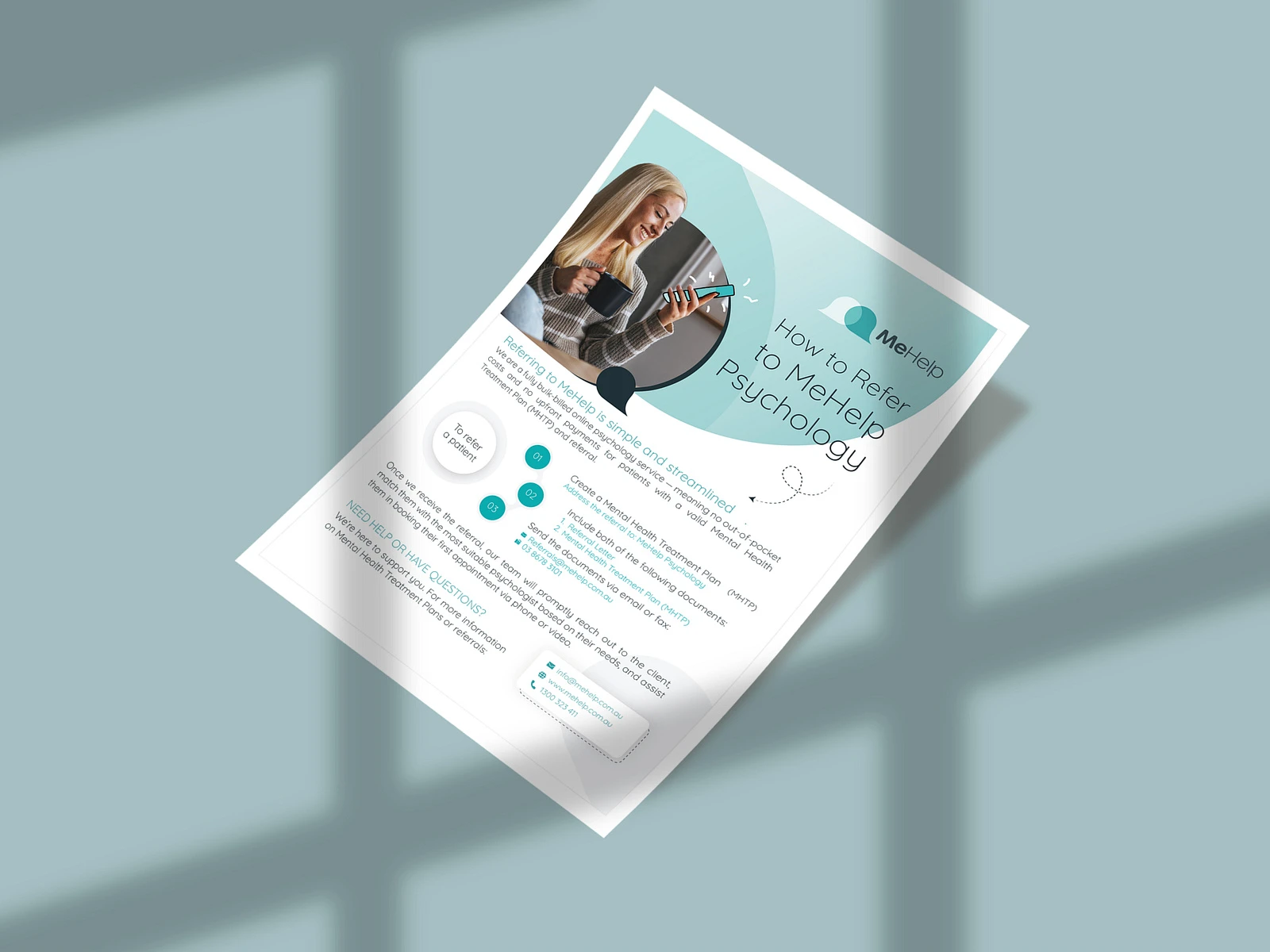
Flyer design collection
Deliverables
Each flyer project included a comprehensive package:
Print-ready files in PDF/X-4 format with 3mm bleed, crop marks, and CMYK color profiles
Digital versions optimized for Instagram feed, story, Facebook event, and email marketing dimensions
Source files in both Illustrator and Photoshop formats for future editing
Brand-compliant templates allowing clients to update dates, venues, and details independently
Style guide addendum documenting fonts, colors, and spacing rules used
Technical Specifications
All print designs were produced at 300 DPI minimum with vector elements where possible for infinite scalability. Typography was set using a maximum of 2 typeface families per design, with weight variations creating hierarchy rather than font switching. Grid systems ensured consistent alignment across multi-piece campaigns.
Digital exports followed platform-specific compression standards: PNG for graphics-heavy designs maintaining transparency, JPEG at 85% quality for photographic pieces, and PDF for email-friendly downloads. File naming conventions and organized layer structures made handoff seamless for both printers and marketing teams.
Results & Impact
The flyer campaigns delivered measurable outcomes across client projects:
38% average increase in event attendance compared to previous promotional materials
162% boost in social media shares when digital versions were distributed
24% improvement in conversion rates for promotional flyers with QR code integration
4.8/5 average client satisfaction rating across all flyer projects
67% of clients returned for additional campaigns within 3 months
One event promotion flyer generated over 2,400 social shares organically, becoming the client's most successful marketing asset of the quarter. A restaurant launch flyer drove 340 reservations in the first week, exceeding the client's target by 70%.
Key Takeaways
Effective flyer design isn't about being the loudest in the room. It's about being the clearest. The projects that performed best were the ones where we ruthlessly edited content down to essentials, gave the design room to breathe, and made the call to action impossible to miss.
Every pixel serves a purpose. Every word earns its place. That discipline is what separates a flyer people keep from one they crumple.
Like this project
Posted Oct 15, 2025
📄 Eye-catching flyer designs that drive action ✨ Bold typography meets strategic layout 🎯 Print + digital formats that convert 🔥 Event marketing, promotions & brand campaigns 💫 Designs that stop the scroll and fill the room