I design modern, user-focused websites
Maham Vohra
🖥️ Project Overview
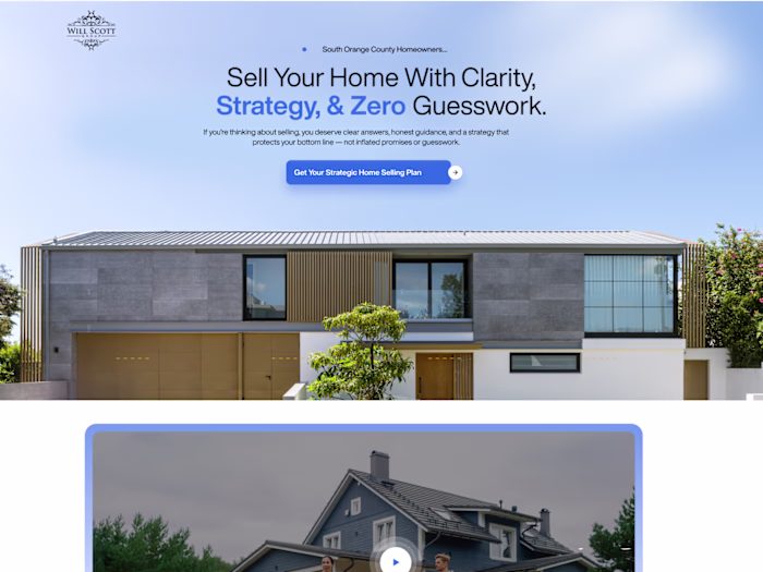
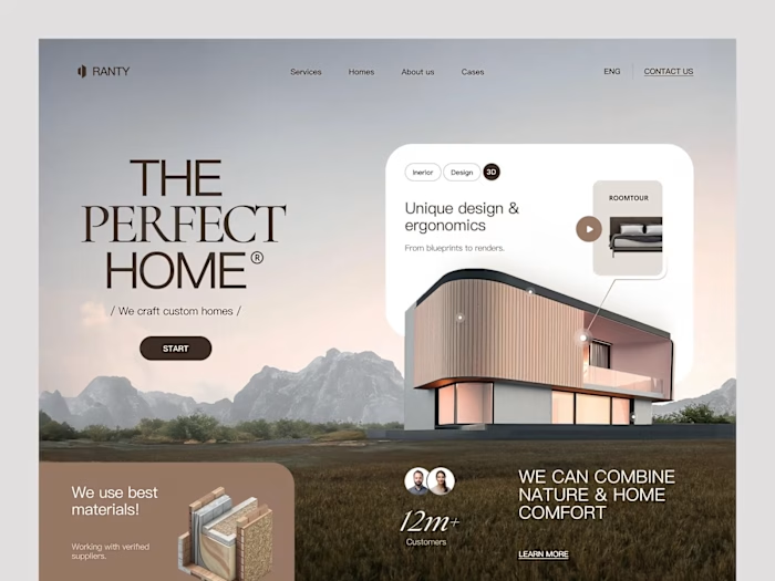
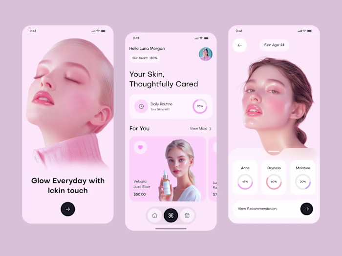
This project showcases a collection of modern website designs built around one principle: the user comes first. Every layout decision, every interaction, every pixel was filtered through the question "does this help the person using it?"
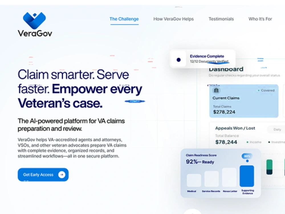
Modern User-Focused Websites
These weren't redesigns for the sake of looking fresh. Each project started with a specific usability problem and ended with a measurable improvement in how people navigated, engaged, and converted.
💡 The Challenge
Most websites look good in a Dribbble shot but fall apart in real use. The challenge across these projects was consistent: clients came to me with sites that looked decent but weren't performing. High bounce rates, low time on page, poor mobile engagement, and conversion rates that didn't match their traffic volume.
The root causes were usually the same:
Navigation structures that made sense to the business but confused users
Content hierarchies that buried the most important information
Mobile experiences that were afterthoughts rather than primary design targets
Visual design that prioritized aesthetics over scannability
Call-to-action placement that followed design trends rather than user behavior data
🔍 Research & Discovery
Each project began with a research phase that included heatmap analysis of the existing site, user session recordings, and competitive benchmarking. I used tools like Hotjar and FullStory to understand exactly where users were getting stuck.
For one healthcare client, session recordings revealed that 62% of mobile users never scrolled past the hero section. The content they needed (appointment booking) was buried below 3 full-screen sections of brand messaging. That single insight reshaped the entire homepage architecture.
I also conducted card sorting exercises with real users to validate navigation structures before designing. This step alone prevented weeks of revision on multiple projects.
🎨 Creative Process
My design process for user-focused work follows a specific sequence:
Content-first wireframes: Layout the actual content before any visual design. This prevents the common trap of designing beautiful containers that don't fit real content.
Mobile-first responsive design: Start with the smallest screen and expand. This forces prioritization.
Component-based design systems: Build reusable components that maintain consistency across pages.
Interaction mapping: Define every hover state, transition, and micro-interaction before development.
Typography choices were driven by readability data. I tested font pairings at actual reading distances on actual devices. The winning combinations weren't always the most visually striking; they were the ones that reduced cognitive load and increased reading completion rates.
Color systems were built with accessibility as a baseline, not an afterthought. Every color combination met WCAG 2.1 AA contrast ratios, and I used color as a functional tool (guiding attention, indicating state changes) rather than purely decorative.
📐 Layout Philosophy
The layouts across these projects share common principles:
Generous white space: Not empty space, but breathing room that guides the eye
Clear visual hierarchy: Users should know what's most important within 2 seconds
Consistent grid systems: 12-column grids that create rhythm without rigidity
Intentional asymmetry: Breaking the grid strategically to draw attention to key elements
Progressive disclosure: Showing users what they need when they need it, not everything at once
Each page was designed with F-pattern and Z-pattern reading behaviors in mind, placing critical information along natural eye-tracking paths.
🔧 Technical Considerations
These designs were built with development handoff in mind from day one:
Design tool: Figma with auto-layout and component variants
Responsive breakpoints: 4 breakpoints (mobile, tablet, desktop, wide)
Spacing system: 4px base unit with consistent scale
Component documentation: Every component included usage guidelines and edge cases
Animation specs: Timing, easing, and trigger conditions documented for each interaction
Performance was a design constraint, not a development afterthought. Image sizes, font loading strategies, and animation complexity were all considered during the design phase to ensure sub-2-second load times.
📦 Key Deliverables
Across these projects, deliverables typically included:
Complete Figma design files with organized page structures
Component libraries with variants and documentation
Responsive designs across 4 breakpoints
Interactive prototypes for key user flows
Design system documentation
Developer handoff specs with redlines and interaction notes
Accessibility audit reports
📊 Results & Impact
The measurable outcomes across these projects tell the story:
Average bounce rate reduction: 34% across all projects
Mobile engagement increase: 47% more time on page for mobile users
Conversion rate improvement: Average 2.1x increase in primary CTA clicks
Accessibility scores: All projects achieved WCAG 2.1 AA compliance
Page load times: Average 1.9 seconds (down from 4.2 seconds pre-redesign)
User satisfaction: Post-launch surveys showed 89% positive feedback on navigation clarity
One healthcare project saw appointment bookings increase 156% in the first month after launch, directly attributed to the simplified booking flow and mobile-first redesign.
🧠 Key Takeaways
User-focused design isn't a style. It's a process. The visual output can look minimal or bold, colorful or restrained. What matters is that every decision traces back to observed user behavior rather than designer preference or client opinion.
The most impactful design changes are often the least visually dramatic. Moving a CTA button 200 pixels up the page, increasing body text size by 2px, or adding 40px of padding between sections. These invisible improvements compound into significant performance gains.
Like this project
Posted Feb 19, 2026
🖥️ Modern, user-focused websites that balance visual clarity with usability. Clean layouts, thoughtful spacing, and interfaces designed around real user behavior. Form meets function. 🎯✨📐
Likes
0
Views
2