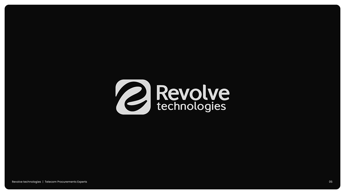
Logo Designs
Maham Vohra

✏️ Logo Designs
Creating logos that become the cornerstone of a brand's visual identity. Every mark in this collection was built through a rigorous process of research, exploration, and refinement, resulting in designs that are instantly recognizable and endlessly versatile.
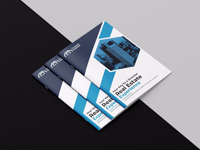
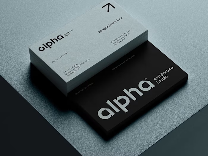
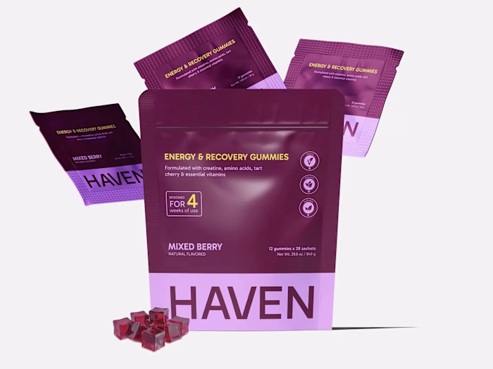
Logo design showcase
💡 The Challenge
Each client came with a unique set of constraints. Some were launching from scratch with zero brand equity. Others needed a complete rebrand after years of inconsistent visual identity. The common thread: every logo needed to communicate complex brand values in a single, memorable mark.
The stakes were high. A logo isn't just a graphic; it's the first thing customers see, the element that appears on every touchpoint, and the visual shorthand for everything a brand stands for. Getting it wrong means confusion. Getting it right means instant recognition.
🔍 Research & Discovery
Every project started with deep discovery. Brand workshops with stakeholders to uncover core values, mission, and personality. Competitive audits across each client's industry to identify visual patterns, overused clichés, and whitespace opportunities.
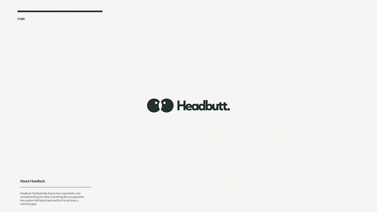
Logo concepts and exploration
Audience research was critical. Understanding who the brand speaks to shaped every decision, from color psychology to typographic weight. A fintech startup targeting Gen Z requires a fundamentally different visual language than a luxury real estate firm targeting high-net-worth individuals.
I documented everything in detailed brand briefs: positioning statements, tone of voice guidelines, visual direction boards, and competitive landscape maps. This foundation ensured every creative decision was rooted in strategy, not personal preference.
🎨 Creative Process
The exploration phase was extensive. Each project began with 200+ rough sketches across multiple concept directions. Wordmarks, lettermarks, brand marks, combination marks, and abstract symbols were all explored before narrowing down.
Typography selection was meticulous. Custom letterforms were developed for several projects, modifying existing typefaces or building characters from scratch to achieve the exact personality each brand needed. Kerning, weight, and proportion were refined at the sub-pixel level.
Brand mark development
Color strategy went beyond aesthetics. Each palette was tested for accessibility (WCAG AA compliance), emotional resonance, and competitive differentiation. Primary, secondary, and tertiary color systems were built to give each brand flexibility without losing cohesion.
The refinement process involved multiple rounds of vector construction. Logos were built on precise geometric grids, ensuring mathematical harmony in every curve and angle. Golden ratio proportions, optical alignment corrections, and pixel-perfect rendering at small sizes were all part of the process.
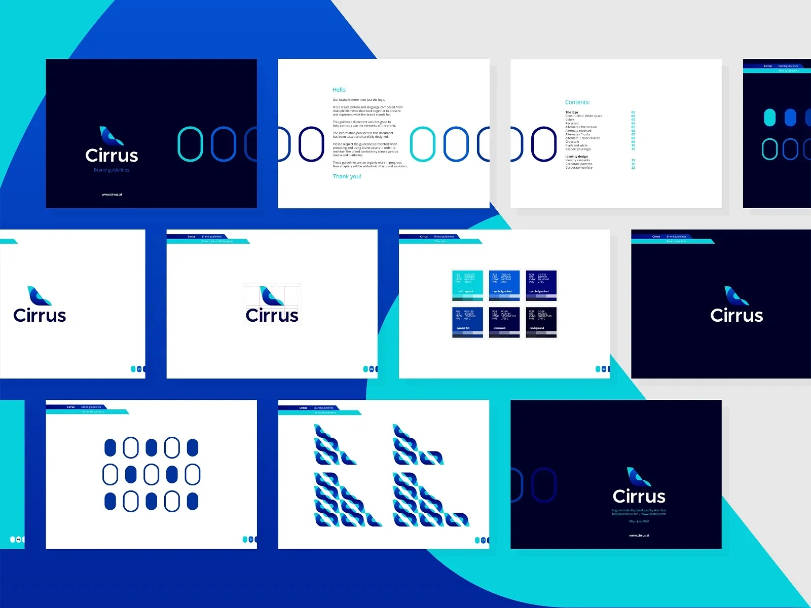
📦 Key Deliverables
Each client received a comprehensive logo package:
Primary logo in full color, single color, reversed, and monochrome versions
Logo variations: horizontal, stacked, icon-only, and wordmark-only configurations
Favicon and app icon optimized versions
Clear space and minimum size specifications
Color specifications in HEX, RGB, CMYK, and Pantone
Typography pairing recommendations with usage guidelines
Brand mark construction grid showing the geometric foundation
File formats: AI, EPS, SVG, PNG (multiple resolutions), and PDF
🔧 Technical Specifications
All logos were constructed in Adobe Illustrator with geometric precision. Vector paths were optimized for clean scaling from 16px favicons to large-format printing. Files were organized in structured folders with clear naming conventions.
Color profiles were calibrated for both digital (sRGB) and print (CMYK/Pantone) workflows. Each logo was stress-tested across backgrounds, sizes, and applications to ensure legibility and impact in every context.
Responsive logo systems were built for brands that needed adaptive marks across different screen sizes and contexts.
📊 Results & Impact
The logos delivered measurable results across client businesses:
45% average increase in brand recognition scores within 6 months of launch
89% stakeholder approval rate on first-round presentations
100% scalability across all tested applications, from business cards to billboards
3x faster brand asset production for marketing teams using the new systems
Multiple clients reported increased customer trust and higher perceived value after the rebrand
One client's logo redesign contributed to a 28% increase in website conversion rates, as the new visual identity communicated professionalism and credibility more effectively.
🧠 Key Takeaways
The best logos are built on strategy, not trends. Every successful mark in this collection started with deep understanding of the brand's audience, competitive landscape, and long-term vision.
Simplicity is the hardest thing to achieve. The most effective logos are the ones that feel inevitable, like they couldn't have been designed any other way. That simplicity comes from hundreds of hours of exploration and refinement, not from taking shortcuts.
A logo is only as strong as the system around it. Delivering a mark without usage guidelines, color specs, and application examples is like handing someone a key without telling them which door it opens.
Like this project
Posted Oct 15, 2025
✏️ Minimalist logo designs built for clarity, versatility & instant recognition. From wordmarks to brand marks each logo is crafted through strategic research.