Social Media Designs
Maham Vohra
📱 Project Overview
This project encompasses social media design work for brands across lifestyle, fashion, food, and professional services. The work ranged from one-off campaign graphics to complete content design systems that clients could scale independently.
Social Media Designs
Social media design is a unique discipline. You're designing for a 2-second attention window, a thumb-scrolling user, and an algorithm that rewards engagement. Every visual decision is filtered through one question: will this make someone stop scrolling?
💡 The Challenge
Most brands struggle with social media design for the same reasons: inconsistency, slow production, and content that looks good in isolation but doesn't build a cohesive brand presence when viewed as a grid.
Specific challenges across these projects:
Brands posting inconsistently because each piece of content required custom design from scratch
Visual identity that worked on websites but fell apart at Instagram's square format
Content that looked professional but generated zero engagement
Teams that needed to produce 15-20 pieces of content per week without a designer on staff
Maintaining brand consistency across multiple platforms with different format requirements
Standing out in feeds dominated by polished, same-looking content
🔍 Research & Discovery
For each client, I conducted a social media audit covering their existing content, competitor content, and top-performing accounts in their industry. The analysis focused on:
Content performance patterns: Which post types (carousels, single images, text-heavy, photo-heavy) generated the most engagement in their niche? For most B2C brands, carousels outperformed single images by 3-4x in saves and shares.
Visual trend analysis: What visual styles were saturating the feed, and where were the gaps? In the wellness space, for example, every brand was using the same muted earth tones and serif fonts. A brand using bold color and geometric shapes would immediately stand out.
Platform-specific behavior: Instagram users scroll vertically and engage with visual-first content. LinkedIn users scan horizontally and engage with insight-first content. The same message needed fundamentally different visual treatment on each platform.
Grid aesthetics: On Instagram, individual posts are viewed in two contexts: the feed (where they appear one at a time) and the profile grid (where they appear as a 3-column mosaic). Designs needed to work in both contexts.
🎨 Creative Process
Phase 1: Content Strategy Alignment
Before designing anything, I worked with each client to define their content pillars (3-5 recurring themes) and content mix (the ratio of educational, promotional, entertaining, and community content). This strategic foundation ensured the design system supported actual content needs rather than hypothetical ones.
Phase 2: Template System Design
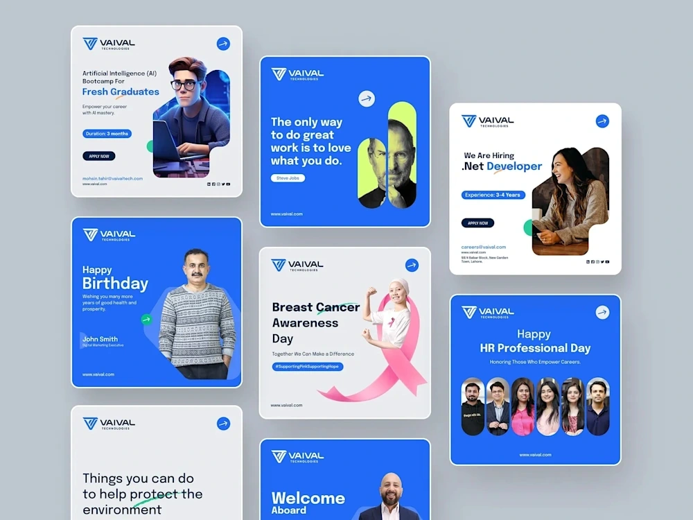
The core deliverable for most social media projects was a template system. Not rigid templates that produce identical-looking posts, but flexible frameworks that maintained brand consistency while allowing creative variation.
Each template system included:
Carousel templates: 3-5 slide structures for educational and storytelling content
Single post templates: Quote cards, product features, announcements, and testimonials
Story templates: Interactive polls, Q&A frames, behind-the-scenes layouts, and promotional slides
Reel cover templates: Consistent thumbnail designs for video content
Phase 3: Visual Language Development
The visual language for social media needed to be bolder and more immediate than the brand's website or print materials. I adapted each brand's identity for the social context:
Typography was scaled up dramatically. Headlines that worked at 24px on a website needed to be 60px+ on a social post to be readable at phone screen size. I selected typefaces that maintained character at large sizes and remained legible when Instagram compressed the image.
Color was intensified. Subtle color palettes that worked on websites got lost in busy social feeds. I created "social-optimized" color variants: same hues, but higher saturation and stronger contrast.
Photography and illustration styles were defined with specific guidelines: crop ratios, filter presets, overlay treatments, and composition rules that ensured visual consistency regardless of the source imagery.
📐 Platform-Specific Design
Instagram Feed (1080x1080, 1080x1350):
Designed for vertical scroll behavior
Text kept to 30% or less of the image area
Key message visible without expanding the caption
Grid-aware design (alternating visual weight for mosaic effect)
Instagram Stories (1080x1920):
Designed for tap-through behavior (15-second attention window)
Interactive elements (polls, sliders, questions) integrated into the design
Safe zones respected for UI overlays (username top, reply bar bottom)
Sequential storytelling across 3-7 frames
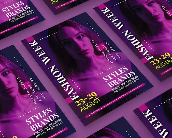
Instagram Carousels (1080x1080 or 1080x1350, up to 10 slides):
First slide designed as a hook (the scroll-stopper)
Interior slides designed for swipe momentum (visual continuity between slides)
Final slide designed as a CTA (save, share, follow, or link in bio)
Consistent navigation cues (slide numbers, progress indicators)
LinkedIn (1200x627 or 1080x1080):
More text-forward design (LinkedIn users read more than Instagram users)
Professional color palette (less saturated than Instagram variants)
Data visualization and infographic elements for thought leadership content
Author branding integrated into the design
🔧 Technical Specifications
Design tool: Figma (master templates) + Canva (client-facing editable versions)
Export formats: PNG (static posts), MP4 (animated posts), PDF (carousel guides)
Resolution: 1080px minimum width for all Instagram content
Color mode: sRGB for all digital content
File organization: Structured by platform > content type > template variant
Font licensing: All fonts verified for commercial social media use
Animation: After Effects for motion graphics, Figma for simple transitions
📦 Key Deliverables
Complete social media design system in Figma
Canva-editable template library (for client self-service)
Platform-specific template sets (Instagram, LinkedIn, Facebook, Twitter)
Brand photography/illustration style guide for social
Content calendar template with visual planning grid
Export presets and file naming conventions
Training documentation for template usage
30 days of designed content as launch inventory
📊 Results & Impact
Results across social media design projects:
Lifestyle brand: Instagram engagement rate increased from 1.2% to 4.8% within 45 days of implementing the new design system. Follower growth rate doubled.
Professional services firm: LinkedIn post impressions increased 280% after switching to the designed template system. The firm's thought leadership carousels consistently outperformed industry benchmarks.
Food brand: Content production time dropped from 4 hours per post to 45 minutes using the template system. The brand went from posting 3x/week to daily without adding design resources.
Fashion brand: Instagram saves (the strongest engagement signal for the algorithm) increased 520% with the new carousel-first content strategy.
Aggregate metrics:
Average engagement rate increase: 3.2x across all clients
Content production time reduction: 65% average
Brand consistency score (measured by visual audit): Improved from average 4/10 to 9/10
Client self-sufficiency: All clients producing content independently within 2 weeks of handoff
🧠 Key Takeaways
Social media design is systems design. Individual posts don't build brands; consistent, scalable content systems do. The most impactful deliverable isn't a beautiful one-off graphic. It's a template system that empowers the client to produce beautiful content independently, every day, without a designer in the loop.
The scroll-stop moment is everything. You have roughly 0.3 seconds to earn someone's attention in a social feed. That means the visual hook needs to work at thumbnail size, in peripheral vision, while competing with every other post in the feed. Designing for that constraint is a fundamentally different skill than designing for a website or print piece.
Like this project
Posted Feb 16, 2026
📱 Social media designs that blend brand storytelling with scroll-stopping visuals. Carousel templates, story designs, and content systems built for consistency at scale. Thumb-stopping work. 🎯🔥✨