Brand Identity
Maham Vohra
🎨 Project Overview
Brand identity is more than a logo. It's the entire visual and emotional language that defines how a business shows up in the world. This project involved building a complete brand identity system from the ground up for a growing company that needed to transition from a scrappy startup look into a polished, professional, and instantly recognizable brand.
The scope covered everything: logo design, color architecture, typography systems, brand guidelines, and a full suite of collateral templates. Every element was designed to work together seamlessly across digital platforms, print materials, social media, and physical touchpoints.
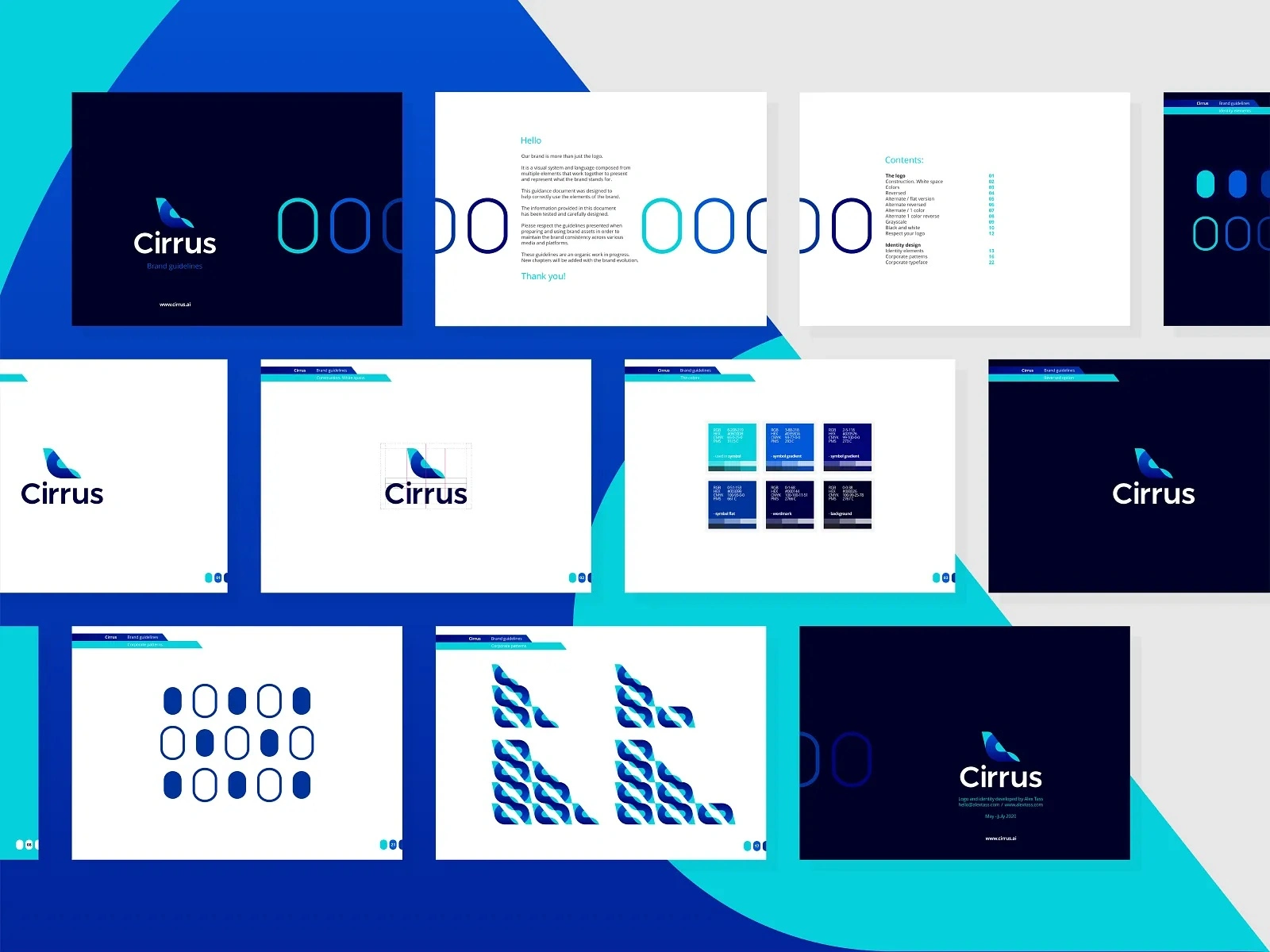
Brand Identity Design System
💡 The Challenge
The client came to me with a familiar problem. Their brand had evolved organically over 3 years, and the result was a patchwork of inconsistent visuals. Different team members were using different logo versions. Social media posts looked nothing like the website. Pitch decks had a completely different color palette than the business cards. There was no single source of truth for the brand.
Beyond the visual inconsistency, the brand didn't reflect where the company was headed. They'd grown from a 4-person team to 30+ employees, expanded into new markets, and were preparing for a Series A fundraise. The existing brand felt amateur and undermined their credibility with potential investors and enterprise clients.
The brief was clear: build a brand identity system that communicates trust, innovation, and sophistication while remaining approachable and human. It needed to scale across every touchpoint without losing coherence.
🔍 Research & Discovery
Before touching any design tools, I spent 2 weeks in pure research mode. This phase is where the real foundation gets built.
Competitive Audit: I analyzed 18 competitors across the client's industry, documenting their visual language, color choices, typography patterns, and overall brand positioning. This revealed a sea of sameness: most competitors defaulted to safe blues and grays with generic sans-serif typography. The opportunity was clear: differentiate through bold, confident color choices and distinctive typographic personality.
Stakeholder Interviews: I conducted 6 interviews with founders, department heads, and key team members. These conversations surfaced the brand's core values, personality traits, and aspirational positioning. Three words kept coming up: trustworthy, forward-thinking, and human.
Audience Research: I reviewed customer feedback, support tickets, and social media comments to understand how the audience perceived the current brand. The gap between internal perception and external reality was significant, and closing that gap became a primary design objective.
Brand Audit: I cataloged every existing brand asset, from the original logo files to email signatures, social templates, and presentation decks. This inventory revealed 14 different logo variations in active use and 6 different color palettes across various materials.
Brand Identity Visual Exploration
🎨 Creative Process
With research complete, I moved into the creative development phase. This is where strategy transforms into visual language.
Concept Development: I developed 3 distinct creative directions, each rooted in the research findings but expressing the brand personality differently. Direction A leaned into geometric precision and minimalism. Direction B explored organic shapes and warmth. Direction C combined structured layouts with unexpected color pops. The client gravitated toward a hybrid of A and C, which became the foundation for the final system.
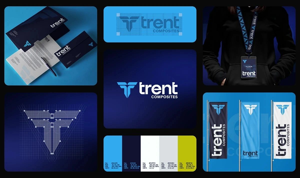
Logo Design: The logo process started with 47 hand-drawn sketches exploring different typographic and symbolic approaches. I narrowed these down to 12 digital concepts, then refined to 4 strong candidates. After 3 rounds of feedback and iteration, we landed on a wordmark with a custom letterform that subtly references the company's core product. The final logo works at every scale, from a 16px favicon to a billboard.
Color Architecture: Rather than picking colors that "look nice," I built a systematic color architecture. The primary palette consists of 3 colors chosen for their psychological associations and accessibility compliance. The secondary palette adds 4 supporting colors for data visualization, UI elements, and accent moments. Every color combination was tested against WCAG 2.1 AA standards to ensure accessibility.
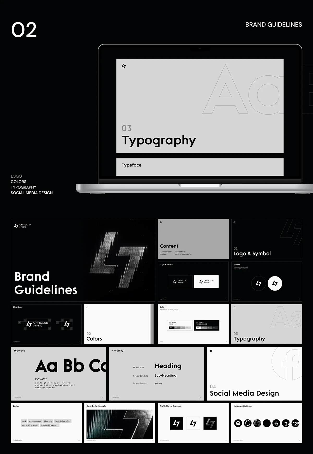
Typography System: I selected a primary typeface for headlines that conveys confidence and modernity, paired with a secondary typeface for body copy that prioritizes readability across screen sizes. The type scale follows a modular ratio of 1.25, creating consistent visual rhythm across all materials. I defined 8 type styles with specific use cases, weights, and spacing rules.
Grid Systems: I established grid systems for both digital and print applications. The digital grid uses a 12-column structure with responsive breakpoints. The print grid uses a 6-column layout with generous margins that give the brand a premium, breathable feel.
Photography & Illustration Style: I created a comprehensive visual style guide covering photography direction, illustration principles, and iconography rules. The photography style emphasizes natural lighting, authentic moments, and a warm color grade. The icon set uses a consistent 2px stroke weight with rounded terminals.
Brand Identity Guidelines and Applications
📦 Key Deliverables
The final delivery package was comprehensive and built for real-world use:
Primary Logo Suite: 12 logo variations including full color, monochrome, reversed, stacked, horizontal, and icon-only versions. Each variation delivered in SVG, PNG, EPS, and PDF formats.
Brand Guidelines Document: A 68-page brand guide covering logo usage rules, clear space requirements, minimum sizes, color specifications (HEX, RGB, CMYK, Pantone), typography hierarchy, photography direction, tone of voice guidelines, and do's and don'ts with real examples.
Collateral Templates: Business cards, letterhead, email signatures, presentation deck (40+ slide layouts), social media templates for Instagram, LinkedIn, Twitter, and Facebook, and proposal/invoice templates.
Digital Asset Library: A complete Figma component library with all brand elements organized for the design team. This included color styles, text styles, logo components, icon set, and layout templates.
Brand Launch Kit: A one-page quick reference card for team members, plus a recorded walkthrough video explaining the brand system and how to use it correctly.
🔧 Technical Specifications
Every deliverable was built with production precision:
Logo files optimized for both screen and print reproduction
Color values specified across HEX, RGB, CMYK, HSL, and Pantone Matching System
Typography licensed for both web and desktop use across the entire organization
Print templates set up with proper bleed, trim marks, and CMYK color profiles
Digital templates built as Figma components with auto-layout and variants
All assets organized in a structured folder system with clear naming conventions
Icon set delivered as individual SVGs and as a compiled icon font
📊 Results & Impact
The rebrand launched across all channels simultaneously, and the results were measurable within the first quarter:
34% increase in brand recognition scores in follow-up audience surveys
28% boost in social media engagement within the first 6 weeks post-launch
Design production time cut by 60% thanks to the template system and Figma library
Zero brand inconsistencies reported in the 3 months following launch (compared to 20+ monthly incidents before)
The Series A pitch deck, built on the new brand system, contributed to a successful fundraise
Employee satisfaction surveys showed a 41% increase in "pride in company brand" scores
🧠 Key Takeaways
This project reinforced several principles that guide my brand identity work:
Research is design. The 2 weeks spent in discovery directly shaped every creative decision. Skipping research means designing in the dark.
Systems beat assets. A logo is just one piece. The real value is in the system: the rules, relationships, and frameworks that ensure consistency at scale. A brand that only works when the designer is in the room isn't a brand system.
Accessibility is non-negotiable. Every color combination, type size, and interactive element was tested for accessibility. Beautiful design that excludes people isn't good design.
Documentation enables adoption. The 68-page brand guide and video walkthrough weren't afterthoughts. They were essential tools that empowered the entire team to use the brand correctly without constant designer oversight.
Measure what matters. Connecting brand design to business metrics (recognition scores, engagement rates, production efficiency) demonstrates the tangible value of strategic design work. Brand identity isn't decoration; it's infrastructure.
Like this project
Posted Oct 20, 2025
🎨 Complete brand identity systems built from scratch. Logos, color palettes, typography, brand guidelines, and visual language crafted. ✨🖋️📐