Brochure Design
Maham Vohra
📐 Brochure Design: Turning Information Into Visual Experiences
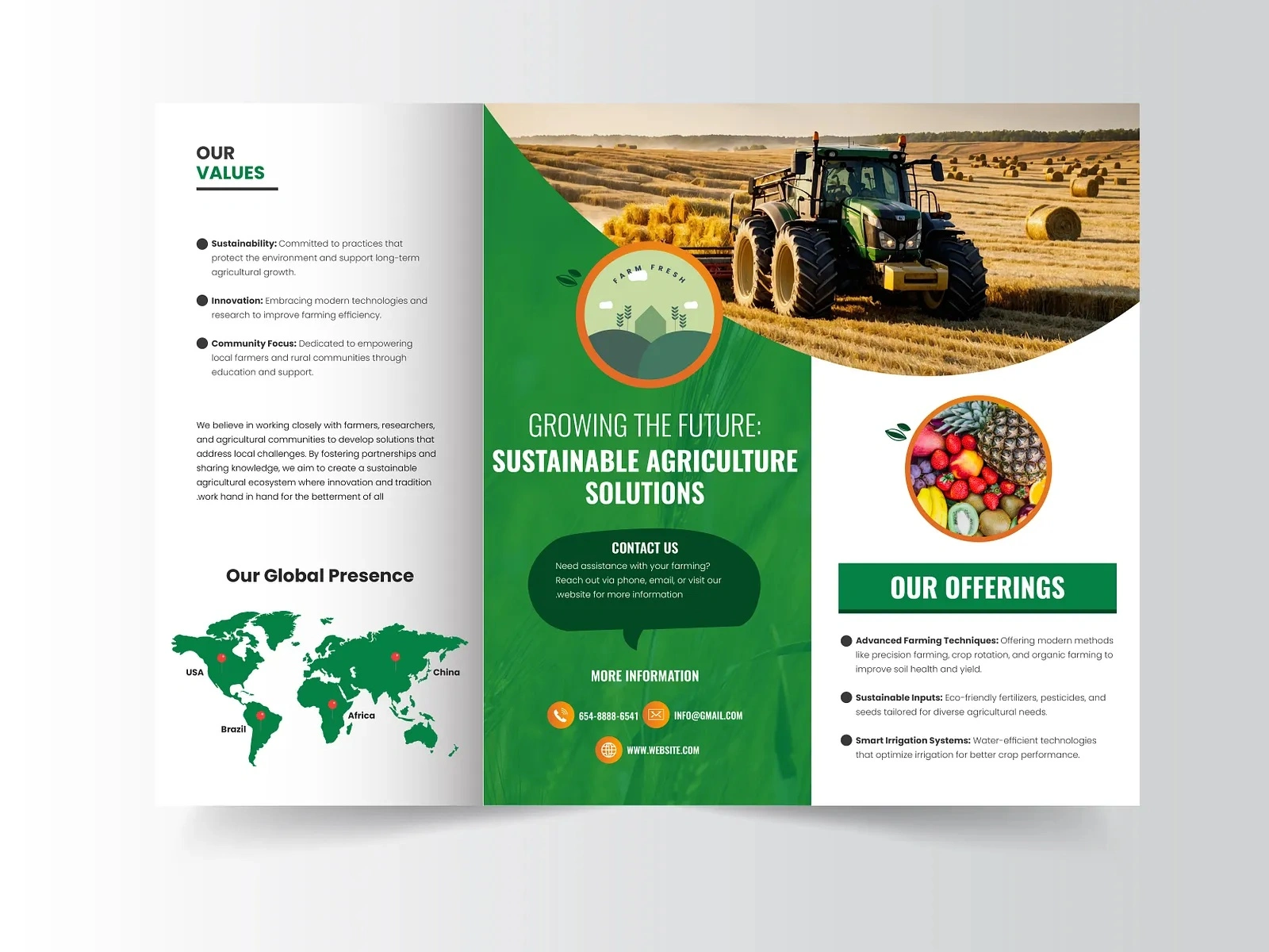
Brochure Design Concept 1
🎯 Project Overview
Brochure design sits at the intersection of storytelling and visual communication. Unlike digital media where users scroll and tap, a brochure demands that every square inch earns its place. This project showcases a collection of corporate brochure designs created for clients across real estate, finance, and professional services. Each brochure was designed to transform dense, complex information into layouts that feel effortless to read, visually compelling, and impossible to throw away.
The goal was never just to "make it look nice." It was to build a physical piece of marketing collateral that does real work: communicates value, builds trust, and moves the reader toward a decision. Every fold, every margin, every typographic choice was made with that purpose in mind.
💡 The Challenge
Most corporate brochures fail for the same reason: they try to say everything at once. Clients come with 15 pages of bullet points, dense paragraphs, and a logo they want "bigger." The real challenge is editing. Figuring out what matters most, what the reader actually needs to see first, second, and third, and then designing a visual hierarchy that guides them through that sequence naturally.
For these projects, the specific challenges included:
Condensing complex service offerings into scannable, digestible sections
Balancing data-heavy content (financial figures, property specs, service tiers) with breathing room
Creating a design system flexible enough to work across tri-fold, bi-fold, and multi-page formats
Ensuring every brochure felt premium in hand, not like a cheap handout
🔍 Research & Discovery
Before opening any design tool, I spent time understanding each client's audience. Who picks up this brochure? Where do they encounter it? What are they hoping to learn? A real estate brochure handed to a prospective buyer at an open house serves a completely different purpose than a financial services brochure mailed to existing clients.
I studied competitor brochures in each industry, noting what worked and what felt dated. Most competitors relied on stock photography, generic layouts, and walls of text. The opportunity was clear: stand out by doing less, but doing it with precision.
I also researched print specifications early. Paper stock, coating options, fold types, and bleed requirements all influence design decisions. Designing a brochure without understanding how it will be printed is like designing a website without knowing the screen size.
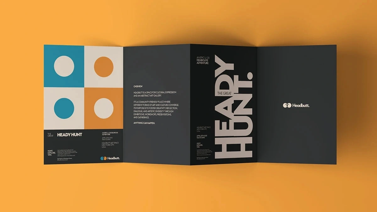
Brochure Design Concept 2
🎨 Creative Process
Wireframing & Layout Architecture
Every brochure started as a wireframe. No colors, no images, just boxes and lines showing where content would live. This step is critical because it forces you to solve the information hierarchy problem before aesthetics enter the picture.
I mapped out the reader's journey panel by panel. The front cover needed to hook attention with a single compelling headline and visual. The inside panels needed to deliver the core message in a logical flow. The back panel needed to close with contact information and a clear call to action.
Typography as Structure
Typography does most of the heavy lifting in brochure design. I selected typeface pairings that created clear contrast between headlines, subheads, body text, and captions. For corporate clients, I leaned toward clean sans-serifs for headlines paired with readable serifs for body copy. This combination signals professionalism while maintaining warmth and approachability.
Font sizes, line heights, and letter spacing were all calibrated for print reading distances. What works on screen often fails on paper, so every typographic decision was tested in print proofs before finalization.
Color Strategy
Each brochure's color palette was derived from the client's existing brand guidelines, then expanded with complementary accent colors for visual variety. I used color strategically to create section breaks, highlight key statistics, and draw the eye to calls to action.
For data-heavy sections, I introduced subtle background tints to differentiate content blocks without adding visual clutter. This technique lets readers scan quickly and find the information they need without feeling overwhelmed.
Grid Systems & White Space
Every layout was built on a modular grid system. Grids create consistency across pages and panels, ensuring that even when content varies in length, the overall design feels cohesive and intentional.
White space was treated as a design element, not empty space to fill. Generous margins and padding between sections give the reader's eye room to rest, making dense information feel manageable. Clients often want to fill every gap, but restraint is what separates a premium brochure from a cluttered one.
Brochure Design Concept 3
📦 Key Deliverables
Each brochure project included the following deliverables:
Print-ready PDF files with crop marks, bleed, and color profiles (CMYK)
Editable source files in Adobe InDesign and Figma for future updates
Multiple format variations including tri-fold, bi-fold, and multi-page booklet versions
Digital-optimized versions reformatted for email attachments and website downloads
Style guide addendum documenting the typography, color codes, and grid specifications used
🔧 Technical Specifications
All brochures were designed at 300 DPI with full bleed (3mm on all sides). Color mode was set to CMYK throughout, with Pantone spot colors specified for brand-critical elements. Files were packaged with all linked assets and fonts for seamless handoff to print vendors.
I worked closely with print partners to select appropriate paper stocks. For corporate clients, I recommended 170gsm coated matte for interior pages and 300gsm for covers, providing a substantial feel without excessive weight. Coating options included soft-touch lamination for covers and spot UV on logos and key headlines for tactile contrast.
📊 Results & Impact
These brochures delivered measurable results for clients:
Real estate client: Reported a 40% increase in follow-up inquiries from open house attendees after switching to the new brochure design
Financial services client: Used the brochure as their primary leave-behind at industry conferences, noting that prospects frequently referenced specific pages in follow-up meetings
Professional services client: Reduced their print marketing budget by 25% by consolidating three separate flyers into one comprehensive, well-designed brochure
Beyond metrics, the feedback consistently highlighted how the brochures "felt different" from competitors. That tactile, visual distinction is exactly what print collateral should achieve.
🧠 Key Takeaways
This project reinforced several principles I carry into every brochure design:
Edit ruthlessly. The best brochures say less, not more. Every word and image must earn its place.
Design for the fold. Understanding how panels relate to each other when folded and unfolded changes everything about layout decisions.
Print proofs are non-negotiable. Colors shift, type sizes feel different, and paper texture changes perception. Always proof before final production.
White space is confidence. Brands that let their content breathe signal that they trust their message. Cluttered layouts signal desperation.
Think beyond the page. A great brochure works as part of a larger brand ecosystem, not in isolation. Every design choice should reinforce the brand's visual language across all touchpoints.
Like this project
Posted Feb 17, 2026
📐 Corporate brochure designs that turn complex information into visually stunning, easy-to-read layouts. Bold geometry, intentional white space, and premium typography. Print-ready, pixel-perfect, and designed to leave a lasting impression on every reader. 🎨✨📄