Business cards
Maham Vohra
💼 Project Overview
Business cards are the smallest design canvas with the highest stakes per square inch. This project involved designing premium business cards for clients across cosmetics, consulting, and creative industries. Each card needed to communicate brand identity, professionalism, and personality in a format that fits in a wallet.
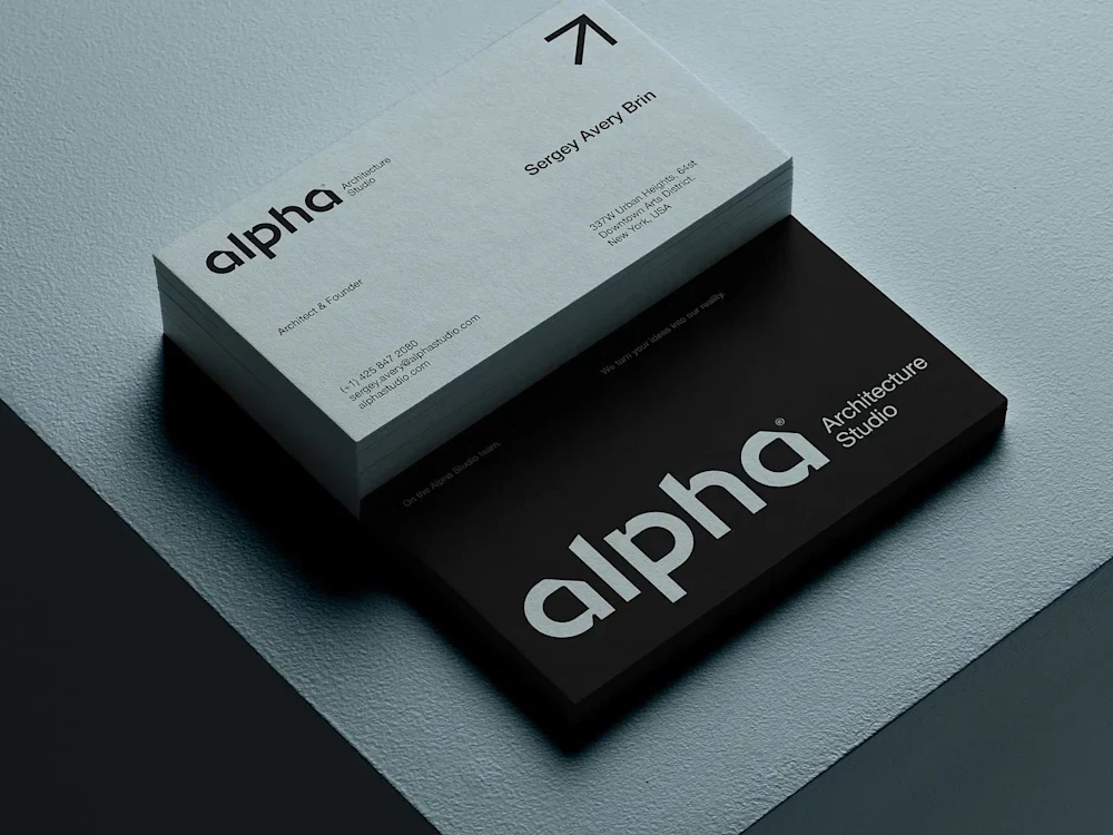
Business Card Designs
These weren't quick template jobs. Each card was designed from scratch with custom typography, intentional layout systems, and print-ready specifications that ensured the final product matched the digital design exactly.
💡 The Challenge
Business cards seem simple until you actually design one well. The 3.5 x 2 inch format is brutally unforgiving. Every element competes for attention, and there's no room for anything that doesn't earn its place.
Specific challenges across these projects:
Clients who wanted to include too much information (phone, email, website, social handles, tagline, QR code, address)
Brand guidelines designed for digital that didn't translate to print (RGB colors, screen-optimized fonts)
Clients who needed cards that stood out at networking events without being gimmicky
Print production constraints (bleed areas, safe zones, minimum font sizes for legibility)
Designing for multiple print finishes (matte, gloss, spot UV, foil stamping, letterpress)
Creating designs that looked premium at standard print budgets
🔍 Research & Discovery
I collected and analyzed 200+ business cards across industries, categorizing them by layout approach, typography treatment, and finishing technique. The patterns were clear:
What works: Generous white space, one strong visual element, restrained typography (2 fonts maximum), and a clear information hierarchy.
What doesn't: Cramming every contact method onto one side, using more than 3 colors, decorative fonts for contact information, and designs that rely entirely on special finishes to look good.
For each client, I also researched their industry's networking culture. A cosmetics brand founder hands out cards at beauty trade shows (visual impact matters most). A management consultant exchanges cards in boardrooms (understated professionalism wins). These contexts shaped every design decision.
I also consulted with 3 print vendors to understand current production capabilities and pricing tiers. This ensured every design I proposed was actually producible within the client's budget.
🎨 Creative Process
Each business card project followed a structured process:
Phase 1: Content Hierarchy
Before any visual design, I worked with each client to prioritize their contact information. The exercise was simple: rank every piece of information from "absolutely essential" to "nice to have." Anything below the top 5-6 items got cut. This was often the hardest conversation but the most important one.
Phase 2: Layout Exploration
I created 8-12 thumbnail sketches exploring different layout approaches: centered, left-aligned, asymmetric, vertical orientation, minimal, and information-dense. These rough sketches let clients react to structural choices before getting attached to visual details.
Phase 3: Visual Design
The selected layout direction was refined into 2-3 polished concepts. Typography was chosen for both screen and print legibility (some beautiful screen fonts become illegible at 8pt on paper). Color was specified in both CMYK and Pantone to ensure print accuracy.
Phase 4: Print Specification
Final designs were prepared with proper bleed (3mm), safe zones, and crop marks. I created print-ready PDFs with embedded fonts and CMYK color profiles, plus a specification sheet for the printer detailing paper stock, finish, and any special treatments.
📐 Design Principles for Small Format
Designing at business card scale requires specific principles that don't apply to larger formats:
Hierarchy through scale contrast: With limited space, the difference between primary and secondary information needs to be dramatic. Name at 10pt and phone number at 7pt creates clear hierarchy. Name at 9pt and phone at 8pt creates visual mush.
White space is structural: On a business card, white space isn't empty. It's the element that makes everything else readable. I typically allocated 30-40% of the card surface to white space.
One side, one job: The front of the card handles brand identity (logo, name, title). The back handles contact information. Trying to do both on one side almost always fails.
Touch matters: Business cards are physical objects. The paper weight, texture, and finish are design decisions as important as the visual layout. I specified paper stock for every project, typically recommending 400gsm+ for a premium feel.
🔧 Technical Specifications
Standard specifications across these projects:
Dimensions: 3.5 x 2 inches (standard) or 90 x 50mm (European)
Bleed: 3mm on all sides
Safe zone: 5mm from trim edge for all text and critical elements
Resolution: 300 DPI minimum for all elements
Color mode: CMYK with Pantone spot colors where applicable
Minimum font size: 7pt for body text, 6pt for fine print
File format: Print-ready PDF/X-1a with embedded fonts
Paper stock recommendations: 400-600gsm cotton or coated card stock
Special finish specifications varied by project:
Spot UV on logo elements (gloss on matte stock)
Gold foil stamping for luxury brand clients
Letterpress deboss for tactile impact
Soft-touch matte lamination for a velvet feel
Edge painting in brand accent colors
📦 Key Deliverables
For each business card project:
2-3 design concepts (front and back)
Selected concept refined with client feedback
Print-ready PDF files (CMYK, 300 DPI, with bleed and crop marks)
Pantone color specifications
Paper stock and finish recommendations
Print vendor recommendations (based on location and budget)
Digital mockups showing the card in realistic contexts
Source Figma files for future modifications
📊 Results & Impact
Business card impact is harder to quantify than digital projects, but client feedback told the story:
Cosmetics client: "I've had 3 people at trade shows ask who designed my cards. That's never happened before." The cards used a soft-touch matte finish with spot UV on the logo, creating a tactile experience that matched the brand's premium positioning.
Consulting client: Reported a 40% increase in follow-up emails after networking events, attributing it to the card's clean design making contact information immediately findable.
Creative agency: The cards became a portfolio piece themselves. The letterpress design on 600gsm cotton stock communicated craft and attention to detail before a single word was spoken.
Across all projects:
Client satisfaction: 100% approved within 2 revision rounds
Print accuracy: Zero reprints needed (proper file preparation)
Turnaround: Average 5 business days from brief to print-ready files
🧠 Key Takeaways
Business card design is an exercise in restraint. The best cards I've designed are the ones where I removed the most elements. When everything on the card is essential, nothing competes for attention, and the overall impression is one of confidence and clarity.
The physical production is half the design. A beautifully designed card printed on cheap 250gsm stock with digital CMYK undermines the entire effort. Specifying materials and finishes is as much a part of the design process as choosing fonts and colors.
Like this project
Posted Feb 17, 2026
💼 Business card designs that balance professionalism with brand personality. Premium finishes, intentional typography, and layouts that make a lasting first impression in a 3.5x2 inch format. ✨🖋️🎨