Language App UX Review: DIY Hacks for User Retention


Hello! Today we're about to explore the nooks and crannies of this Portuguese exam prep app, spotting gaps and dreaming up game-changing tweaks. We’ve shared practical, easy-to-implement tips for upgrading features and engaging users, all without breaking the bank. Check out how these recommendations can make the app more useful and give it an edge in the crowded language learning market.
📱 About the project:
This language learning app is designed to help users prepare for language exams, crucial for obtaining visas or residence permits in Portugal. It focuses primarily on interview practice, but lacks coverage of other exam components like reading and writing. The app offers a basic interactive experience with voice recording, aiming to simulate real exam conditions. However, it currently falls short in providing a comprehensive and engaging training experience.
Product
📦 Concept Gaps to Consider
1️⃣ Lack of Functionality
We rarely discuss this in the context of MVPs, as we usually encounter the opposite problem – creators wanting to cram everything into the MVP, which contradicts the concept of a minimum viable product.
However, FluenciaMagica faces the opposite issue. The target audience is relocating individuals preparing for a language exam to obtain a visa or residence permit in Portugal. But the current service only covers the interview part of the exam, completely ignoring other stages like reading or writing.
This is a critical flaw because users aren't choosing between "using this app or not," but rather "which app to use." Especially since FluenciaMagica doesn't offer unique features that can't be found elsewhere.
2️⃣ "Warm-up" Instead of Full-fledged Training
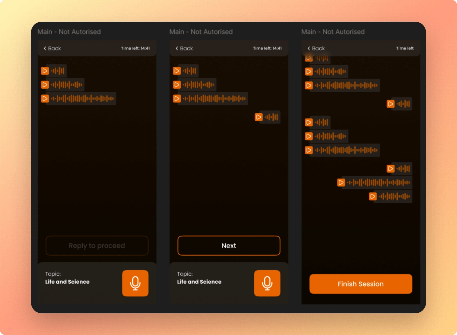
That's how interacting with Flume, the app itself, feels right now. The core function is listening to questions and recording answers as voice messages. Simulating a real exam using AI tools would be challenging, but the experience could be more immersive and closer to the actual exam.
How to achieve this:
🔹 Remove the need for users to press "Next" after answering. In the real exam, those who articulate their thoughts in one comprehensive answer get higher scores, and that's the skill we should help users practice.
👉 We don't need to drastically change the app – even replacing the "Next" button with a Telegram-like mechanic, where you record one long voice message and send it, would make it more realistic.
🔹 Add progress tracking. This is a feature worth delaying the launch for. It's not difficult to implement, either graphically or on the backend, but it's crucial for retention, which is vital for such services.
🔹 We don't have to "demotivate" users by showing error statistics. There are other approaches:
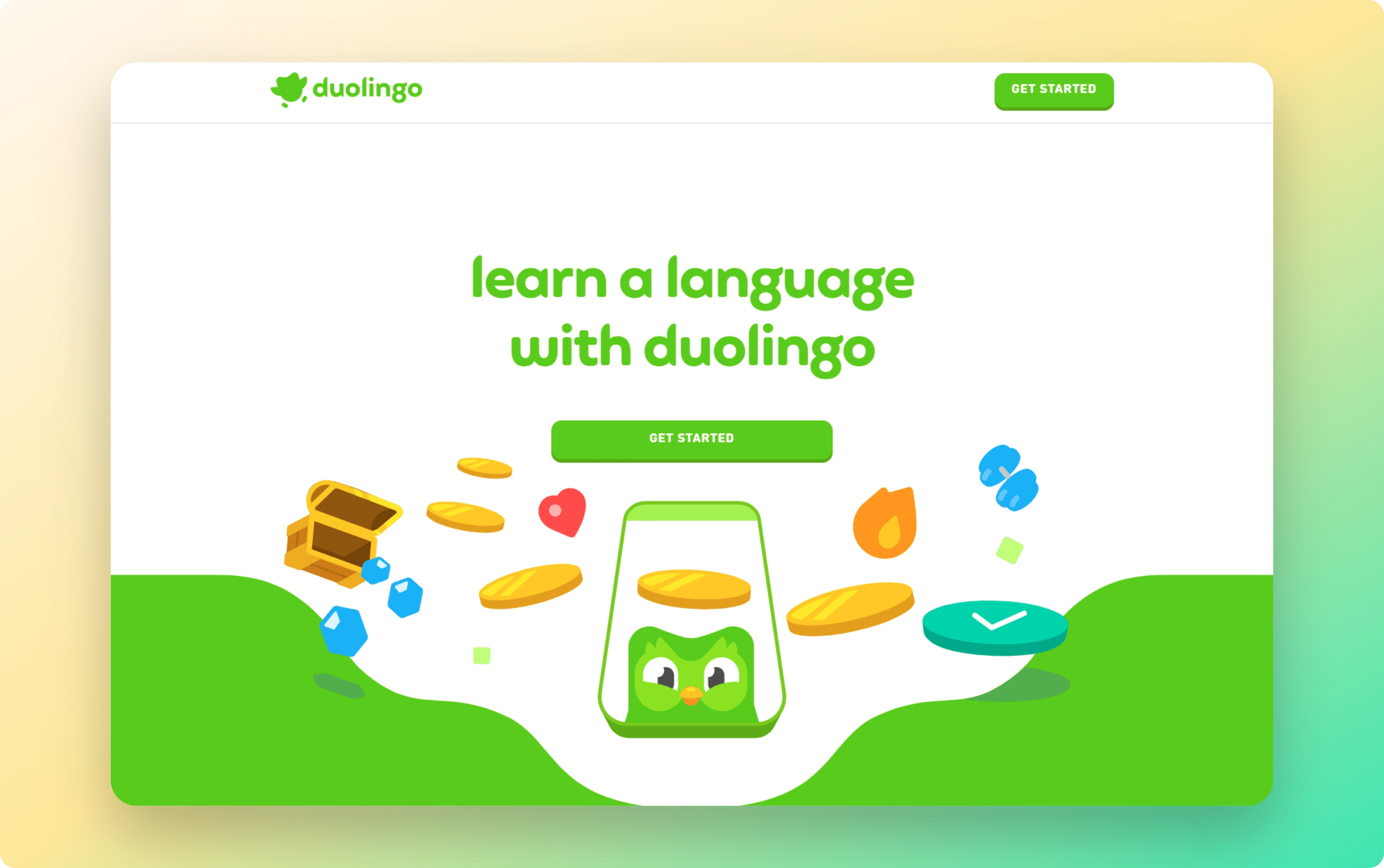
Strikes: Even without rewards, push notifications like "Hey, you've been practicing for a week, come back for a minute or it'll expire" will motivate most to return. We can also tweak onboarding – for instance, ask users when it's convenient for them to practice, like Duolingo's owl.
Comparison: We can use Flume's feedback to highlight user progress, like "Your vocabulary has grown by... this week." This is important for retaining existing users because switching to another service would mean losing this progress. Flume, unlike a new app, would already be more "familiar."
👉 Technically, you don't need a separate service for user data in the MVP – it can be stored locally on the user's device.
💎 Hidden Gem
Remembering conversation context, even minimally with local caching, not only solves the issue of Flume seeming to see you for the first time every time (which is annoying), but also allows using this data for more personalized mechanics.
For example, we can send push notifications like "Hey, you mentioned wanting to travel somewhere last week" and suggest a related lesson.
Plus, Flume could remember and highlight recurring mistakes, providing feedback.
But most importantly, lacking this memory could destroy the product, even in the MVP stage. We should prioritize its implementation over other features, even if it means delaying the release.
🎯 The main goal is to keep in mind the full range of skills users need for the exam interview. It's not just vocabulary and sentence construction, but also:
Speaking without long pauses or hesitations
Connecting thoughts logically
Answering unexpected questions and adapting to the situation, etc.
3️⃣ Retention Management
For an app like FluenciaMagica, retention is absolutely crucial, especially with limited functionality. Widgets, push notifications, reminders – all of these should be included even in the MVP version to encourage users to return and "get them hooked" on the app.
4️⃣ Other UI Considerations
🔹 Add Transcripts of Flume's and User's Speech
This might seem counterintuitive to learning to understand and speak the language. However, the more we read correct conversational speech expected in the exam, the better we'll remember it.
Another benefit is that users can see how Flume understood and heard their answers.
🔹 Provide Links to Helpful Resources and Best Practices
This is a great way to shift the focus from the unpleasantness of the exam to the enjoyable learning process. Given that the product's USP is personalized feedback, we can add such resources directly to the feedback.
For instance, if Flume notices the user rarely or incorrectly uses linking words, a common speaking criterion in language exams, we can send a link to an article or resource covering this topic. Or simply links to articles about preparation practices.
This can be implemented within the app or as links to external resources you trust. This makes the feedback and overall vibe even more personalized.
🔹 Minor Cosmetic Adjustments
Again, we're considering design within the constraints of an MVP. So, we're focusing on what can be done here and now, not on how the product might look with millions in investments. And there's a lot we can do:
Increase line spacing in text by about 150% of the default to increase readability.
Consider a slightly different, less rounded font. Try Switzer or Satoshi Variable, for example.
Visually make "locked" paid cards attractive and distinct from free ones, perhaps through background color or more unique illustrations. Apply this to banners, modals, and other elements where we ask for payment.
Reduce the number of interactions required from the user.
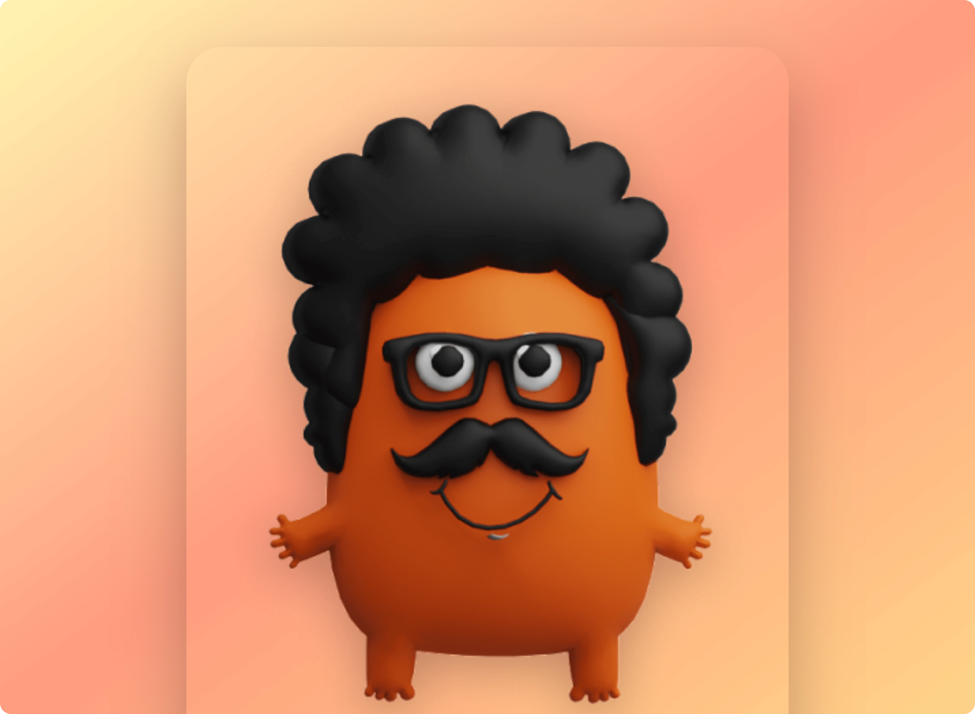
Mascot's Role and Character
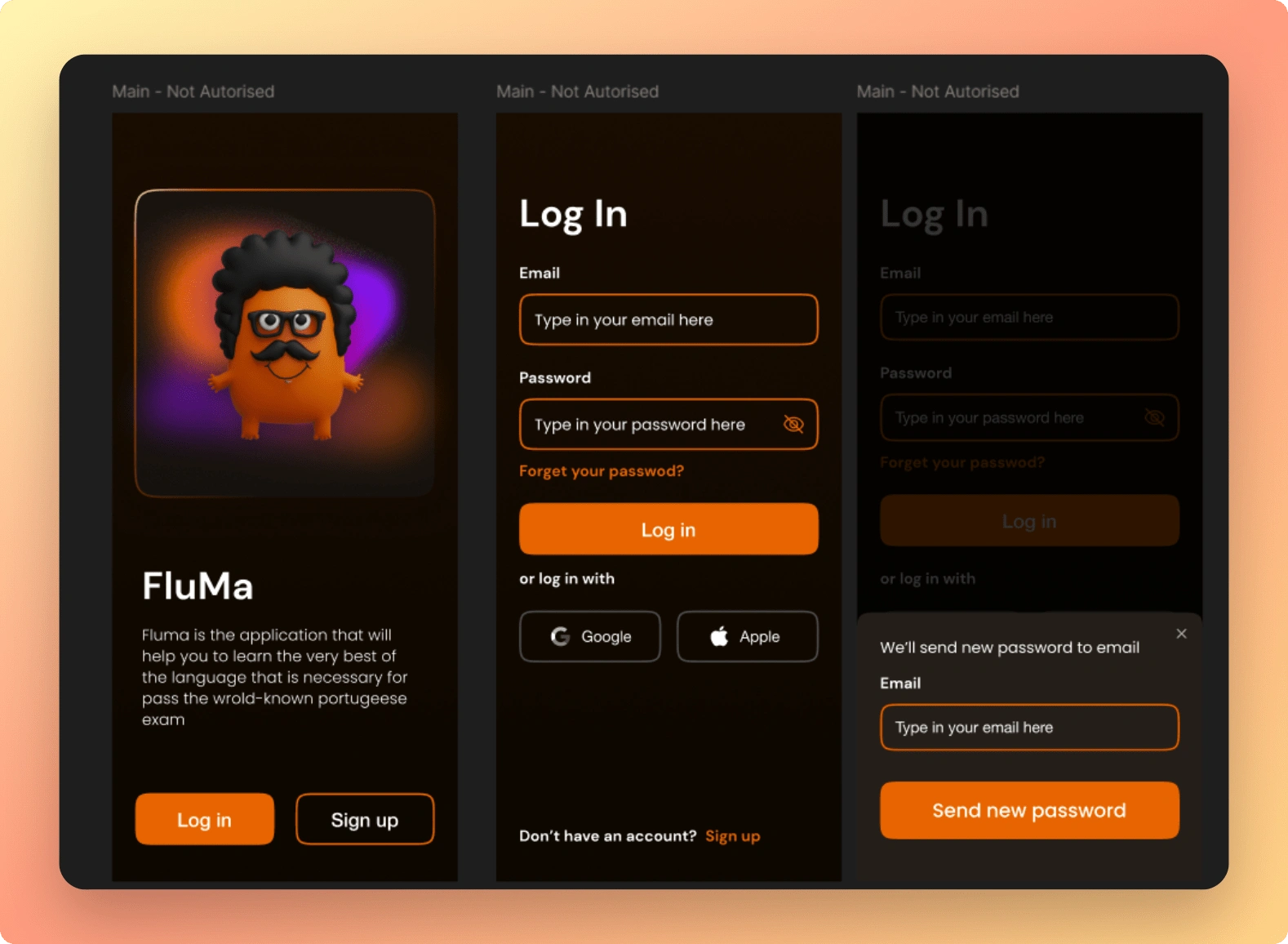
Flume, as a mascot and character, isn't fulfilling its role, even though that's its purpose. This is evident in many places:
🔹 Flume is absent from the main product flow – the dialogue interface. It feels like the user is exchanging voice messages with an impersonal chatbot.
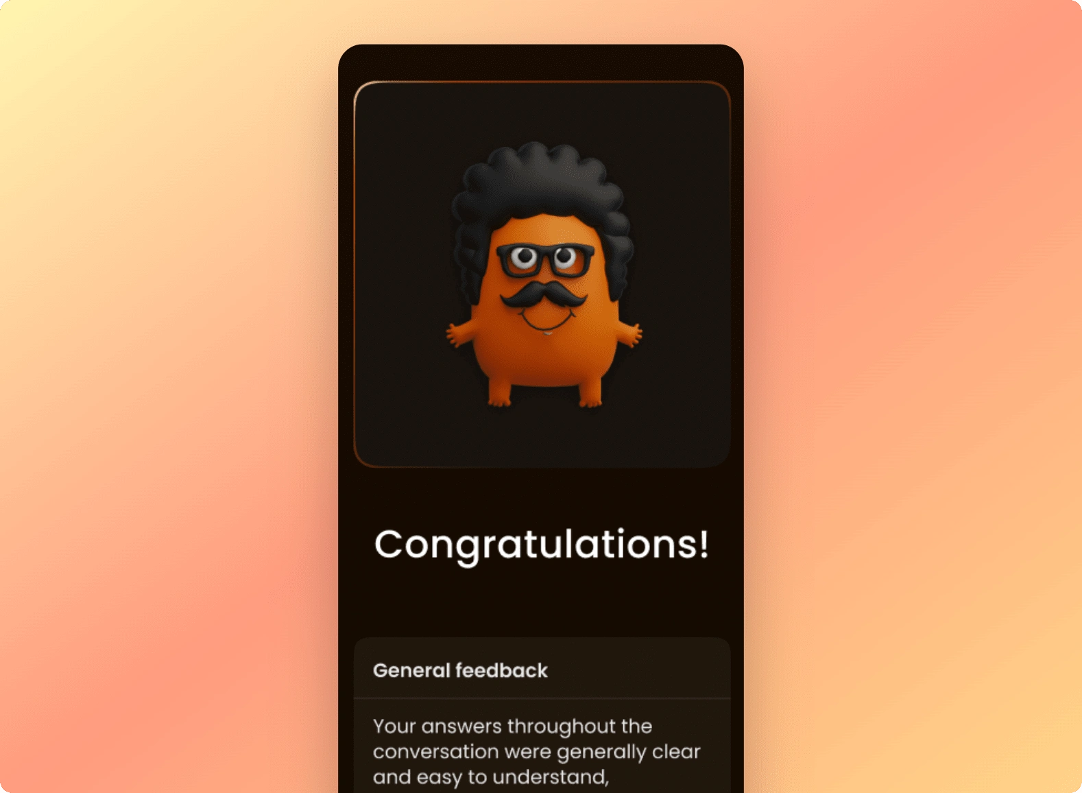
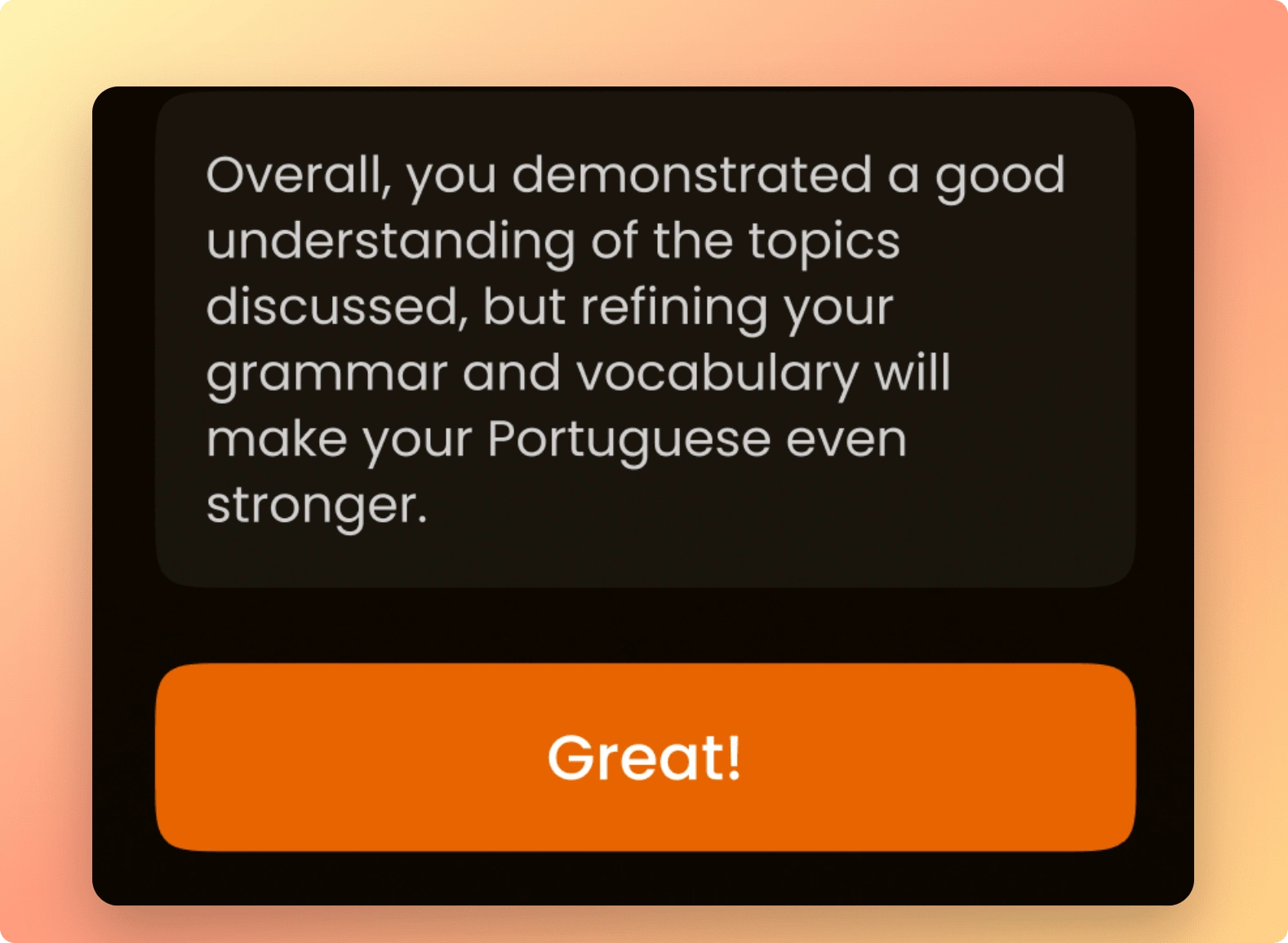
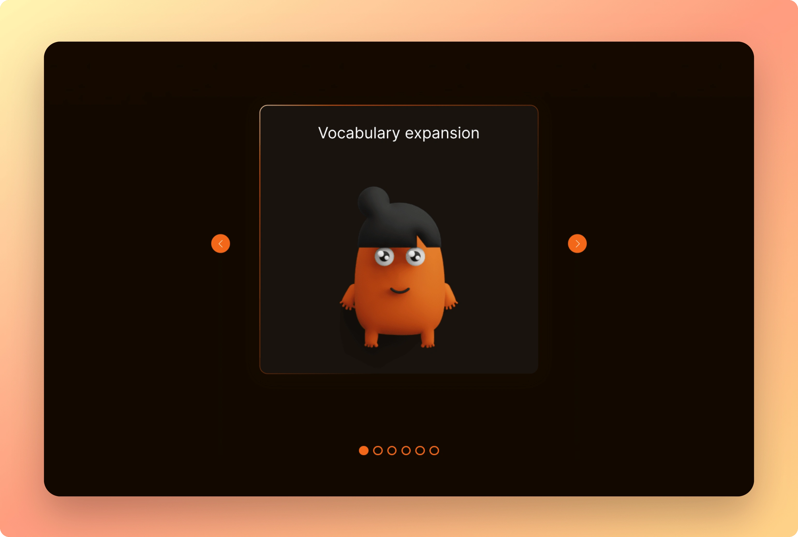
🔹 Flume appears at the most "unpleasant" moments for the user: during feedback, pointing out mistakes, and when the app asks for money. Even on the feedback screen, its role is purely decorative, looking the same regardless of the user's success.
What can be done with minimal effort:
🔸 Add the mascot to the dialogue, simply showing a circle with its avatar on the left, similar to messengers.
🔸 Redesign the feedback screen so Flume isn't just a banner at the top, but appears next to the text on the left, as if sending a message with feedback. This could be a modal or even a continuation of the dialogue. Either way, it would give the impression that Flume is a living character participating in the conversation. Plus, it further aligns the mechanics with the real-world interview format.
Monetization
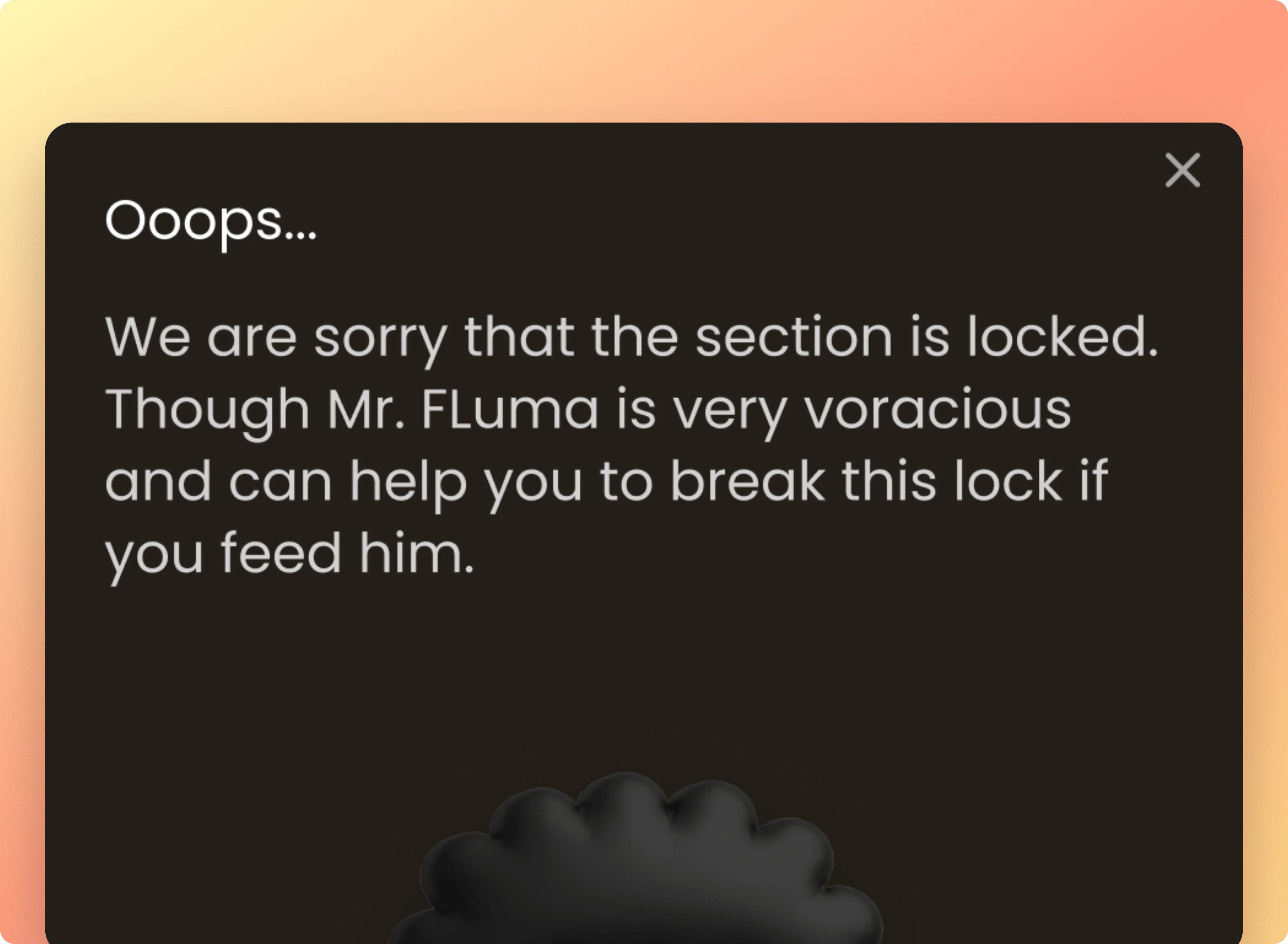
Nobody likes paying for services, it's a given. Any encounter with a paywall is delicate, especially for a new product. Such notifications and limitations are always irritating. But here, they're even more annoying because instead of potential benefits, we see an "Oops" notification and a huge "Buy" button.
How to fix this quickly and affordably:
🔹 Change the text. Even this alone would make a big difference. The difference between "Oops" and "Unlock access to 20+ topics with a subscription, increasing your chances of passing the exam by X%" in this flow would be VERY noticeable.
🔹 We can further enhance the effect by immediately explaining why we're charging: perhaps because we manually write scripts for these topics or involve an editor. Create a vibe of "we've done a lot of work and would love to give you the product for free, but unfortunately can't."
💡 Tip: EVERYWHERE you discuss monetization, write using a formula that answers the user's two main questions: "How will this help me?" and "Why are you charging for this?"
A bit more about characters...
We love mascots and characters, and we're all for using them, especially when it comes to humanizing AI. This helps avoid the feeling of a "soulless machine" and build a deeper, more personal connection with users. This is one of the key tasks of a mascot, like in the case of ChatGPT's voice.
For Flume, this is even more important because, ideally, such a character should be integrated at all levels – participating in dialogues, feedback, marketing materials – it should be everywhere.
Landing Page
🔹 Hero Section
This is the most important screen on the website. If it's not appealing, users will leave without learning about any benefits, increasing your user acquisition cost. Instead, try to clearly show what the app looks like and how it helps the user. Immediately convey the problem it solves.
🔹 Product Demonstration
When discussing benefits and use cases, it's important to show relevant parts of the product. Examples:
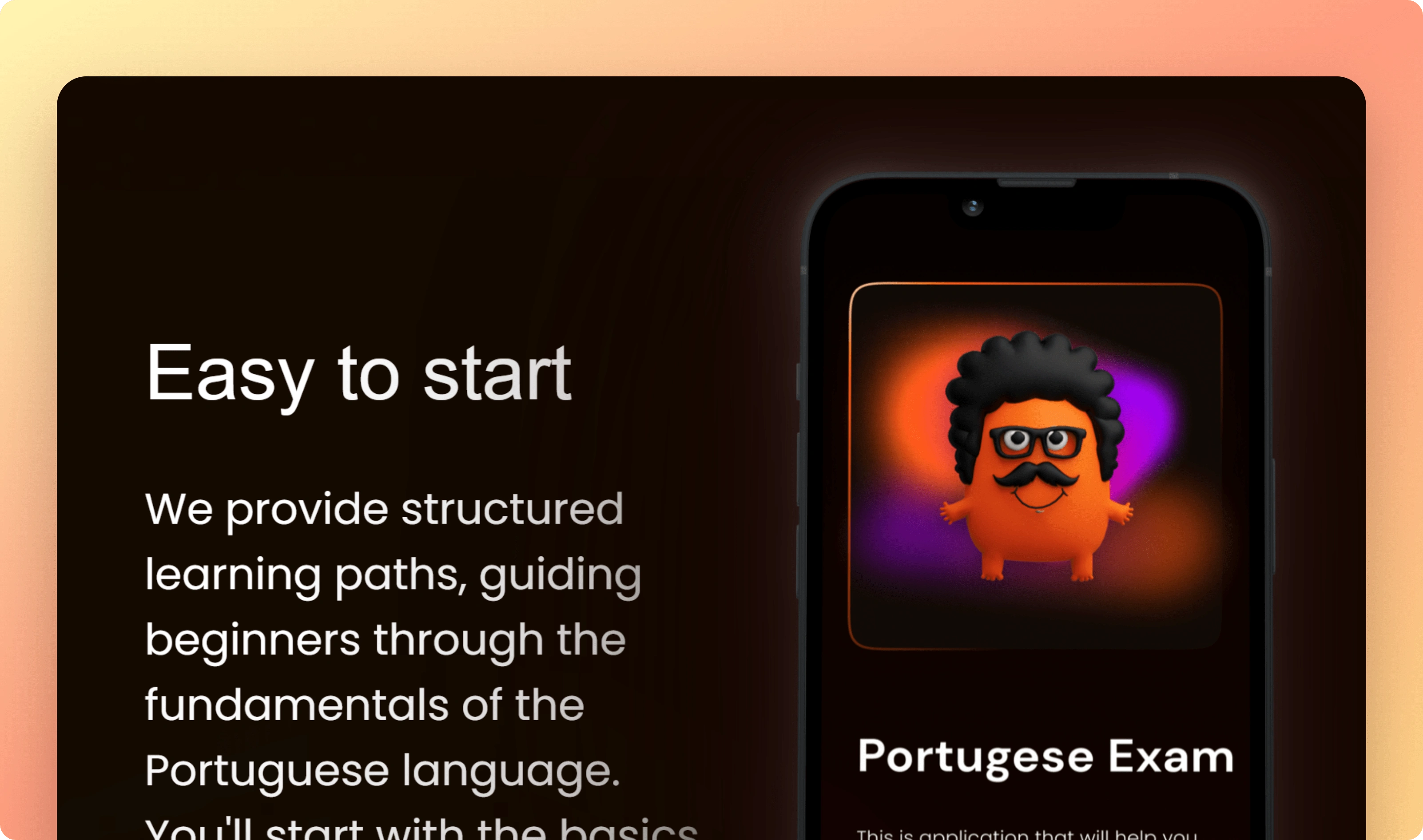
Easy to Start: Don't literally show the login screen. Instead, show how easy it is to start preparing for the interview. This can be done through the interface – for example, by showing a wide selection of topics, as if "nudging" the user to start with one they're familiar and comfortable with.
Easy Lessons: The current text is poorly connected to the screenshot. Instead, create a small "collage" of interface elements, showing what makes it 'easy' – the ability to choose a schedule, Flume's flexibility.
Speaking Skill Up and Control Result: These blocks definitely need graphic work, but only after changes to the product interface itself – much will depend on how you integrate the mascot into the process.
🔹 Benefits and Features
Using a slider isn't a good idea because those who take the time to switch slides will always be fewer than those who don't.
Instead, simply place all the points on one screen, with icons and illustrations. This way, nothing important gets lost.
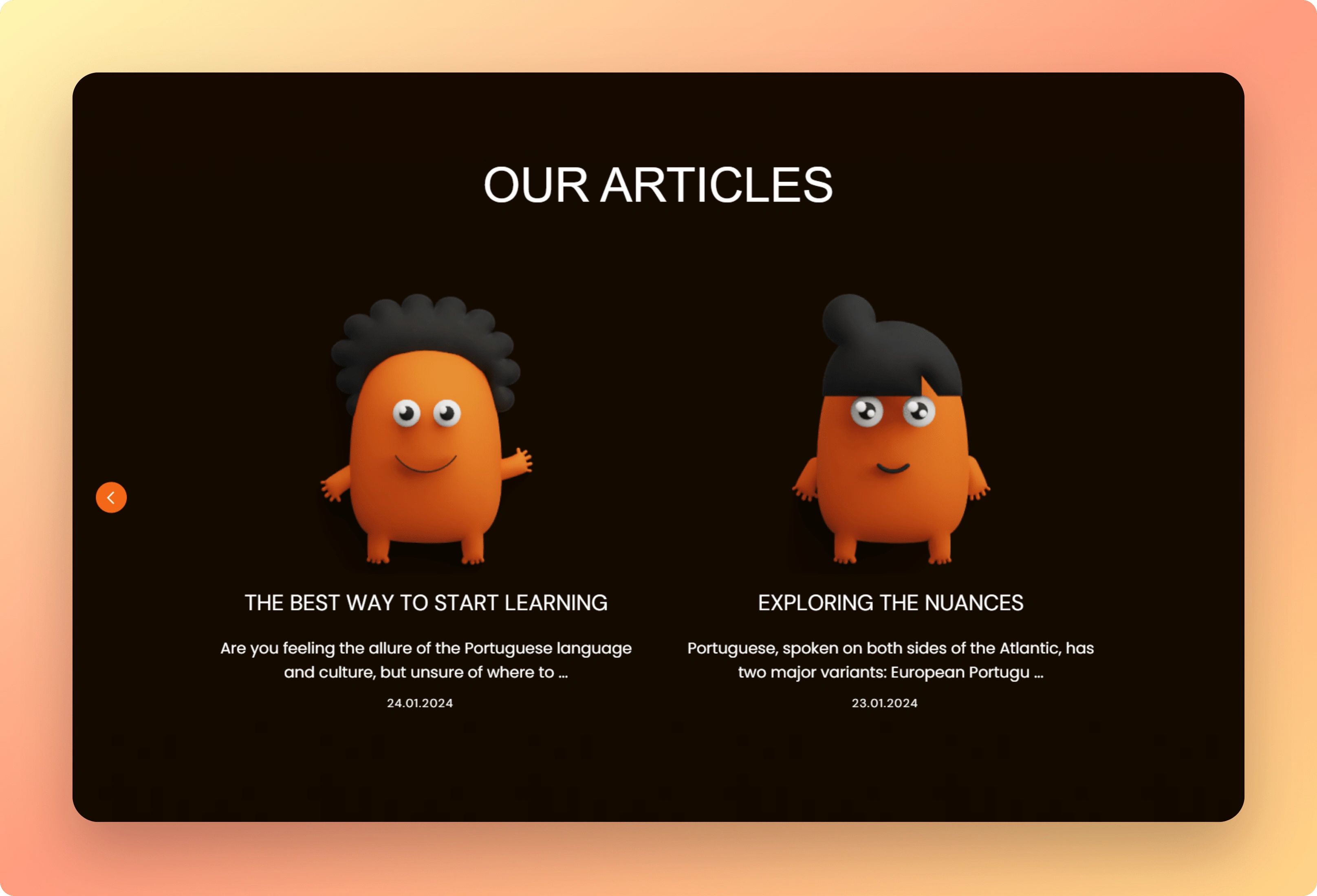
🔹 About the Blog, But Not Only
Currently, the article covers feature impersonal, somewhat monotonous images. But for a small startup that's just launched, there's no need to hide the creator's personality behind templates. On the contrary, the site will benefit from showing that it's made by a real person – sincere and genuine.
Here are some ideas:
Instead of mascots on article covers, use your own photos – for example, the founder reading, writing, or preparing for an exam.
Gathering feedback. Again, the charm of a small startup is that you can do this not through forms sent to thousands of users, but through an email saying: "Hi, I'm Kate, the creator of this startup. Thank you for installing the app. Please tell me what you liked or what didn't work – I personally read every email to make the product better."
🔹 A Few More Points
Define your target audience (TA): Simply state somewhere on the landing page that you're making a product for specific people – for example, those preparing to move to Portugal. Ideally, add a separate block for this.
Refine CTAs: The current ones are weak, but this is easily fixed by changing the text on the buttons. For example, instead of "Let's Go," it could be something like "Start Learning Now," and on the waitlist page – "Be Our Focus Group." These changes will impact the number of emails collected and, later, the number of installations.
🔍 References and Inspiration
TalkPal
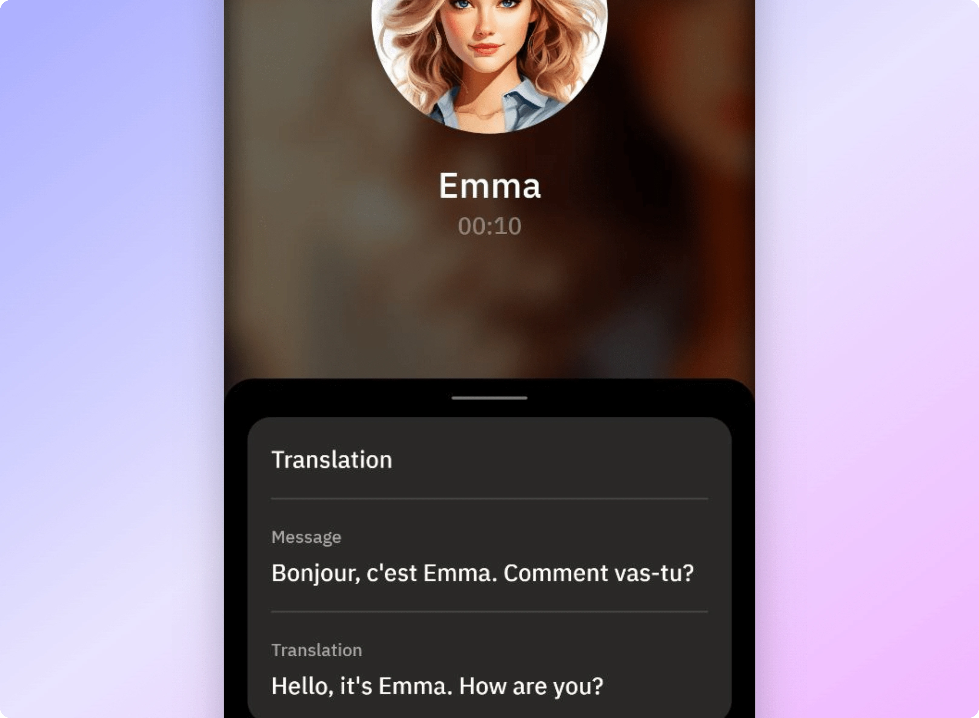
Their "Call Mode" implements mechanics closer to a "live" conversation. The chatbot (usually) understands when the user finishes speaking, you can see transcripts of both the user's and your own speech, errors are highlighted – in short, many of the aspects we discussed in the context of the product.
Duolingo
You can look at everything here, but primarily how characters are integrated and how they increase retention. The success of the "toxic" owl is a slap in the face to "experienced marketers" who think in terms of "smiling people increase conversions." This character has personality, is persistent, sometimes even too much so, but it's this uniqueness and integrity, combined with numerous mechanics like widgets and push notifications featuring the owl, that largely determine the product's success.
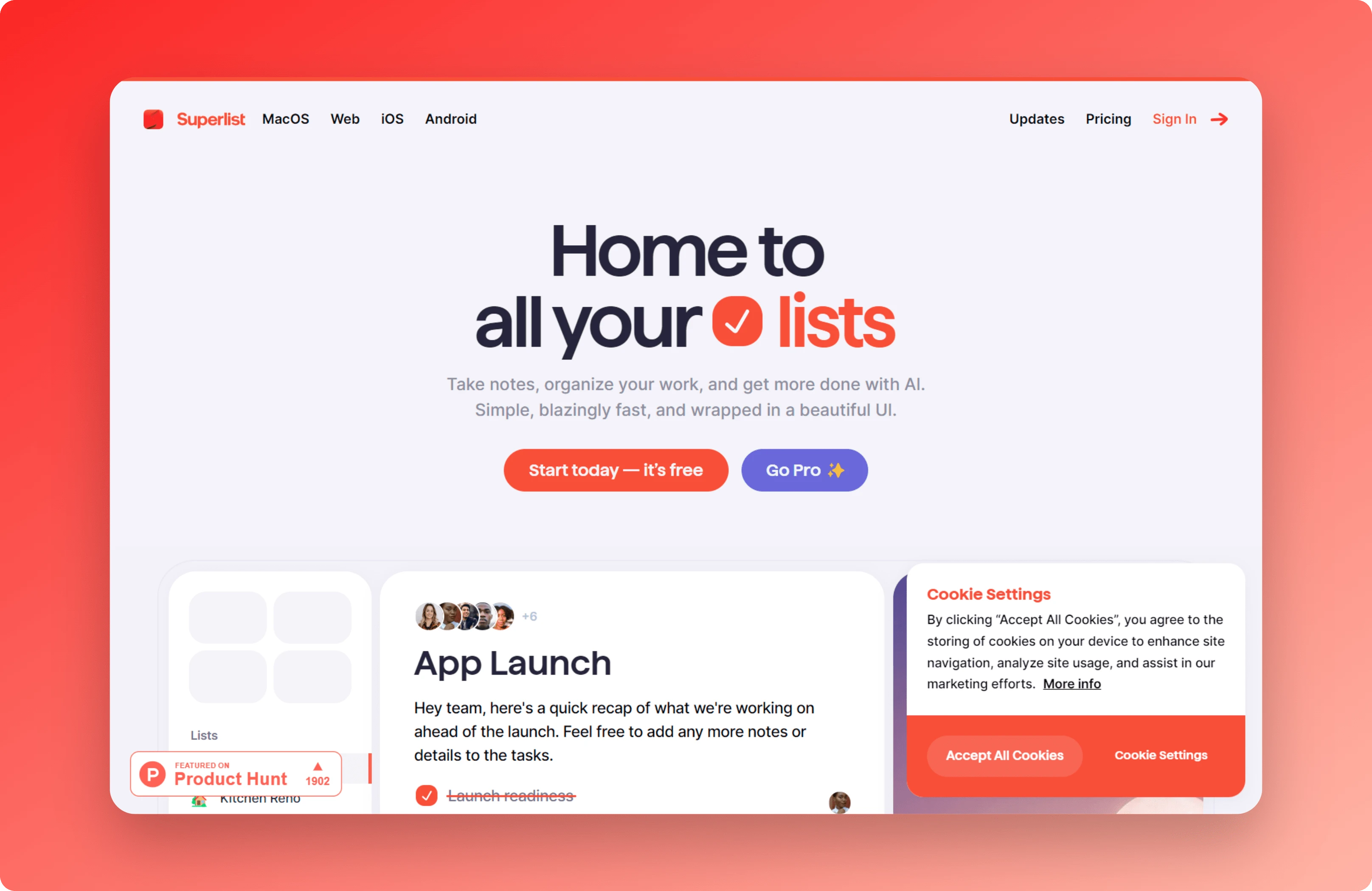
Superlist
We can and should borrow conceptual elements for the landing page from here: the design of the hero section, CTAs on buttons, the summary of what's in the app. The user immediately understands what it is and why they should scroll further. In your case, the obvious idea is that Fluma is good because it helps you pass the exam.
Amie
Another reference for the website. Everything here is shown through the lens of the product, in the context of use cases. For example, where it talks about how easy it is to use email, there's an animation next to it showing exactly how it looks on a phone.
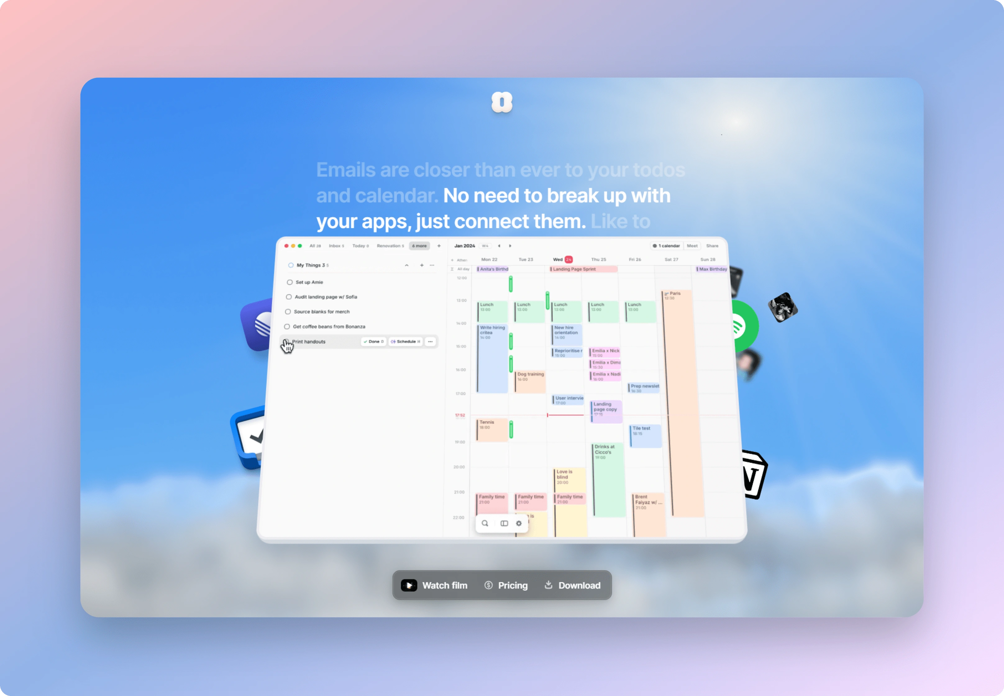
Lifehack: In the initial stages, instead of animations, you can use screencasts recorded from your own phone. This eliminates the need for complex graphics on the website while still demonstrating use cases effectively.
Like this project
0
Posted Jul 24, 2024
Comprehensive UX/UI roadmap for a language learning app: Practical advice on enhancing usability, user engagement, and affordable design upgrades.
Likes
0
Views
24


Uniqorn.ws UI/UX Review: Key Insights for Growth & Monetization
Part Two: Mastering UX/UI in DApp Investment Platform Design
UX/UI Design for a DApp Investment Platform in Just Two Weeks
Crypto Charity Project UX/UI Audit & Insights