Part Two: Mastering UX/UI in DApp Investment Platform Design
The Story Continues
Welcome back to our case study about designing an investment platform for Cybro.io in record time! If you missed the first part, here's a quick recap:
Our friends at Cybro.io asked us to design their investment platform featuring Vaults, where users could invest their funds in various cryptocurrencies. The challenge? We had to complete the core sections, including the main platform page, the internal Vault page, and the investment widget, in just two weeks!
In the previous part, we shared how we approached planning, prototyping, and getting client approval. Now, let's dive into the exciting world of design and see how we brought this platform to life.
Starting the Design
With time being our most precious resource, we had to resort to some senior-level tricks to deliver top-quality results. Instead of focusing on each specific element, we'll share the life hacks and non-trivial procedural solutions that allowed us to work efficiently and effectively.
Building the Foundation for Each Screen
Here's a smart approach we used: instead of tackling the layout and user flow of each core screen one by one, we identified the key element of the product and built the entire page's architecture and structure around it.
This approach significantly accelerates the process and helps create a stellar MVP. The client gets a perfectly fine-tuned core function, while we can showcase our skills in areas beyond that function's performance.
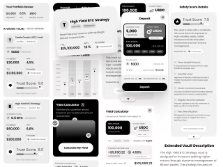
For the Vaults list page, the Vault card became the centerpiece. On the internal Vault page, the deposit and withdraw widget took the spotlight. As for the calculator page, well, we actually removed it! More on that later.
Creating a Backlog without Waiting for Advice
It might seem odd that we make most decisions based on our own taste, but that's part of our signature style. We believe that clients come to us not for minor tweaks like "move this 20 pixels to the left," but for our expertise as a reliable design partner. When sending a layout to the client, we usually don't ask for feedback; instead, we present the best solution that can be slightly personalized.
While working on the agreed-upon flows, we collect all our cool ideas, comments, thoughts, and sketches on a separate page. Many of these ideas will be implemented in future updates at no extra cost to the client since we came up with them while working on related solutions.
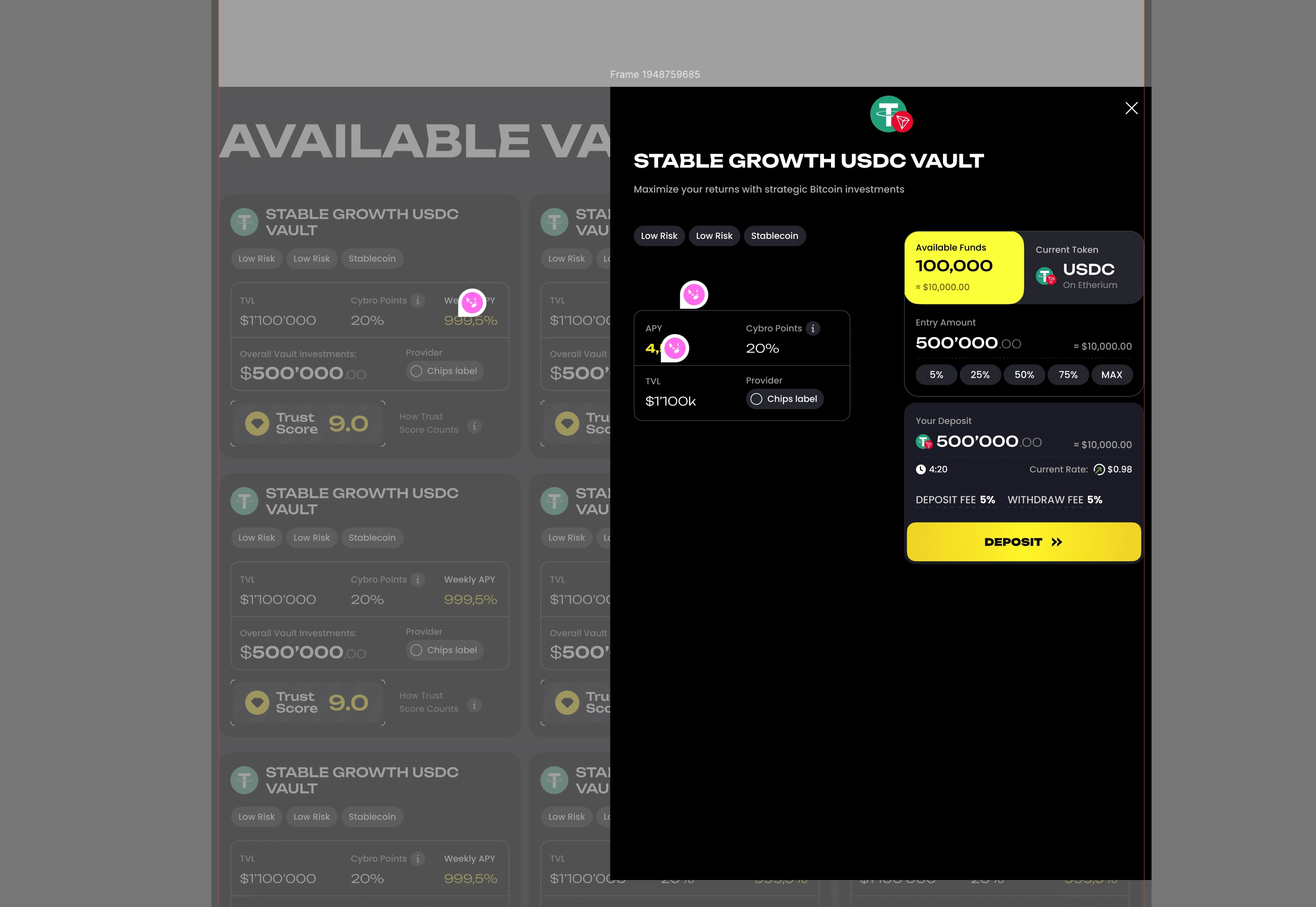
However, we immediately implement the most reliable options we're absolutely confident about without additional approval or discussion with the client.
Considering Business Objectives from the Start
Your products, whether a landing page or an app, don't exist in a vacuum. They are launched alongside your existing social media accounts, other products, referral programs, and so on. We always take this into account when working on a new product or supporting and developing an existing one.
In the case of Cybro.io, the platform was launched with an existing landing page where users could buy Cybro tokens.
This meant we could introduce the platform's traffic to the landing page's offers, which were quite contextual. So, we came up with a fantastic native ad in the spirit of "Bento" for the Vaults grid on the platform's main page.
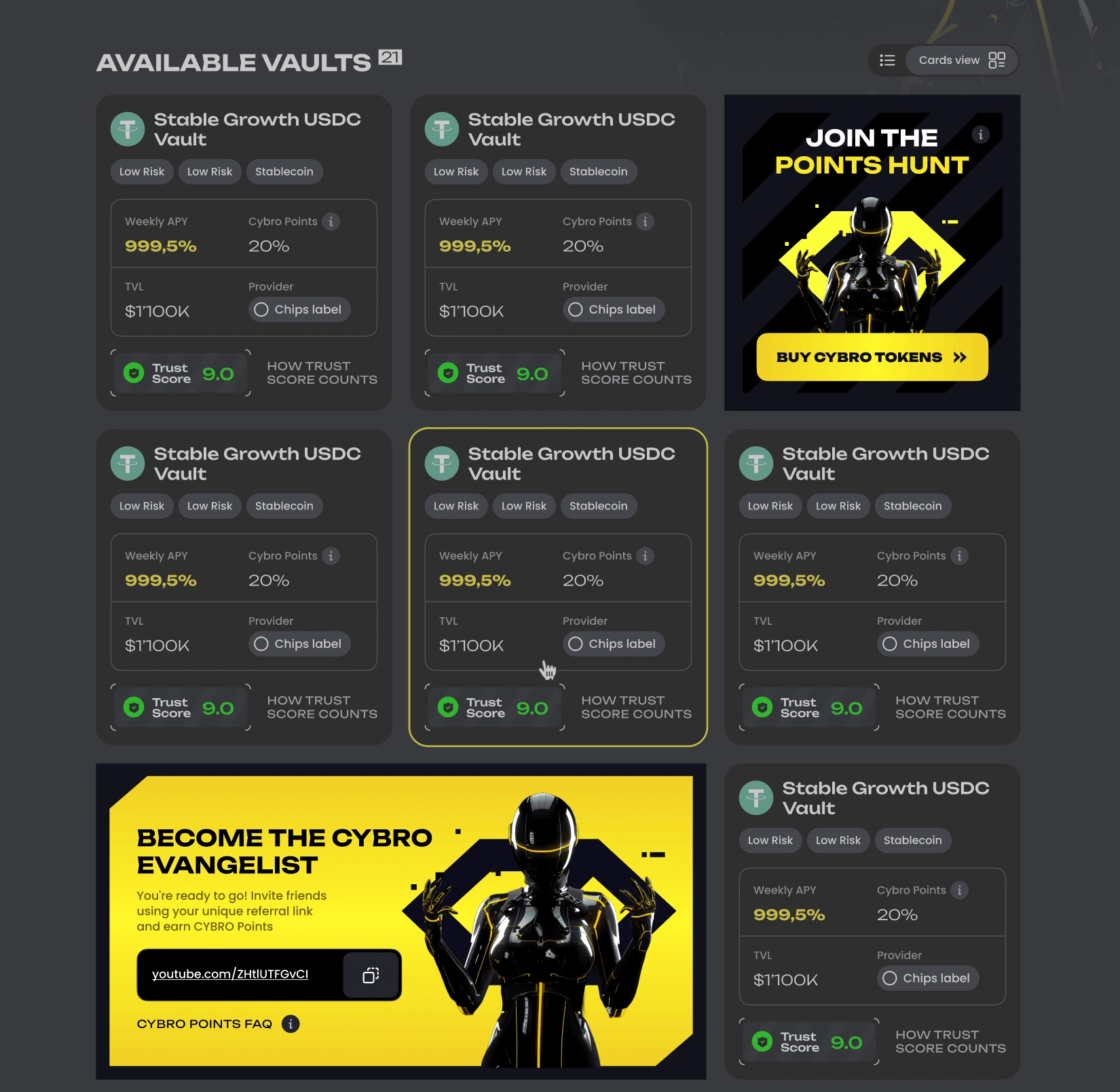
There's even a simple pattern for added aesthetics – our gentle lead designer Masha is physically incapable of releasing anything unattractive into production.
Optimizing Interactions
Now for the most interesting part – how we dealt with the calculator and the deposit/withdraw functionality. We simply eliminated the difference between the calculator and the motivated action of placing or withdrawing money on the platform.
Here's how it works: you always have this widget on the internal Vault page. It sticks with you, so you won't lose it accidentally, and it's always in view. Now, you might want to calculate the profitability of this Vault by connecting your wallet and entering the amount you're interested in. Voila!
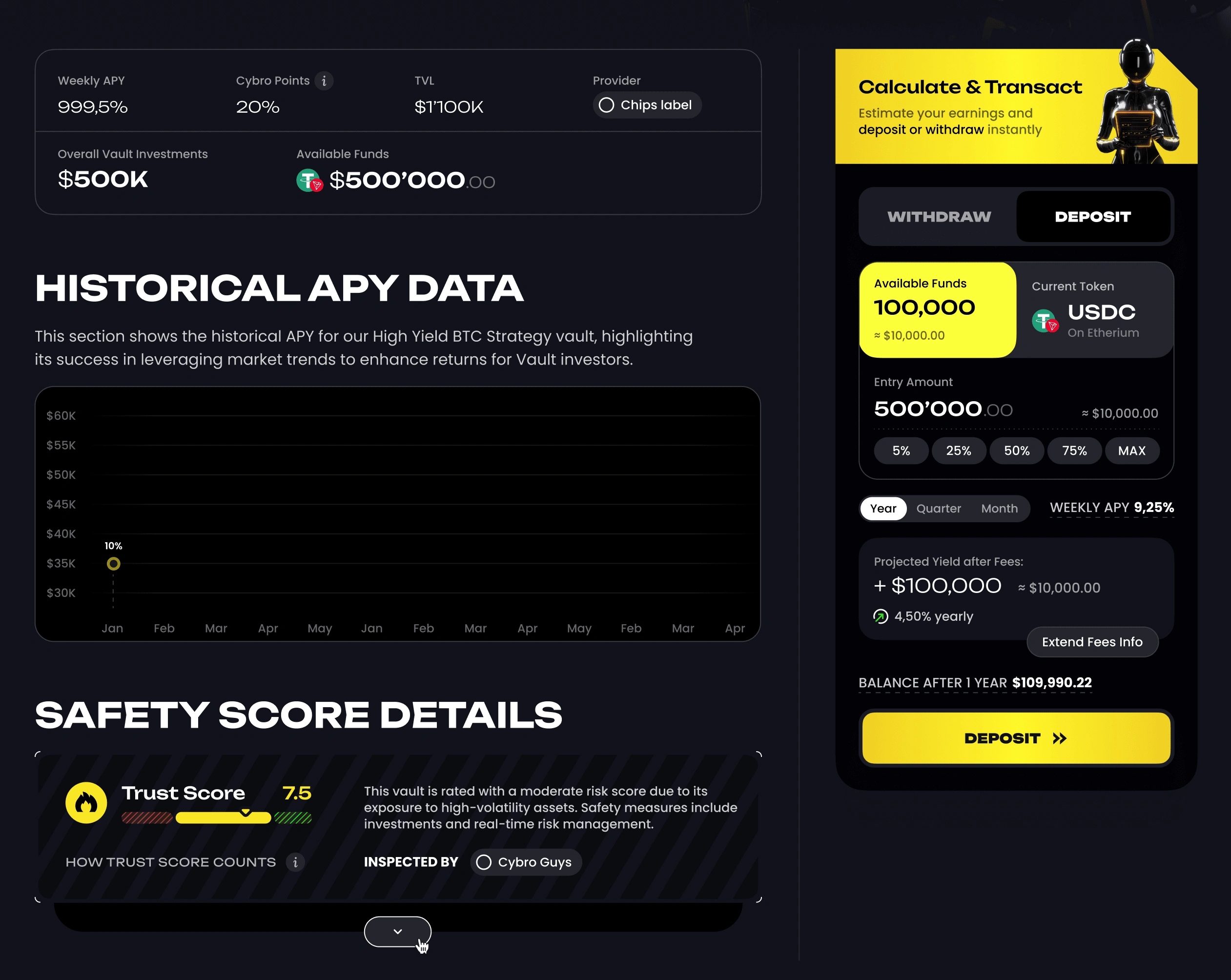
The result appears, complete with commissions, profitability, APY, and all those crypto-investment perks.
And here's the unexpected twist – the deposit button is right there in the calculator! Cool, right?
We just got rid of the need to make two flows and replaced them with one, which is even more convenient.
We saved money on layout and development, even helping ourselves save money!
Moreover, this widget is used in the same form in the mobile version, which means that by creating this widget once in production, you immediately have all the adaptations for any device. Isn't that genius?
Adding Comments
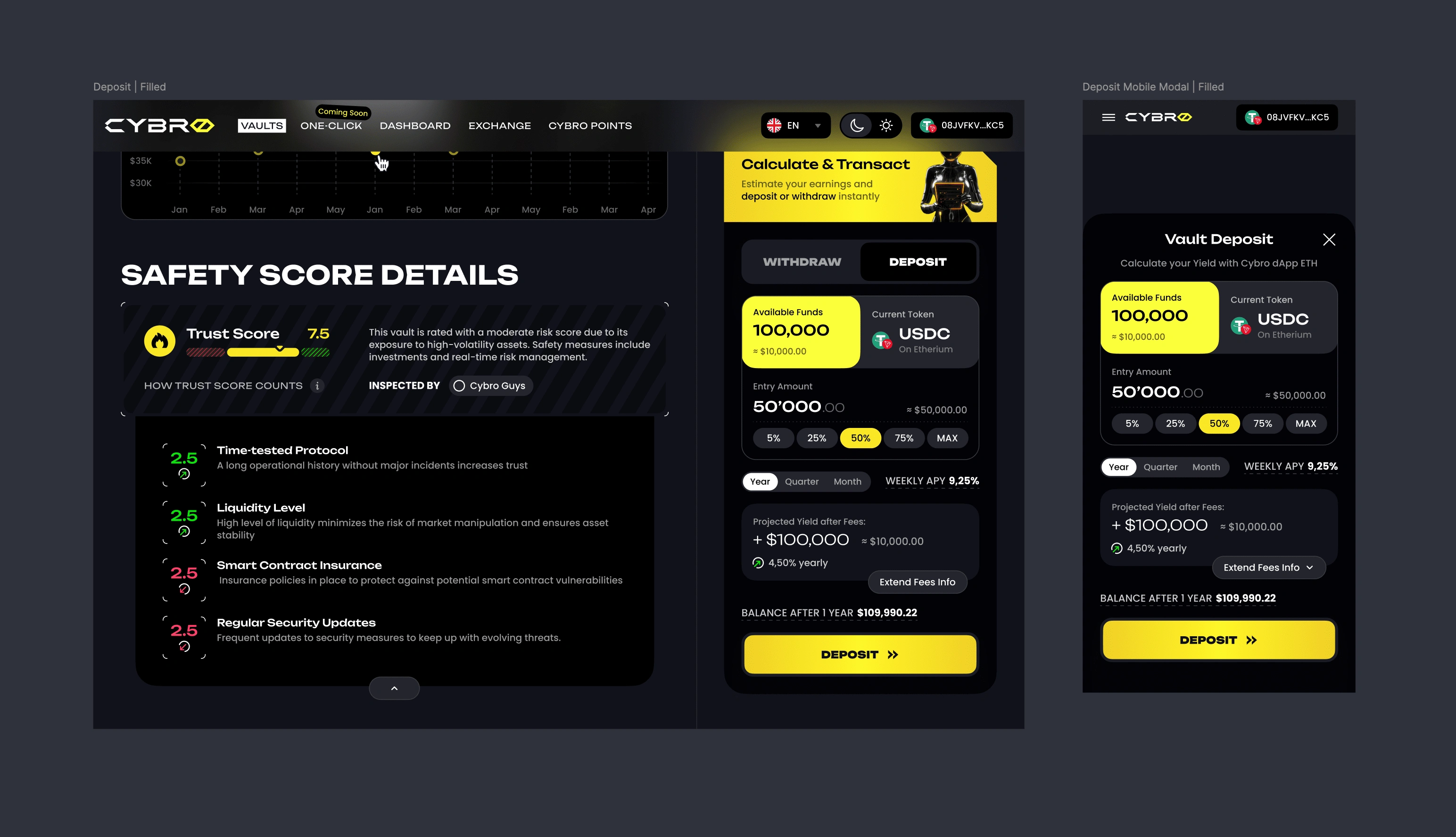
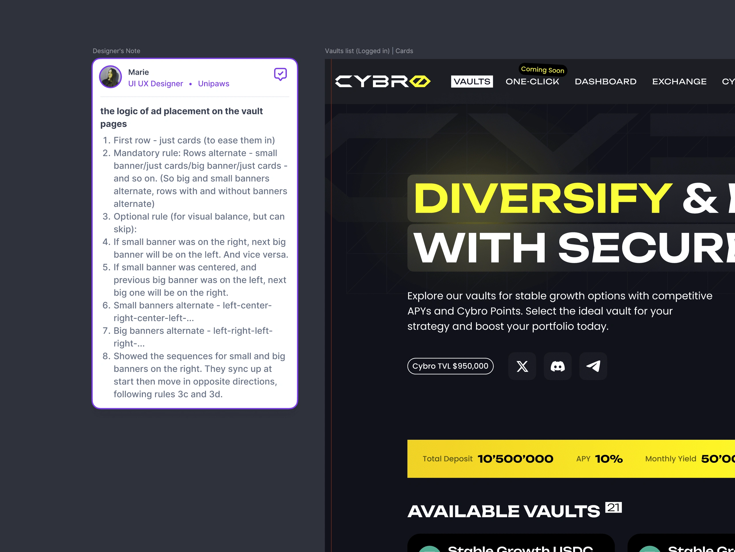
The final part of any of our work is writing instructions for everything that might need them. How elements work, which viewports are relevant for what, how any non-default element behaves – we provide all this with our signature Designer's Notes, which make your layout designers' work MUCH faster. Again, we're thinking about your money!
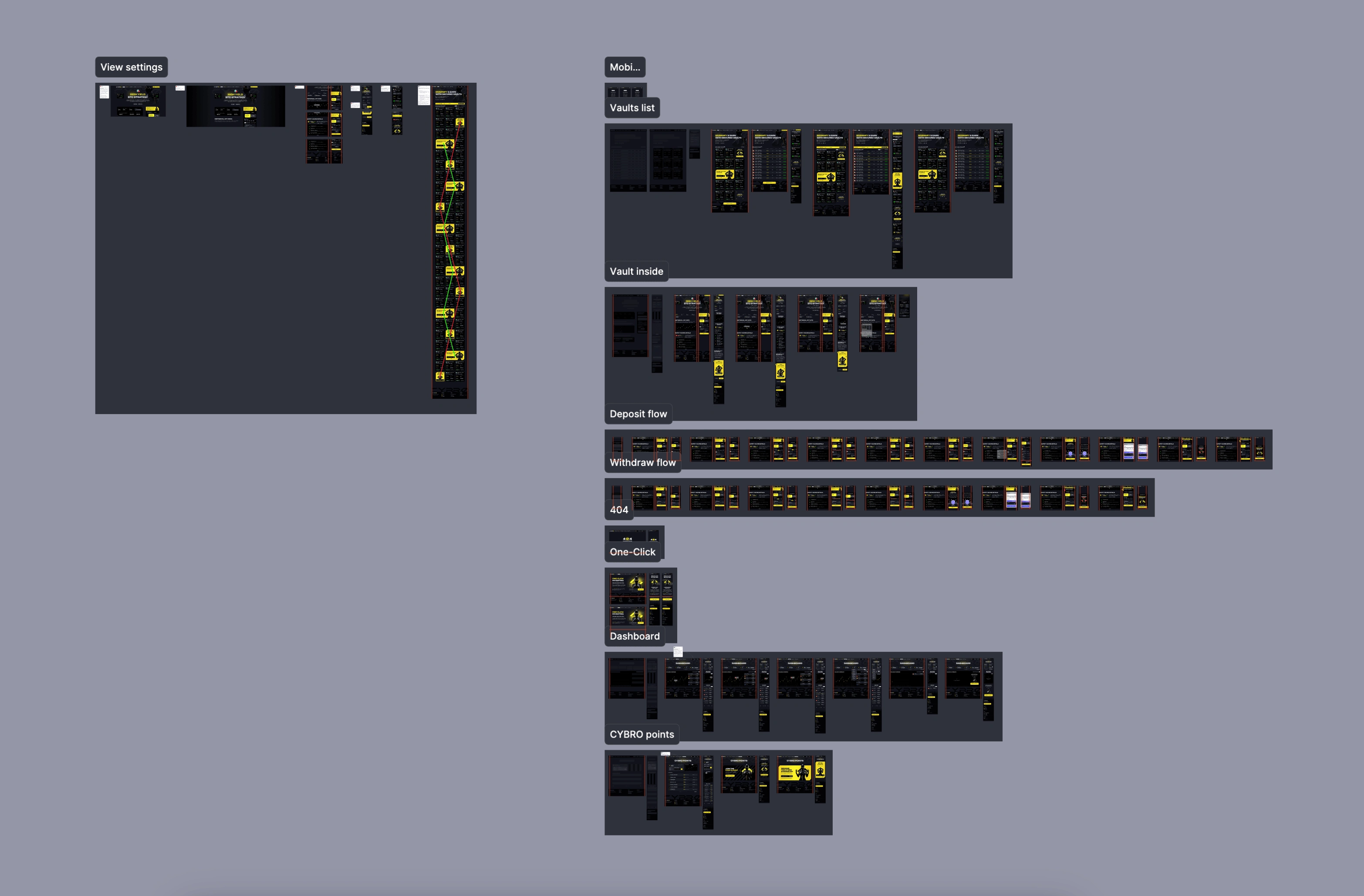
The ready-made flows look like this, always on components, with a ready-made UI kit to boot.
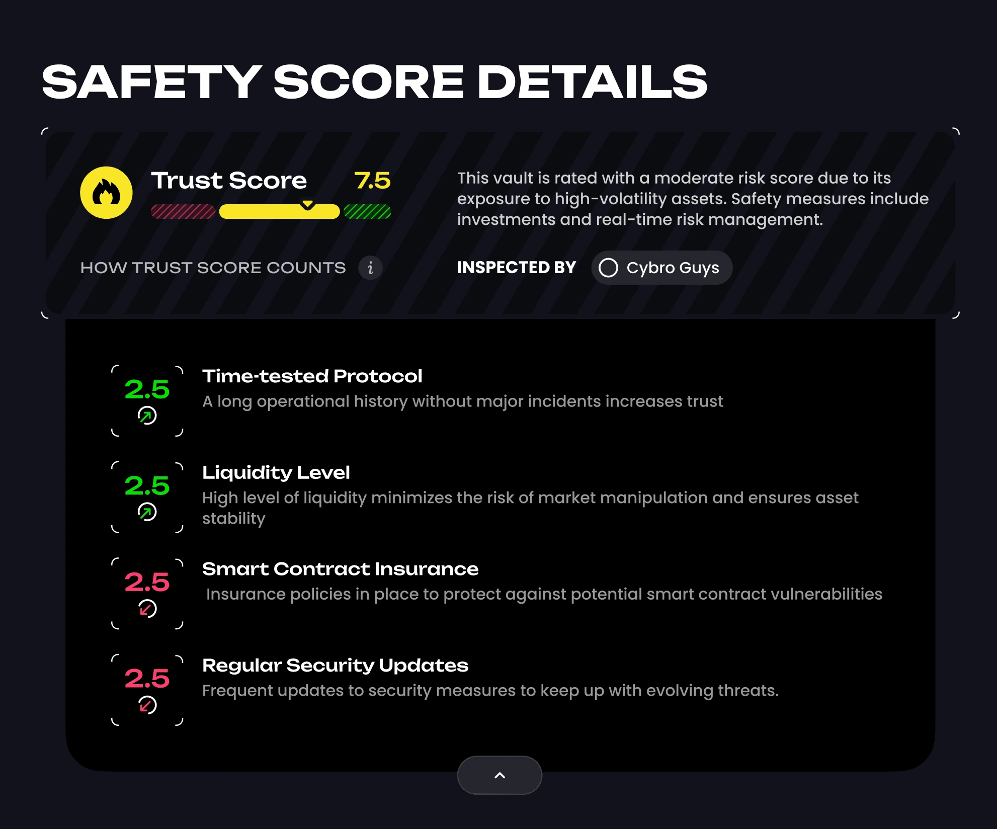
By the way, this is what Trust Score looks like in the UI, if you're interested
The Outcome
In just two weeks, we designed a full-fledged investment platform for Cybro.io, complete with a Vaults page, an internal Vault page, an investment widget, and a mobile version. By leveraging our experience, creativity, and problem-solving skills, we managed to deliver a high-quality product within an extremely tight deadline.
Our client was thrilled with the result, and the platform was ready for development and launch. The success of this project demonstrates our ability to work efficiently under pressure and provide innovative solutions that meet both business objectives and user needs.
We hope you enjoyed this case study and found it informative and engaging. If you have a challenging design project in mind, don't hesitate to reach out to us at Unipaws. We're always ready to embark on a new exciting adventure and create something amazing together!
Like this project
Posted Jun 10, 2024
Designing an investment platform at lightning speed: Part 2 focuses on building each screen around key elements and optimizing user flow.
Likes
0
Views
37


