UX/UI Design for a DApp Investment Platform in Just Two Weeks

Ivan Kalkaev


Hey there! We're Unipaws, a design studio that loves taking on challenges and delivering top-notch results. Today, we want to share with you the story of how we designed an investment platform for our friends at Cybro.io in record time. Buckle up, it's going to be a wild ride!
The Challenge
Cybro.io is a project by our long-time friends, an awesome team of professionals from various fields who consistently create cool products that live long and attractive lives for investors.
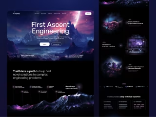
At the time we were working on this case, Cybro was a token in the presale stage. They already had a fantastic landing page, which we continued to improve and refine, providing ongoing design support with both ideas and hands-on design.
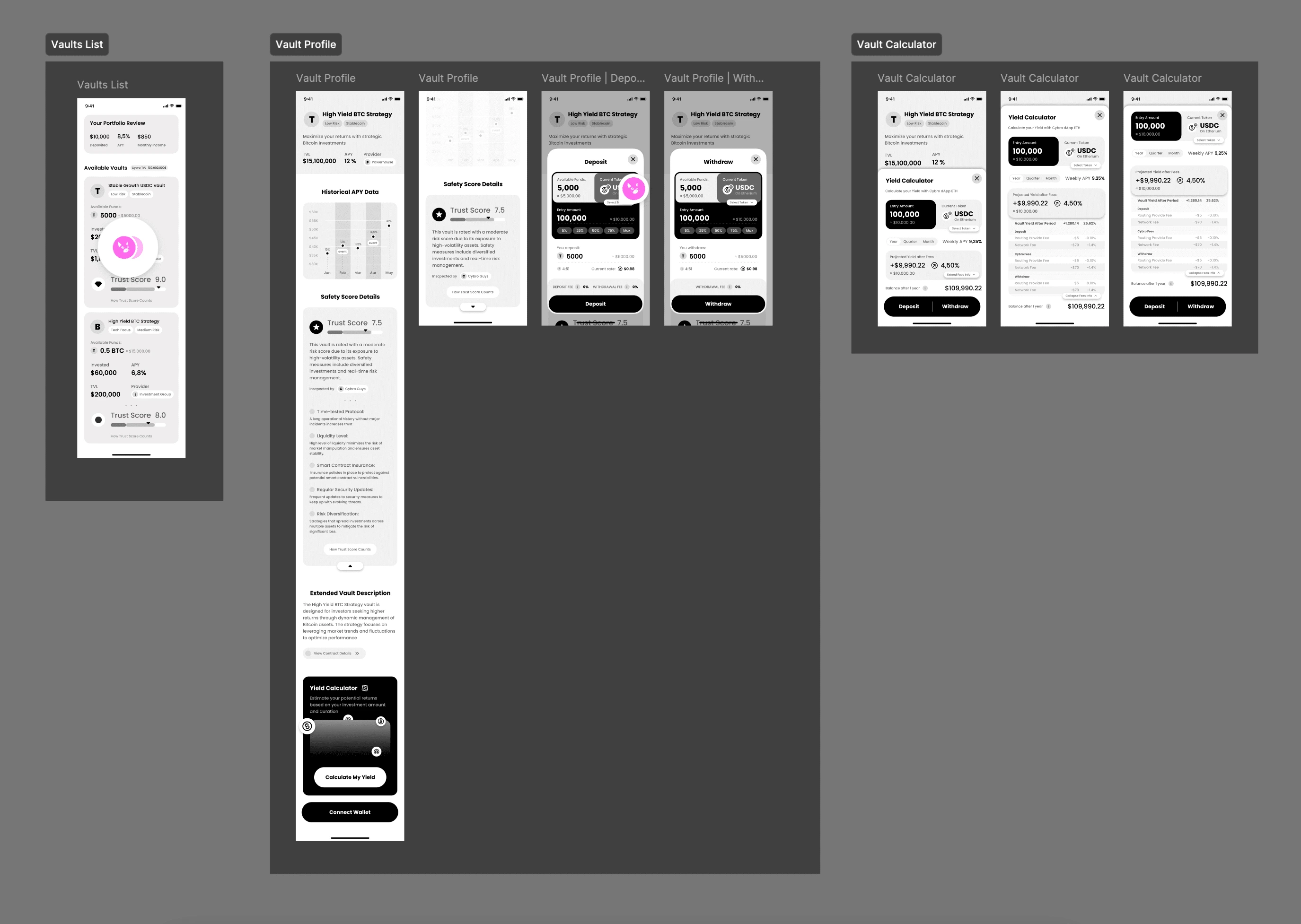
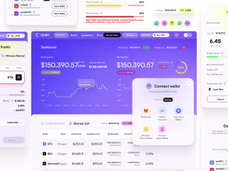
At some point, the Cybro team decided it was time to launch their own investment platform. This platform would feature Vaults, where users could invest their own funds in USDT from different networks under various APY indicators, depending on the volatility of the coin and the algorithms of each specific Vault.
The guys were eager to start the development process as soon as possible. Despite our initial milestone planning estimating around 7 weeks, we decided to speed things up significantly. We met the guys halfway and accelerated to the max – it was decided to prioritize the core sections, including the main platform page with the list of Vaults, the internal Vault page, as well as the calculator and investment widget – all in just 2 weeks!
This is going to be a detailed and dynamic story about how we raced through this sprint, and everything went smoothly (which rarely happens)!
The Planning Stage
Considering our extremely limited time and the fact that only four hands would be working on this for the next two weeks, we decided to plan everything thoroughly first. Some decisions might be considered controversial, but our goal is not to tell you how you should work with your clients, cases, and projects. We're here to share how the Unipaws team works, which largely explains why people want to work with us.
Skipping the UX Phase
It might be a debatable decision, but we felt confident in our experience and skills to either completely skip the UX phase or reduce the time spent on prototypes. Our reasoning was as follows: we would create static prototypes of the core screens to immediately understand what additional flows would "grow" from there. If there weren't many additional flows expected, but only various states of elements and more or less the same screens, we would do everything at once "for real" during the UI phase. As a result, Vanya and Masha drew the UX of all the core screens in just a couple of days, leaving comments for themselves in controversial places and those that would obviously need to be "rethought" at the UI stage. In addition, we tried to make the prototypes not too far from the UI to spend less time in the following days reworking these screens for the sake of aesthetics.
Mobile-First Approach
The boom of this approach to web application design architecture has been declining for several years, but in this case, we decided to use it. The main audience of Cybro uses phones for viewing, which is likely related to the advertising sources that drive traffic. Moreover, it was much more important for Cybro to create a mobile version first. In the two weeks we agreed on for designing the specified scope of the platform, we had to make both the mobile and desktop versions, but we decided to start with mobile.
Balancing Aesthetics and Conversions
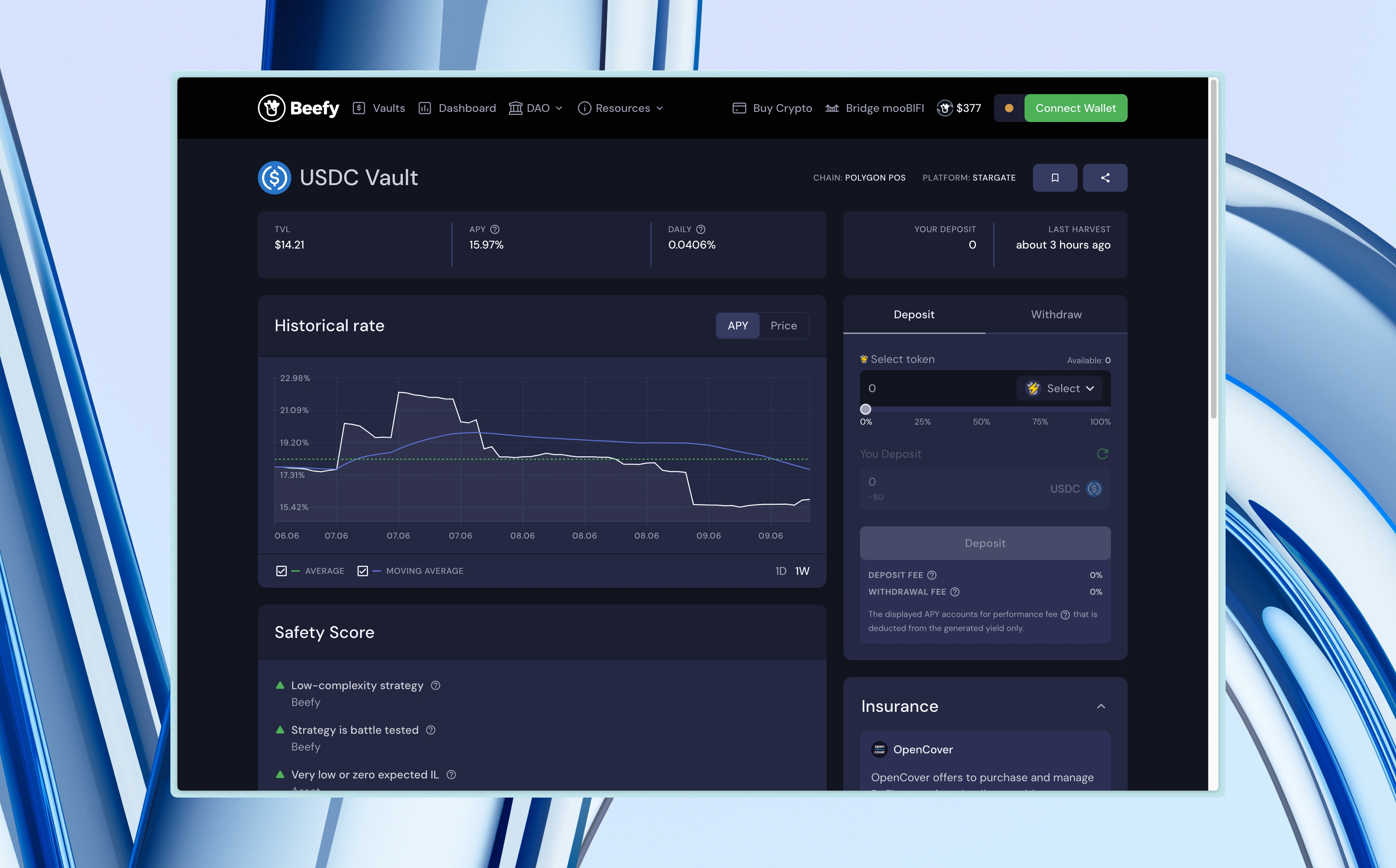
The thing is, we had Beefy as an approved reference with the client, an example of excellent monetization and conversion of traffic into money.
On the other hand, there was Locus.Finance, which was the most modest among all the discussed competitors but aesthetically stunning.
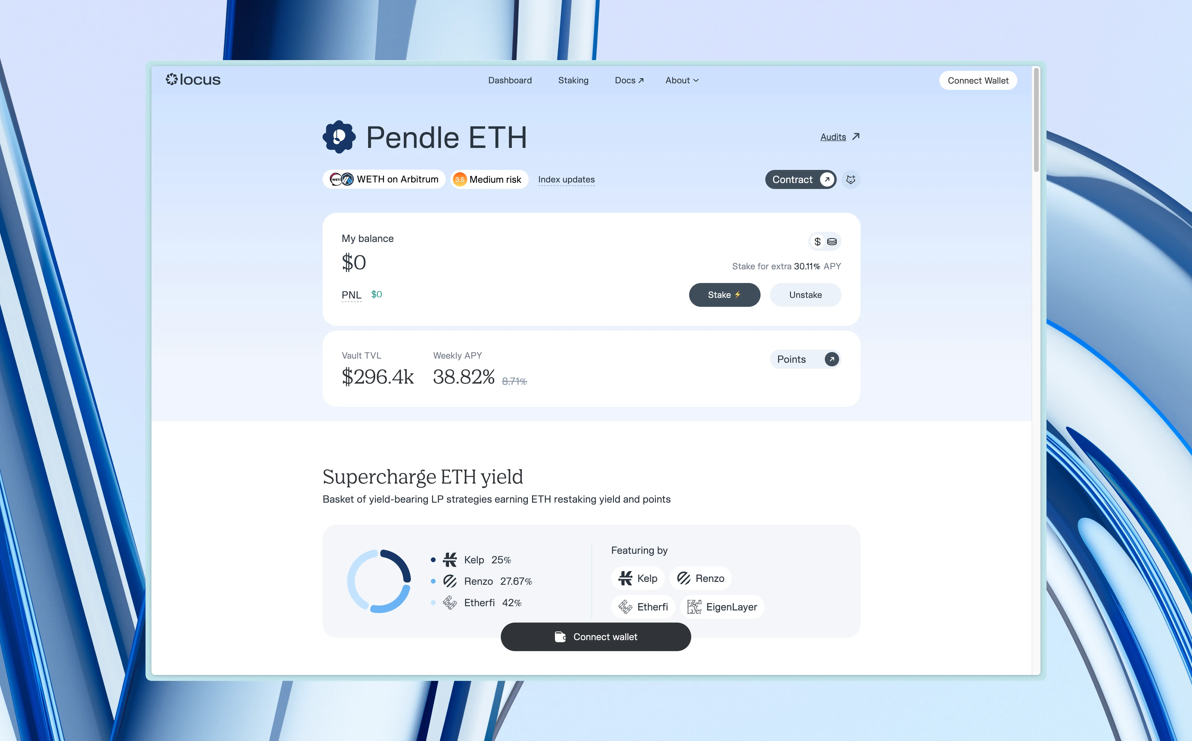
We decided to mix both approaches in equal proportions with our own solutions. We'll tell you more about the proportions and the final result later on.
Starting with Prototypes
During the prototype drawing process, we immediately tried to lay the foundation for an aesthetic UI. Let's talk about a few solutions from the perspective of usability, logic, and aesthetics.
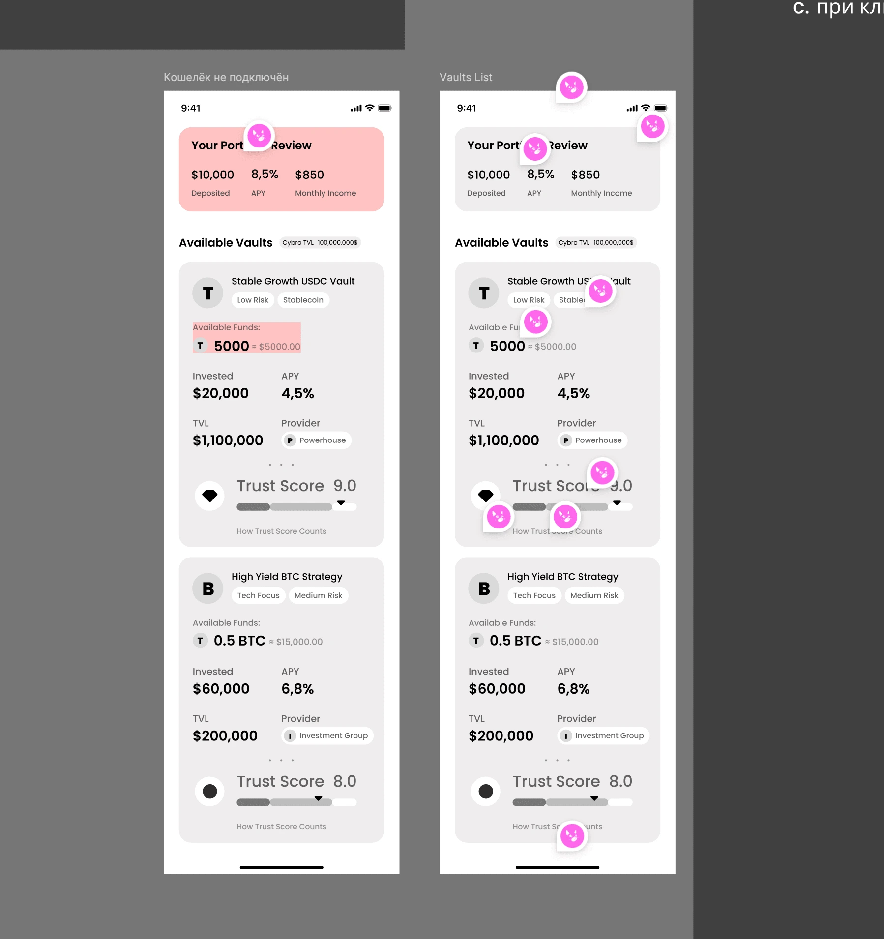
No Tables for Vaults
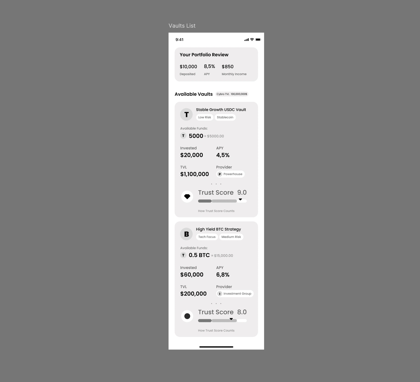
It might seem like nothing could be more convenient than a table, where each row represents a separate investment pool – a Vault.
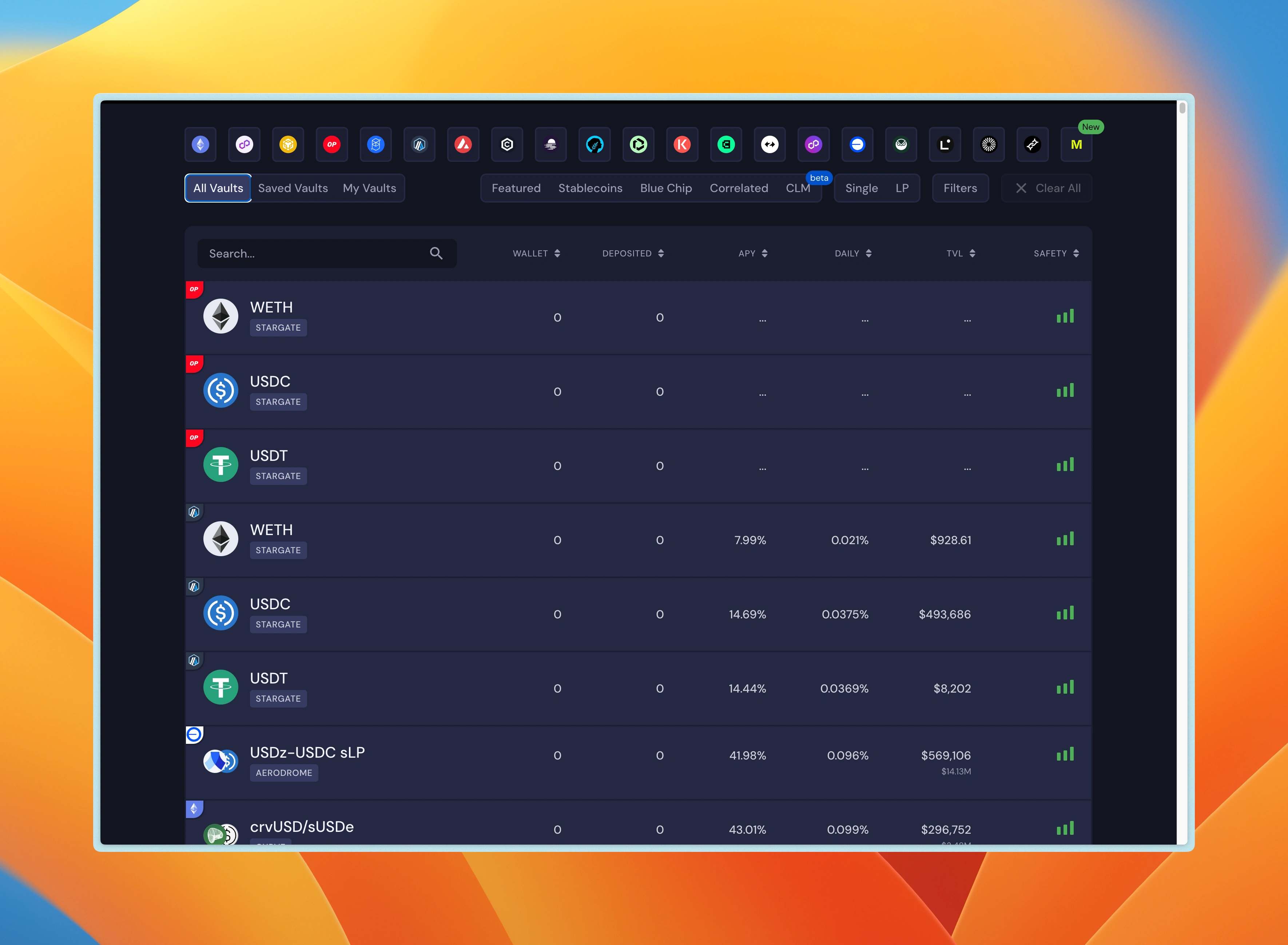
But that's not the case! As Ivan explains here, this doesn't really work if each "cell" of your potential table contains a lot of differing data. Thus, the table was replaced by cool large cards. This intentionally narrows the metaphorical "angle of view," keeping the focus on only one card, which attracts all the user's attention at the moment of "scanning" the content.
This will greatly help the platform in the initial period when there are not so many vaults, less than a dozen.
Basic Onboarding without Onboarding
How is that even possible? Let us explain! For example, each vault has its own trust score.
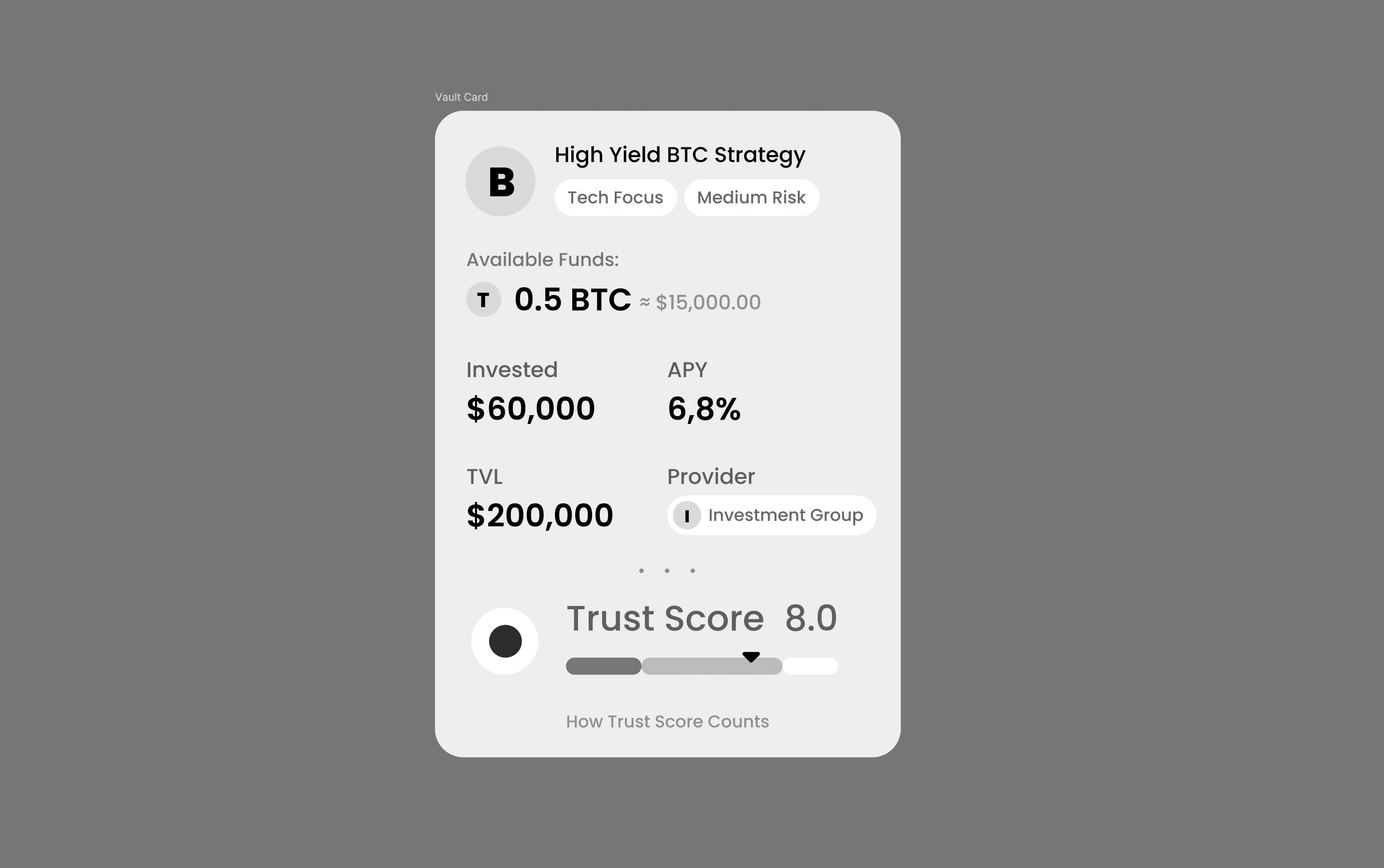
This is a normal and familiar indicator for crypto enthusiasts on such platforms. It is used to calculate the overall review indicator of the reliability of a particular investment pool according to the platform's own assessment. The platform's assessment is based on a whole bunch of different other indicators, vault marketing, its profitability, and all that.
So, we put a huge emphasis on this trust score indicator.
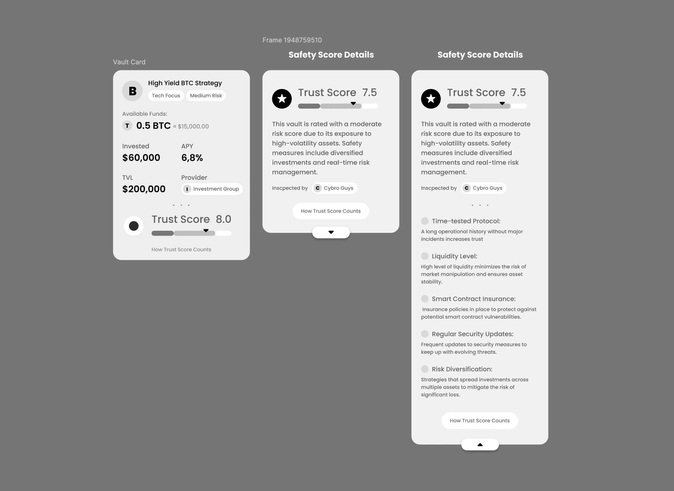
Logically, it completes the indicators of each of the cards, vaults, like a footer on a website. At the same time, each card has the ability to tap on it and find out how this trust score is calculated. This way, without overlays and transitions to new tabs, we explain to the user exactly how this Vault received its reliability rating and what points to pay attention to when looking at crypto investment projects in general. Lovely!
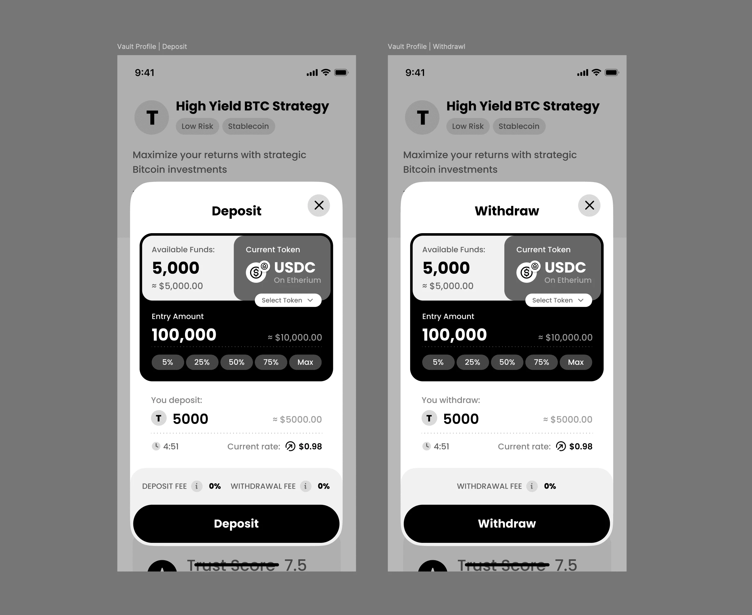
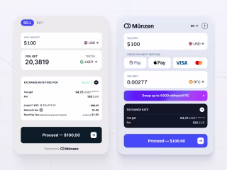
Deposit or Withdraw?
For the profitability calculator and the internal vault page, we created an interface that we won't dwell on in detail now. More interestingly, we had another idea – a dynamic toggle between Deposit and Withdraw. This dual button seemed to us a fresh and convenient solution: in fact, it is one interaction with the vault, but divided into two opposite actions – transferring funds from the account to the deposit, and withdrawing funds from the deposit back to your account. It was supposed to work like this:
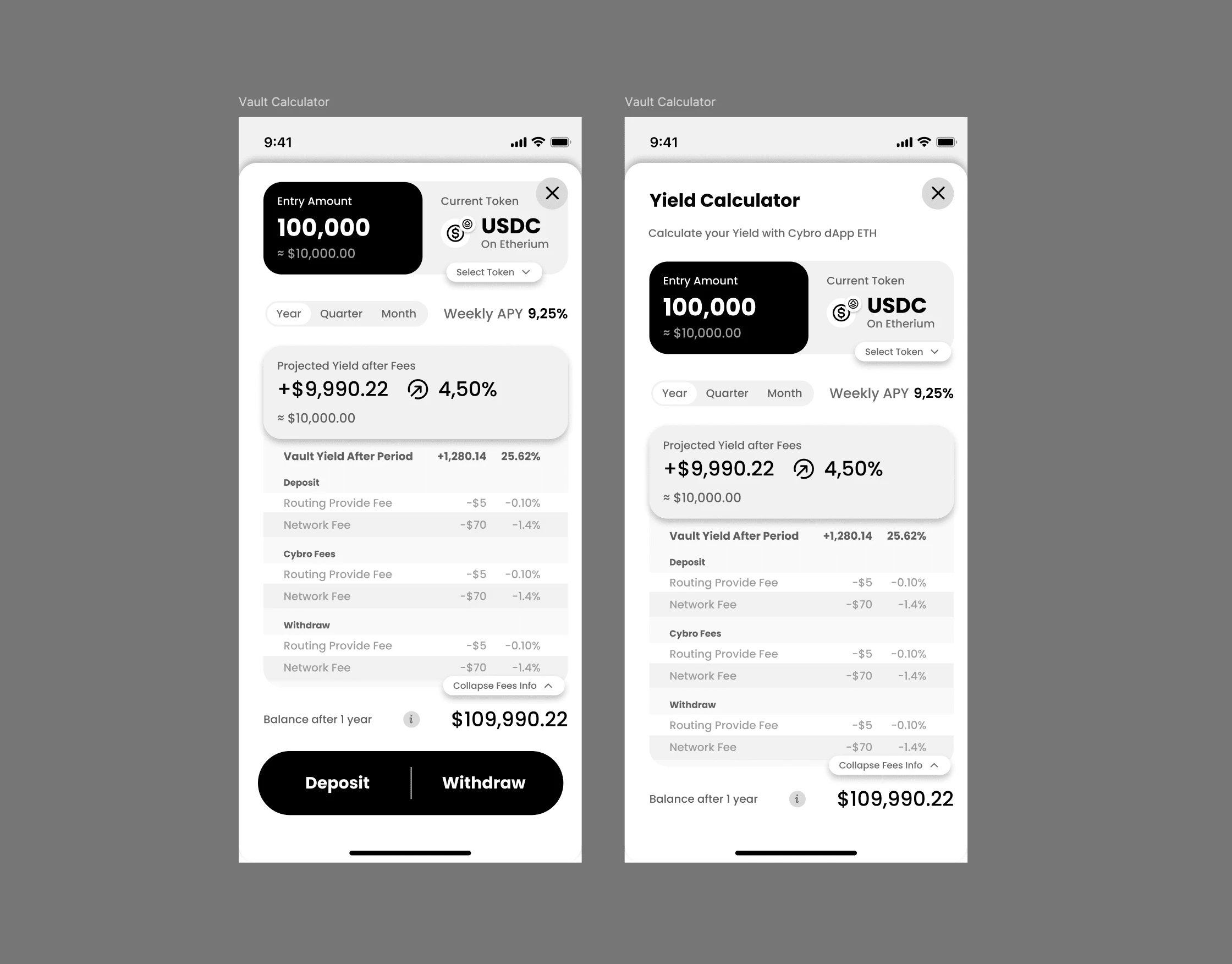
Later, we abandoned this idea, but someday, in one of the following projects, we will refine, rethink, and implement it!
And here's what the entire UX looked like for the three agreed-upon flows that we concluded we would need. Everything else – we will design in real-time action.
Why Did We Do It This Way?
We are confident in our abilities, and we know too much about how to make good products without spending years of time and millions of money on it. In the courses of IT giants, they will definitely tell you that you need to conduct research on every pixel, do 10,000 tests with button placements, conduct 300,000 user interviews, and so on and so forth. As it turned out, we are practitioners, not theorists, so we leave all this to those who spend six months agreeing on a palette for the color of icons in the interface. We, on the other hand, will do it better without any research, but in 15 minutes. That's just how it happened.
Why Shouldn't You Do This?
Because the chance of doing everything badly increases dramatically. Design research in MVP is something from the world of anecdotal absurdity, but detailed prototypes with all the flows and all the states of all possible scenarios are really important. When you decide that "ah, screw it, I'll finish it later on the design," you risk both missing deadlines and making a lot of logical mistakes in your beautiful interface. For example, here are our comments on what's done with reservations, what needs to be finalized going forward, and states that need to be reviewed on UI Stage.
Better not do that, and if you do – be prepared to quickly fix everything that pops up at the development stage as serious problems.
Getting Client Approval
We showed the guys our developments two days after starting work on the project and discussed all the associated flows.
An important point: we try to work iteratively and always "do it badly" first. It's hard, painful, and you always want to immediately surprise everyone with beauty and elaboration, but it's much more important to synchronize in the general vision, direction, and act according to our proven method.
The unique feature of our method is that our design is always ready on time. Whenever corrections to the functionality and core functions are needed, the design is always ready for it. At these stages, we flex with beauty, elaboration, and states, but at the same time, our "bad" design is ready at any stage; it just lacks details that do not carry the entire structure.
We discussed everything, approved it, and continued our confident movement: we can finish drawing everything that is missing and add details.
Starting the Design
Time is short, and there's a lot to do, so we resort to senior tricks. We won't dwell on the design of each specific element, as there will be a whole bunch of pictures at the end of the case that you can feast your eyes on. Here we'll run through the life hacks and non-trivial procedural solutions we used to deliver the best quality in such a short time.
Forming the Basis for Each Screen
Here's the trick: instead of progressively dealing with the layout and user flow of each core screen, we choose a key element of the product and build the architecture and structure of the entire page, the product functions around this key element.
This greatly speeds up the process and helps to make everything cool at the MVP stage – the client gets one perfectly fine-tuned function of their product, and we can flex with almost everything beyond the performance of this function.
For the page with the list of Vaults, the Vault card became such an element.
For the internal Vault page, it was the deposit and withdraw widget.
For the calculator, it was... we removed this page! I'll tell you why a bit later.
Wrapping Up Part One
Whew, what a journey! In this first part of our case study, we've explored how the Unipaws team tackled the challenge of designing an investment platform for Cybro.io in just two weeks. We've shared our approach to planning, prototyping, and client communication, and how we managed to lay a solid foundation for the project's success.
But the story doesn't end here! In the next part, we'll dive even deeper into the design process and reveal the clever tricks and solutions we used to create a stunning platform in record time.
Get ready to learn about:
How we built the foundation for each screen around key elements
Our approach to creating a backlog of ideas without waiting for client input
The importance of considering business objectives from the start
How we optimized user interactions to save time and money
The role of detailed designer's comments in speeding up development
We'll also share the final outcome of the project and reflect on the lessons learned along the way.
So, stay tuned for the second part of this case study, where we'll uncover even more insights into our design process and show you how the Unipaws team brings projects to life against all odds. Trust us; you won't want to miss it!
Like this project
Posted Jun 10, 2024
Balancing aesthetics and conversions while designing an investment platform under a tight deadline.
Likes
0
Views
28


Dropspot Pitch Deck: Where Bold Design Meets NFT Cool
Innovative UX/UI Design for a Data Architecture Landing Page
Revamping a Crypto Payment Widget with Stellar UX/UI Design
Crypto Lending Web3 App UX/UI