Crypto Charity Project UX/UI Audit & Insights
Hi! Today, with the permission of our wonderful friends from the Pawthereum team, we are publishing this example of strategic UX/UI insights that we made for their crypto project.
Here are our observations, insights, and ideas that we hope will help you upgrade the Pawthereum brand and make sure this wonderful project continues to live on and attract more audience.
We noticed many of these things on the website https://pawthereum.com/, but these insights can also (and ideally will be) applied to overall design strategy, including social media and other materials.
Empathy as the main motive
The main insight is that the overall vibe is currently a bit too "corporate". At the same time, the very concept of the project, its main idea, and the main reason from the users' point of view to use the products of your ecosystem - swap tools, etc., is built on empathy.
Now this core part, the main idea and mission is a bit lost behind the numbers and details. At the same time, it is empathy, compassion and the desire to help animals that is the main motivation that will guide ordinary users.
Animal photos
This is the first thing that catches the eye. Many photos on the site look like stock photos, although we assume that this is not the case.
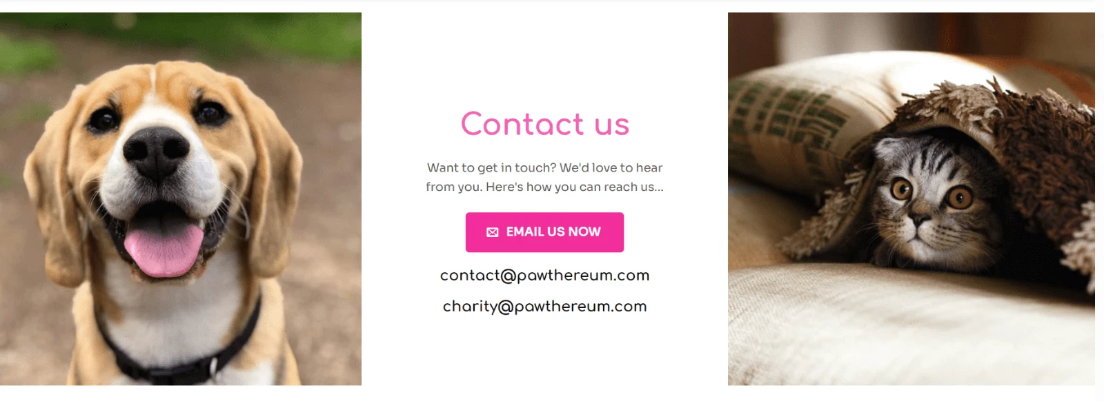
Why this is NOT OK: it greatly spoils the impression of the site as a whole and greatly interferes with the growth of that very empathy that we need from the audience.
In addition to the appearance, such a "stock" vibe also appears due to the complete lack of context.
💎 Hidden gem All your wards are actually ready-made mascots that can and should evoke that very emotional response. The only nuance is that they need to be told a little more in detail, turned from just cute pictures into living stories.
How to do it
• Make the site and other materials a little less corporate, because it is not necessary for your specific project. Unfortunately, the world is so arranged that most of all donate to some kind of disabled animals. Therefore, it is precisely for collecting donations, selling your tokens that we would recommend everywhere, including design, to focus more on specific cases where something bad happened to the animals and they were helped.
• Implement the storytelling potential. As a reference to what we mean, we would like to show the site https://chernikacat.tilda.ws/. It is as simple as possible, made on Tilda (automatic translation from Google will be enough). But at the same time, he tells the story of this particular cat so much that by the end you involuntarily feel sympathy, it seems to you that she is your acquaintance.
Important point because WE CARE: looking ahead, this kitten, Chernika, is doing great now - she found a loving forever home, just the site remained as the work of the one guy who found her.
Content and overall structure
The next moment is, again, the focus shifted to the crypto-corporate theme. For example, in the very first block:
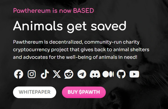
Even for tech-savvy users, it will take a few seconds to understand the meaning of this part:
"Pawthereum is a decentralized, community-run charity cryptocurrency project that gives back to animal shelters and advocates for the well-being of animals in need!"
Moreover, in order to want to use your swap, buy a token, you do not need to know all this at the start. What is needed is to tell what you are helping animals and how exactly. For example, as in the main title Animals get saved - simple, laconic, and already sows the first seed of empathy.
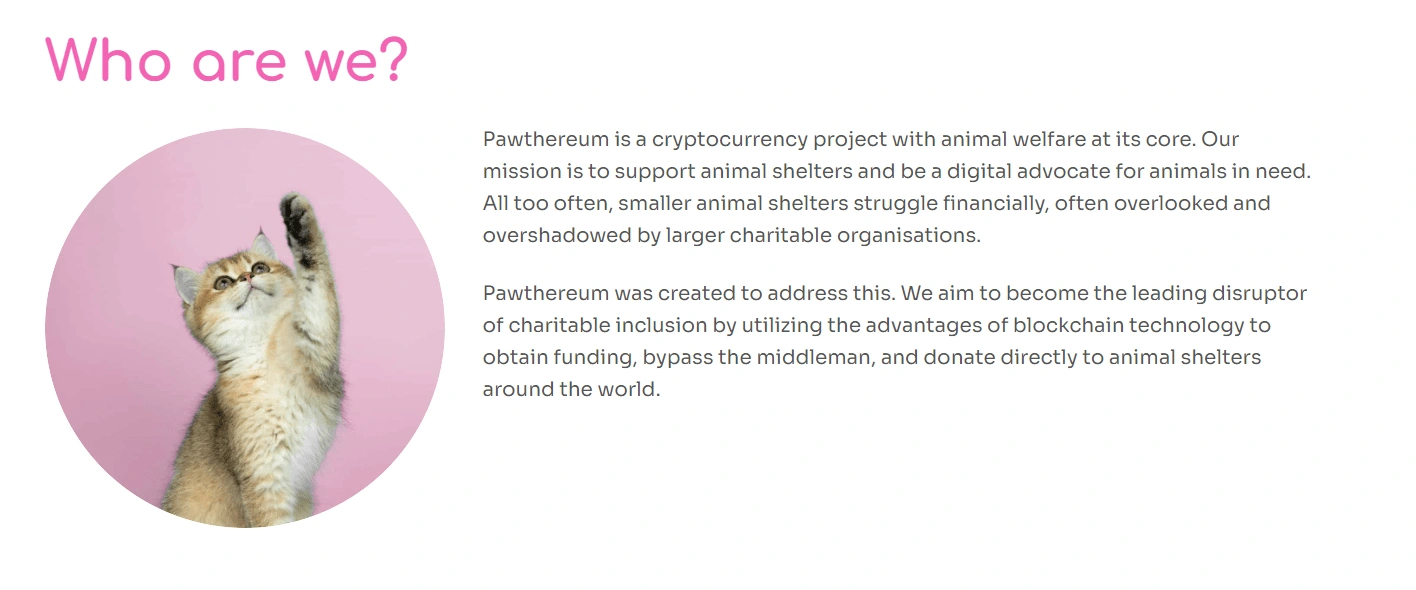
The same problem is found further on: we have a lot of long text that explains quite simple and human things in complex technical words. Many things can simply be omitted, and they do not matter.
Key thoughts:
It will only be better if we simplify the content in terms of how it is written - reduce the amount of text and make it more "lively".
Add more pictures and stories.
Returning to storytelling
Now about the most important observation. Pawthereum critically needs some animal stories, as we wrote above. Now let's try to explain our thought in more detail.
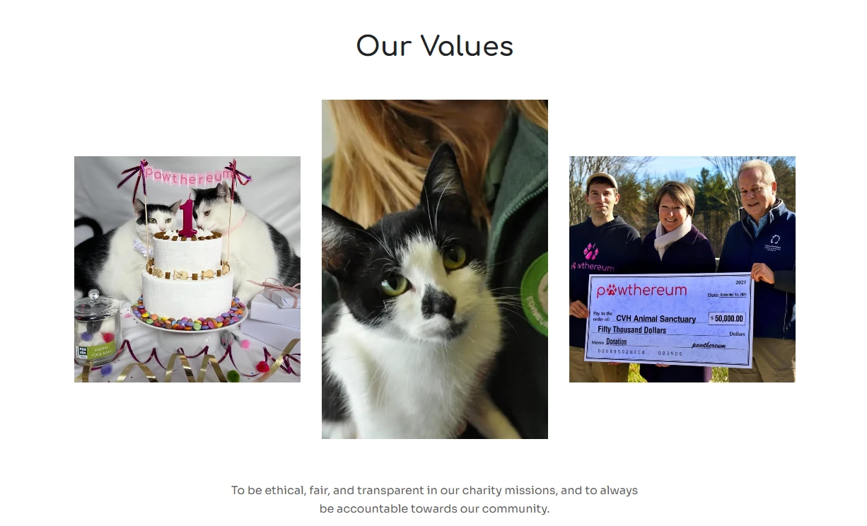
Example 1: Our Values. It is not quite clear what is happening here (from the user's point of view). The kittens have a birthday - this is a wonderful photo and event, but it is not clear from here what values are in question.
Example 2. Gallery. We see a tiger walking in a small enclosure, but again, from this photo it is impossible to find out what story is behind it. Or the cute sloth - what's his name? What is his story? How old is he?
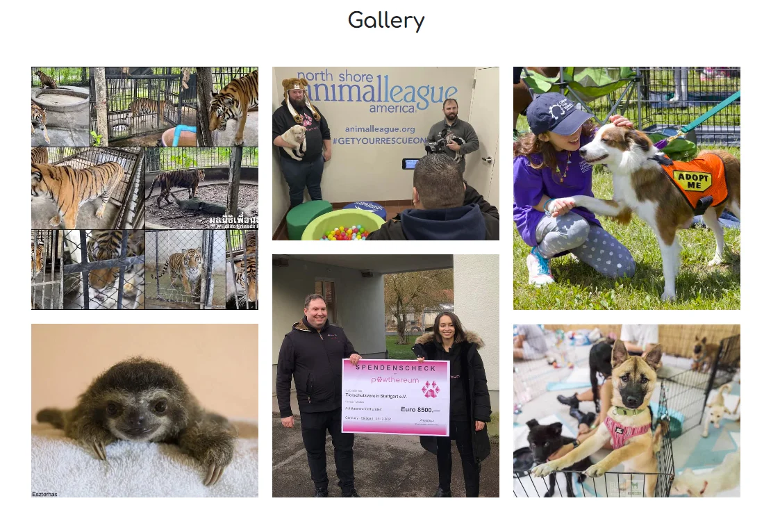
In a nutshell, the problem is that when a user looks at such photos, they get the feeling that it's just some kind of decoration. This is precisely because of the lack of context. But behind each photo is a whole wonderful story of good, help, and salvation. They have names, stories, which can and should be empathized with. And if you tell all these stories - or at least some of them - this empathy in the users will be multiplied.
For example, in the case of the gallery, even one block telling the tiger's story in more detail would work much better than just a collage of abstract photos.
Donations
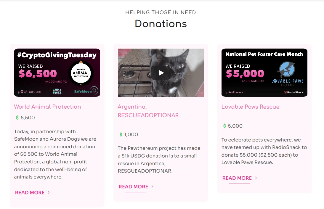
In fact, this is almost the main section of the site, its main essence - cases of help to real animals. But the problem here is the same - excessive corporatism. For example, template Medium covers with large numbers, etc.
Of course, this adds seriousness, but "seriousness" in this case can be shown through the reality of cases and proofs, and not through the design. In terms of design, in our opinion, Pawthereum would only benefit from moving away from solid corporatism and being more "generic" guys.
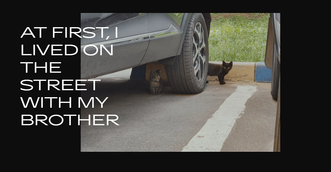
The advice here is the same as in the previous cases: to use more photos of animals, as in the example in the middle. Then they will be read much more often and with more enthusiasm. And especially if you use "storytelling" headlines. It's hard to come up with a good one on the fly, but in general we are talking about more personal ones, for example "I lived on the street, but now I always have a full bowl." And World Animal Protection, for example, of course, gives a basic understanding that someone somewhere was helped, but with a very low probability it will lead the user further into your world - simply because it is too impersonal.
Hierarchy
We will not delve into the intricacies of design, but we will note some points that, again, are critical and affect how people will behave on the site.
Example 1: In the hero section we have as many as 5 buttons, with two of them duplicated and one not even quite a button. Both here and in other materials, it is definitely worth thinking about the hierarchy: what action do we want here? And here?
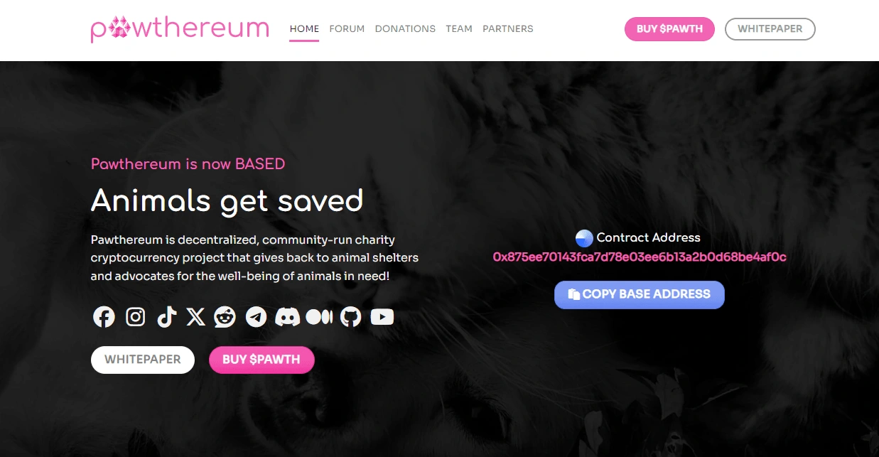
Example 2: In the same section we have 10 (!) social network icons. It's great that there are so many of socials, but if you want people to subscribe and the audience to grow (and this is the main goal of these links!), this is definitely not the best way to place them.
What can be done instead: move them to a separate block and tell why it is important and why you need to subscribe to each one. For example, on Instagram there are more photos, on TikTok there are funny videos with our wards, and on Twitter there are company news, on Reddit you can participate in discussions, etc.
Why is this better: in the end, as a user, you don't choose what to subscribe to and "where it's more convenient", if you have already penetrated with sympathy for animals and immersed yourself in the project.
At the same time, even if someone is not yet sure that they are ready to buy tokens, or the person simply does not have the money, they may want to subscribe to different social networks, knowing what the "trick" of the content on each of them is.
That is, shift the focus to why it is better to subscribe to one or another social network, what will be there. This will give an additional influx of audience that will know about you, advertise, interact, and give additional growth.
💎Another 'hidden gem
Another cool thing we found from you is this map: Donations - Pawthereum. Unfortunately, it is hidden in the "depths" of the site.
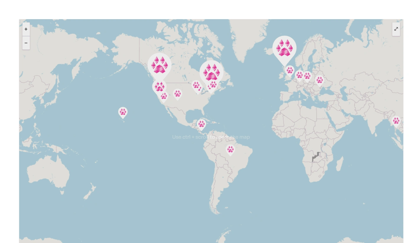
This section could be greatly boosted and made super interesting with the help of Zenly: zenly.com
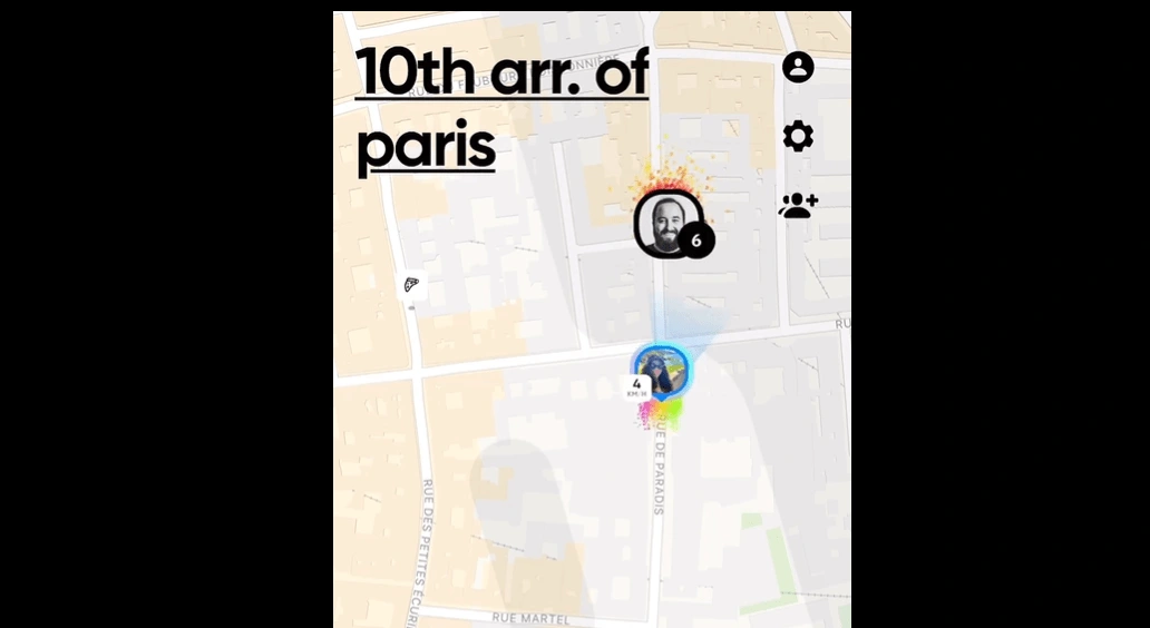
They have an API for very beautiful maps, and right there inside with the help of JS to tell interactive stories with some donations, etc. And such a block can and should be placed right on the main page and in other materials, because people will stick to it, be interested in it, "wander" around the planet 🤗
Summary and recommendations:
Use only your real photos of animals, signing the names on each photo. Plus, add the stories themselves - in the simplest version, at least in the tooltip that will appear when you hover over the photo. This will both boost SEO, as people will spend more time on the site, and will cause more empathy.
Revamp the structure with an emphasis not on how it is "accepted" to do on websites, but on how you yourself feel the main thing - the stories of animals and how they were helped. Those who want to help are not fools, they just need to be given a convenient opportunity to do so. More stories - more empathy - more desire to figure out how to help you.
Reduce the amount of text in the copy.
Add real and personal cases. Here is pure psychology. If you offer a person to donate $50 to a fund to help disabled cats, they will most likely think about it and, with a slight feeling of guilt, will not do it. But if instead you tell the story of a specific cat from a shelter or refuge that something bad happened to, and show how the same $50 will help her feel better here and now - the response will be much higher. Simply because evolutionarily, we are not programmed to feel empathy for some "community", but we are very programmed to feel empathy for specific living beings.
Why we talk so much about stories: objectively, this is the only reason to use your tokens, buy them, etc., since, like any charity stories, economically such projects themselves are not very promising in terms of finance, this is not a tool for earning money. That is why it is so important to give users the opportunity to feel what you felt when they created Pawthereum.
Like this project
0
Posted May 14, 2024
A deep dive into Pawthereum's UX/UI, uncovering strategic design insights to amplify their mission and drive emotional connection with holders.


