Uniqorn.ws UI/UX Review: Key Insights for Growth & Monetization


Hello! Today we will share our observations, insights, and ideas that we hope will help you upgrade the Uniqorn link-in-bio tool and ensure your wonderful project continues to thrive and attract more users.
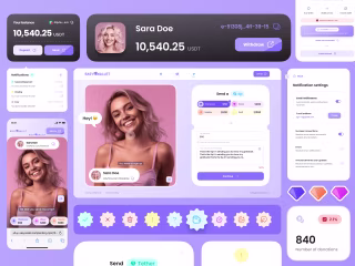
Landing Page
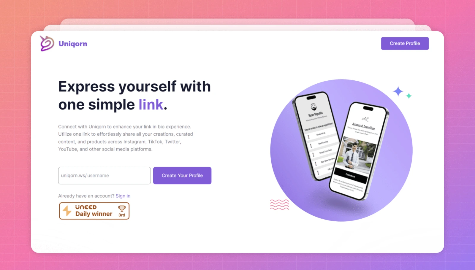
General Thoughts
👉 No one will discover how good the product is unless it's properly explained. You need to clarify the product's benefits and demonstrate usage scenarios.
What's wrong with this right now:
The second block right after the hero immediately talks about features in the product instead of explaining to the user why they need this product in the first place, what opportunities it provides.
How to fix: In the simplest version, just move this block lower, under the product description. 🔄
Keeping the User's Logic in Mind 🧠
With each block, the percentage of users who scroll down to a certain point decreases. Meaning the first block will be seen by everyone, those who found something relevant in the hero will scroll to the second, and so on. This is a general rule for ALL sites, including highest-converting landings.
Therefore, it's better to arrange blocks by level of appeal: from the crucial "Where are we?" in the hero and product description, to benefits and usage scenarios.
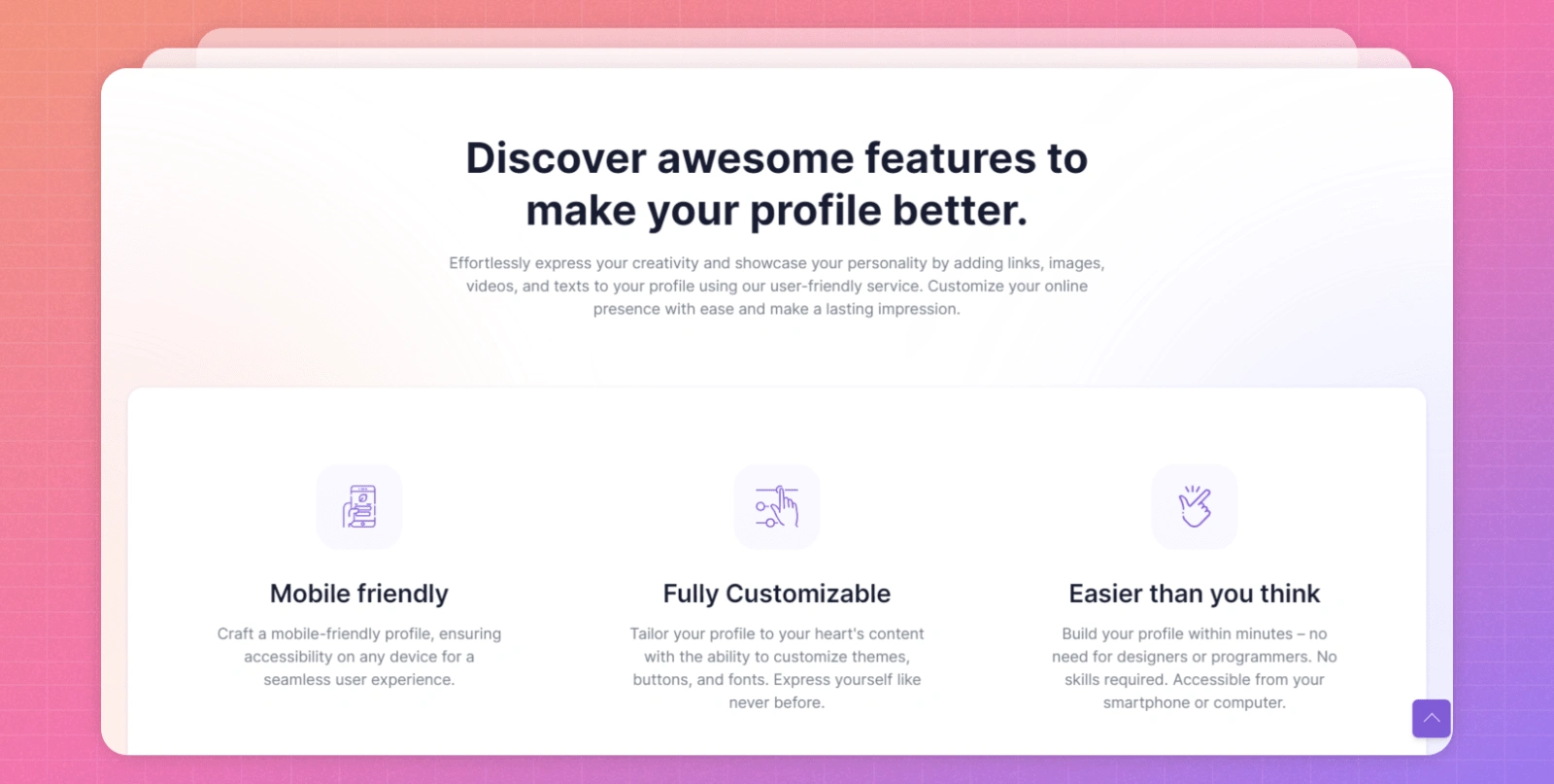
👉 In the block with product features, a usage scenario is not currently shown. It's better to approach from two angles:
🎬 Visuals. A huge plus for you as a small project is that your content can be anything for now. In this case, you can simply use short screencasts instead of screenshots, showing how to use something or demonstrating an advantage you're discussing.
💬 Text. Make it as simple, transparent, and concrete as possible, so even a child understands. Don't worry about tone of voice, vibes, etc. for now.
Defining the Target Audience 🎯
This is a must-do that will greatly facilitate working with text and content overall. For example, you can orient toward users similar to yourself - the optimal option, since you'll understand best what problems these users face.
Details by Sections 🔍
We're proceeding from the assumption that we're still hypothesis testing, and can't rule out it being erroneous with simply not enough demand for such a product. This is absolutely okay for a startup; exactly why MVPs exist - to validate. So no need to invest heavily in fancy design now. But there are things that should be done immediately.
👀 Replace screenshots with screencasts of how the product works, in blocks describing functions and advantages. Another plus - you'll simultaneously conduct light onboarding for new users.
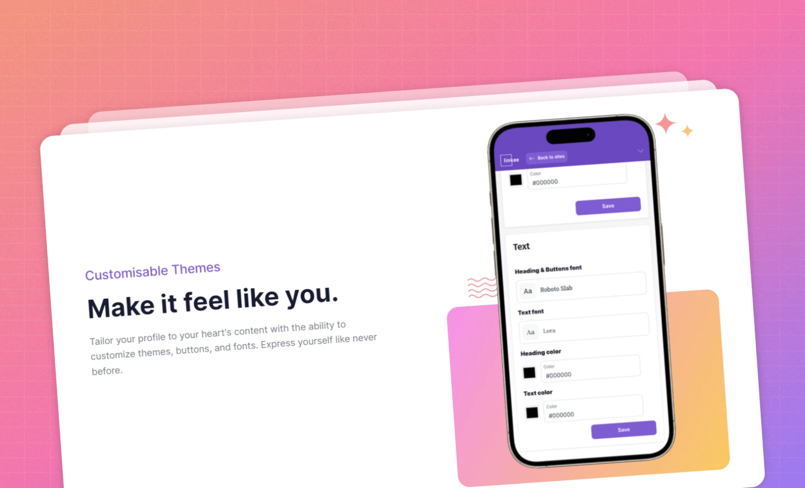
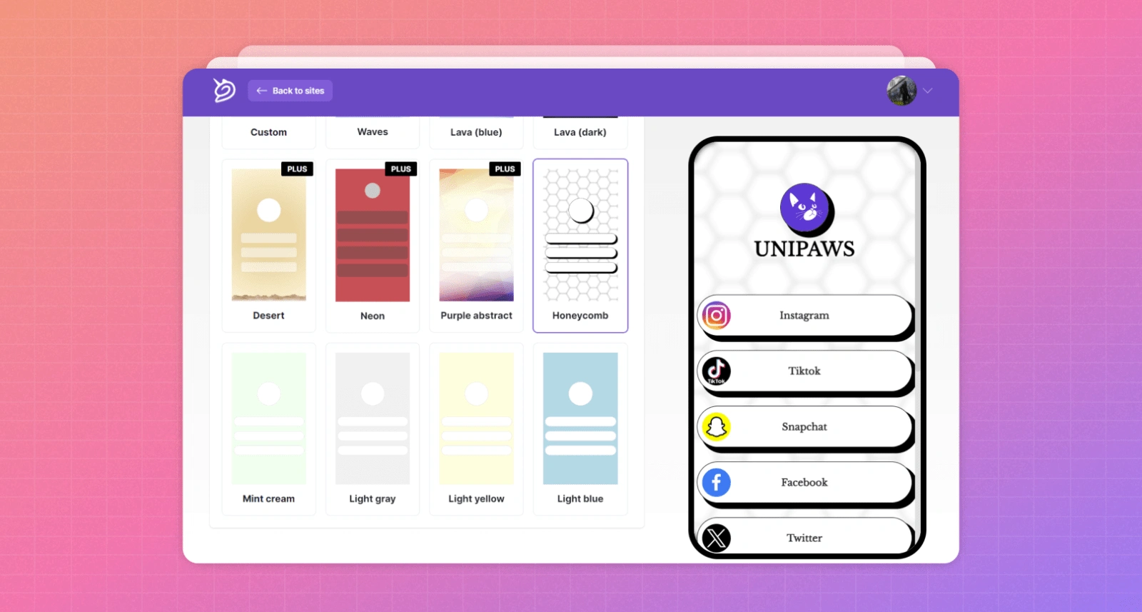
🎨 In the Customizable Themes block and near the final CTA, better show the finished result, not customization process, if showcasing diversity like on Dribbble. If showcasing customization ease - then use a screencast with the process.
👥 You definitely need a block with those already using your product, with links to them - e.g. links to real users' mini-landings you think turned out most appealing. Ideally premium account users. If no real cases, gather non-existent user profiles. The main thing is showing people can use this service differently, plus adding social proof.
📱 Instead of the blog section, better to add social media - could even be your personal accounts, like "Follow my Twitter, I created this service." This will be the first building block in crucial community building. Literally key in 2024 when SEO doesn't work formerly, and advertising is expensive.
📝 In the blog section's place, make a simple changelog to show the product is alive, developing and supported.
Hidden Gem 💎
By building your community, you'll benefit regardless, because even if this hypothesis is wrong, the community in some form remains. For example, if you have 10K Twitter followers and release an NFT collection or new service - first early adopters will be attracted much faster.
Let's "Touch" the Product Right Away 🖐️
Another trick that could boost conversion - a block with the templates themselves that the user can interact with.
Currently, product touchpoint is implemented at the level where in the hero user can enter a nickname and immediately create their profile. But you can and should bring user back to this flow repeatedly, and through template block is coolest way. You click on template you like - click - immediately see result.
Final CTA 📢
Without a juicy final CTA - bad. Better to make separate block at bottom. Though menu with same button is stuck top, by this point user likely ignores it and focuses on center screen area. It's right here you need to remind again what to do.
Adding Discounts 💰
For new users, makes sense to offer a discount, e.g. 50%. "Reason" can be anything - summer arrived, we launched, doesn't matter.
The point is you already paid to attract user, and when they're on site you're already "in the red." Simple logic: if user just leaves, you won't recoup these costs even partially. But if lure same user with discount so they want everything they'd get for $8 but for $4 - already better than just losing them.
Product
General Thoughts
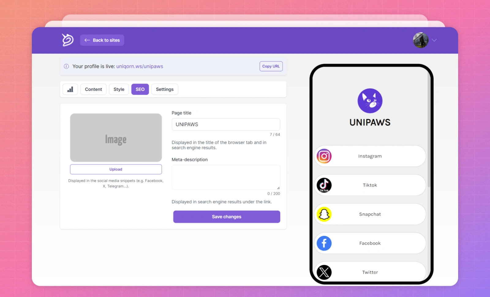
💅 Profile Appearance: The first priority should be working on the design itself - how all these links and icons look cosmetically. For many elements, just minimal knowledge of Figma or another editor will suffice. For example, make the buttons more high-contrast, tweak the rounding and shadows, etc.
Important: No, this won't reduce the appeal of paid features, it will simply increase the overall product attractiveness.
🚶 Step-by-Step Profile Setup: Right now there's no onboarding for the user - they just toggle between different tabs, poking around trying to do something. As an idea, check out the logo generation service Looka and services with multi-step checkout flows: just guide the user through this process step-by-step.
What needs to be done:
👉 Break down the profile creation into a linear flow with stages
👉 Add an option to skip any stage - then some default solution applies. Convenient for those in a hurry and those with time.
🗣️ Encouraging Sharing: This call exists now, but it's kind of peeking out shyly from the top. Instead, better to show a bold banner or plate that really entices clicking - the more users sharing and talking about Uniqorn on social media, the higher chance new users come via their links. So you can benefit even from non-paying users this way.
🔄 Micromoment: add a button to refresh the preview.
What Can Be Done Now for Monetization 💰
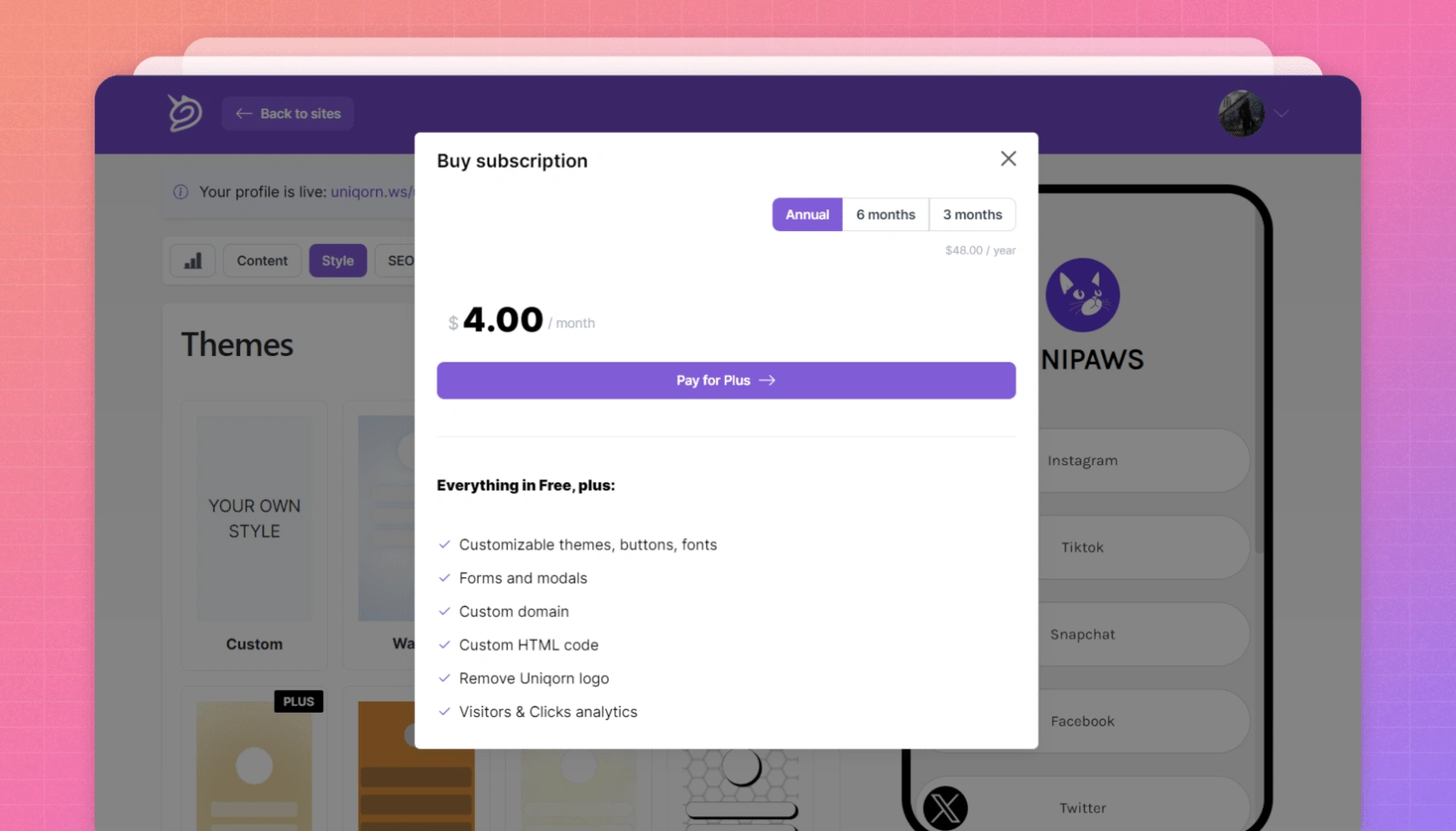
1️⃣ Let users preview premium themes and templates. Then it'll be much easier for them to decide to purchase.
2️⃣ Add explanations to each stage why the user needs something and why pay for it. For example, with themes, explain a beautiful one increases conversion over default designs by X on average; on the SEO tab - you'll set up this-and-that, get this result. The user shouldn't have to guess.
3️⃣ Another more radical advice - drop the freemium model and add a regular 14-day trial. Currently conversion of registered to premium users is low, so it can't get worse. What improves: you accelerate the pay-or-not decision cycle, shortening it. Plus users accustomed to the product over two weeks are more likely to buy. And one non-obvious plus for you developers - no need to decide what functions stay free vs. premium.
New Ideas ✨
Developing the Mobile Landing Page Builder Concept 📱
One key difference of Uniqorn from popular analogues like Linktree is deeper customization. This idea could be greatly expanded by letting users make themes different not just visually (colors, button shapes), but in layouts too.
For example, if there's a block with a heading and link content preview - it could be full-screen width or square.
All layouts will still be premade of course, but even so the user gets to deeper customize their mini-landing for themselves and audience.
Integrating the ChatGPT API 🤖
Not a passing trend, this is a must-have. It can be used for writing bios, snippets, etc. Plus ChatGPT API has very democratic pricing.
Quick Profile Setup ⚡
Another idea - let users quickly set up their profile by clicking chips for the desired "vibe" - e.g. fun, elegant, professional. In this flow the user doesn't step-by-step customize everything, choose fonts etc. - they just click the vibe they like and see their profile automatically apply different styles from premade options.
References 🔗
Craft Docs
https://www.craft.do/
A great example showing what the product is, usage scenarios. They apply most things discussed in this audit - including discount banner and even product videos shot phone-to-phone, juicy final CTA.
Screen Studio
https://www.screen.studio/
A screen recording service with AI for quick "on-the-fly" editing. Here too they use the same tactics: everything shown through the product, with videos. The social proof block looks especially convincing, even if not real testimonials.
Bento.me
https://bento.me/en/home
Functionally and conceptually an almost direct Uniqorn analog. And here the showcasing of best user profiles is beautifully implemented - even categorized. Another interesting point is Bento launched when Linktree seemed to have the whole market covered, but they carved their niche through visual appeal and customization.
To summarize:
1️⃣ Really need to narrow down the audience, choose a niche, and optimize product and landing for that niche's needs. Move away from "everything for everyone."
2️⃣ Keep in mind the market is quite saturated. Not fatal, but important to understand who and what you're making this for, what can be countered to giants like Bento and Linktree. Could be e.g. simplicity of customization combined with depth, as an option. But in any case functionality additions beyond just marketing will likely be needed.
3️⃣ Adding deeper customization capabilities would be great. 👍
4️⃣ Use the Stripe integration opportunity as a potential USP - especially relevant if targeting some influencers. 💳
5️⃣ Consider B2B monetization angles like partnerships. 🤝
6️⃣ Solicit feedback directly via email. Ideally highly personal, in the vein of "Hey, I'm the creator, tell me if everything worked, what you liked/disliked." 💌
Like this project
0
Posted Jul 16, 2024
Strategic UI/UX review of Uniqorn.ws: Optimizing user journey, enhancing customization, and exploring monetization strategies for the link-in-bio tool.
Likes
0
Views
17


Part Two: Mastering UX/UI in DApp Investment Platform Design
UX/UI Design for a DApp Investment Platform in Just Two Weeks
Crypto Charity Project UX/UI Audit & Insights
EZ Wallet UX Design: A Journey of Innovation and Intuition