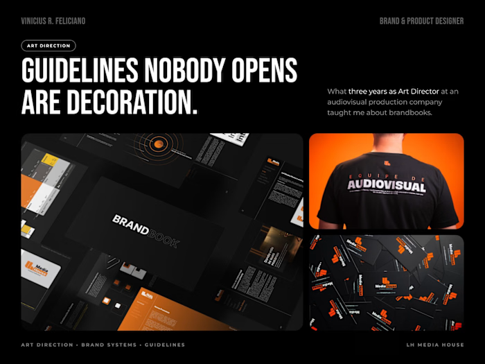
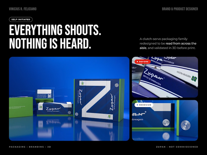
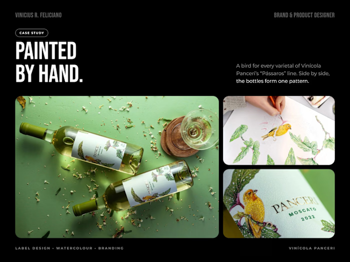
Amplie — Branding + Digital Product for a Fintech

Vinicius Rodrigues


One app, all your cards, one place to control them.
Amplie is a fintech built on a simple promise: bring together the credit cards people currently manage in separate apps. The challenge was making a young company read as trustworthy without looking like every other blue bank.
The idea behind the system
Everything comes from one image, cards merging into one. Layers that stack and fuse became the logic of the whole identity, with modular shapes and a vibrant range of blues. The goal was a brand that feels like a platform you can rely on, accessible and simple, rather than one more bank competing for attention.
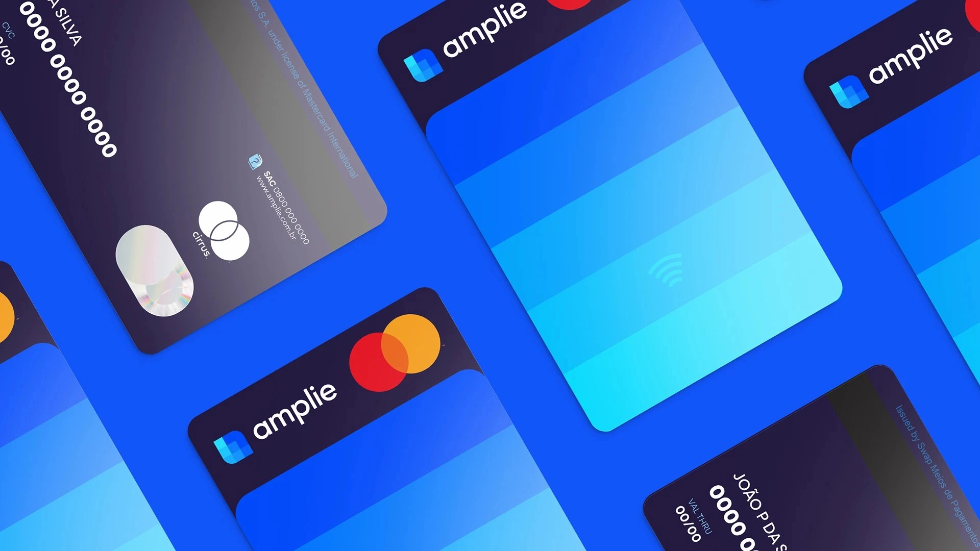
Amplie cards and brand system
Brand and product in the same process
I worked on the brand and the product at the same time. The positioning, archetype, naming and verbal identity were built alongside the app, so the product speaks with the same voice as the brand instead of feeling like something bolted on later.
The product design covered the flows that decide whether someone trusts a fintech with their money: onboarding, identity verification with facial biometrics, managing every card in one place, and splitting a purchase into instalments.
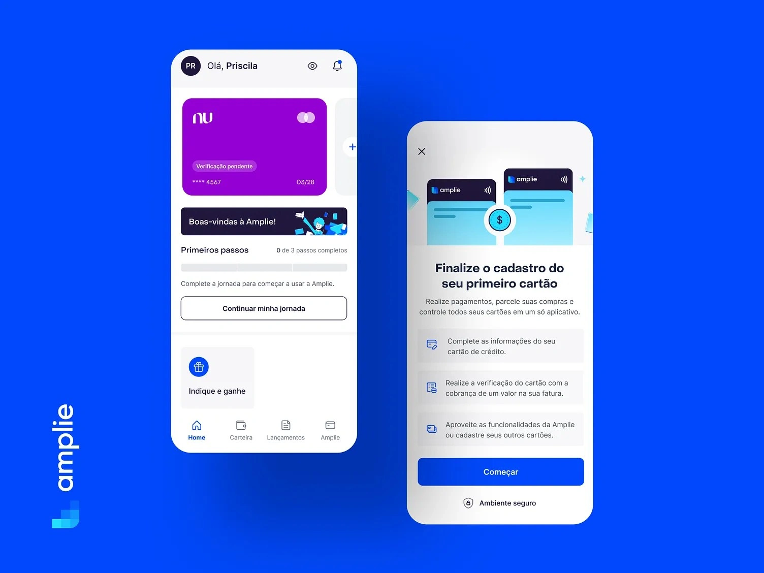
Amplie app screens: onboarding, facial biometrics and card management
Off the screen
An illustration system gives the brand some warmth, and the identity carries into the physical world through cards, out-of-home and merchandise.
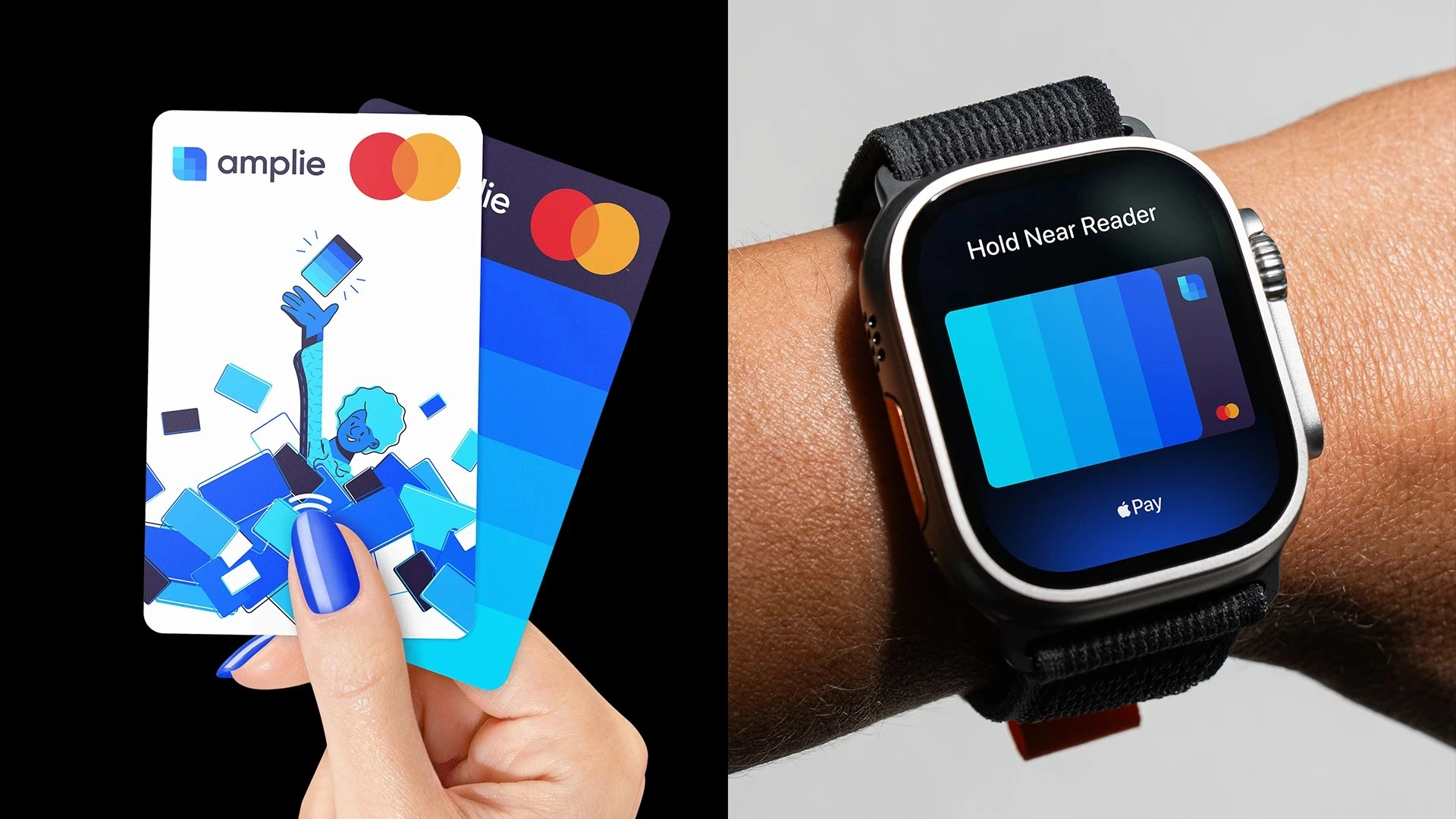
Amplie cards in use
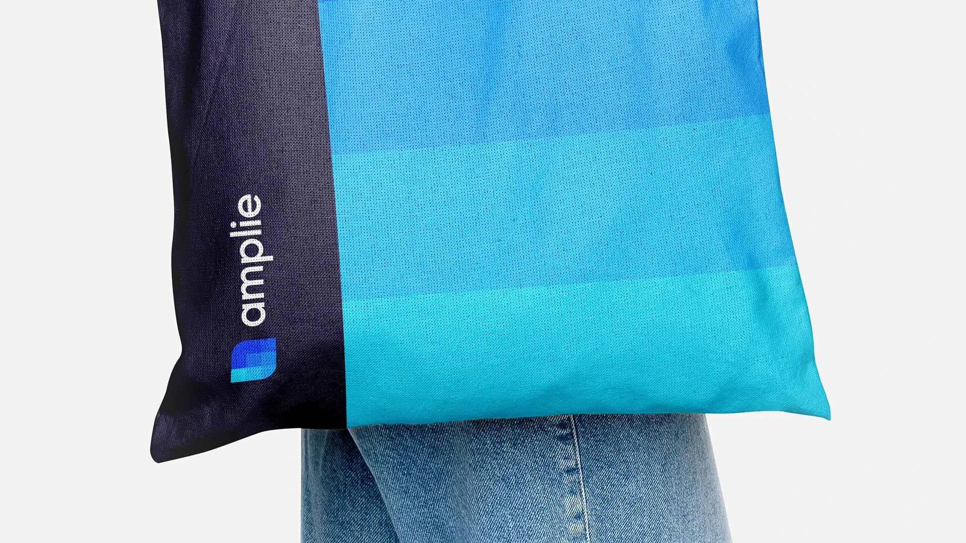
Amplie identity applied to merchandise
What I did
Brand strategy, positioning and archetype. Naming and verbal identity. The full visual identity and graphic system. Illustrations. Product design (UX/UI) for the mobile app. Digital and physical applications.
Like this project
Posted Sep 20, 2026
Brand strategy, identity and mobile app UX/UI for a fintech built on one promise: all your credit cards unified in a single app.