Zest Rituals — Skincare Brand & Packaging System

Vinicius Rodrigues


When Zest Rituals came to me, there was an idea, a handful of products, and no real brand structure holding them together. The founder, based in Madrid, needed to organise a growing skincare portfolio so it made sense, both to her and to whoever would eventually pick a product off a shelf.
This wasn't really a packaging project
The first thing to get right was the brief itself. On paper it looked like packaging. In practice it was product architecture. The brand had to separate lines, purposes and benefits clearly, without the portfolio falling apart into a pile of unrelated boxes.
Packaging only works once you know what each product is for, and how it relates to the others. So that's where I started.
Where the concept came from
The idea grew out of two textures that turned out to share a shape.
On one side, the structure of the skin, with the organic, cellular pattern of the epidermis. On the other, the inside of a citrus fruit, with the segments and cells that give you that hit of energy and freshness when you cut one open.
Put the two together and you get the Zest symbol, and the pattern that runs across every box.
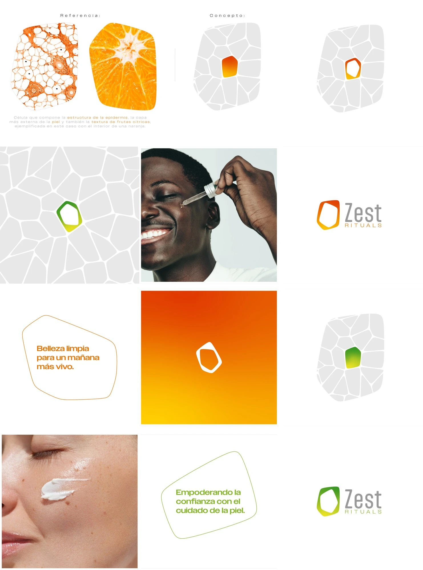
Concept board: skin cells and citrus texture combining into the Zest symbol
The name did a lot of the steering. Zest is brightness, energy, activation. Rituals is the everyday part: routine, self-care, the thing you do every morning. The visual system had to carry both. Light and fresh, functional, and sensorial enough to feel like care rather than chemistry.
Four lines, four colour codes
To organise the portfolio I built an architecture of four lines, each with its own colour.
Vitality & Energy. Orange and yellow. Glow, vitamin C, antioxidants, skin that looks awake.
Nutrition & Regeneration. Green. Hydration, nourishment, repair, balance.
Purification & Control. Blue and cyan. Cleansing, renewal, oil control, freshness.
Zest for Men. Dark blue, with a more technical and direct language.
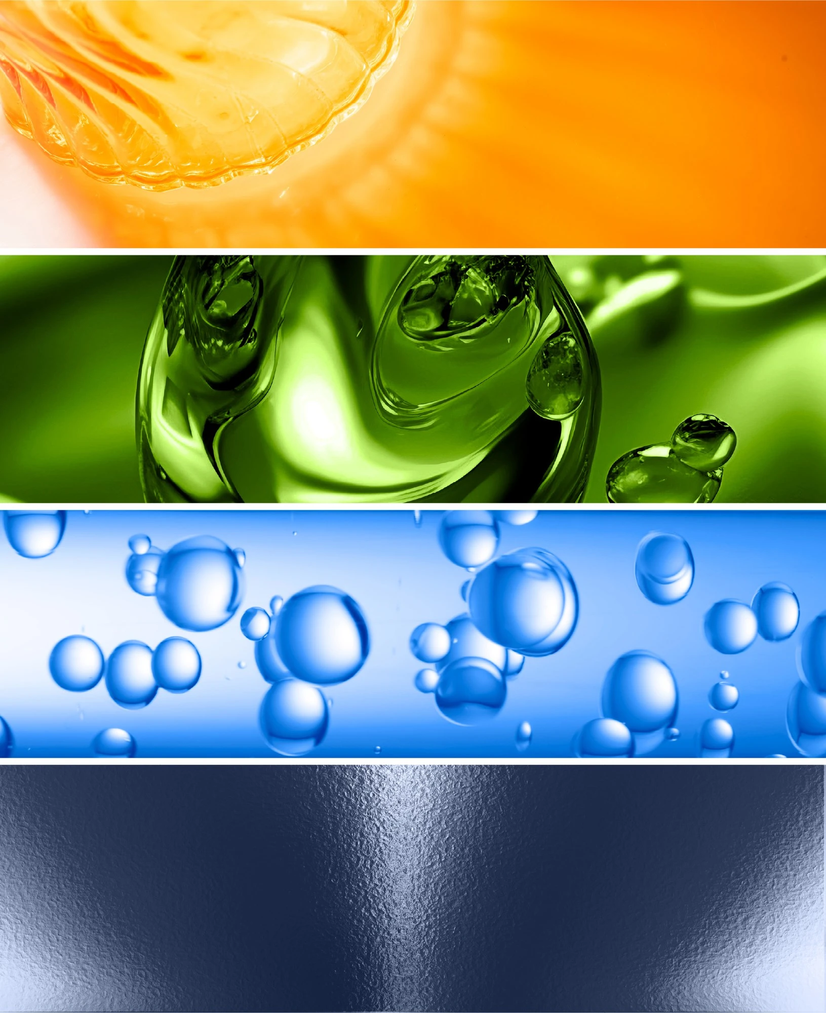
The four product lines and their colour codes
One template, every product
The packaging follows a modular structure. Every product uses the same composition logic: logo, product number, name, description, benefits and volume. The ingredients panel sits in the same place on every label.
That's what lets the brand keep adding products without losing consistency. A new SKU isn't a new design problem. It's a new entry in a system that already works.
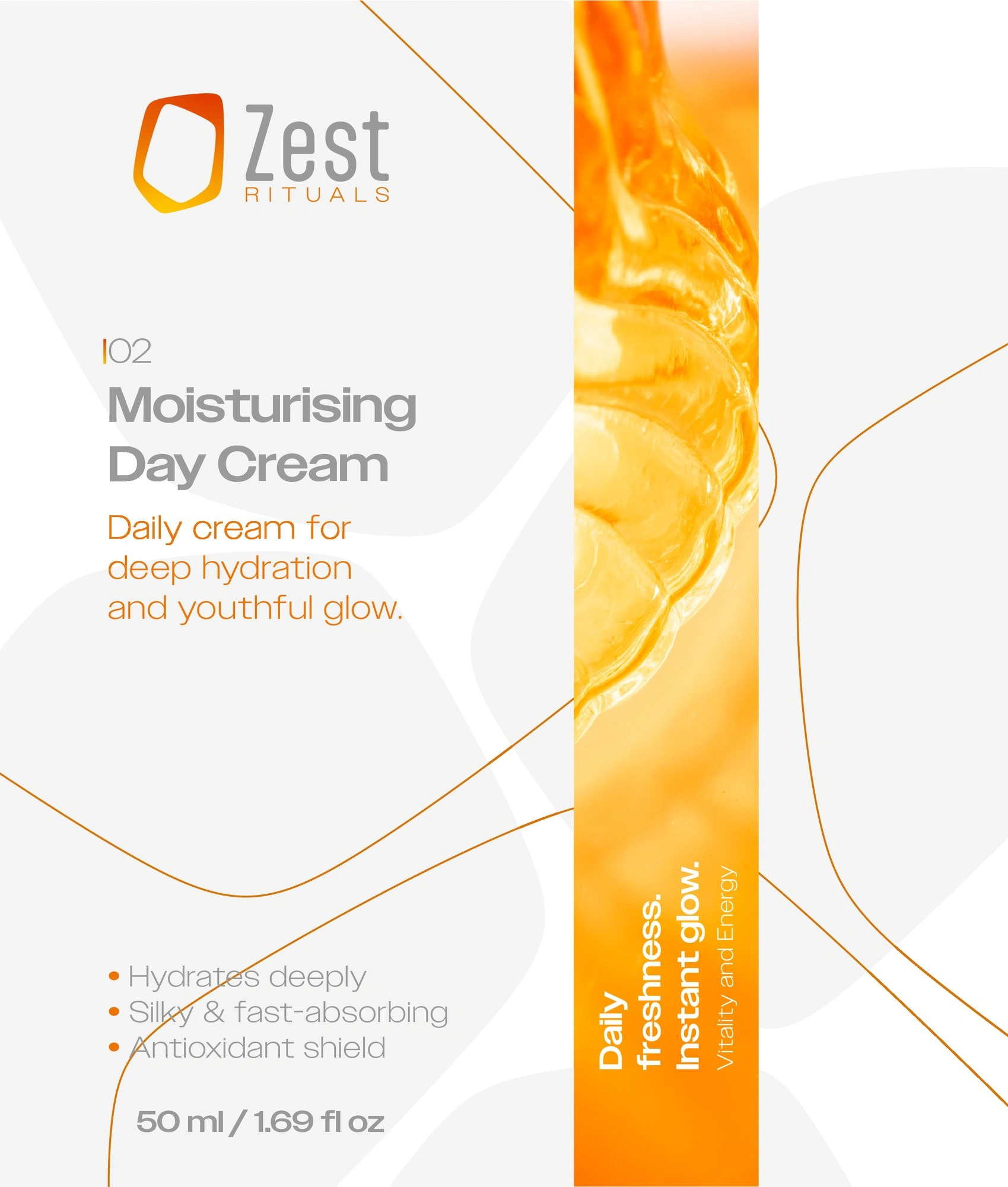
Label template showing the modular structure shared by every product
White dominates, carrying the idea of cleanliness and dermatological care. Colour does the work of a code, so you can tell which line a product belongs to at a glance, before reading a single word.
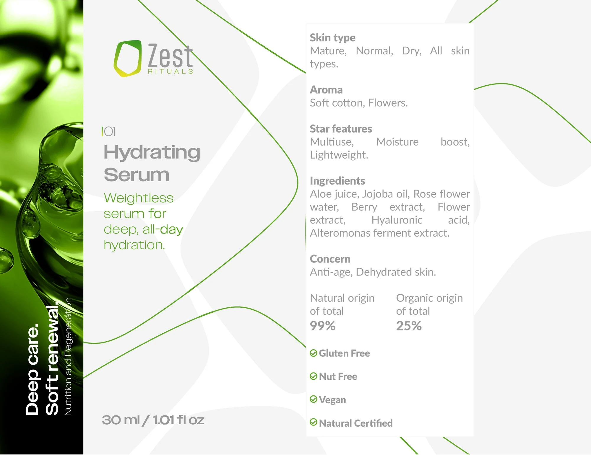
Label with the ingredients panel in its fixed position
Every label and box was built on production dielines, with separate formats for EU, UK and US markets.
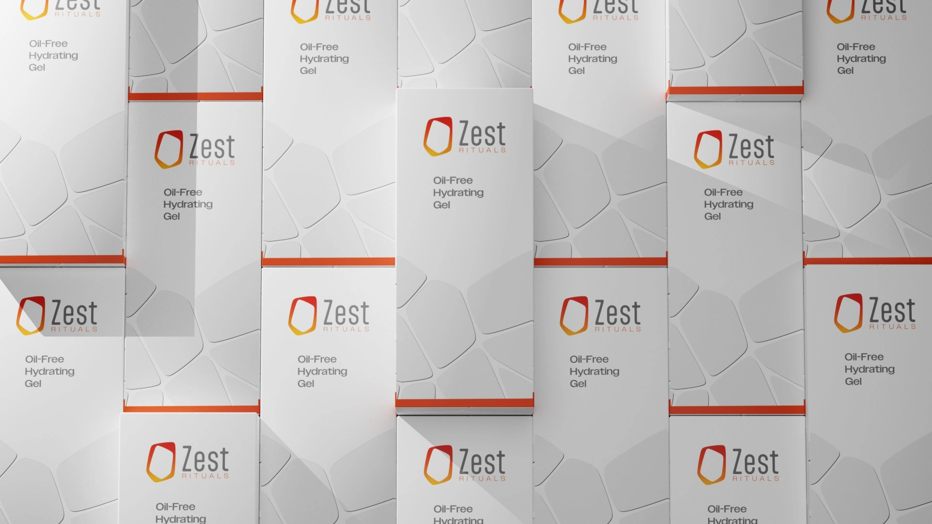
The box system applied across the range
The result
A brand system that's clear, scalable and easy to recognise. Each product has its own job inside the portfolio, and every one of them still belongs to the same world.
Zest Rituals stopped being a set of skincare products and became a brand with its own language, built around ritual, freshness, care and balance.
Like this project
Posted Sep 21, 2026
Brand identity, product architecture and a modular packaging system for a skincare brand. Four lines, one template, every SKU.