FlexPay: the type, colour and icon behind a wallet app

Dject Studio

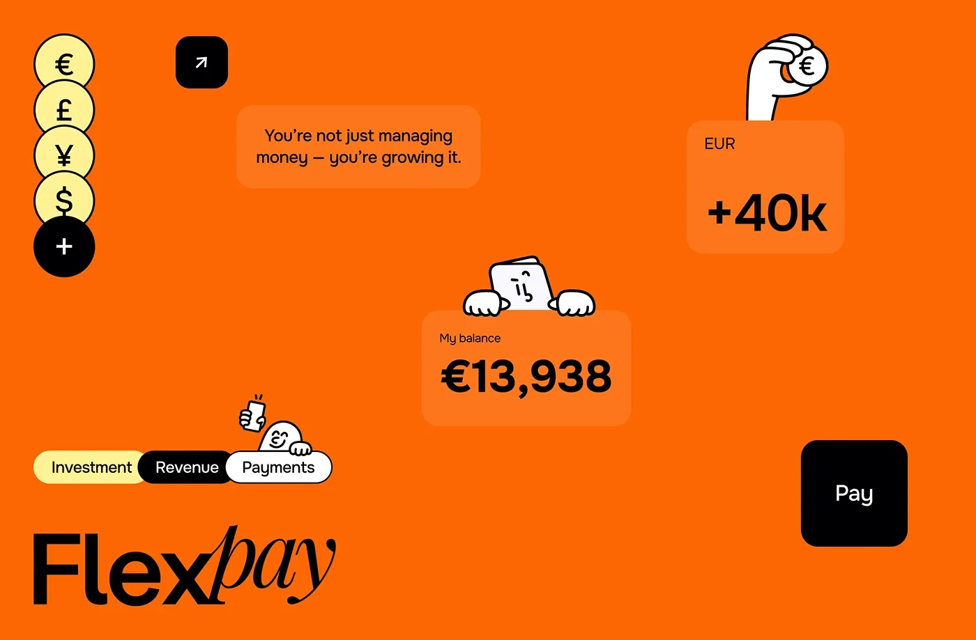
FlexPay is a digital wallet app we designed in 2025. This post is about the brand layer under the screens, not the screens themselves.
Type and colour
The type is Onest, in three weights only: Bold, Medium and Regular. A wallet is mostly numbers, so the euro, pound and yen signs had to sit well next to the figures.
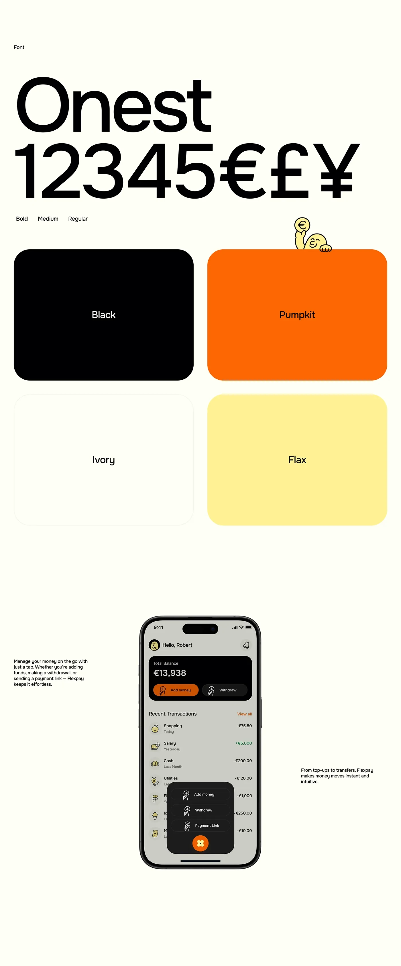
Onest type specimen and the four FlexPay colours
Four colours do all the work. Black, Pumpkit orange, Ivory and Flax yellow. Orange is the loud one, so it goes on the main actions and the app icon. The screens stay mostly ivory and black.
Wordmark and icon
The wordmark sets "Flex" in a plain sans and "pay" in a loose italic serif. The app icon is only that italic p on orange, and it reads fine in a notification too.
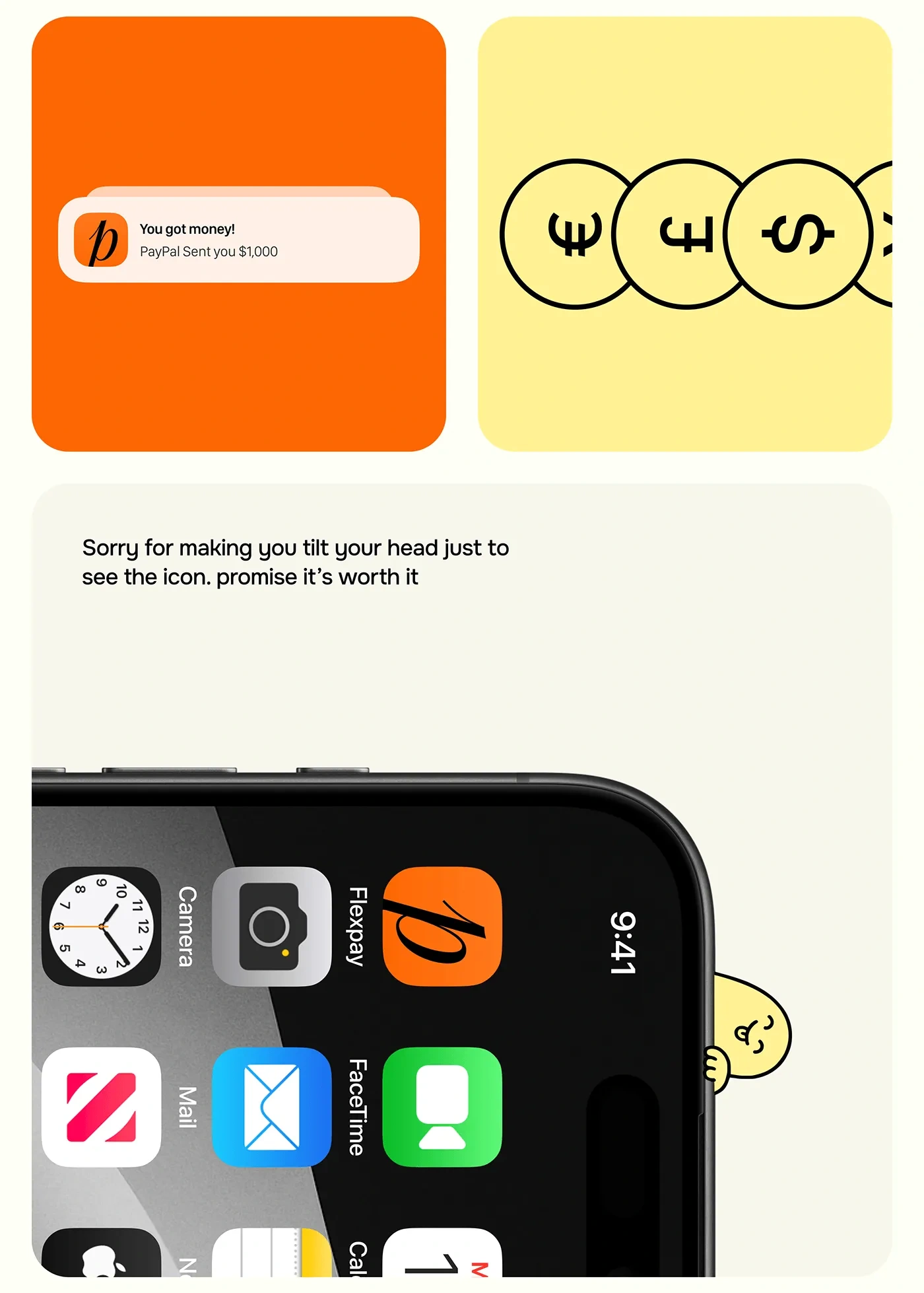
FlexPay app icon on the home screen and a payment notification
We also put the system on a building banner, a tote bag and an event badge to see if it holds away from the phone.
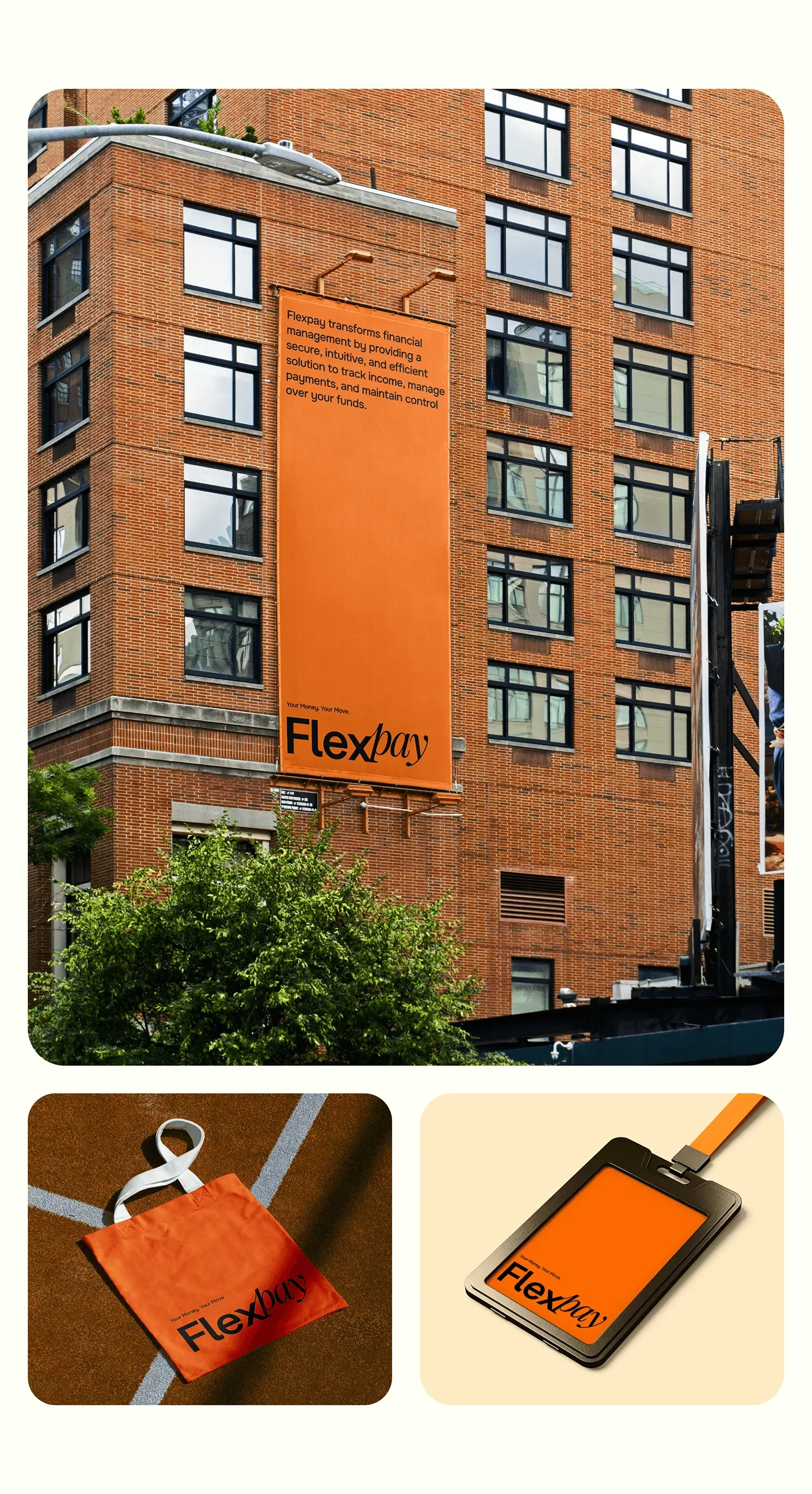
FlexPay brand on a building banner, a tote bag and a badge
Like this project
Posted Oct 29, 2026
The brand layer of FlexPay, a digital wallet app we designed in 2025: Onest type, four colours, a two-part wordmark and an italic p icon.
Likes
0
Views
2