E-commerce 3D icons: from pencil sketch to glass

Dject Studio


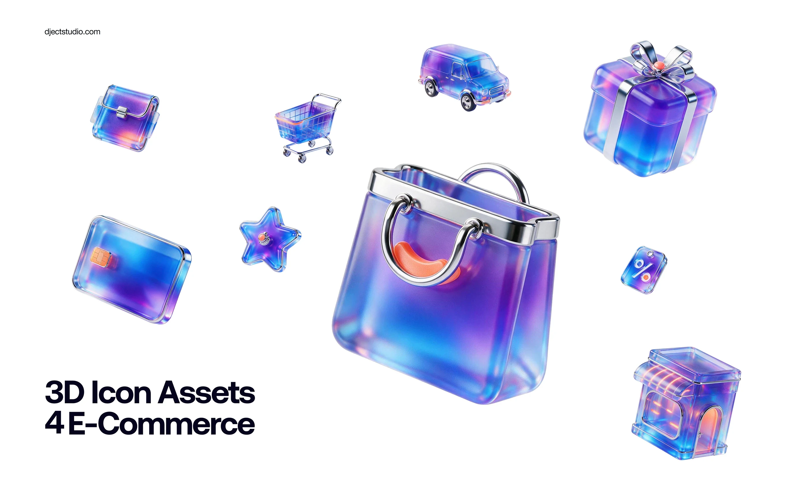
Most e-commerce icon sets we pulled into checkout screens were soft clay and pastel. Friendly, but they all looked the same. So we made our own set and changed the material, not the subject.
Paper first
Every icon started as a pencil thumbnail. Bag, coupon, card, cart, van, gift, store, megaphone. If a silhouette did not work flat on paper, glass and chrome were not going to save it.
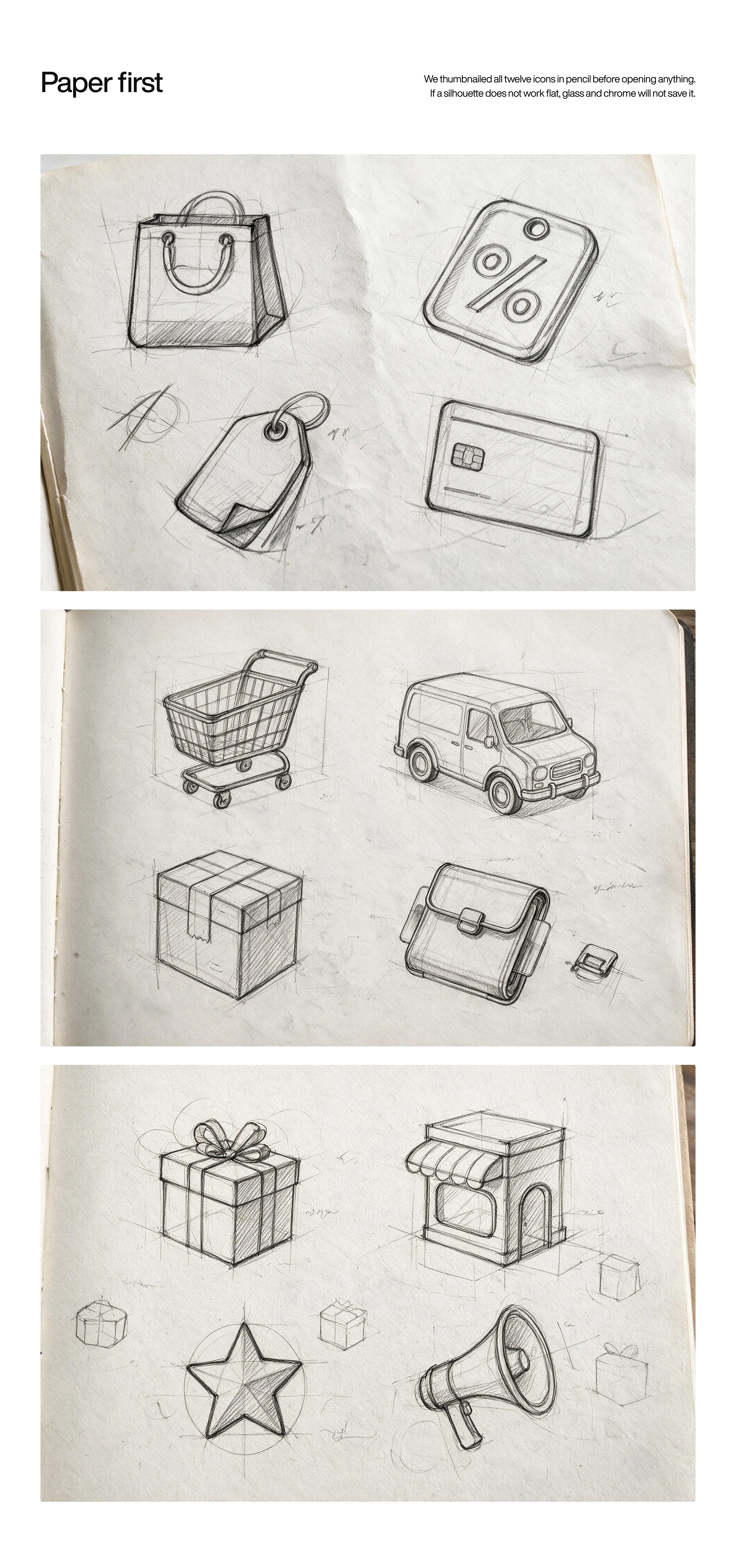
Pencil thumbnails of the e-commerce icons
Then a plain white clay pass in Blender, to check form and proportion with no colour in the way.
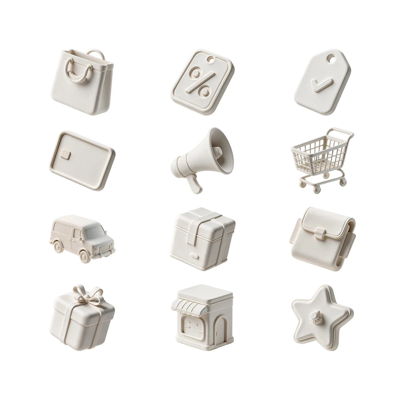
White clay pass of the icon set
Glass last
The final material is thick translucent glass with polished chrome parts, and one blue to violet gradient across the whole set. A small orange accent sits on each icon. The rule we kept the entire time: every icon still has to read at 24 pixels.
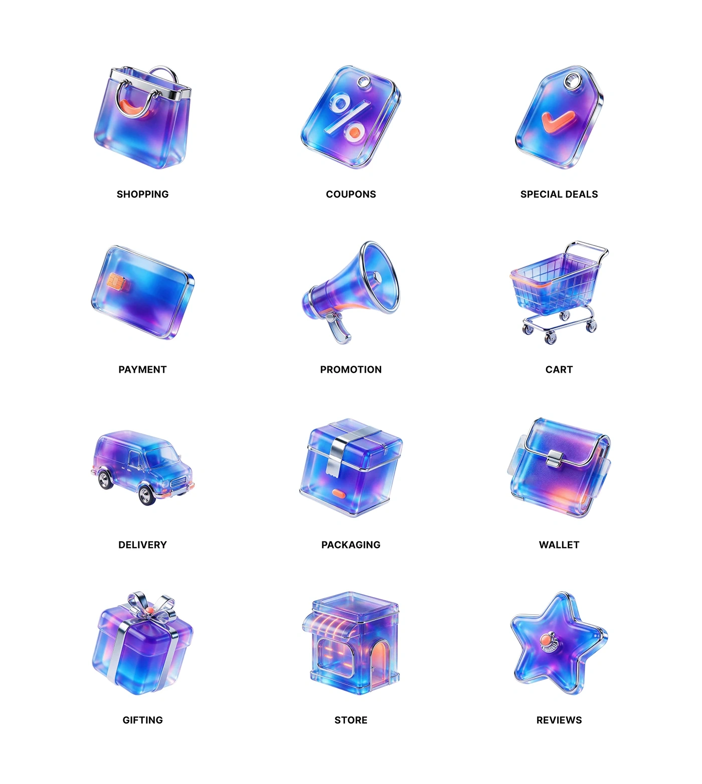
Final glass and chrome icons with labels
Like this project
Posted Oct 25, 2026
A 3D e-commerce icon set we took from pencil thumbnails to a clay pass, then to translucent glass and chrome.
Likes
0
Views
1