Ali Arshad
Creating with beating heart
- 1x
- Hired
- 13
- Followers



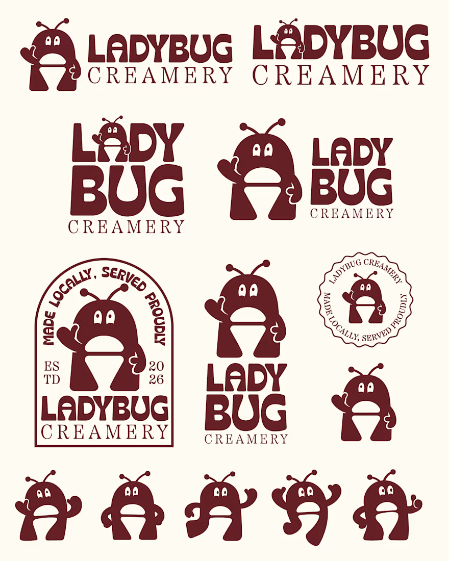
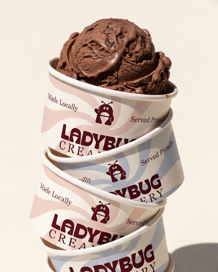
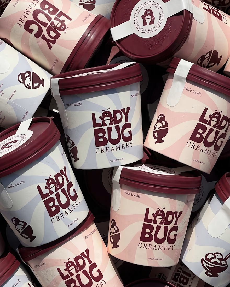
Ladybug Creamery - Visual Identity
Meet Ladybug Creamery, an artisan ice cream brand built around good ingredients, local roots and the simple joy of enjoying a really good scoop. With a focus on locally sourced dairy, fresh fruits and natural ingredients, the brand celebrates...


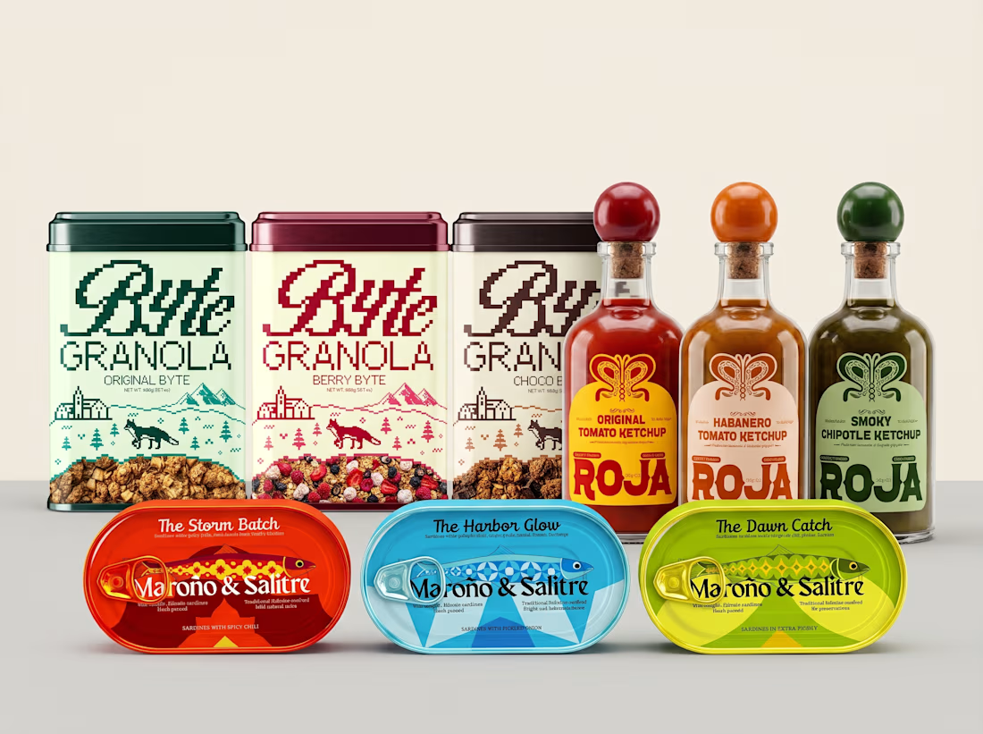
Something I think about a lot when working on packaging is that colors shouldn't just make things look nice. They can actually help people understand the product.
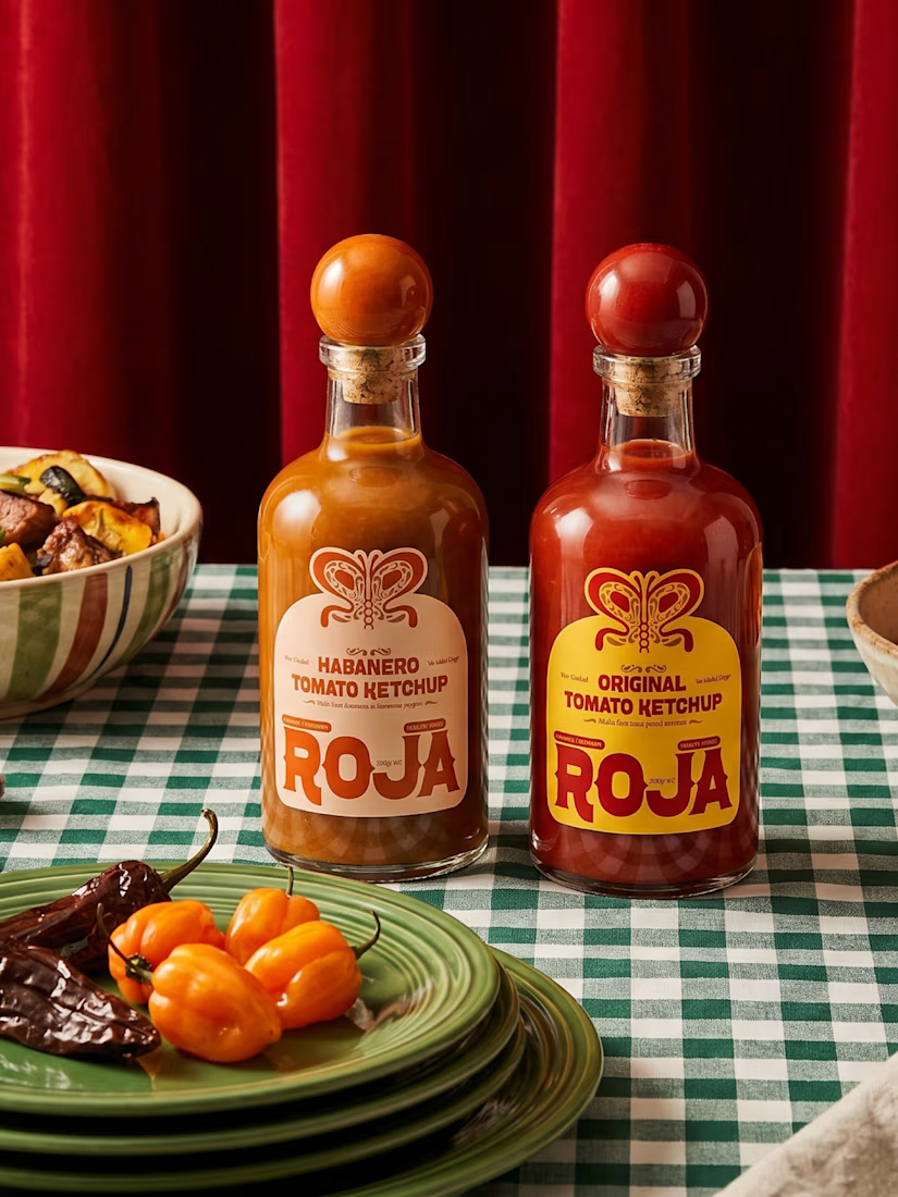
For Roja, I used color to separate the three ketchup flavors. Original is red, Smoky Chipotle is green, and Habanero...
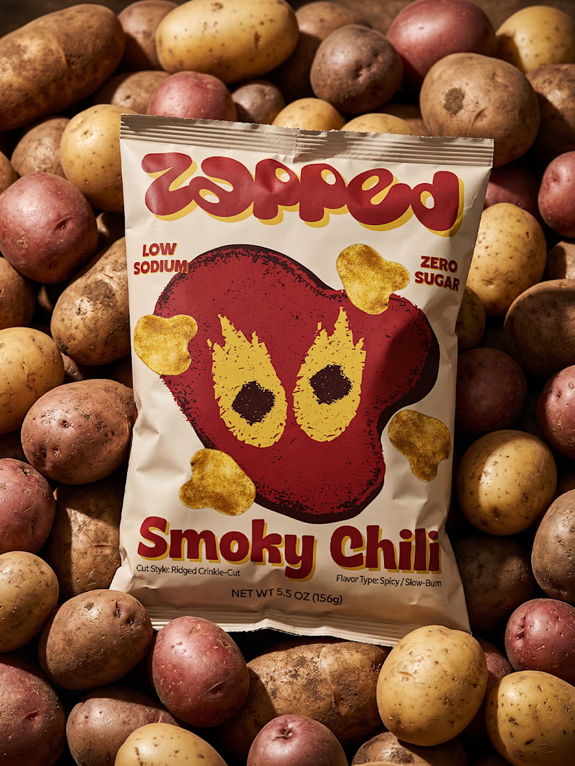
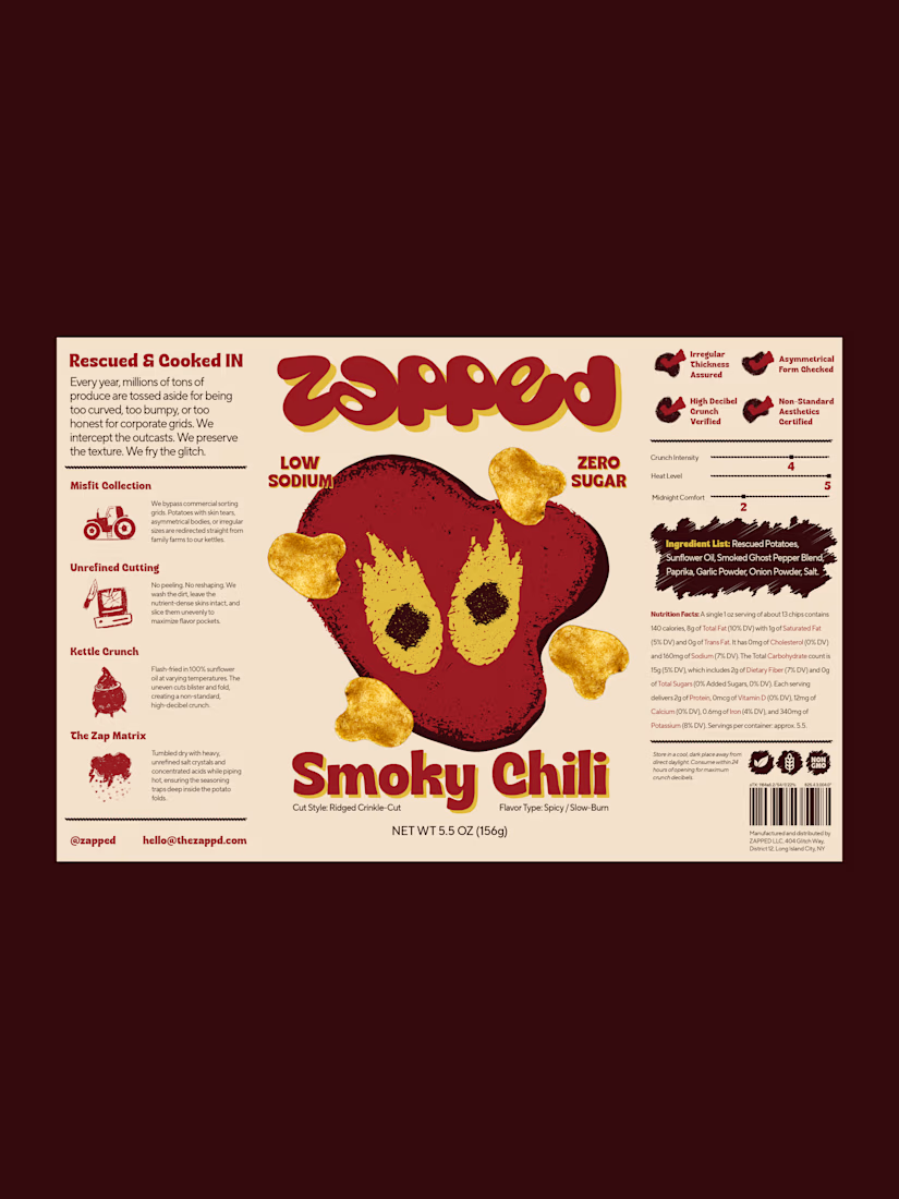
One thing I really liked exploring with ZAPPED was the contrast between the typography and the illustrations.
The front of the packaging is all about the big wordmark and the character, but when you look at the back, it feels more like a technical report. I added a little “Misfit...
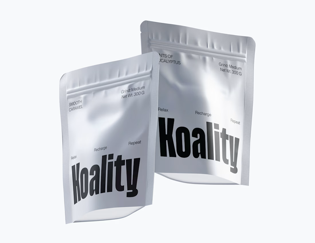
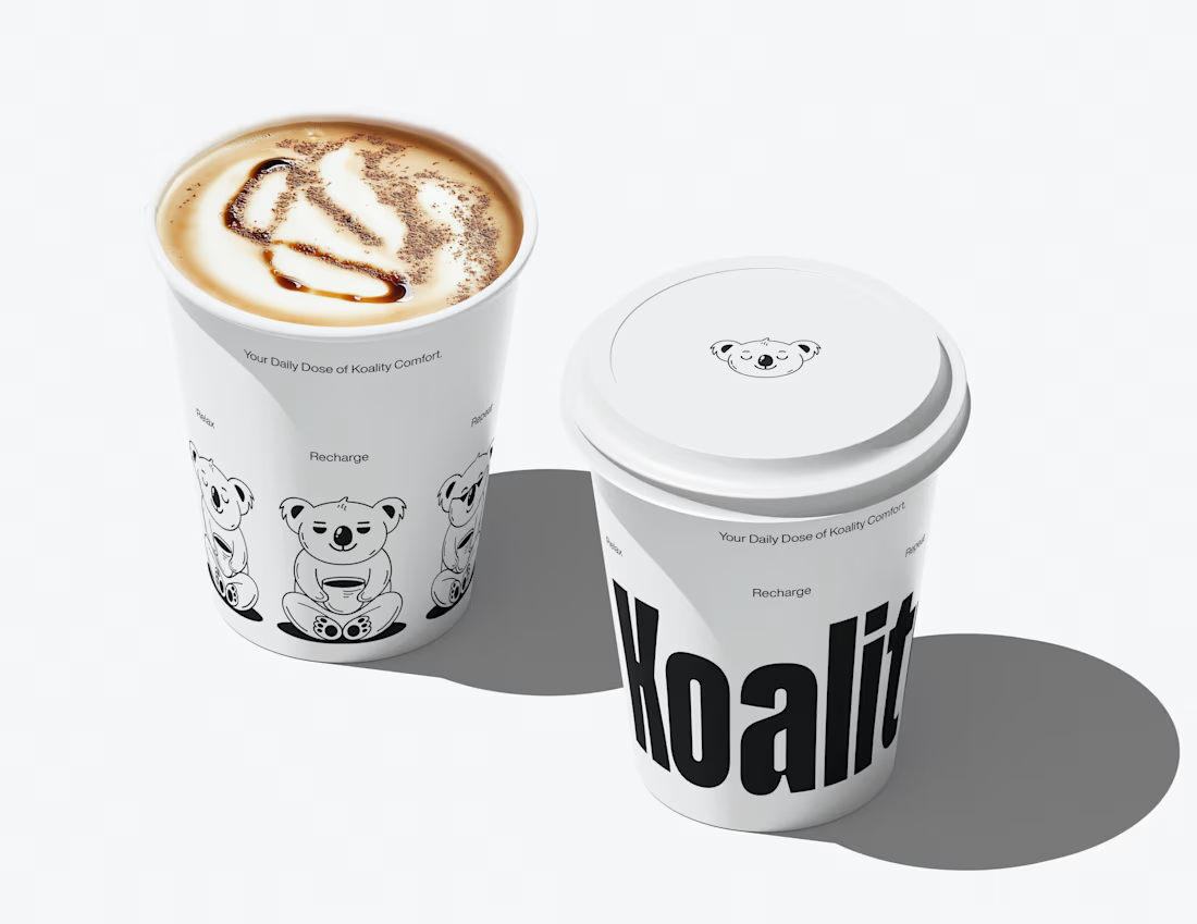
Two colors. That's it for Koality.
Charcoal black and a very light gray. I wanted to keep the palette really simple because the whole idea was to make the brand feel calm, clean and a little premium without adding too much.
Black gives the brand that strong, rich feeling,...
Ketchup doesn't have to come in a squeeze bottle.
That was the starting point for Roja.
Every ketchup on a supermarket shelf uses the same shape. Same squeeze bottle, same flip cap, same "sauce that gets forgotten in the fridge door" energy. And Roja isn't that kind of ketchup;...