The network for creativity
Join 1.25M professional creatives like you
Connect with clients, get discovered, and run your business 100% commission-free
Creatives on Contra have earned over $150M and we are just getting started
Back to feedPost

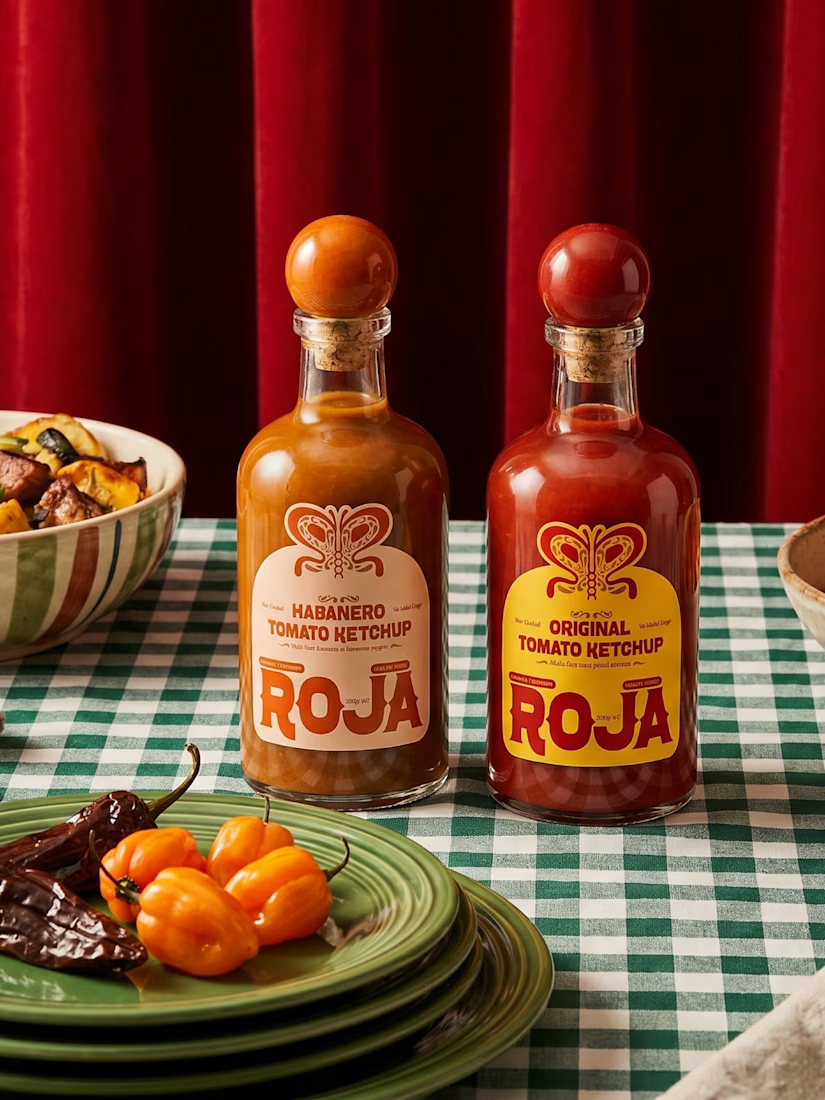
Ketchup doesn't have to come in a squeeze bottle.
That was the starting point for Roja.
Every ketchup on a supermarket shelf uses the same shape. Same squeeze bottle, same flip cap, same "sauce that gets forgotten in the fridge door" energy. And Roja isn't that kind of ketchup; it's built on a real story, a family's tomato fields in Michoacán, a recipe that actually tastes like tomatoes instead of sugar.
A squeeze bottle would've undersold all of that.
So the bottle shape changed first, before a single label was designed. Rounder body, cork-style rounded cap, something that sits on a table like a crafted sauce or a good olive oil, not a fast-food condiment.
Here's the thing about packaging shape: people register it before they register anything printed on it. Color, label, type; all of that comes second. The silhouette is the first signal of what category a product belongs to.
Change the silhouette, and you've already told someone "this isn't the ketchup you're used to" before they've read a single word.

Super well executed 🔥
Thank you!
The network for creativity
Join 1.25M professional creatives like you
Connect with clients, get discovered, and run your business 100% commission-free
Creatives on Contra have earned over $150M and we are just getting started








Related posts

Honey should taste like somewhere 🍯
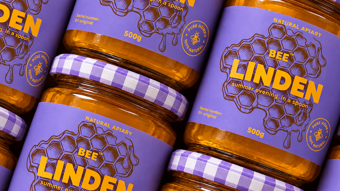
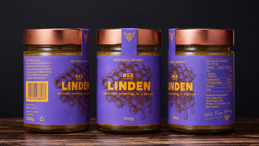
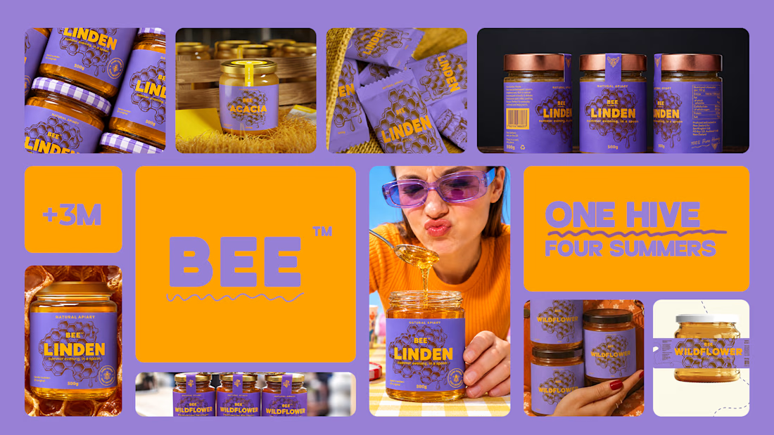
Spent the past week designing BEELINE, a single-apiary honey brand built on one idea: every jar comes from a specific place and time, so the packaging should show it.
No hexagons, no cartoon bees, no wooden crates. Just one thin line, the flight path of a bee from hive to flower, drawn short and direct for acacia, long and tangled for buckwheat. Four varieties, four colors, four routes. 🐝
Sometimes the most honest thing a jar can say is where it’s been.




Love the storytelling behind this packaging. Turning each bee’s flight path into a visual identity is such a clever touch.

A little packaging design appreciation 🌞
UluSoleil was one of my first big clients, and over time, I helped bring four of their products to life through packaging design.
This lip balm tube was all about balancing a delicate, feminine aesthetic with clear product communication, thoughtful typography, and functional packaging.
I’m still working on the full case study, but I wanted to share a little peek at the process!
More to come ✨

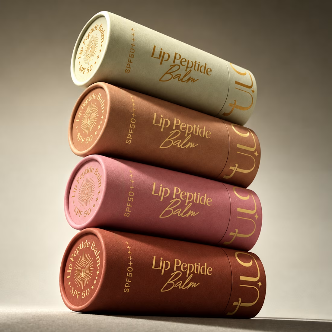
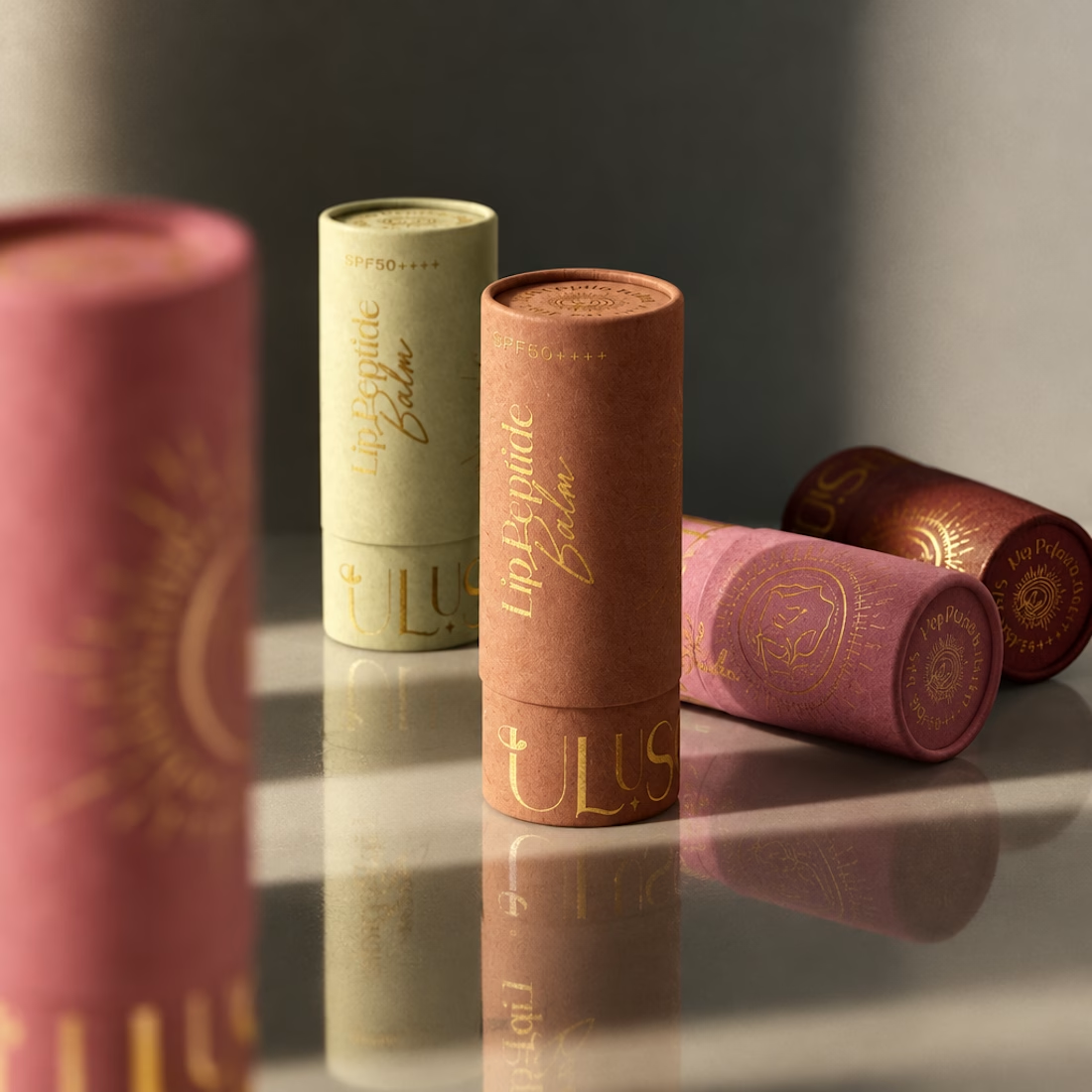

Gorgeous color story and tactile packaging! Beautiful work, Anita!

Static ad for a functional MagSafe bottle 👀
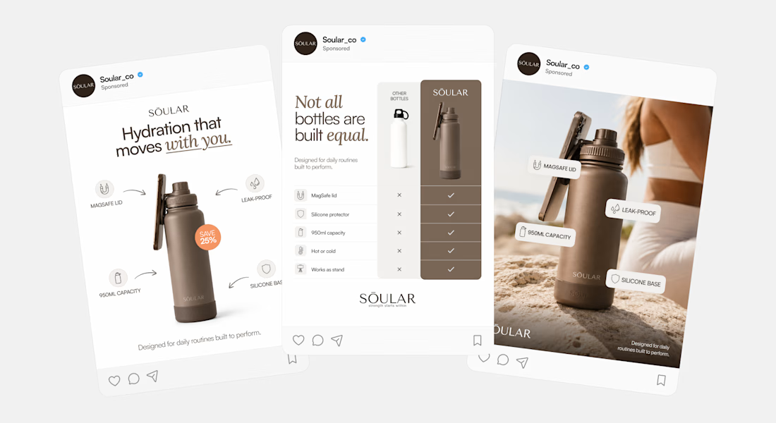

Really love this add ad design