The network for creativity
Join 1.25M professional creatives like you
Connect with clients, get discovered, and run your business 100% commission-free
Creatives on Contra have earned over $150M and we are just getting started
Back to feedPost

Two colors. That's it for Koality.
Charcoal black and a very light gray. I wanted to keep the palette really simple because the whole idea was to make the brand feel calm, clean and a little premium without adding too much.
Black gives the brand that strong, rich feeling, while the light gray keeps everything a little softer. I didn't feel like it needed warm oranges, browns or extra accent colors to make it feel like a coffee brand.
And I kept those same two colors everywhere. Cups, packaging, tote bags, signage. I could've added more colors when designing different things, but I actually liked the idea of not doing that. It keeps everything feeling like the same brand without having to think too much about whether things match.
Sometimes having fewer options actually makes the design easier. You have less to play with, but you also have less to mess up.
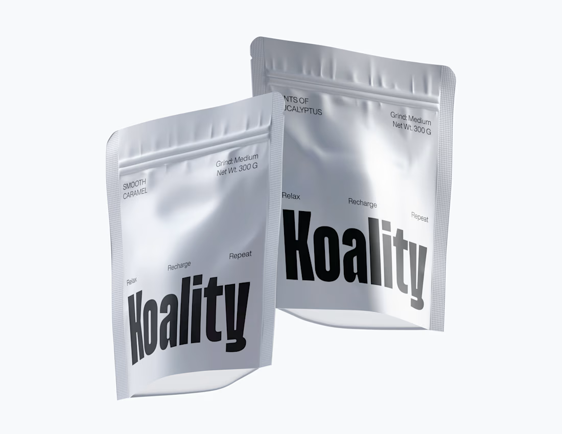
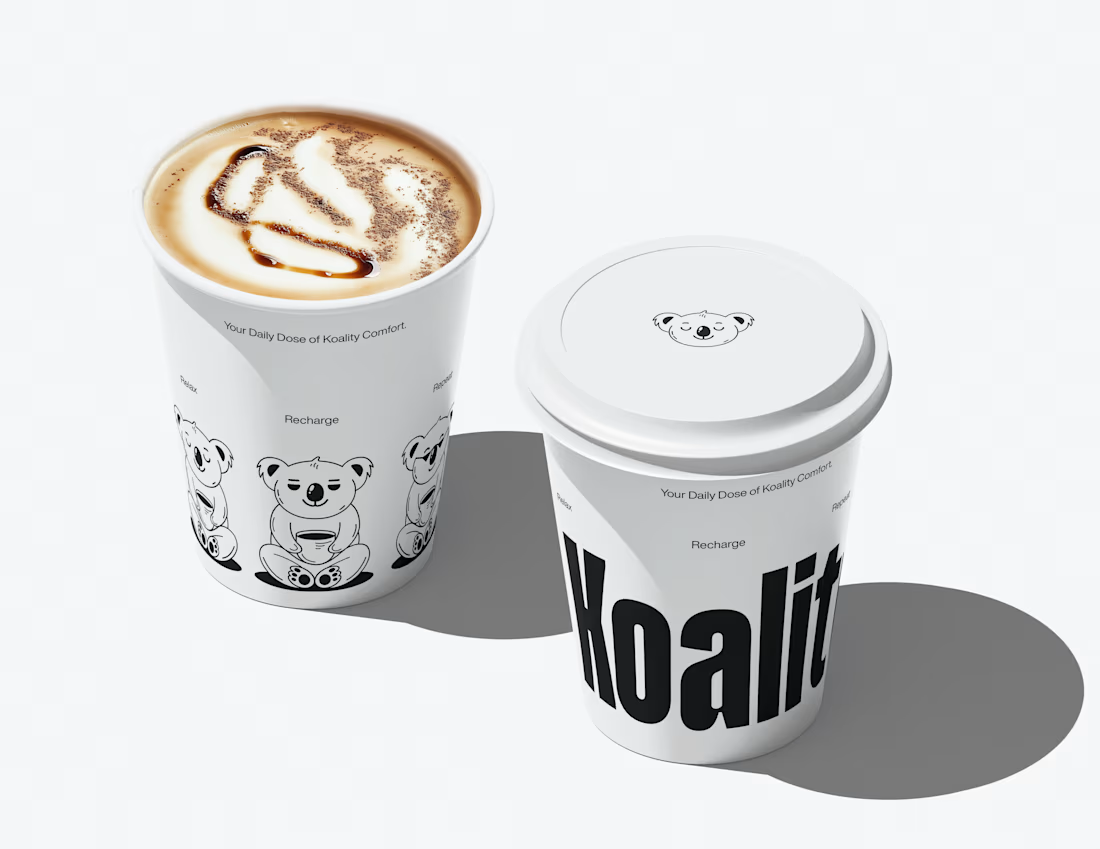

Committing to two colors across cups, bags and signage is braver than it looks in coffee, where almost everyone defaults to kraft and warm browns. The place I'd watch is the shelf and the ecommerce thumbnail, because a charcoal and light gray bag can disappear next to busier...
Thank you Mariana. Yes, through type weight or different expression of mascot plays a vital role to tell roasts or origins apart.
The network for creativity
Join 1.25M professional creatives like you
Connect with clients, get discovered, and run your business 100% commission-free
Creatives on Contra have earned over $150M and we are just getting started








Related posts

A little packaging design appreciation 🌞
UluSoleil was one of my first big clients, and over time, I helped bring four of their products to life through packaging design.
This lip balm tube was all about balancing a delicate, feminine aesthetic with clear product communication, thoughtful typography, and functional packaging.
I’m still working on the full case study, but I wanted to share a little peek at the process!
More to come ✨


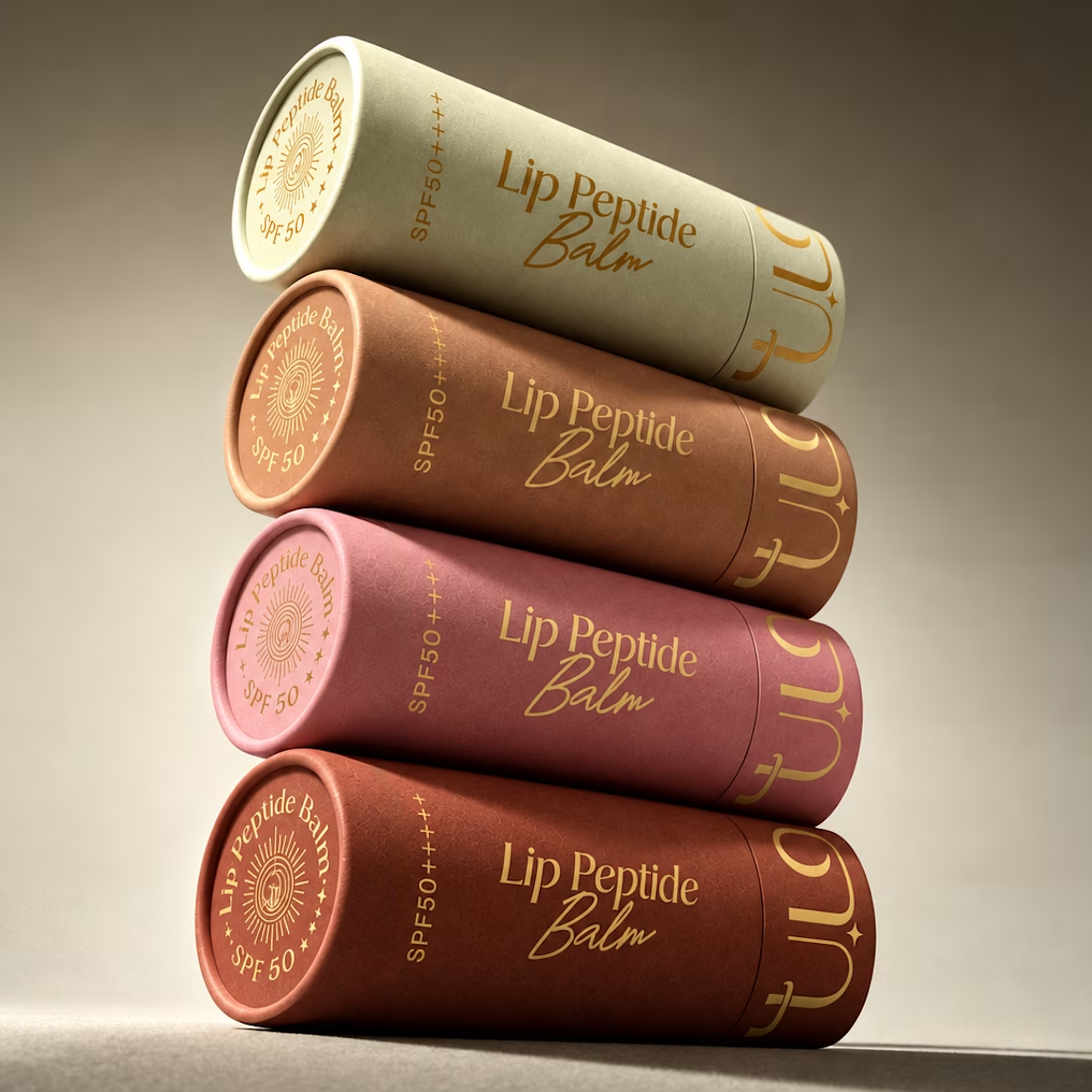
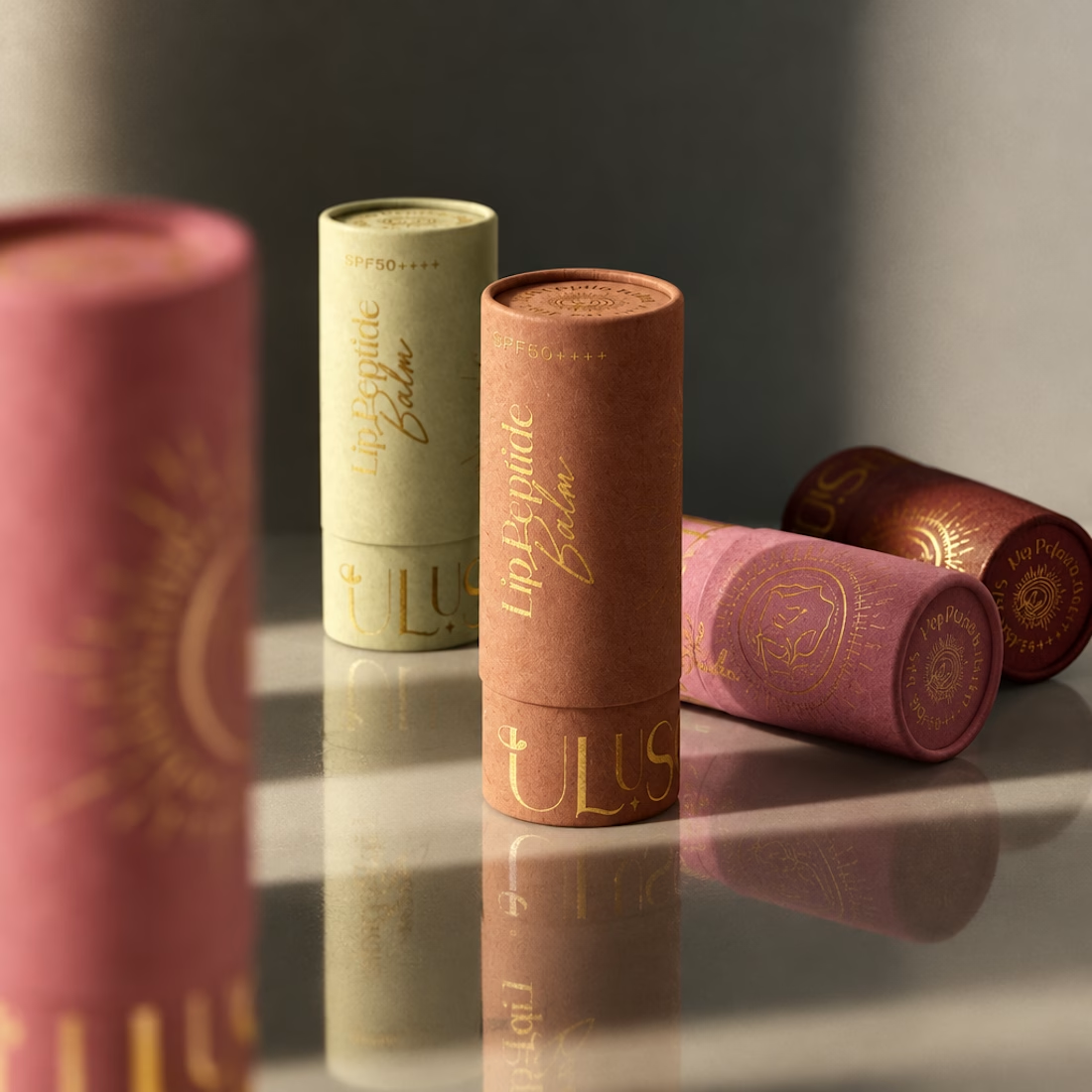

Gorgeous color story and tactile packaging! Beautiful work, Anita!

Honey should taste like somewhere 🍯
Spent the past week designing BEELINE, a single-apiary honey brand built on one idea: every jar comes from a specific place and time, so the packaging should show it.
No hexagons, no cartoon bees, no wooden crates. Just one thin line, the flight path of a bee from hive to flower, drawn short and direct for acacia, long and tangled for buckwheat. Four varieties, four colors, four routes. 🐝
Sometimes the most honest thing a jar can say is where it’s been.


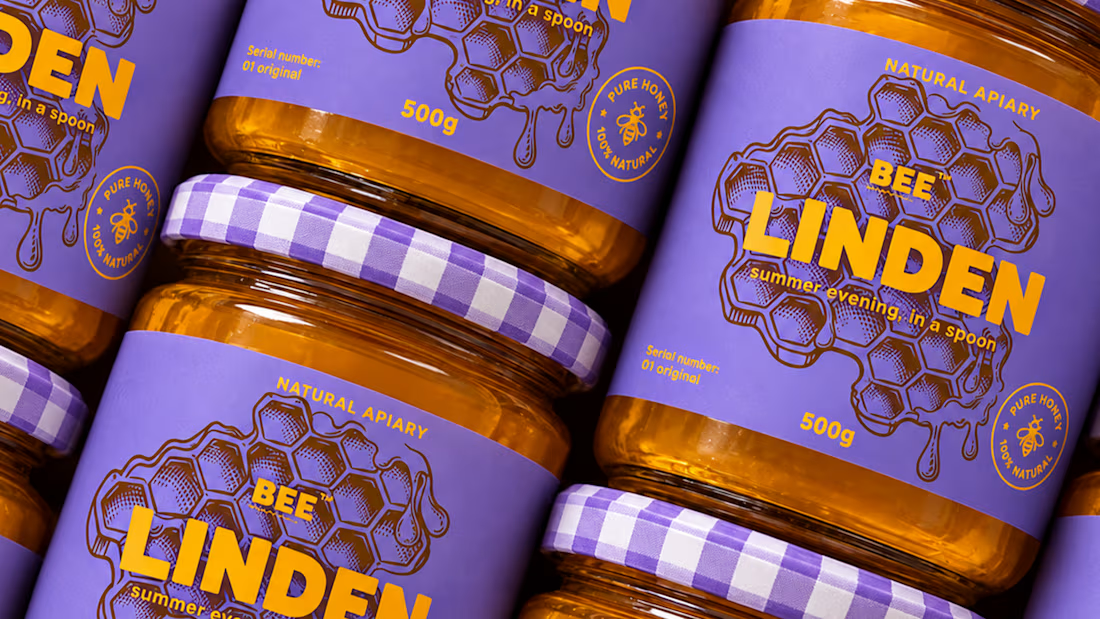
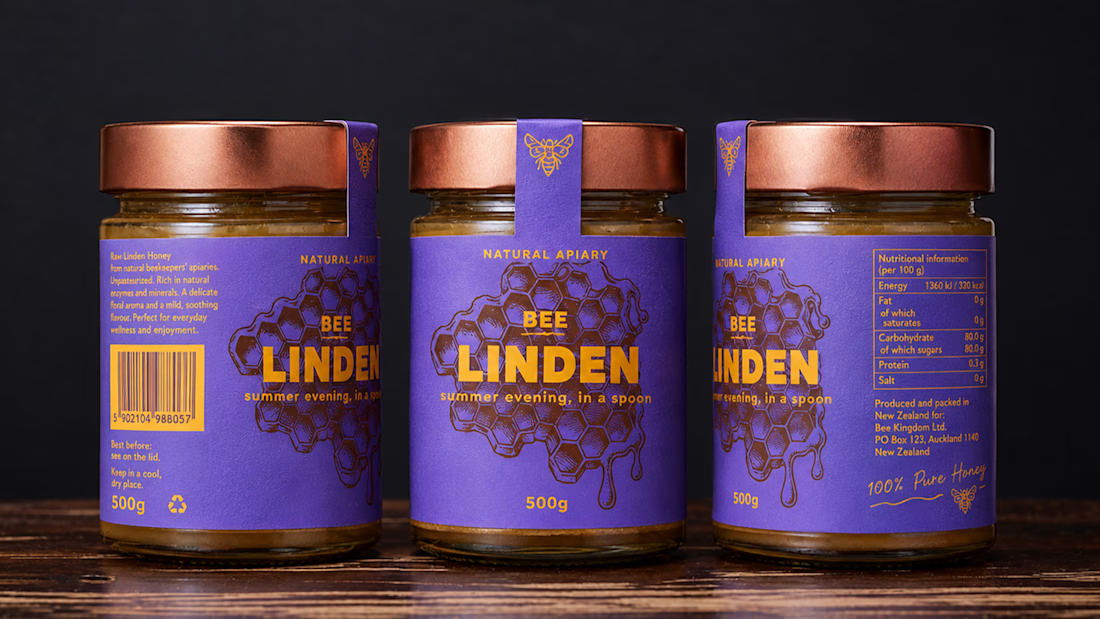
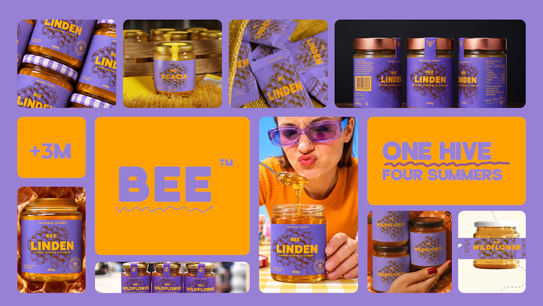


Love the storytelling behind this packaging. Turning each bee’s flight path into a visual identity is such a clever touch.

MARLOW is a modern fashion and clothing brand identity built around individuality, everyday style, and self-expression.
The branding combines a custom rounded wordmark, bold M monogram, warm red tones, and minimalist typography to create a confident and recognizable fashion identity.
From logo design and brand guidelines to apparel graphics, clothing labels, hang tags, packaging, shopping bags, stationery, and advertising campaigns, MARLOW creates a cohesive visual experience across fashion and lifestyle applications.
Services: Brand Identity, Logo Design, Fashion Branding, Clothing Brand Design, Apparel Branding, Packaging Design, Visual Identity.

That rounded M monogram in warm red sounds like it carries the whole system. Fashion identities live or die on the small touchpoints, so going all the way down to hang tags and labels is exactly right. Which piece of the rollout was the trickiest to keep consistent, the packaging or the apparel graphics?