


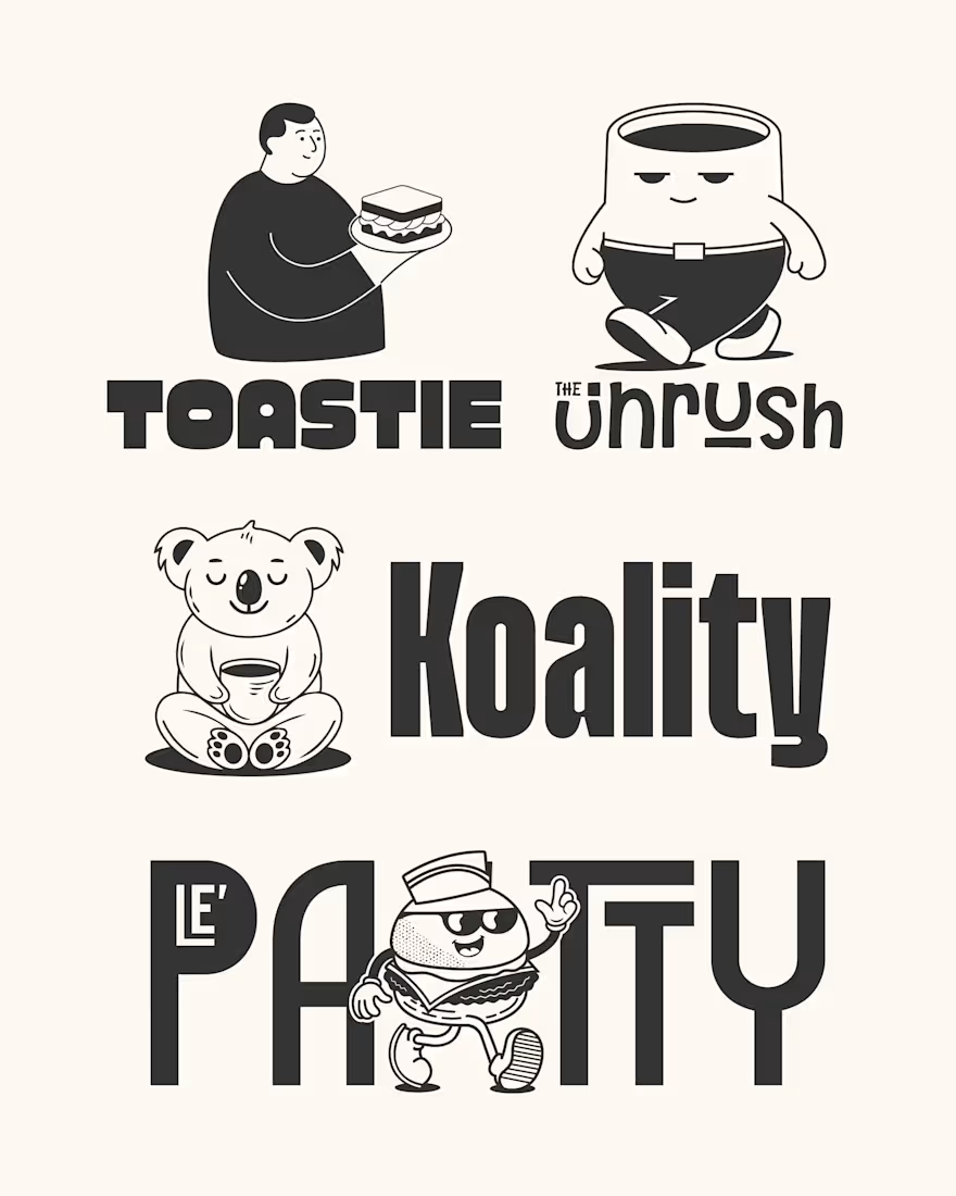
When I design a mascot, I don't want it to just look cute. I want it to do something for the brand.
For The Unrush, the sleepy coffee cup helps give the brand that calm, relaxed feeling. For Le'Patty, the burger character is playful, but still looks sharp and clean. Koality's...
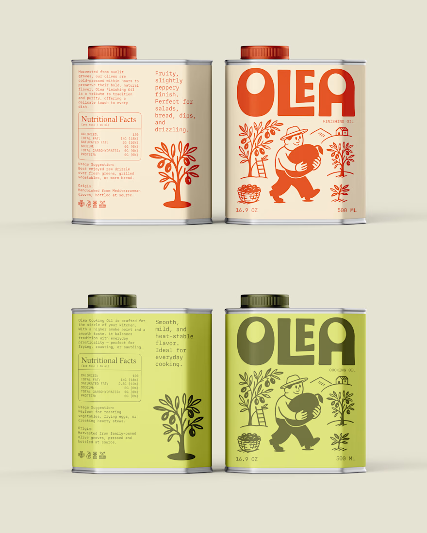
When you look at a lot of olive oil brands, you'll notice they have a pretty similar look. White backgrounds, gold details, elegant fonts and a little olive branch somewhere on the label.
When I was working on Olea, I didn't want to go in that direction. I wanted the brand to...
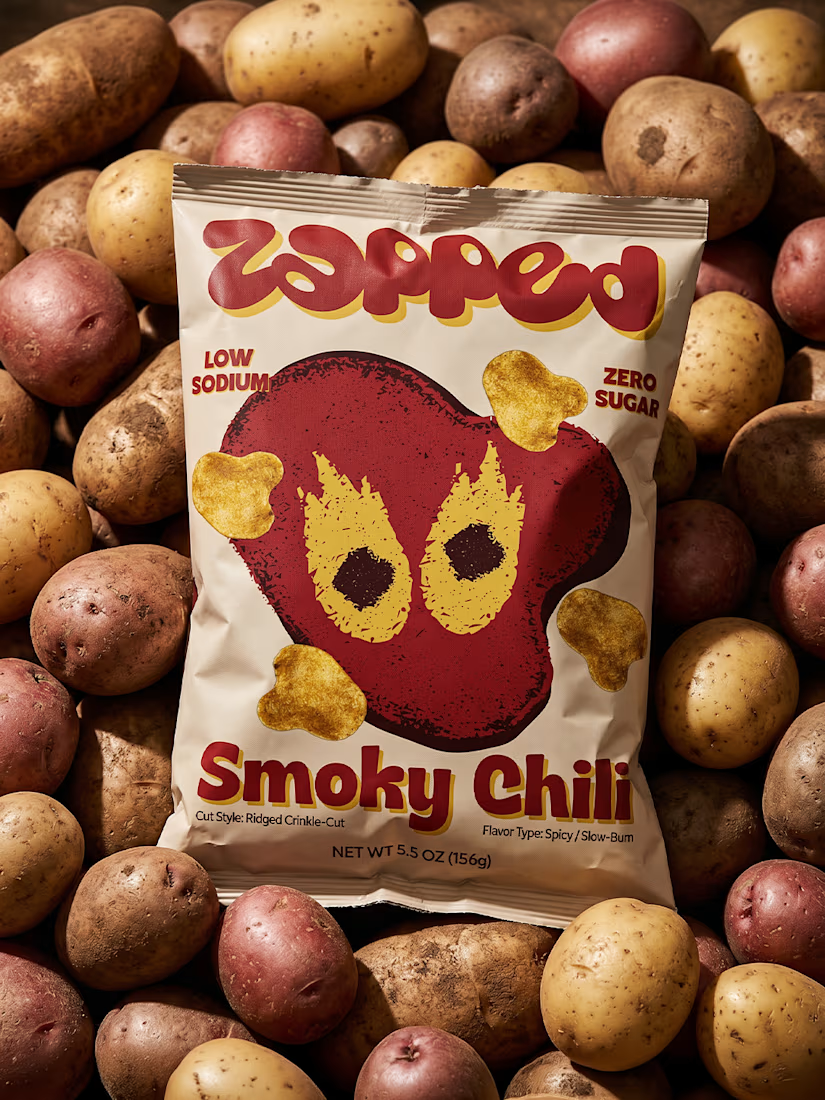
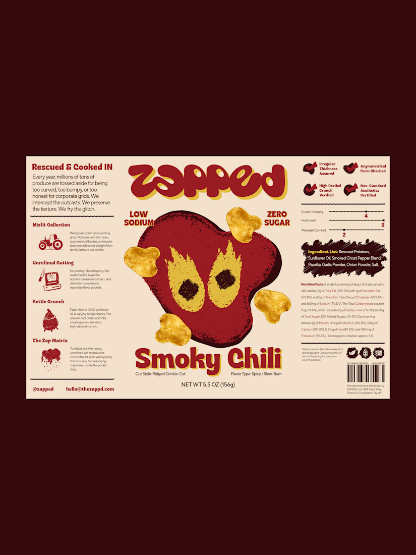
One thing I really liked exploring with ZAPPED was the contrast between the typography and the illustrations.
The front of the packaging is all about the big wordmark and the character, but when you look at the back, it feels more like a technical report. I added a little “Misfit...
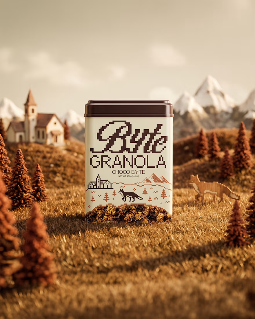
Granola is one of those products where a lot of brands start looking the same. Kraft paper bags, earthy colors, a simple logo and a picture of oats. There's nothing wrong with that, but I wanted Byte to feel a little different.
So instead of going with the usual bag or box, I...
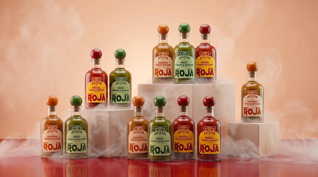
Roja has three ketchup flavors, and I wanted each one to have its own color while still feeling like part of the same brand.
Original stays red, Smoky Chipotle gets green, and Habanero gets a warm orange. The bottle shape and wordmark stay the same, so the colors are what help...