The network for creativity
Join 1.25M professional creatives like you
Connect with clients, get discovered, and run your business 100% commission-free
Creatives on Contra have earned over $150M and we are just getting started
Back to feedPost

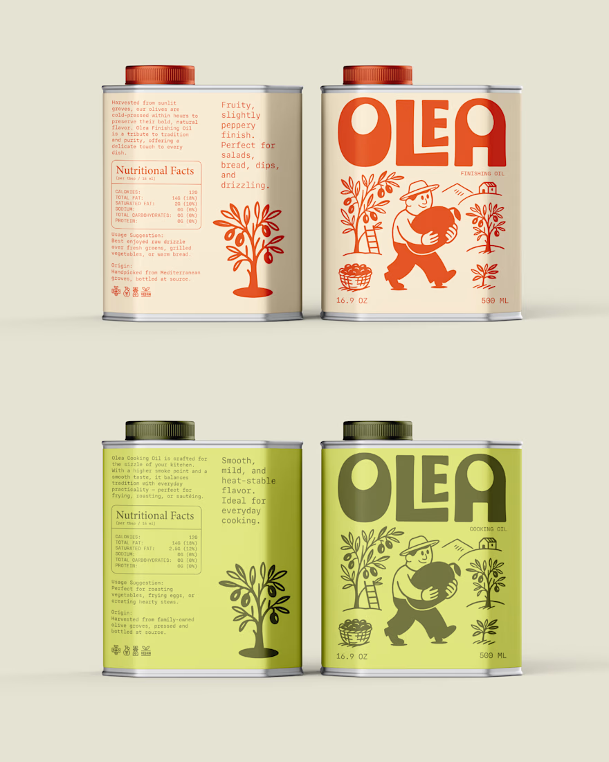
When you look at a lot of olive oil brands, you'll notice they have a pretty similar look. White backgrounds, gold details, elegant fonts and a little olive branch somewhere on the label.
When I was working on Olea, I didn't want to go in that direction. I wanted the brand to feel more like something you'd actually use in your kitchen, not something that looks too fancy to touch. Olive oil is part of everyday cooking, and I wanted the identity to show that side of it.
So I went with a bold, chunky logo, warm reds and greens, and a little farmer carrying a giant olive across the label. I wanted the whole thing to feel a little playful and approachable instead of going for that usual premium look.
I think sometimes we follow what's already popular in a category without questioning whether it actually fits the brand. For Olea, I felt like doing something different made more sense than following the same style as everyone else.
The network for creativity
Join 1.25M professional creatives like you
Connect with clients, get discovered, and run your business 100% commission-free
Creatives on Contra have earned over $150M and we are just getting started








Related posts

Brand identity exploration
Which one do you think it fits better?
36 voted
77%
11 voted
23%

47 votes
Closed

Cobalt is great Gold is unique 🎉🎉🔥🔥

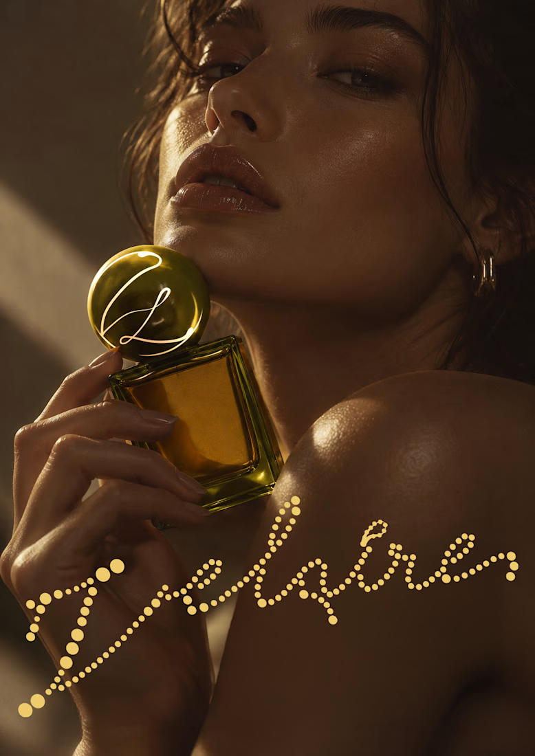
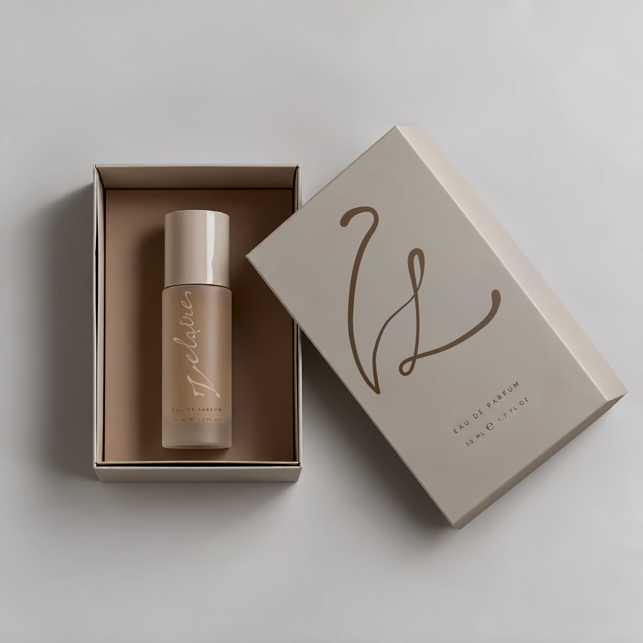
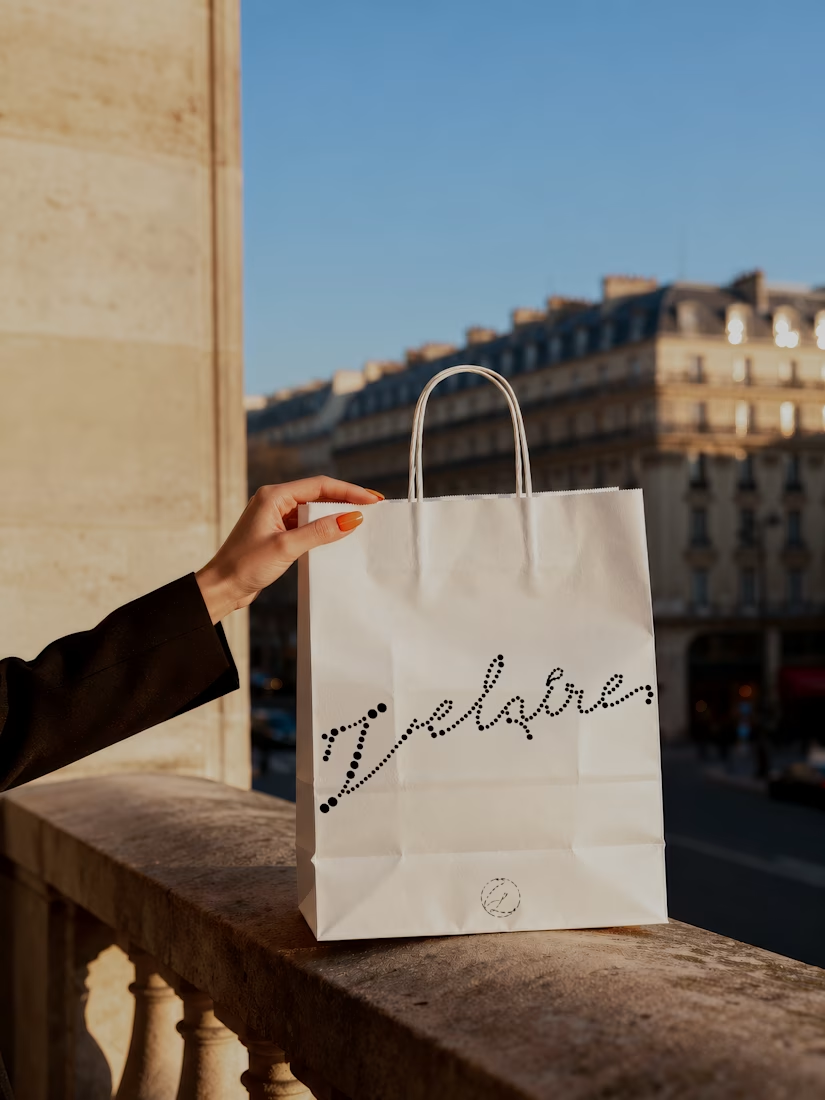
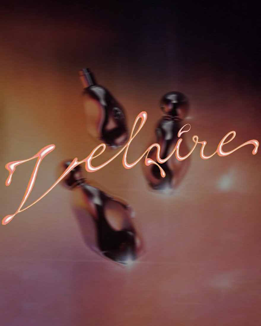
VELAIRE — Beauty & Fragrance Visual Identity
A self-initiated identity exploring custom lettering, sensual art direction and a refined visual system across packaging, editorial and digital applications.
Currently open to freelance and remote collaborations in branding, music, fashion and culture.
Visual Identity · Art Direction · Logo Design · Campaign Design
#VisualIdentity #ArtDirection #BrandDesign #LogoDesign #GraphicDesign


Great brand identity Yaren that's really luxury 🔥🔥


Same brand. Same palette. Two completely different proposals for a real estate developer.
A: An isotype built from blocks. Geometric, precise, the language of construction. It says we build.
B: Custom lettering with movement. Warmer, more editorial. It says we build places you’d want to live in.
36 voted
51%

35 voted
49%

71 votes
Closed

My vote is B, Milagros. Custom lettering with movement has real editorial warmth, which suits a developer selling places people actually want to live in.