The network for creativity
Join 1.25M professional creatives like you
Connect with clients, get discovered, and run your business 100% commission-free
Creatives on Contra have earned over $150M and we are just getting started
Back to feedPost
Something I think about a lot when working on packaging is that colors shouldn't just make things look nice. They can actually help people understand the product.
For Roja, I used color to separate the three ketchup flavors. Original is red, Smoky Chipotle is green, and Habanero is orange. For Byte, I used used different colors to distinguish berry choices. And with Maroño & Salitre, I wanted the colors to match the mood of each sardine flavor.
So even though I'm using color in all three projects, the reason behind it is different. Sometimes it's helping people tell products apart, and sometimes it's helping tell the story behind the product.
I think that's what makes choosing colors interesting. It's not just about finding a palette that looks good. You also have to think about what those colors are actually doing for the brand.
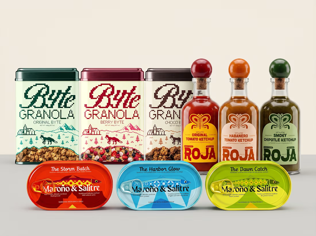


green for smoky chipotle is the one id have argued about. did the client push back on it?

the green was intentional, the reason was to to give each flavor its own identity across the range than following the usual color expectations for each flavor.
The network for creativity
Join 1.25M professional creatives like you
Connect with clients, get discovered, and run your business 100% commission-free
Creatives on Contra have earned over $150M and we are just getting started



Related posts

Can AI create a professional-looking logo?
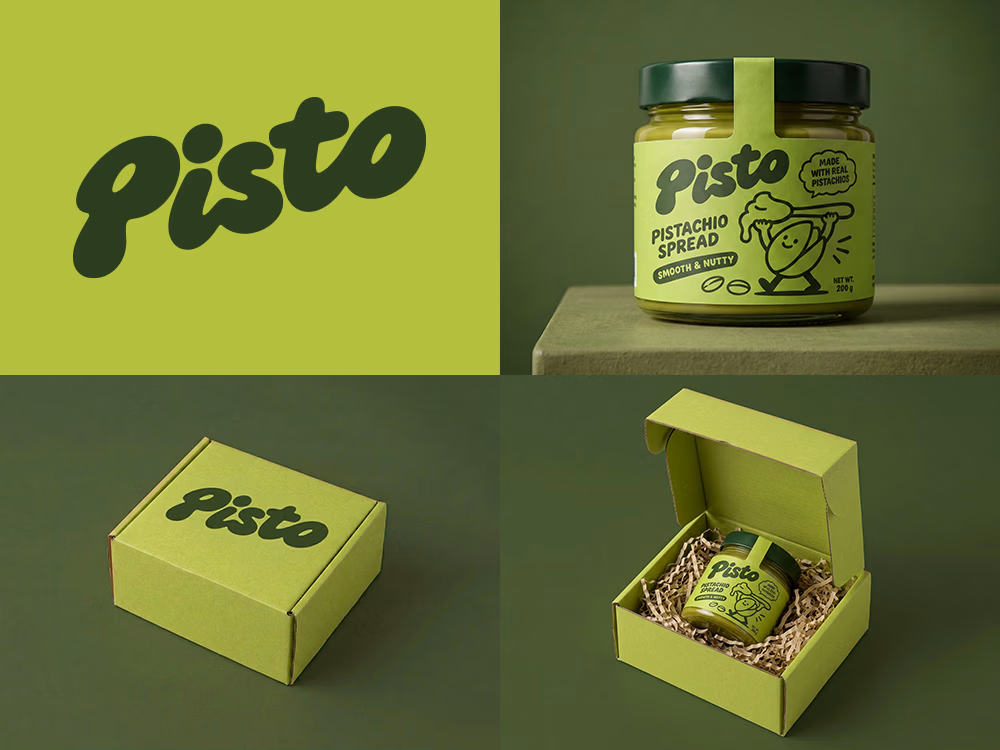
I tried to create a logo concept for a pistachio spread brand using Recraft Logo Maker.
After answering a few questions about the brand and going through several variations, I finally landed on a logo that felt right and captured the fun, fresh personality I had in mind.
But I didn't want to stop at just the logo.
I took it a step further by exploring how the identity could come to life through product packaging and a branded mailer box.
A quick process video is included in the comments.
What do you think?


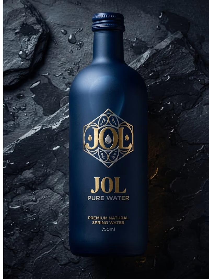
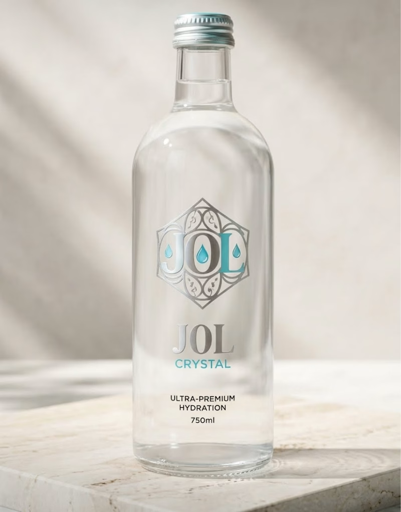
Which J0l bottle design stands out more to you?
I am testing two packaging directions for J0l, a luxury water concept I designed.
On one side, I created a bold, matte midnight blue bottle with gold accents. On the other, I designed a clean, crystal clear glass bottle with silver and teal details.
Which look grabs your attention first? Let me know in the poll below!
0 voted
0%
1 voted
100%
1 vote
Closed

Love how clean and well-balanced this is.

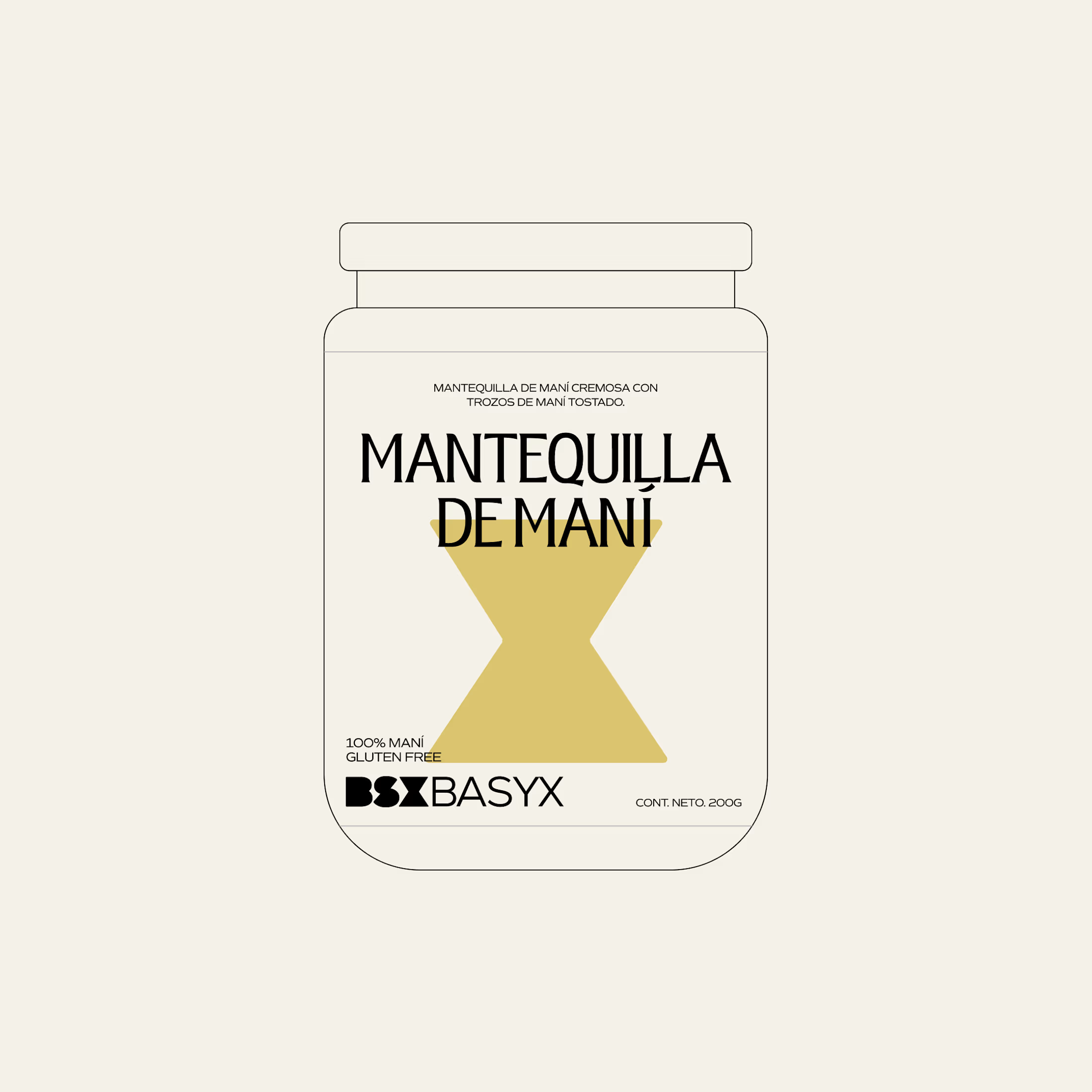
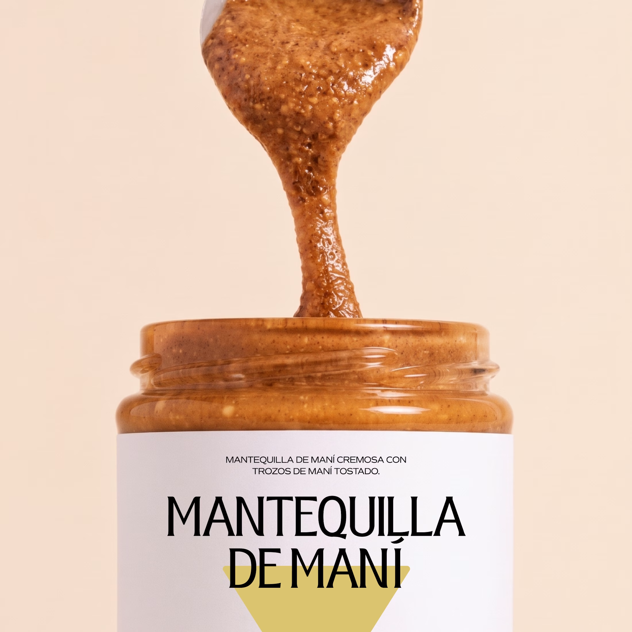
Minimal packaging is not less work. It’s MORE decisions 🤍
On a recent project, I spent a whole day on one thing: the spacing between two phrases in a label. Nobody will ever notice it. But everyone will feel it.
When there is nothing else on the label, every small adjustment has to carry the brand.
Do you also lose hours on details no client will ever mention? 😅

So true. A whole day on the spacing between two phrases sounds about right, and it's exactly why good packaging just feels right.