The network for creativity
Join 1.25M professional creatives like you
Connect with clients, get discovered, and run your business 100% commission-free
Creatives on Contra have earned over $150M and we are just getting started
Back to feedPost

One thing I really liked exploring with ZAPPED was the contrast between the typography and the illustrations.
The front of the packaging is all about the big wordmark and the character, but when you look at the back, it feels more like a technical report. I added a little “Misfit Quality Audit” checklist, some sidebars and all the product details to make it feel like ZAPPED is actually checking the quality of these weird-looking potatoes.
I also wanted the typography to have that same contrast. The main type is chunky, bold and full of personality, while the smaller text uses a clean, typewriter-style font. I like how these two styles work together. One grabs your attention, while the other keeps all the information easy to read.
I think this contrast makes the packaging more interesting. It's playful and a little chaotic, but there's still some structure to it.
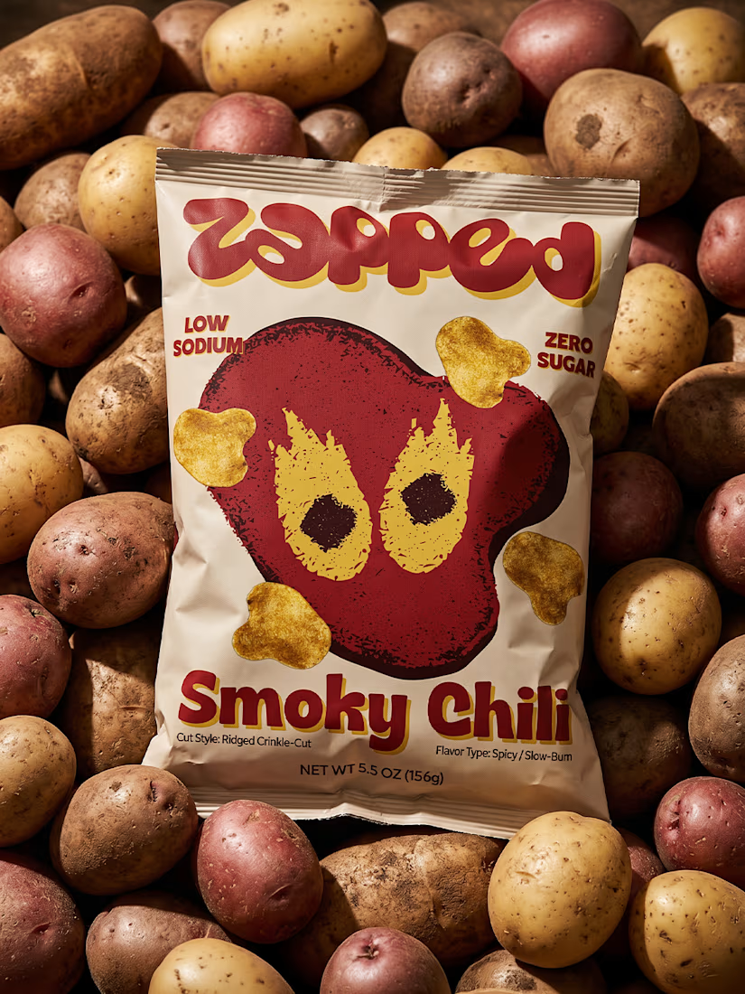
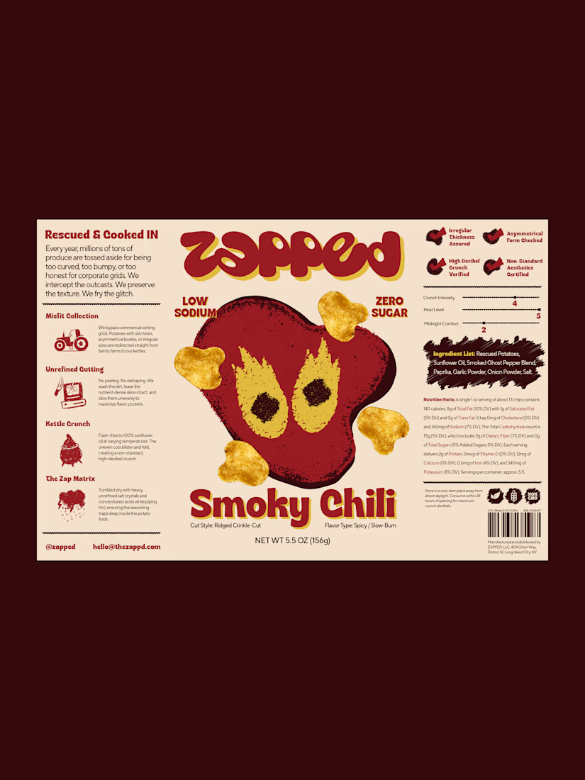


The chunky wordmark against the typewriter-style back panel works nicely, and the deep maroon makes the yellow chili illustration pop off the bag.
Thank you!
The network for creativity
Join 1.25M professional creatives like you
Connect with clients, get discovered, and run your business 100% commission-free
Creatives on Contra have earned over $150M and we are just getting started











Related posts

Not every client comes to me for a brand identity and not all my clients are skincare or cosmetic brands.
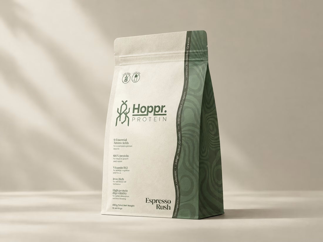
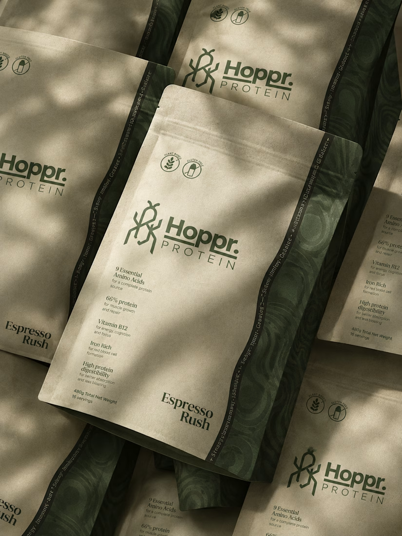
That was the case with Hoppr, a protein powder brand made from crickets. 🦗 YES, CRICKETS!
Sometimes the logo, colors, and visual system are already there and my job is to bring them to life on packaging and see how far I can push them.
I love projects like this because I get to play with typography, layout, and materials while working within an existing identity.
How much freedom do you think a designer should have when working with an established brand?


Great packaging work, nice job

A refreshing color palette inspired by each flavor, paired with bold yet minimal typography, creates strong shelf presence while maintaining a natural and premium feel.


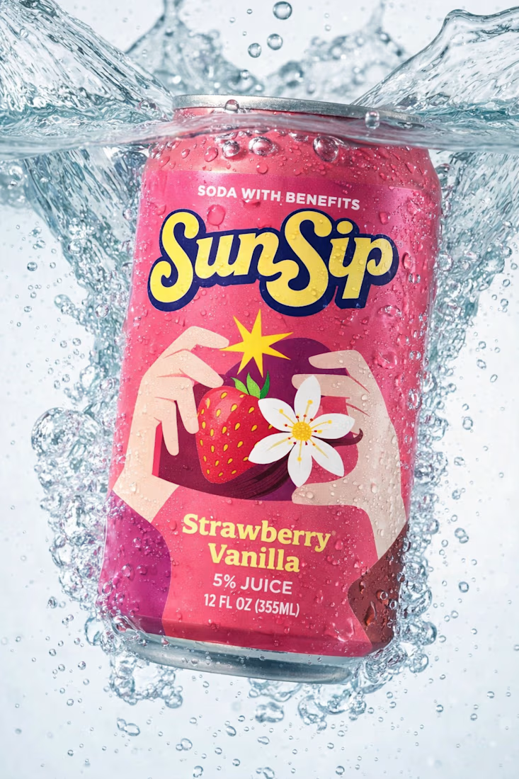

Flavor-led palettes are such a smart system for soda packaging, Umar. The SunSip strawberry can reads bright and playful while that bold minimal type keeps it feeling premium rather than loud.

Built this in Framer as a concept project. Goal was to make it feel run by ex-journalists. Choices: editorial serif (Libre Baskerville), a dark photo with one color accent, and copy that positions against blast-style PR.
Where I’m unsure: text legibility over the photo and whether the two CTAs compete. What would you change?




That's great design it feels professional I like how the background mixed with interface ❤️❤️
Great job Cheree🎉🎉