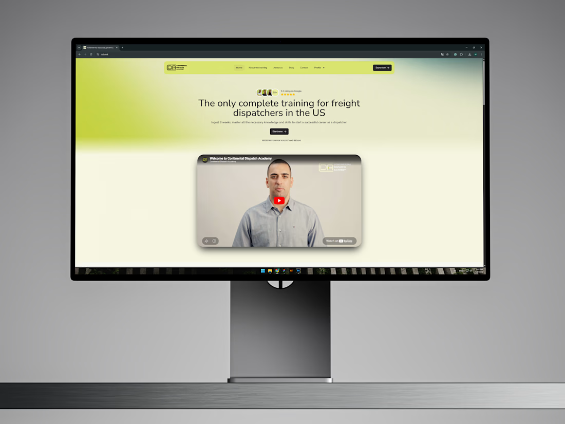


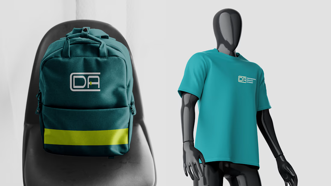
Continental Dispatch Academy is an academy training people to become a logistics dispatcher and start a new career.
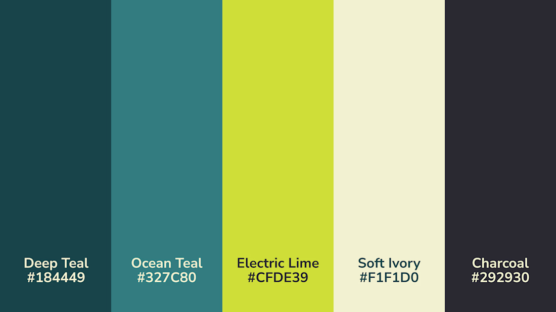
I went for a fresh, modern, and energetic direction to attract a younger demographic making serious career decisions. Combining it with colors that represent...

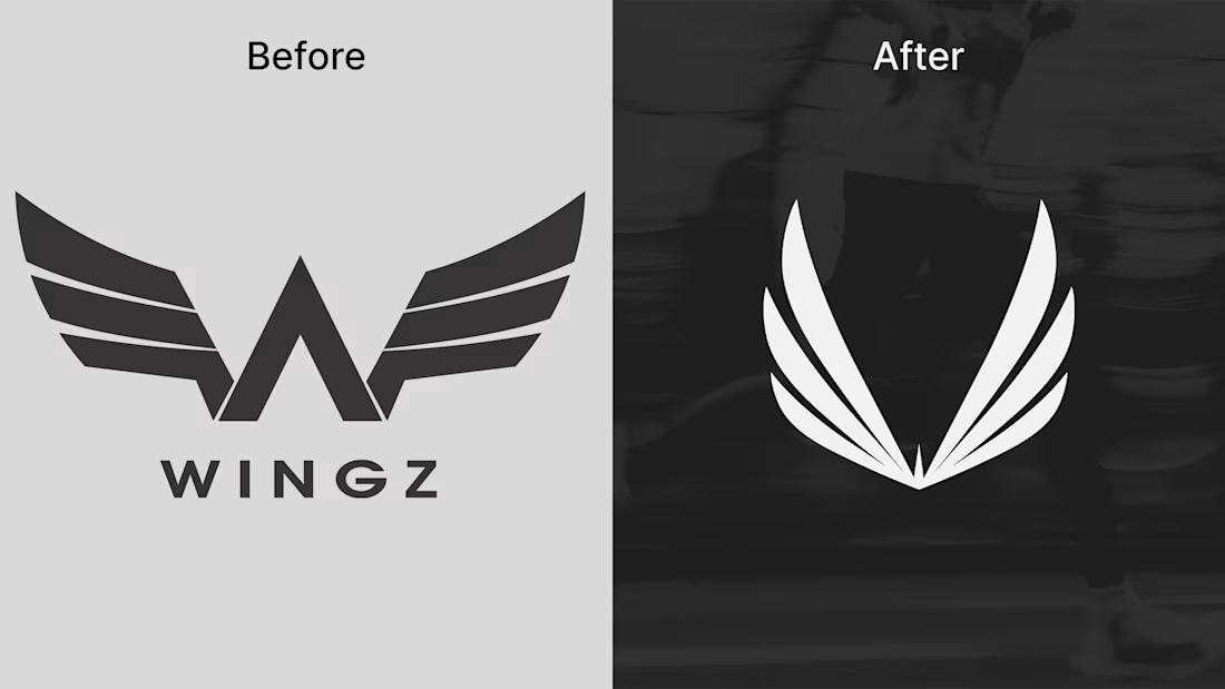
Refreshed the logo for Wingz (Activewear Brand). The problem with the old design was that it was too detailed and chunky. It needed something that would resemble movement, speed, and have a strong presence. To solve this, I broke down the original wing shape and rebuilt it using...
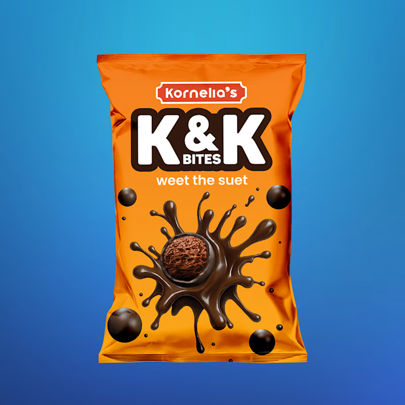
Taking a packaging project from zero assets to a finished product is always a fun challenge.
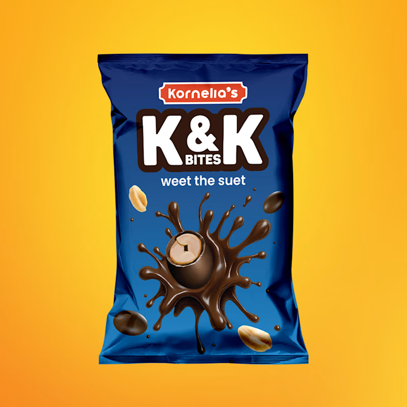
For K&K Bites, I built out the sub-brand identity completely from scratch. We went with a bold, high-contrast palette, electric orange and royal blue, to make sure these pouches actually...
7 voted
78%
2 voted
22%
9 votes
Closed
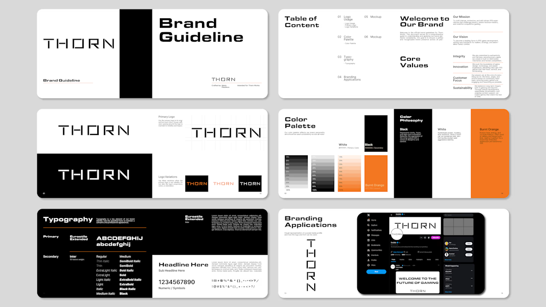
Most gaming studios by default go with loud neons, aggressive shapes, and cluttered graphics. For Thorn, I went the opposite way, pure visual restraint.
Built a clean, modern wordmark paired with a dark palette, a sharp burnt orange accent, and locked-in brand guidelines so the...

Most course academies have the same problem - being able to balance informative content and a clean, high-converting enrollment process.
For Continental Dispatch Academy, I designed a website in Figma that would help reinforce course data, student testimonials, and a smooth...