The network for creativity
Join 1.25M professional creatives like you
Connect with clients, get discovered, and run your business 100% commission-free
Creatives on Contra have earned over $150M and we are just getting started
Back to feedPost

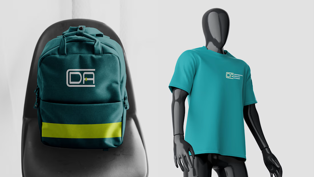
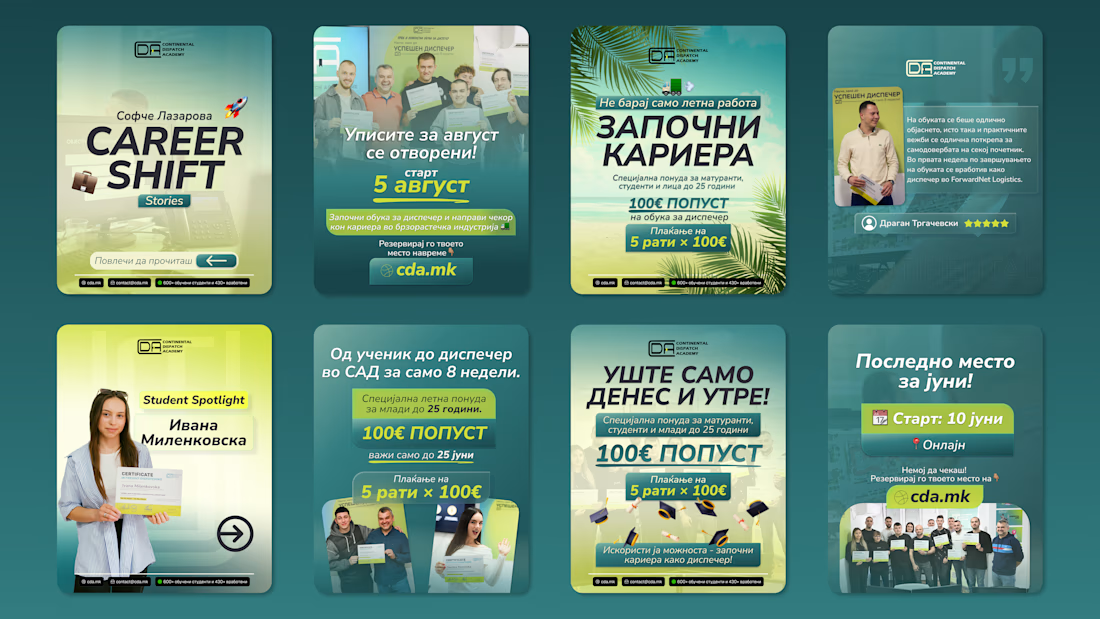
Continental Dispatch Academy is an academy training people to become a logistics dispatcher and start a new career.
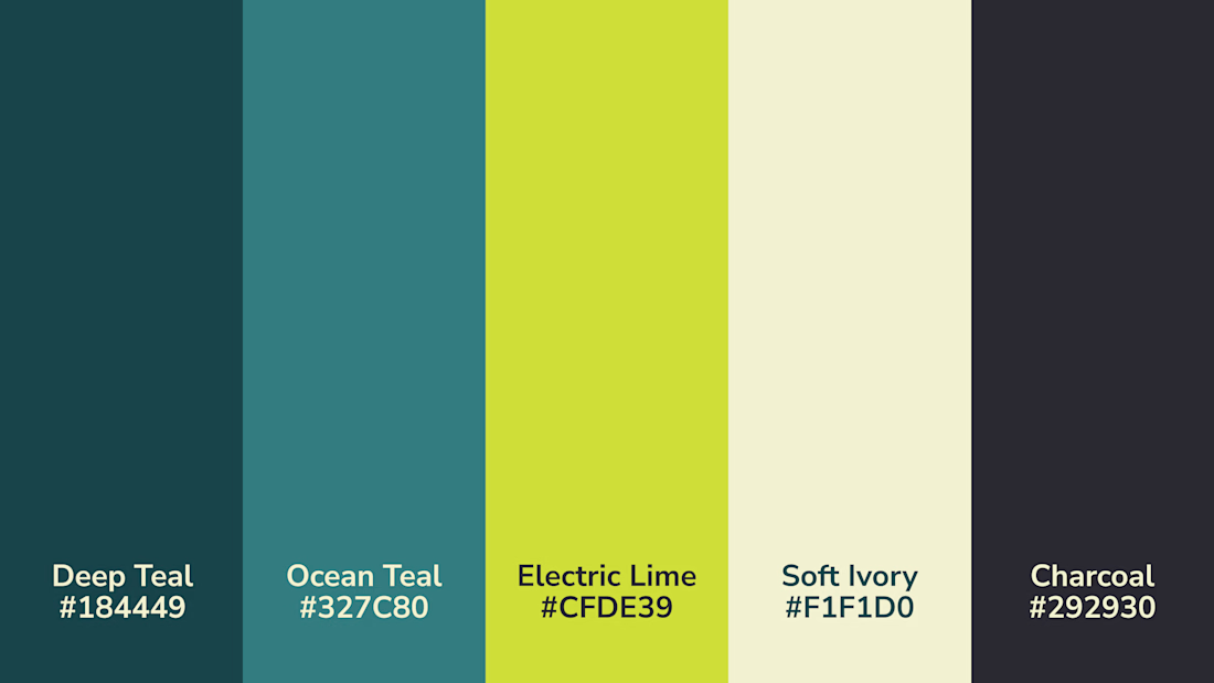
I went for a fresh, modern, and energetic direction to attract a younger demographic making serious career decisions. Combining it with colors that represent positivity, progress, momentum, credibility, and reliability.
You can check out the full case study here: CDA Case Study

this is such a thoughtful project, hats off to you!
Thank you Nicolette.

Career-change audiences are an awkward brief: modern enough that the leap feels worth making, credible enough to bet a year of your life on. Looks like the deep teal is carrying the credibility and the lime is doing all the momentum work. Was that split deliberate from the start?
Yes that split was from the start due to the industry usually going with heavy industrial branding which doesn’t resonate with young people.
The network for creativity
Join 1.25M professional creatives like you
Connect with clients, get discovered, and run your business 100% commission-free
Creatives on Contra have earned over $150M and we are just getting started





Related posts


New Brand Identity project alert! 🚨
GATE108 is a forward-thinking ecosystem bringing together people, ideas, experiences and new ways of living, working and connecting.
We’ve been their long-term design partner, shaping and continuously evolving a flexible visual ecosystem across visual strategy, brand identity, creative direction, digital experiences, event assets, 3D motion and social media.
Inspired by the idea of GATE108 as a gateway into a multidimensional world of people, ideas and possibilities, we’ve built a brand system designed to move, adapt and grow across physical and digital spaces.
As the brand evolves, we continue to create new expressions while keeping the wider ecosystem cohesive, recognisable and ready for what’s next.


Upgoating this..... Converting complex healthtech Figma components into a seamless, high-trust Webflow build is no easy feat—really smooth execution!

More casual or stylized photography?
20 voted
42%
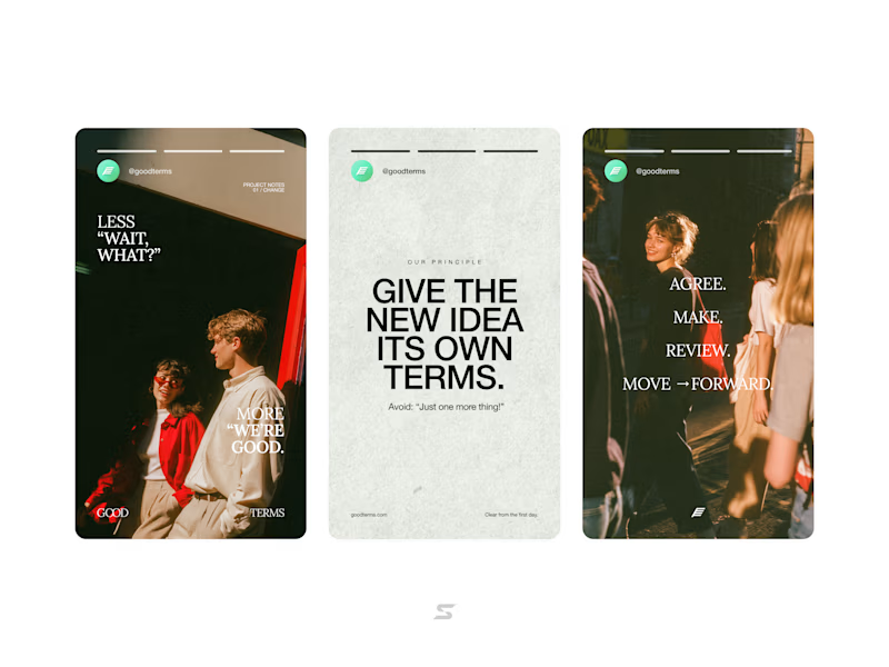
28 voted
58%
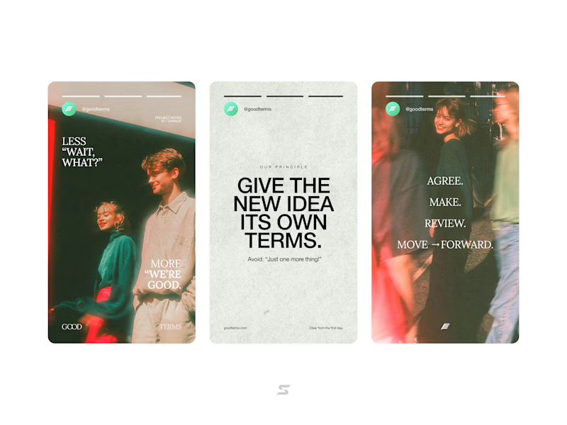
48 votes
Closed


