The network for creativity
Join 1.25M professional creatives like you
Connect with clients, get discovered, and run your business 100% commission-free
Creatives on Contra have earned over $150M and we are just getting started
Back to feedPost

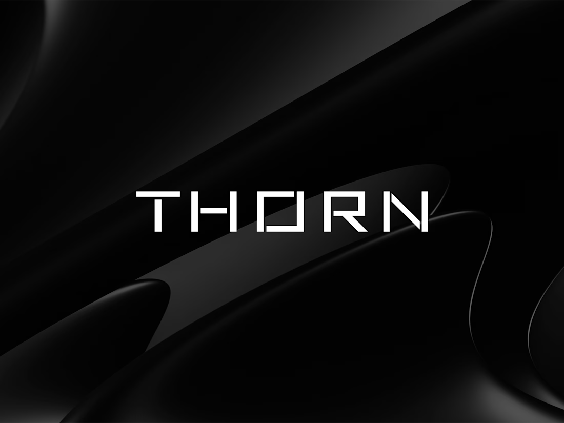
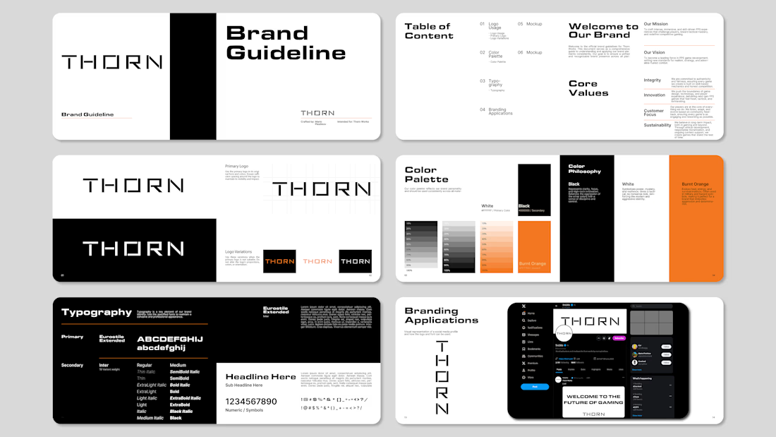
Most gaming studios by default go with loud neons, aggressive shapes, and cluttered graphics. For Thorn, I went the opposite way, pure visual restraint.
Built a clean, modern wordmark paired with a dark palette, a sharp burnt orange accent, and locked-in brand guidelines so the identity stays consistent everywhere.
You can check out the full case study here: ThornCaseStudy

Really well put together!
Appreciate it thanks!

Good

the difference from the norm you named speaks volumes, the polish here almost gives a sort of chrome feel to the text! excellent.
Appreciate it, glad you like the approach.

Going quiet and restrained for a gaming brand is a genuinely bold call when the whole category defaults to loud neon. Did you have to talk the client into that restraint, or were they already tired of the usual aggressive gaming look?
The client wanted to go in this direction, and I was totally down to go this path and not blend in with all the neon signs.
Betting on restraint for a gaming brand takes real conviction given how saturated that neon look has gotten. My guess is the client came to you already burnt out on it rather than needing convincing, does that track?
Right on track with the guess, it was a good experience working with him.

Excellent design sense, well executed 👍
Thank you!
The network for creativity
Join 1.25M professional creatives like you
Connect with clients, get discovered, and run your business 100% commission-free
Creatives on Contra have earned over $150M and we are just getting started





Related posts


New Brand Identity project alert! 🚨
GATE108 is a forward-thinking ecosystem bringing together people, ideas, experiences and new ways of living, working and connecting.
We’ve been their long-term design partner, shaping and continuously evolving a flexible visual ecosystem across visual strategy, brand identity, creative direction, digital experiences, event assets, 3D motion and social media.
Inspired by the idea of GATE108 as a gateway into a multidimensional world of people, ideas and possibilities, we’ve built a brand system designed to move, adapt and grow across physical and digital spaces.
As the brand evolves, we continue to create new expressions while keeping the wider ecosystem cohesive, recognisable and ready for what’s next.


Upgoating this..... Converting complex healthtech Figma components into a seamless, high-trust Webflow build is no easy feat—really smooth execution!

More casual or stylized photography?
20 voted
42%
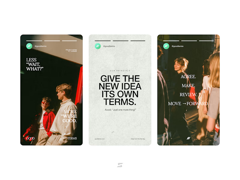
28 voted
58%
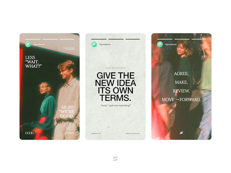
48 votes
Closed


