When does elegance become just another cliché in branding?
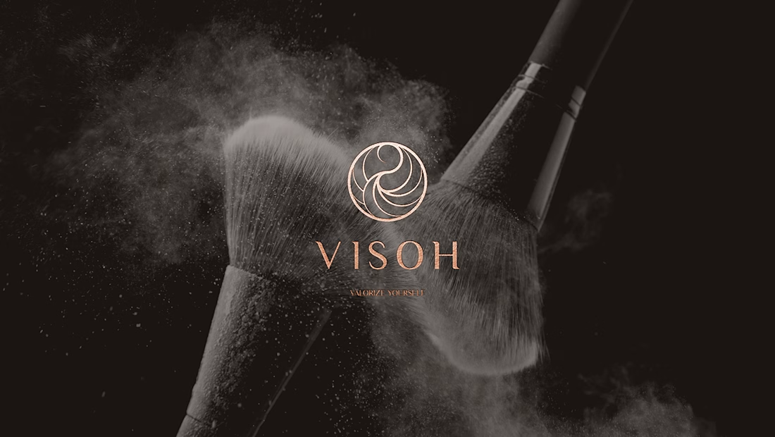
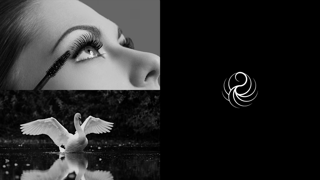
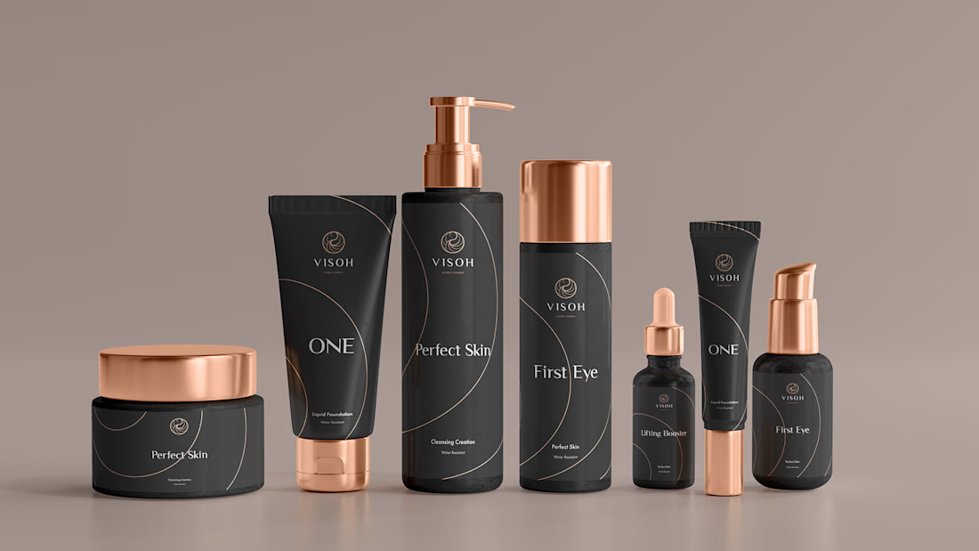
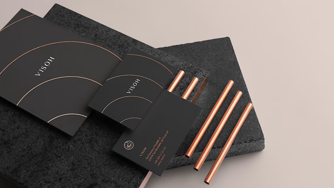
This was one of the questions behind Visoh, a beauty brand identity project I developed at Elle Visual.
The challenge was to communicate sophistication, individuality, and timeless beauty without relying on the predictable...
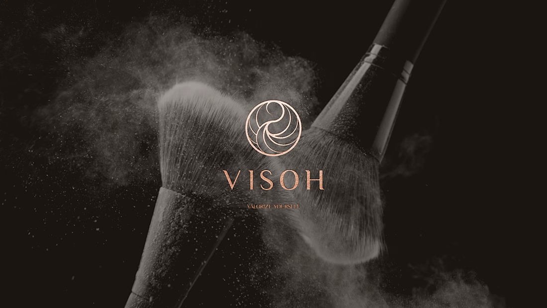
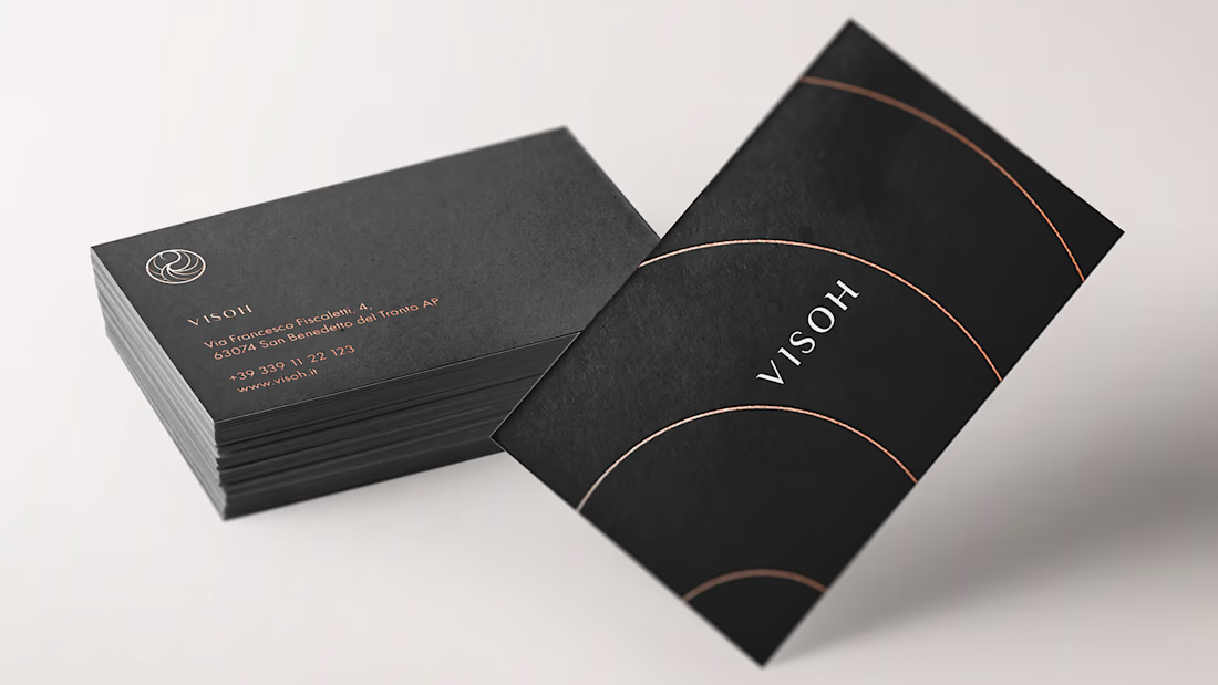
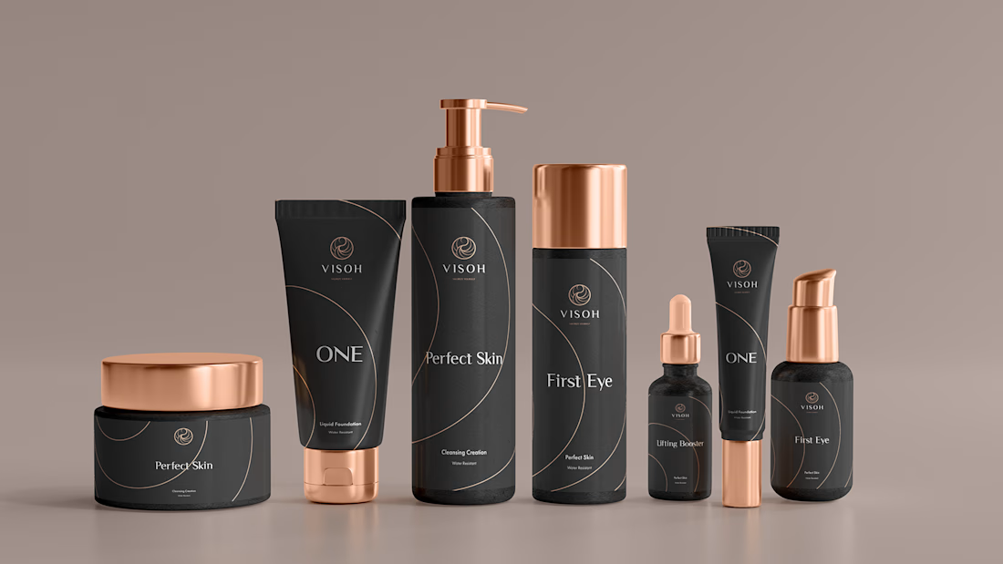
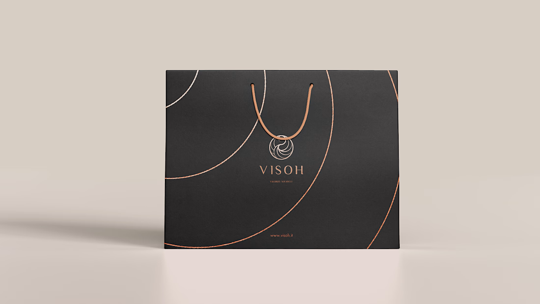
Visoh — Giving a Personal Approach to Beauty a Distinctive Identity
Client Overview
Visoh brings together personalised beauty consultations, cosmetic products, makeup centres, a franchise network and an academy. Its approach centres on enhancing each woman’s individual features.
...
Trust begins before the first conversation.
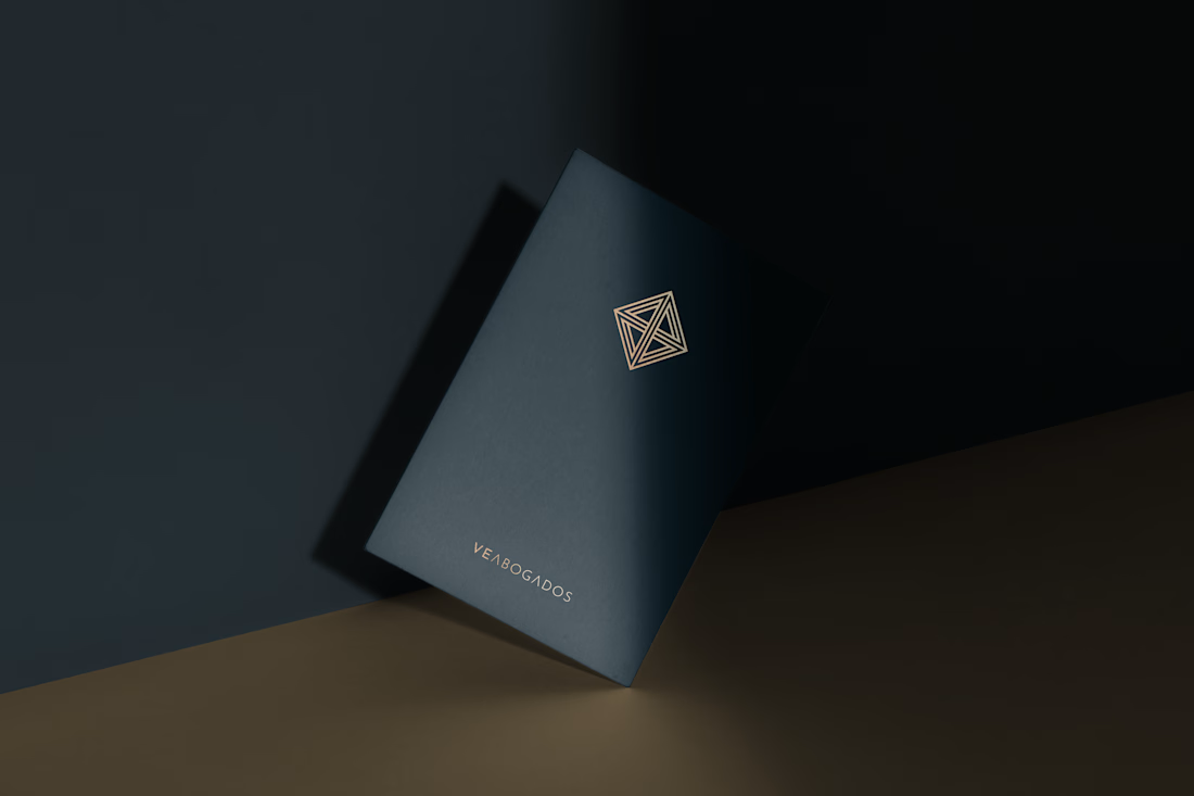
For VE ABOGADOS, I approached brand identity design with a clear focus: communicating the credibility of a legal practice through a distinctive, coherent visual presence.
The goal was to balance professional authority with...
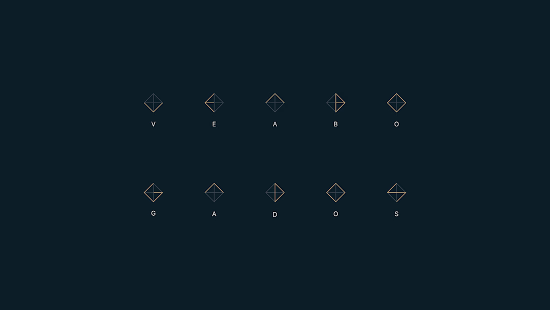
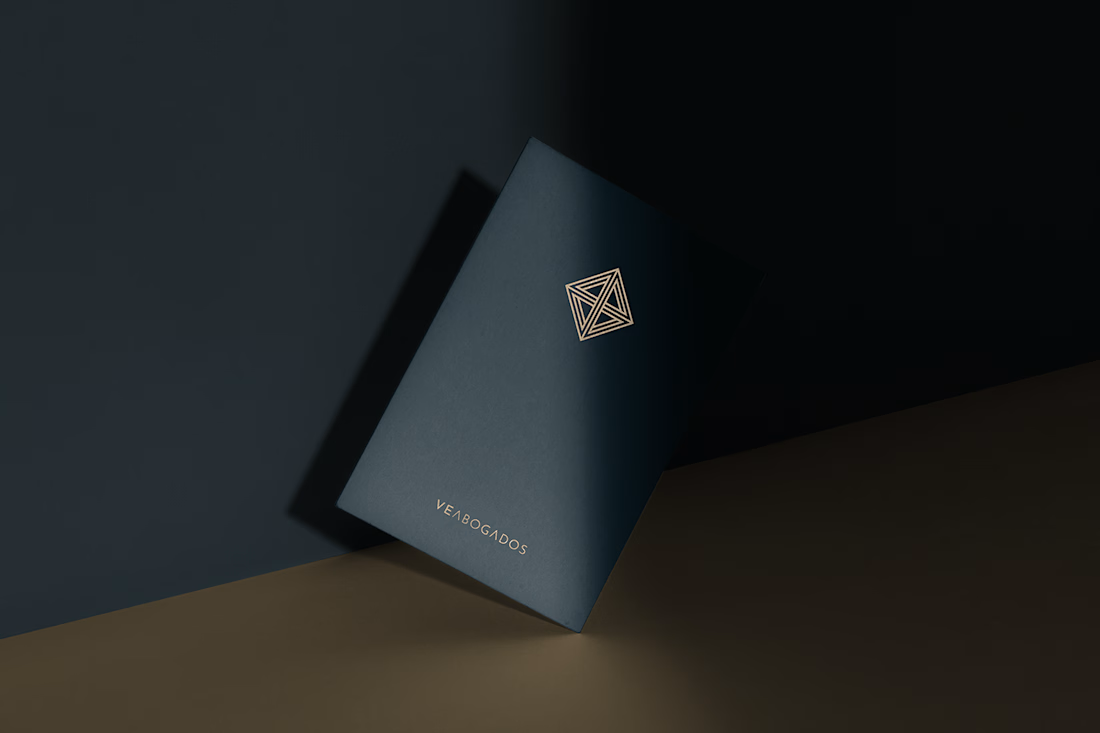
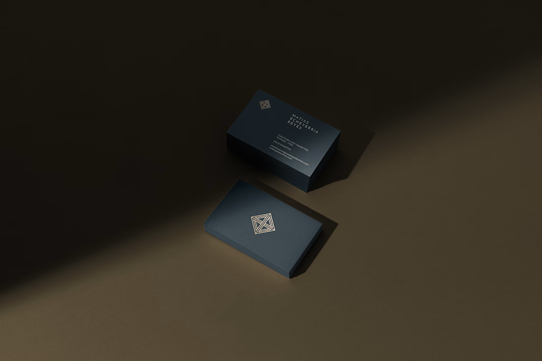
Legal tradition. Bold ambition. A distinctive brand identity for VE ABOGADOS, bringing authority and innovation to Chile’s legal landscape.
Check it out
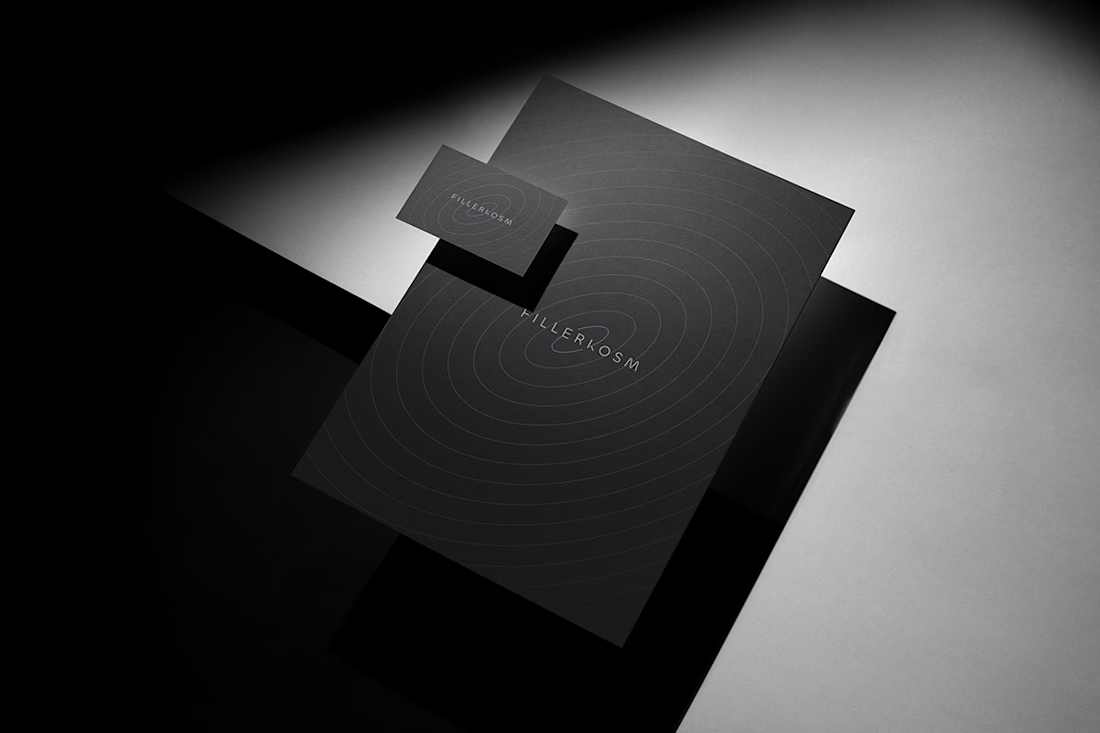
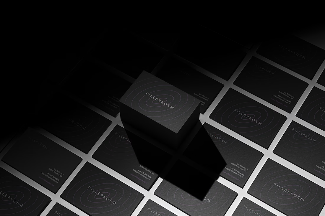
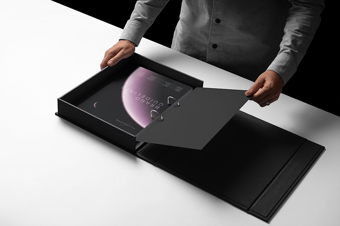
Fillerkosm Brand Identity
Fillerkosm is a brand identity project built at the intersection of science, beauty and precision.
The creative process started from the meaning behind the name itself: Fillerkosm combines the world of aesthetic medicine with kosmos, the Greek idea of...