The network for creativity
Join 1.25M professional creatives like you
Connect with clients, get discovered, and run your business 100% commission-free
Creatives on Contra have earned over $150M and we are just getting started
Back to feedPost

Trust begins before the first conversation.
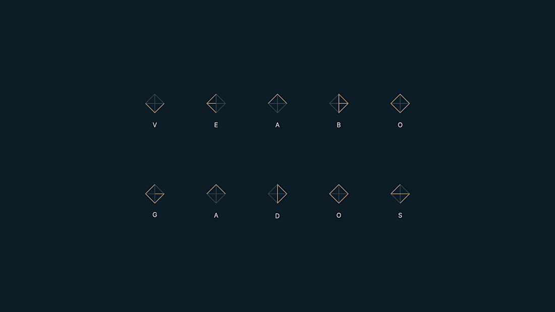
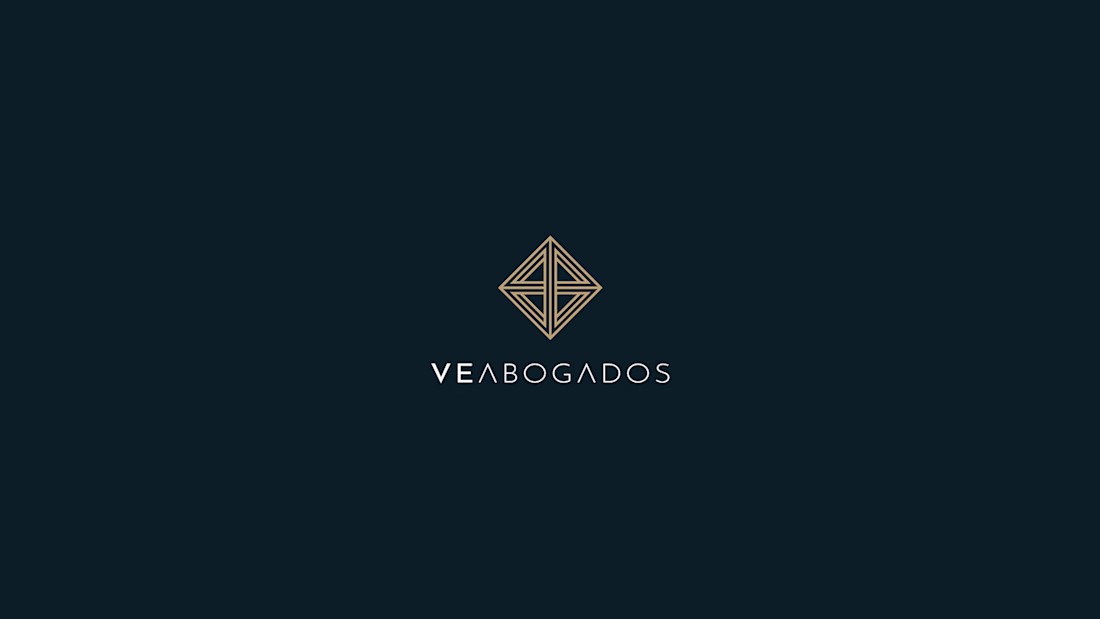
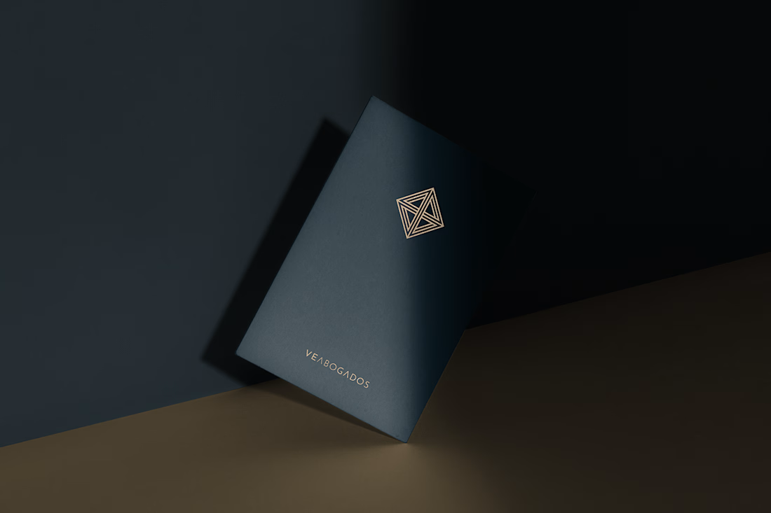
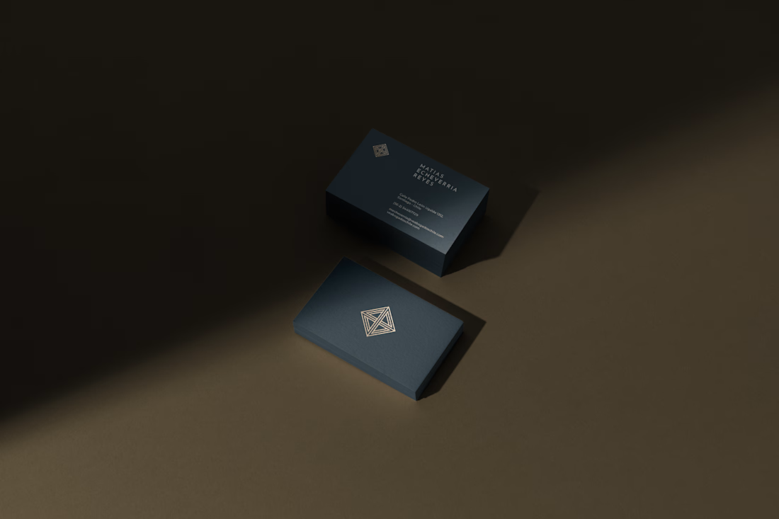
For VE ABOGADOS, I approached brand identity design with a clear focus: communicating the credibility of a legal practice through a distinctive, coherent visual presence.
The goal was to balance professional authority with approachability, creating an identity that helps people recognise the firm and feel confident taking the next step.
A project shaped by my belief that every design decision should serve the brand’s positioning.
The network for creativity
Join 1.25M professional creatives like you
Connect with clients, get discovered, and run your business 100% commission-free
Creatives on Contra have earned over $150M and we are just getting started











Related posts

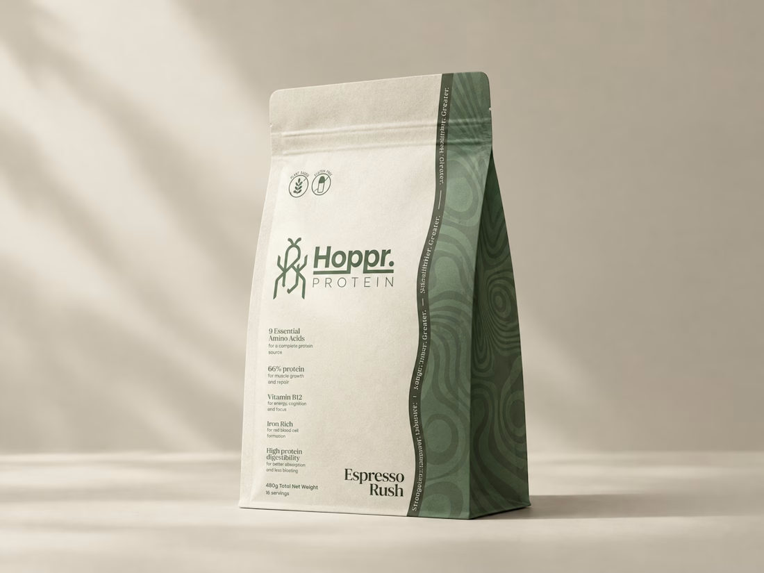
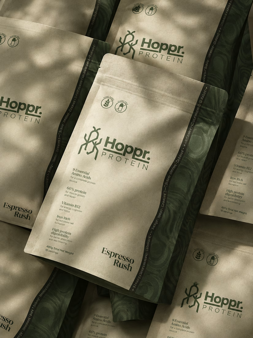
Not every client comes to me for a brand identity and not all my clients are skincare or cosmetic brands.
That was the case with Hoppr, a protein powder brand made from crickets. 🦗 YES, CRICKETS!
Sometimes the logo, colors, and visual system are already there and my job is to bring them to life on packaging and see how far I can push them.
I love projects like this because I get to play with typography, layout, and materials while working within an existing identity.
How much freedom do you think a designer should have when working with an established brand?


Great packaging work, nice job


I don’t avoid templates just to make things look different.
I avoid flattening a physical brand into a generic digital experience.
A restaurant, studio, fashion label or product can have incredible character in the real world, then lose all of it the moment it becomes a website.
That gap is what interests me.
The website should be able to carry the atmosphere through layout, typography, pacing, motion and interaction, and ideally attract people before they ever experience the physical space.
Not every project needs to be highly expressive.
Some websites should stay simple, direct and functional.
But even simplicity can carry identity.
Bolluni was built with that in mind: translating the character of the restaurant into a digital experience rather than simply presenting information.
Embrace the Creativity.

So well said. That's exactly the problem - a restaurant can have so much soul IRL then become another generic grid online. Love that you don't just avoid templates to be different, but to protect the brand's actual character. 100% agree.




Clean and confident work! The green gradient with the mark feels very modern for fintech - trustworthy but not boring. The app screens look really polished. Curious how you landed on this mark, does it represent growth / movement?