
pro
Lorenzo Rocco
Brand Identity Designer | Strategy, Logo & Visual Systems


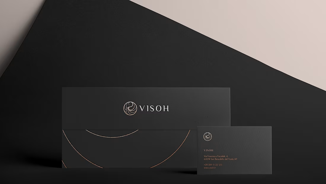
Visoh Brand Identity and Packaging Design
0
0
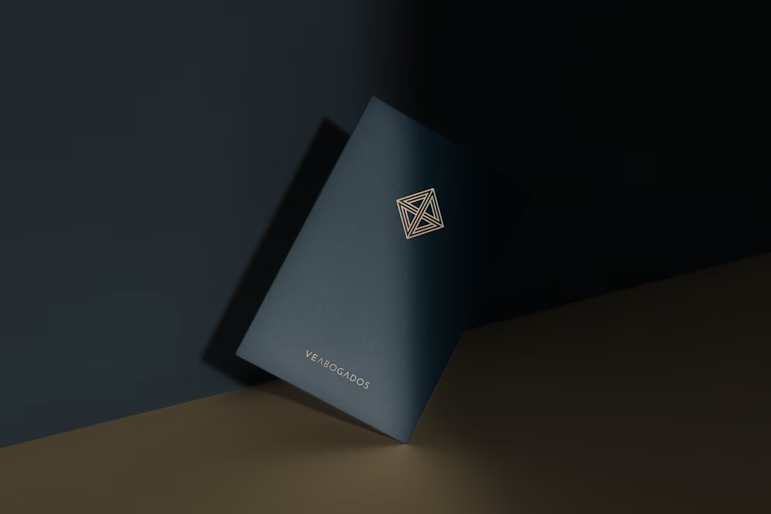
VE ABOGADOS Brand Identity Design
0
3
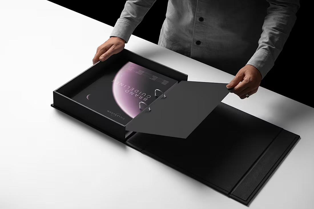
Fillerkosm Brand Identity
Fillerkosm is a brand identity project built at the intersection of science, beauty and precision.
The creative process started from the meaning behind the name itself: Fillerkosm combines the world of aesthetic medicine with kosmos, the Greek idea of order and harmony. From there, I explored visual references connected to chemistry, space and refined beauty, with the goal of creating an identity that could feel technical, authoritative and premium without becoming cold or overly clinical.
The logo was developed as a direct extension of this concept. Two elliptical forms move through the wordmark like planetary orbits, while the circular elements at their extremities also suggest a molecular structure. The result creates a deliberate duality between the scientific precision of aesthetic medicine and the broader idea of harmony, balance and universal beauty.
Rather than designing a logo in isolation, the objective was to build a coherent visual language capable of expressing reliability, innovation and elegance across every brand touchpoint.
14
15
1.5K
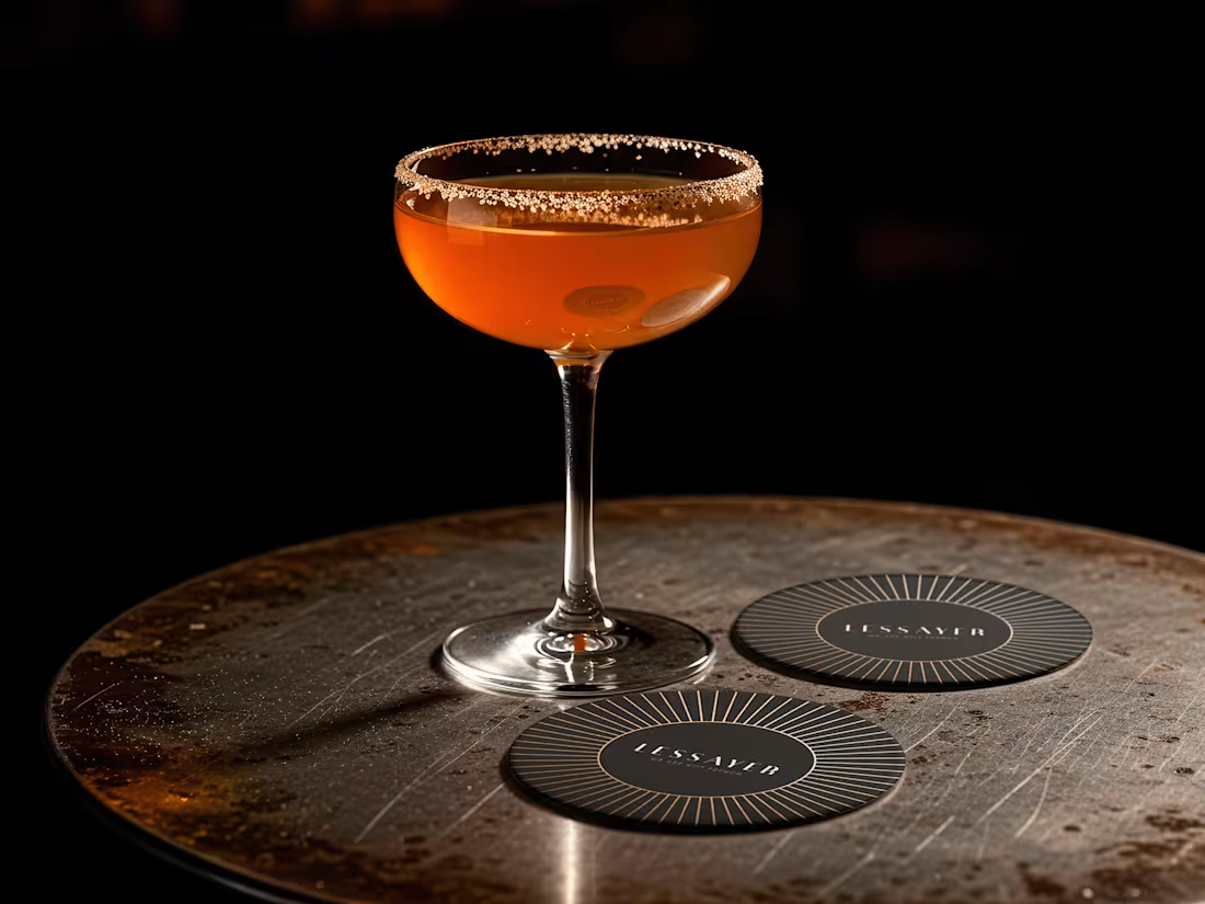
Lessayer
Where Belle Époque elegance meets contemporary minimalism.
The identity started with a simple challenge: how can a luxury pastry brand feel refined and timeless without relying on predictable visual codes?
The answer became a single geometric symbol combining three ideas a crown, a sliced cake, and a subtle reference to the New Zealand sun.
One mark. Three meanings. One distinctive identity.
Here’s a first look at the logo construction and stationery system.
Full case study coming tomorrow.
16
21
943