The network for creativity
Join 1.25M professional creatives like you
Connect with clients, get discovered, and run your business 100% commission-free
Creatives on Contra have earned over $150M and we are just getting started
Back to feedPost

Visoh — Giving a Personal Approach to Beauty a Distinctive Identity
Client Overview
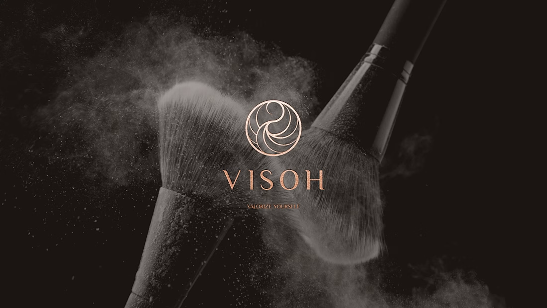
Visoh brings together personalised beauty consultations, cosmetic products, makeup centres, a franchise network and an academy. Its approach centres on enhancing each woman’s individual features.
For Elle Visual, the design challenge was to translate that personal approach into a recognisable beauty brand identity that could connect the different parts of the business.
Why Elle Visual
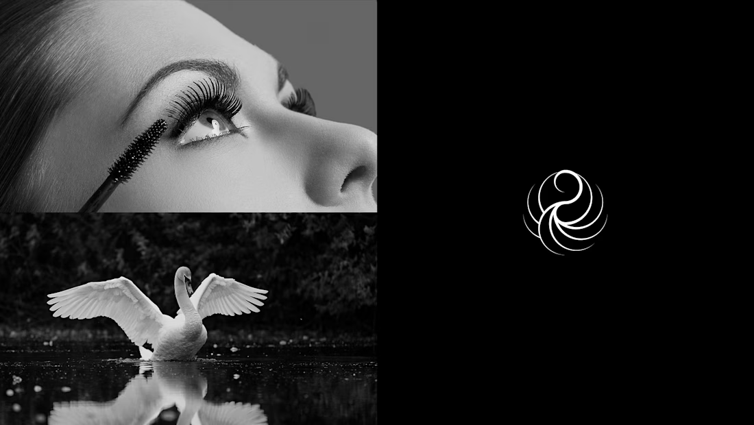
We built the visual concept around the relationship between beauty and the grace of a swan. This gave the symbol a reference beyond cosmetics, while keeping it connected to Visoh’s world.
The creative work involved translating that reference into an abstract mark. Intersecting circles establish its proportions; flowing curves bring softness and movement to the final silhouette. That balance between geometry and expression defines the logo’s character.
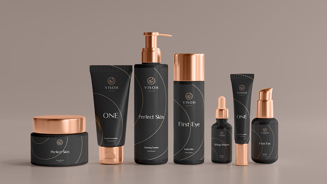
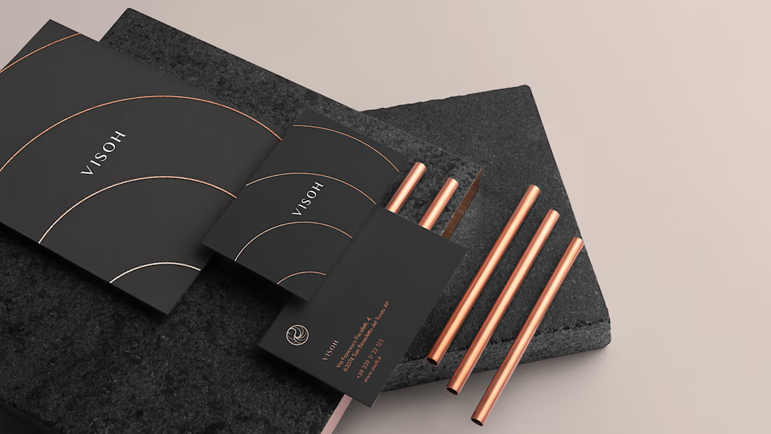
We then extended its curved language into print materials, using enlarged arcs to connect individual applications. Dark backgrounds, white space and warm metallic tones support a consistent visual identity across the brand.
The result brings logo design, print and packaging together around one recognisable idea.
When designing a beauty brand, how do you balance familiar signals of elegance with the need to create something distinctive?
Scope: Brand Identity · Print Design · Packaging Design
The network for creativity
Join 1.25M professional creatives like you
Connect with clients, get discovered, and run your business 100% commission-free
Creatives on Contra have earned over $150M and we are just getting started











Related posts


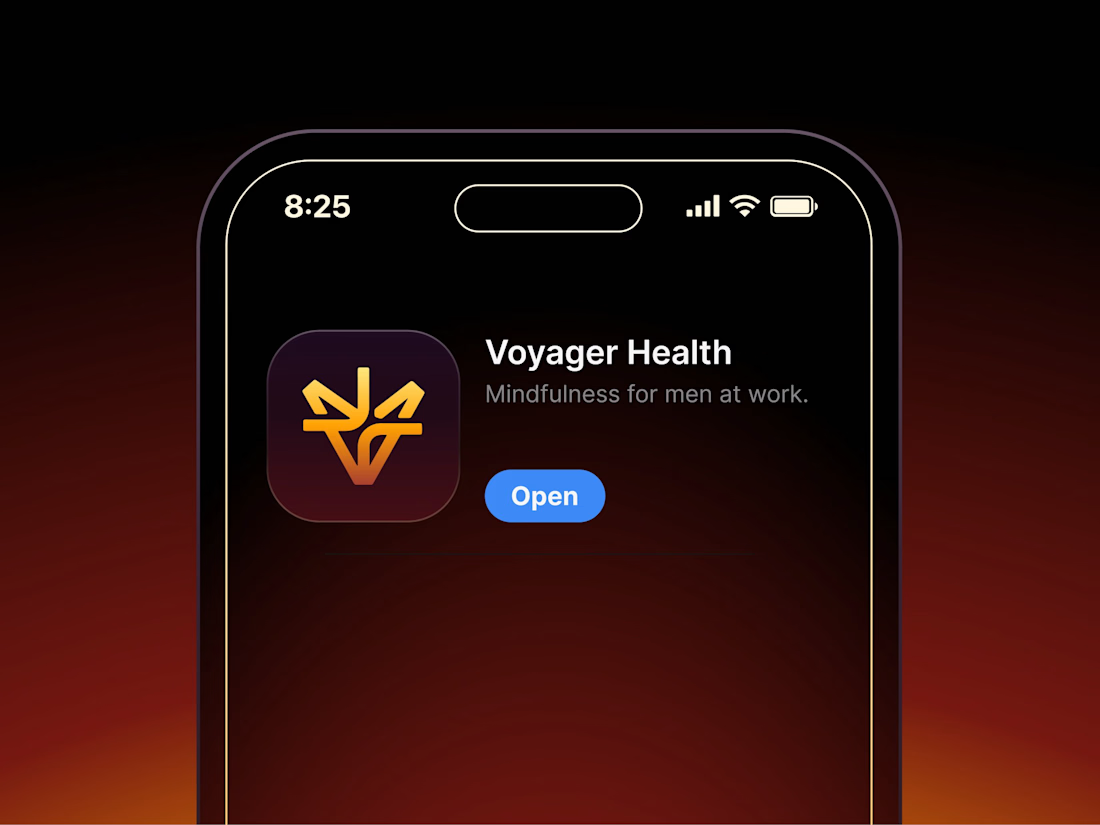

Aryna, that golden symbol pops so nicely against the plum background ✨

Finally a Contra Top Independent!
Been part of this community for a few years now, sharing my work, joining challenges, meeting some great people, and even picking up a few wins along the way.
I've genuinely enjoyed being part of Contra and seeing how much the platform has grown.
This one means a lot. Big thanks to the Contra team for the recognition!
More to come!


Second Serve Club — Exploring Visual Identity Through AI & Design.
For this branding challenge, I created a series of original logo marks in Adobe Illustrator, inspired by vintage tennis culture.
I then explored how these designs could come to life by combining my own typography, monograms and colour identity with AI-generated visuals using ChatGPT.
From the texture of a clay court to embroidered details on tennis balls, the goal was to bring the brand identity into a more tangible, realistic setting.
An exploration of how traditional graphic design and AI can work together to create a cohesive visual world.
Designed by me. Visualised with AI. 🎾
Full brand identity case study coming soon.
#BrandIdentity #VisualIdentity #GraphicDesign #AIDesign #ChatGPT

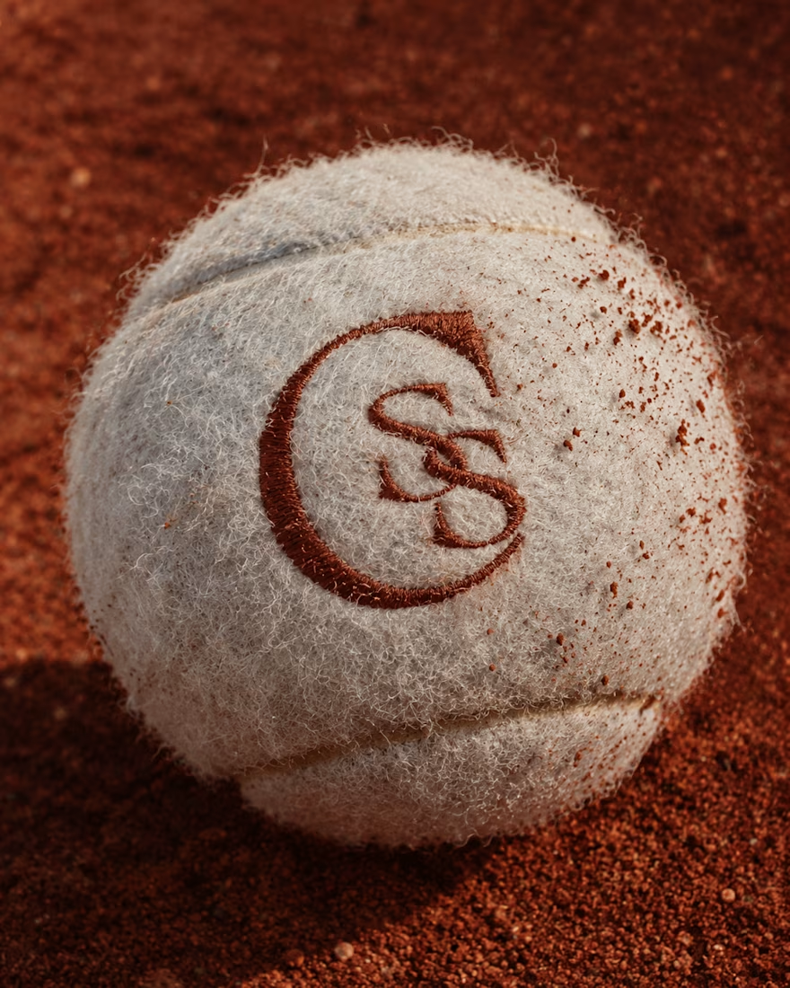
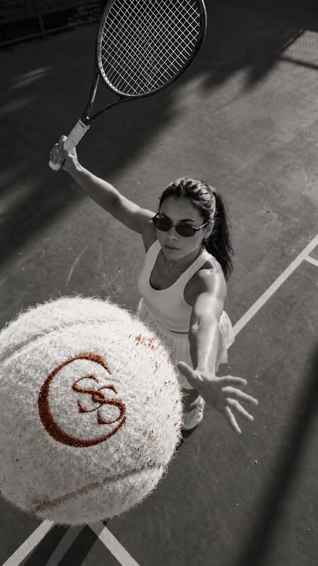
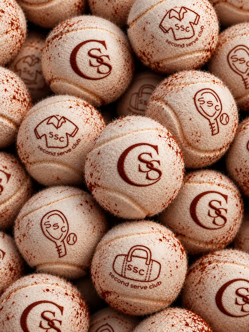

The SS mark stamped into the tennis ball felt is a great detail. Looks very real on the clay court.