The network for creativity
Join 1.25M professional creatives like you
Connect with clients, get discovered, and run your business 100% commission-free
Creatives on Contra have earned over $150M and we are just getting started
Back to feedPost

When does elegance become just another cliché in branding?
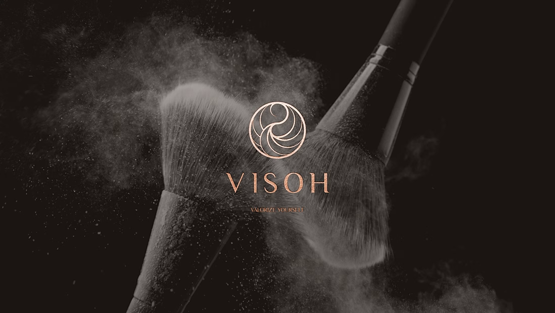
This was one of the questions behind Visoh, a beauty brand identity project I developed at Elle Visual.
The challenge was to communicate sophistication, individuality, and timeless beauty without relying on the predictable visual codes of the beauty industry.
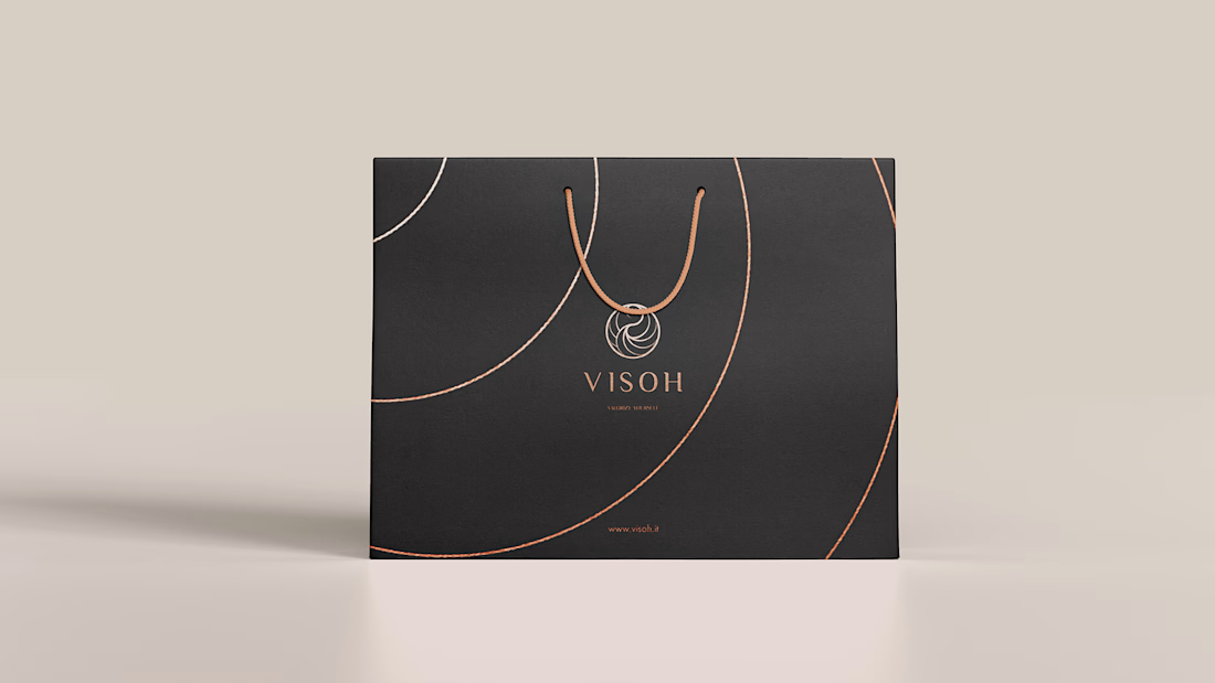
Inspired by the grace of a swan, I developed an abstract symbol using intersecting circles and fluid curves. The concept evolved into a cohesive visual identity, extending from the logo to packaging, printed materials, and brand applications.
But here's something I've learned after designing more than 300 brand identities:
Being beautiful doesn't necessarily mean being memorable.
A successful brand identity needs more than visual appeal. It needs a distinctive idea, a clear purpose, and a consistent design language that people can recognize over time.
And that brings me to an interesting debate.
Should a brand follow the visual conventions of its industry to build familiarity, or challenge them to create differentiation?
I'd love to hear how other designers, creative directors, and founders approach this balance.
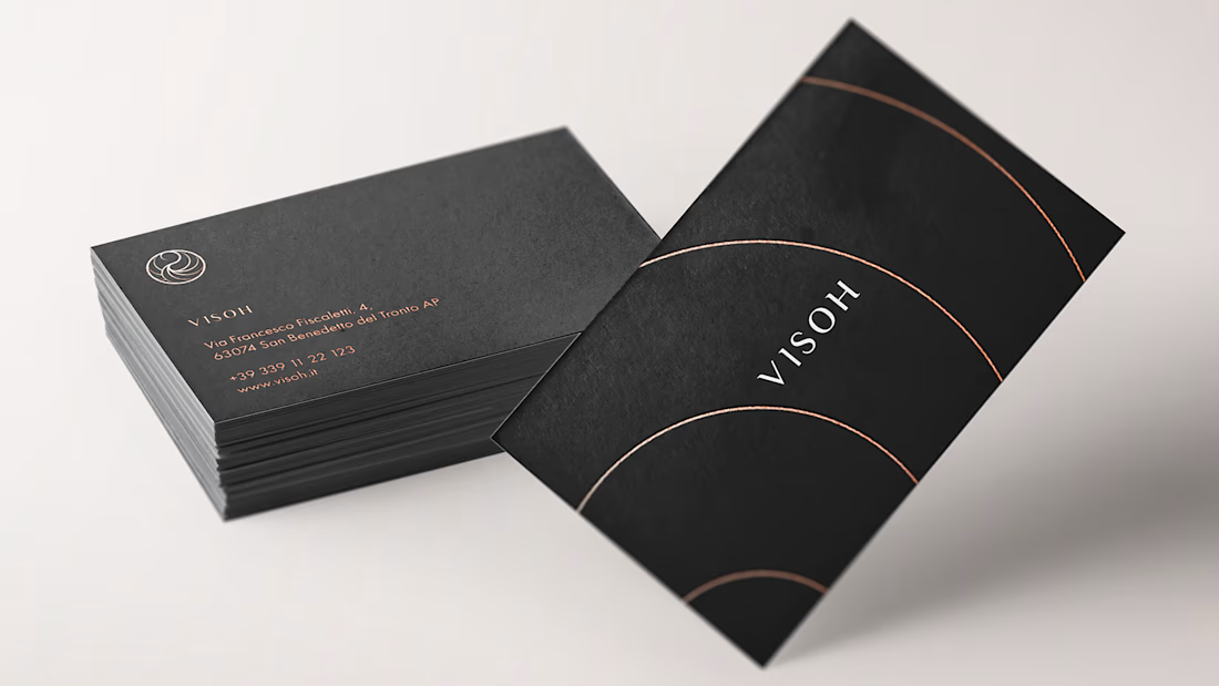
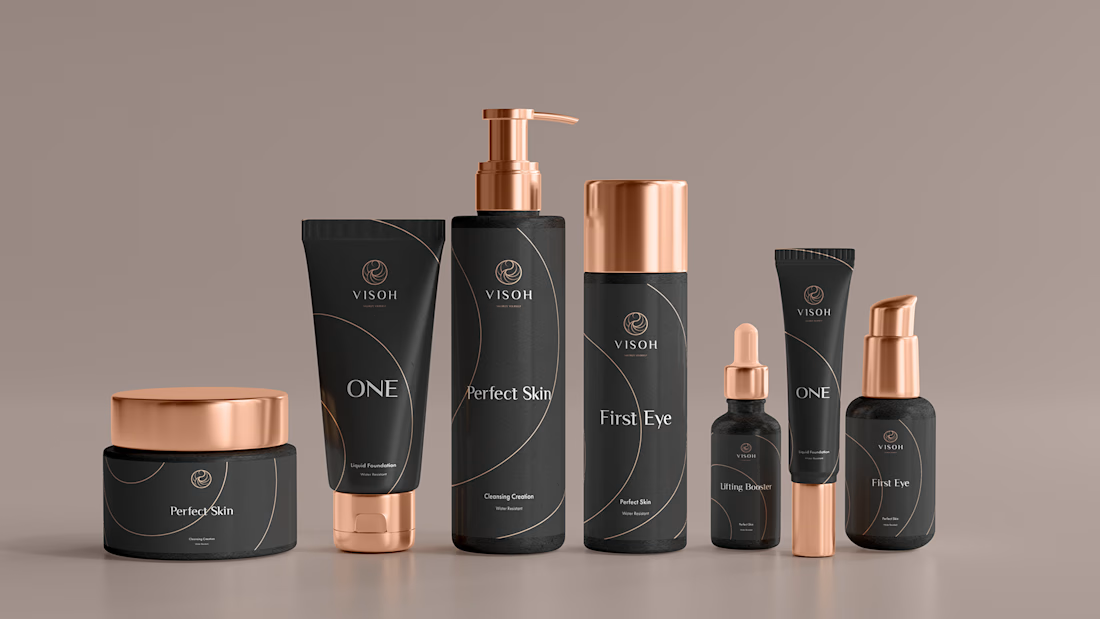


The copper foil line work on the matte black cards and tubes feels restrained and premium, and the swan-inspired mark holds up nicely at small sizes.
Thank you so much for your kind words! I’m really happy you noticed those details. Finding the right balance between elegance, simplicity, and personality was such an important part of the creative process. It means a lot to see those little design decisions appreciated!
The network for creativity
Join 1.25M professional creatives like you
Connect with clients, get discovered, and run your business 100% commission-free
Creatives on Contra have earned over $150M and we are just getting started











Related posts

A logo is not a brand identity.
It’s the signature at the bottom of the letter.
Most founders start by asking for a logo.
What they need is a system that still looks like them on day 100.
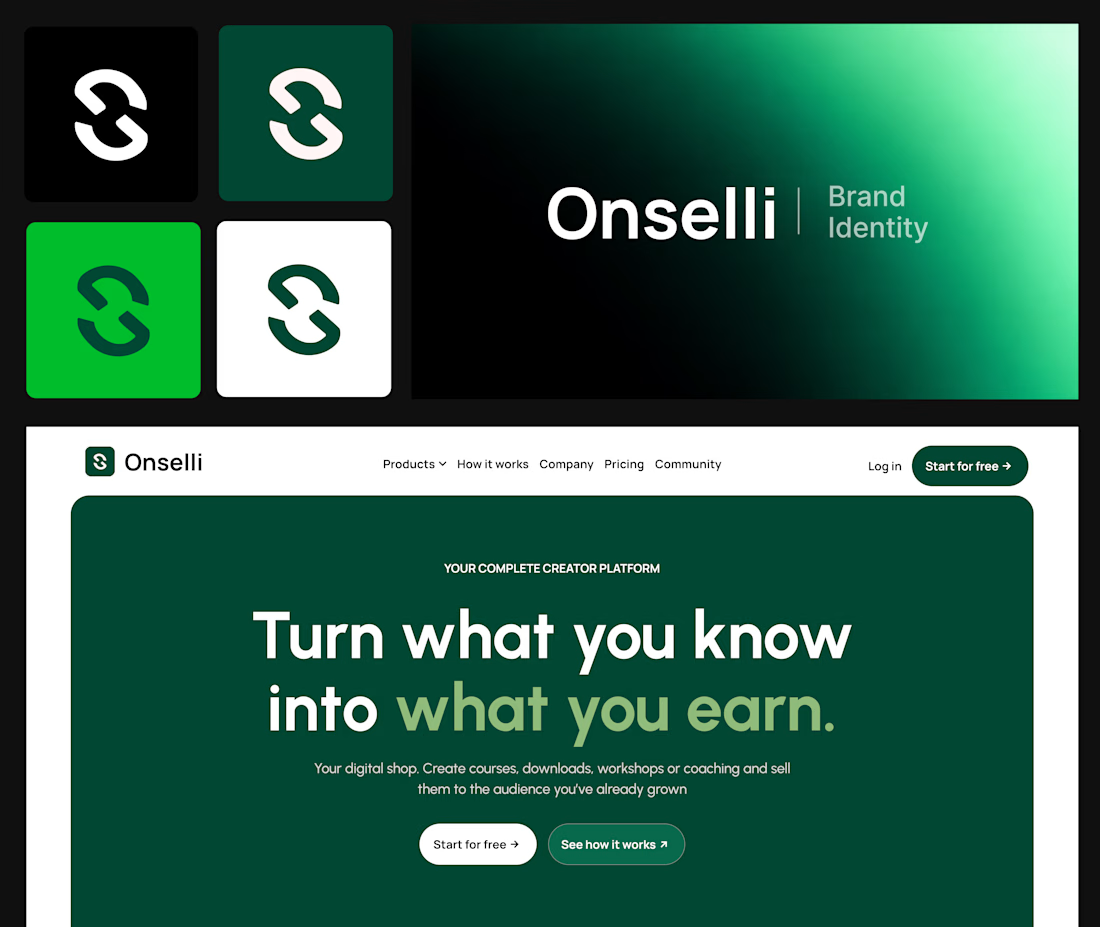
Here’s what sits behind the Onselli mark 👇
- A mark that holds on any background
- A style guide, with a color system where every color has a job and type with a point of view
- The brand principles, with the logo use cases on socials, mockups, or any surfaces.
- Components that match: buttons, cards, hero, forms, etc...
- Social creatives and copy that sells the product: “Turn what you know into what you earn.”
- A live website that carries all of it
Skip one and the whole thing starts to look like a template.
A logo gets you noticed.
A system gets you trusted.
Which of the 6 is your brand missing?
Drop the number below, and I’ll tell you how I’d fix it.
Know a founder who thinks branding is a logo?
Repost ♻️ and save them an expensive redo.
I’m Daniel, a Design Engineer. I craft premium web, motion, product design, and brand identities for startups.
Follow for more breakdowns like this, or DM me “identity” if you’re building something.


Great job Daniel 🎉🎉

Most early-stage brands play it safe and disappear after a while. For Drylendar, I did the opposite.
3 weeks from brief to full identity: logo, illustration system, app visuals, collectible cards and even merch.
AI makes things cheaper. Personality makes brands memorable.
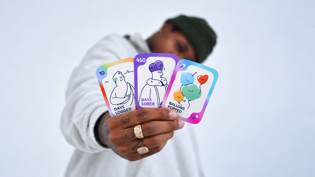
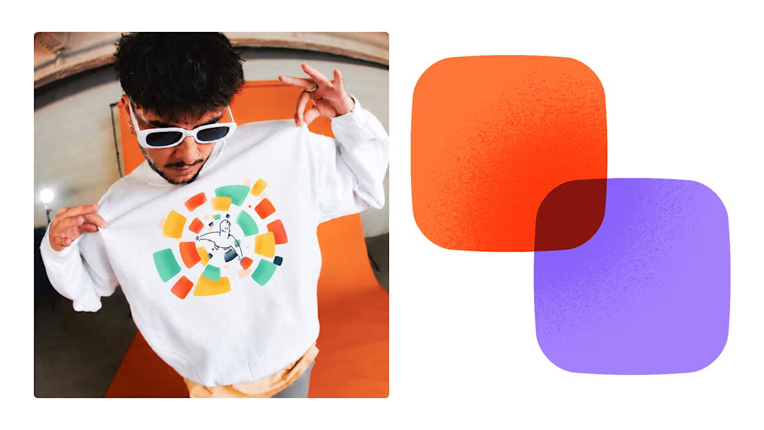
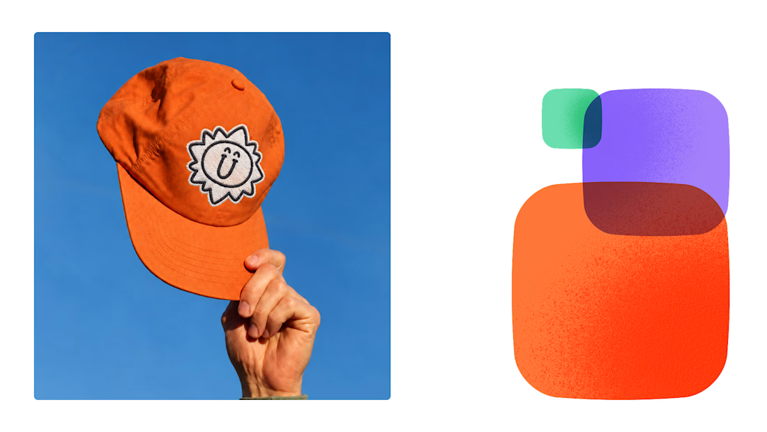
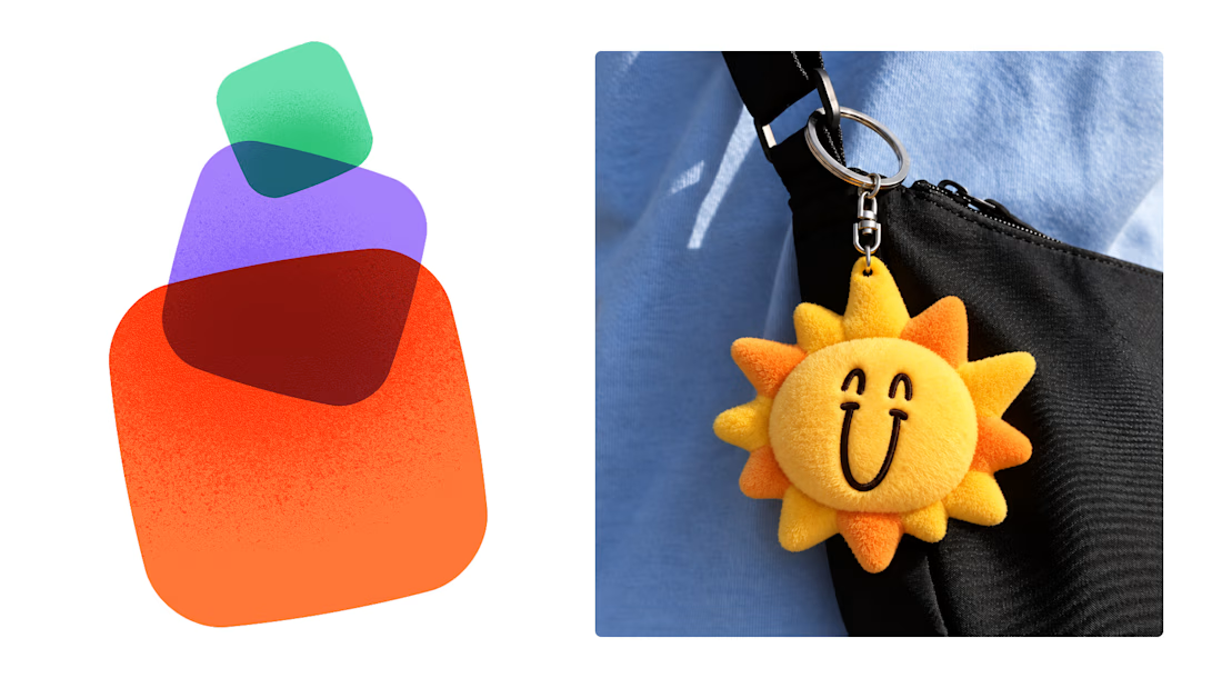

This is exactly what branding should be! 🔥 3 weeks for full identity, merch, cards - you really built personality, not just a logo. Love the Drylendar vibe. AI makes it cheap, but this makes it memorable - so true!

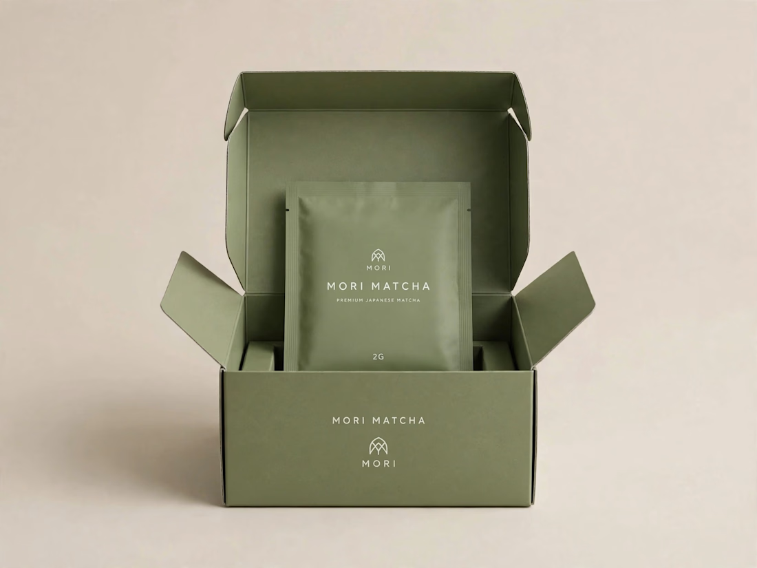
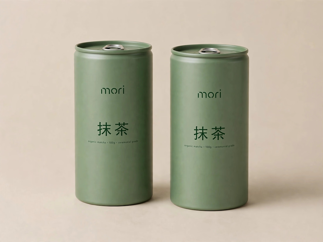
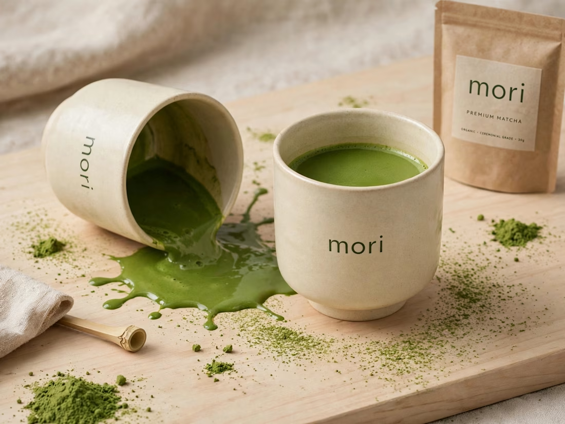
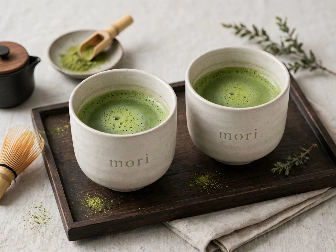
more visuals from my latest project — mori matcha 🍵
explored minimal Japanese packaging with earthy greens and calm typography.
focusing on premium ceramic cups and clean can design.
#branddesign #packagingdesign #visualidentity #brandstrategy #matcha #minimaldesign #japanesedesign #figma #mockup #branding