The network for creativity
Join 1.25M professional creatives like you
Connect with clients, get discovered, and run your business 100% commission-free
Creatives on Contra have earned over $150M and we are just getting started
Back to feedPost

Fillerkosm Brand Identity
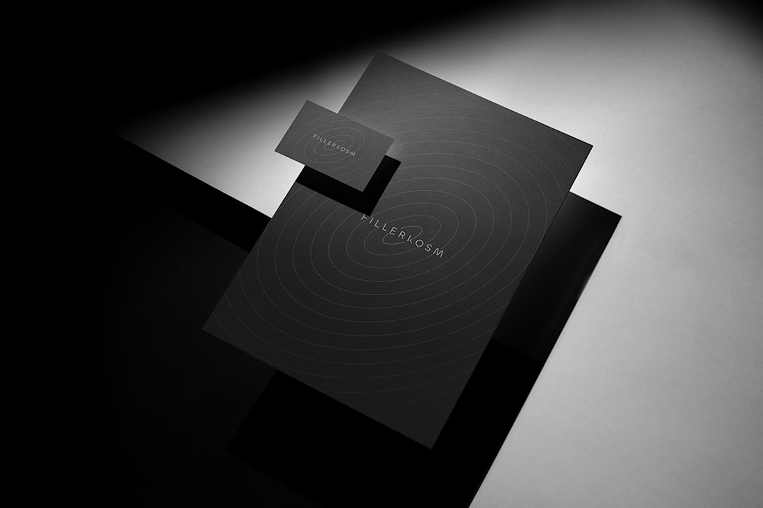
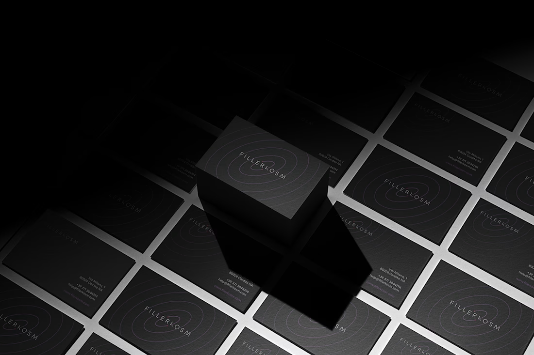
Fillerkosm is a brand identity project built at the intersection of science, beauty and precision.
The creative process started from the meaning behind the name itself: Fillerkosm combines the world of aesthetic medicine with kosmos, the Greek idea of order and harmony. From there, I explored visual references connected to chemistry, space and refined beauty, with the goal of creating an identity that could feel technical, authoritative and premium without becoming cold or overly clinical.
The logo was developed as a direct extension of this concept. Two elliptical forms move through the wordmark like planetary orbits, while the circular elements at their extremities also suggest a molecular structure. The result creates a deliberate duality between the scientific precision of aesthetic medicine and the broader idea of harmony, balance and universal beauty.
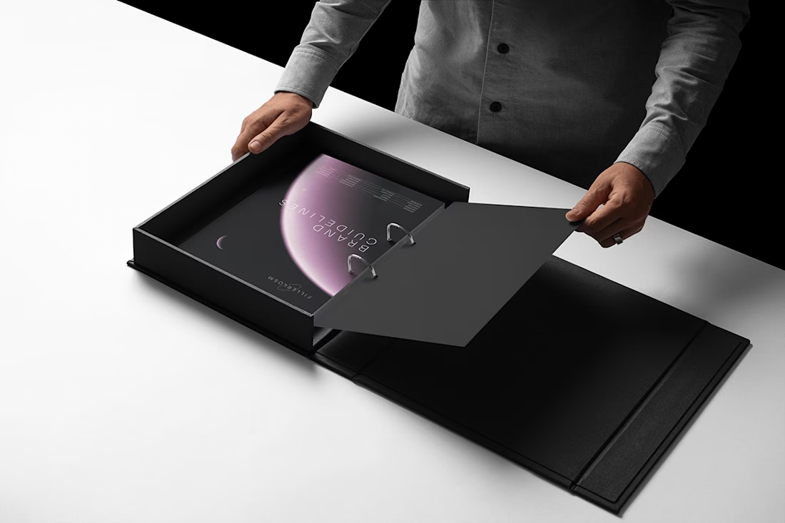
Rather than designing a logo in isolation, the objective was to build a coherent visual language capable of expressing reliability, innovation and elegance across every brand touchpoint.


Sick work 🔥
Thank you so much 🙌

the orbit + molecule double read is really smart. hard to make aesthetic medicine feel technical without going cold, and this nails it
Thank you for your feedback. I'm glad to read your words, because this project was a significant yet highly rewarding challenge for both me and the client.

Black matte color feels so premium I like how you manage everything specially the logo design it was so minimalistic geat job Lorenzo 🎉🎉
Hi Mostafa, thank you for your feedback, I'm glad to read your words.

Your project is exceptional. I'm impressed beyond words with the quality of the work!
Thank you so much for your kind words. I'm particularly proud of this project and for this reason your feedback is truly valuable.

class ser!🔥
Thank you 🙌

The elliptical paths through the wordmark are the whole story — molecular at favicon scale, orbital in the hero lockup, without a second symbol. Matte black stays premium because the geometry carries the clinical precision; the palette doesn't have to shout 'lab' to feel authoritative.
Thank you! That’s exactly the intention behind it. I wanted the elliptical geometry to carry the scientific reference and the sense of movement across every scale, without relying on an additional symbol. Keeping the palette restrained then lets the structure itself communicate precision and authority.

Monochrome with that one soft pink moment in the last shot. Really restrained.
Thank you. That restraint was very intentional. The monochrome system gives the identity consistency, while the soft pink works as a controlled accent rather than a dominant brand color.
The network for creativity
Join 1.25M professional creatives like you
Connect with clients, get discovered, and run your business 100% commission-free
Creatives on Contra have earned over $150M and we are just getting started








Related posts



Beautyy

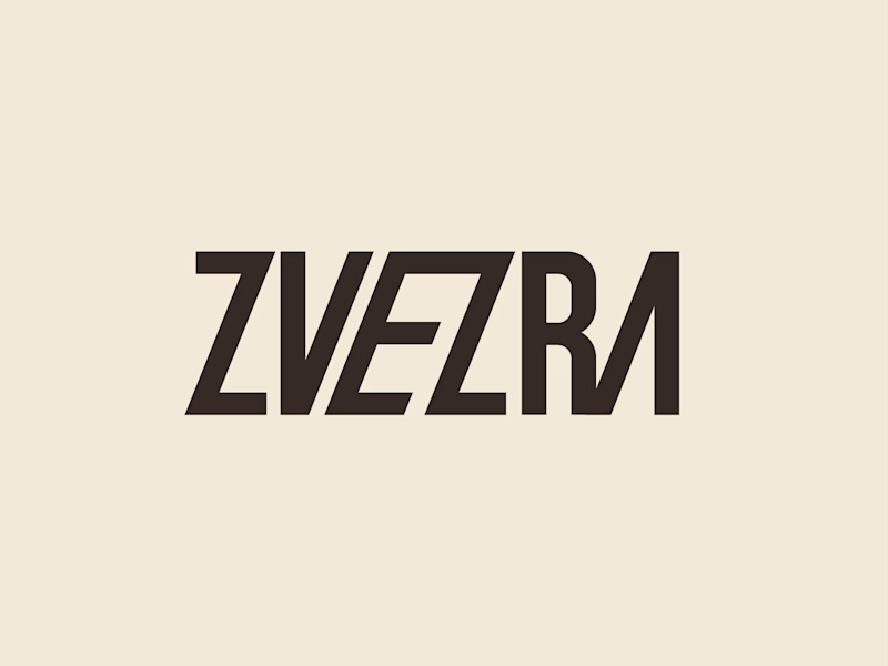
Which ZVEZRA logo direction do you prefer? 👀
I’ve been exploring two variations of the wordmark. Both follow the same visual direction, but each has its own character.
Vote below!
I’d love to hear your thoughts! 👇

39 voted
53%
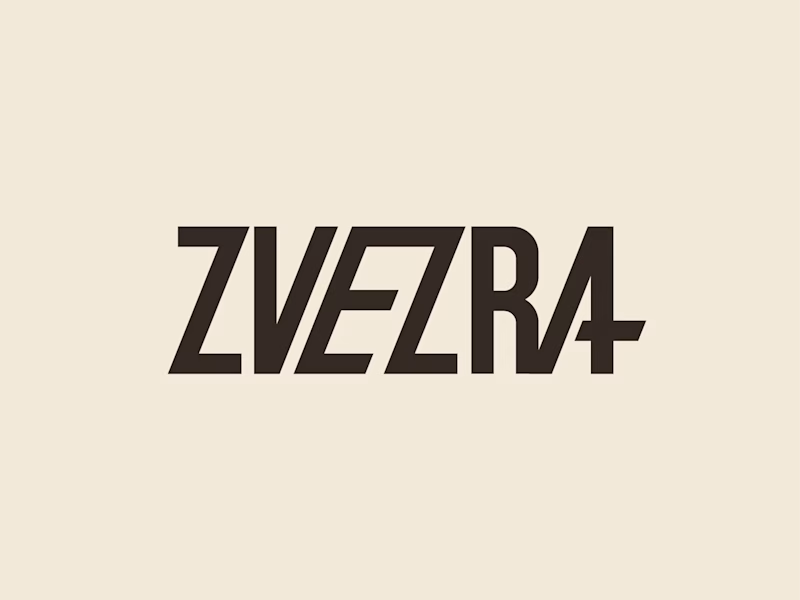
34 voted
47%
73 votes
Closed

Option 1 for me, it has a bit more personality. Both are strong though, tough call

Brand Identity Kit: an animated brand showcase template 🌿
I built a 3D-style brand scene that anyone can make their own. The sign, products and palette are all separate named layers, so swapping the images, retyping the text and changing five color fills turns it into a different brand with the same animation.
Best for brand launches, identity presentations and product reveals, whether you’re pitching a client, showing a rebrand or opening a new store.
How I built it: I designed the brand and products as separate layers, then used the @SVGator MCP with an AI assistant to structure the project and animate it, and finished it by hand in the editor.


Amazing 🔥🔥