
Hamza Fahim
Creative WEB3 Artist | Visualizer | UI Designer
- 11
- Followers


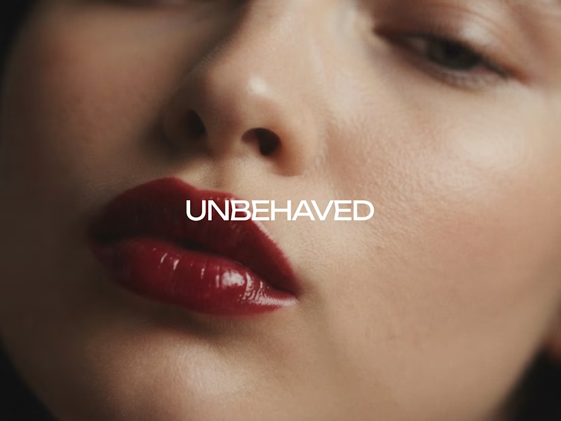
Every brand says be yourself. Then retouches you into someone else.
UNBEHAVED (https://www.behance.net/gallery/257547859/UNBEHAVED-Lipstick-Brand-Identity-Art-Direction) keeps what the others erase. The pore. The lip worn past its edge. The red left on a glass after she’s gone. Proof a person was there.
Here’s where I got stuck. The wine red. I wanted it as the brand’s signature, everywhere, ownable. But the more I used it, the cheaper it looked. So I cut it back to almost nothing. One accent, one moment per layout. The restraint is what finally made it read as luxury.
Still not sure I pushed it far enough. Part of me thinks the strongest version uses the red once in the entire system and never again.
Art directors, brand designers, where do you land on this? Is a signature colour stronger when it’s everywhere, or when it’s almost never there?
✦ Follow for brand identity & art direction
Check it out (https://contra.com/p/LrXq3rRQ-unbehaved-luxury-beauty-brand-identity)
2
2
187
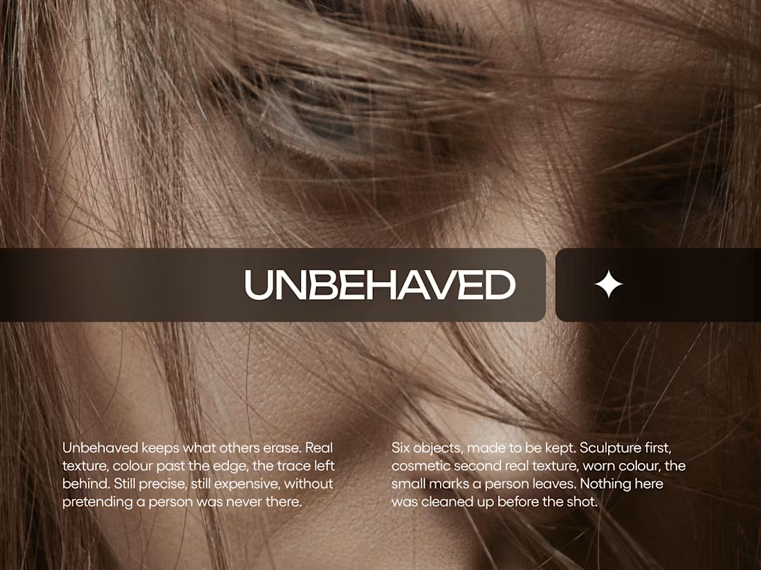
UNBEHAVED Luxury Beauty Brand Identity
0
3
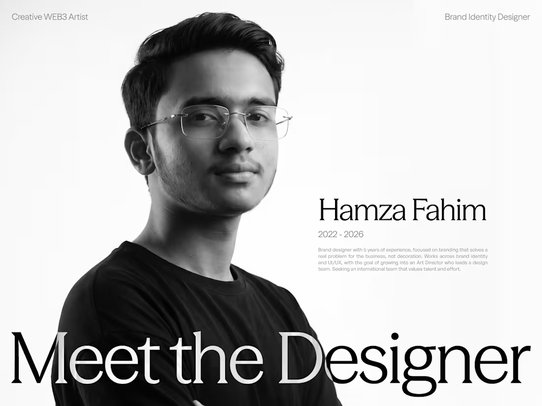
Hamza Fahim. Brand identity designer.
I fix brands that look right but don’t work. I start with what’s holding the business back, then build the identity around it: logo, colour, typography and guidelines, followed by the design system, website and landing pages, UI/UX, pitch decks and social creatives that carry it, so every touchpoint says the same thing. 5 years of experience across Web3, DeFi, travel and marketing, with 50+ Web3 and DeFi projects and 55+ travel campaigns delivered as the right hand to an Art Director, with junior designers working under my direction.
I work fast, keep every asset consistent across print and digital, and understand the product I’m designing for, from apps and platforms to investor presentations. If you’re building a brand and want it to do real work for the business, here's my portfolio Hamza Fahim (https://www.behance.net/hamzafahim1123), and my email is hamzafahim997@gmail.com (mailto:hamzafahim997@gmail.com).
2
5
1K
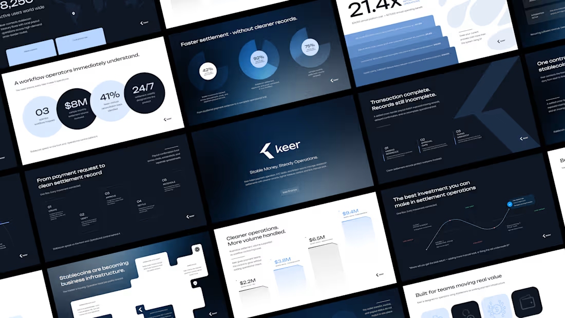
Minimalism isn't a style choice. It's a discipline.
Anyone can strip a slide down to one line and call it clean. The harder part is knowing what to keep, and why every element that stays has a reason to be there.
This deck runs on that principle. Dark base because contrast is the fastest way to direct attention. One accent color because more than one is a decision you haven't made yet. Grid-locked layouts because when the structure holds, the content doesn't have to fight for space.
I design across industries. Tech, finance, healthcare, consumer brands. But there's something about high-stakes products, the ones where a single presentation can move serious money, that pushes the design thinking further.
This is one of those.
I didn't design this to look like a fintech deck. I designed it to look like a decision has already been made, and the slides are just showing you why.
Does the vibe land for you?
Full case study Keer (https://contra.com/p/mMkYrRAL-keer-crypto-and-stablecoin-payment-pitch-deck?referralExperimentNid=DEFAULT_REFERRAL_PROGRAM&referrerUsername=hamzafahim1123)
2
4
578