
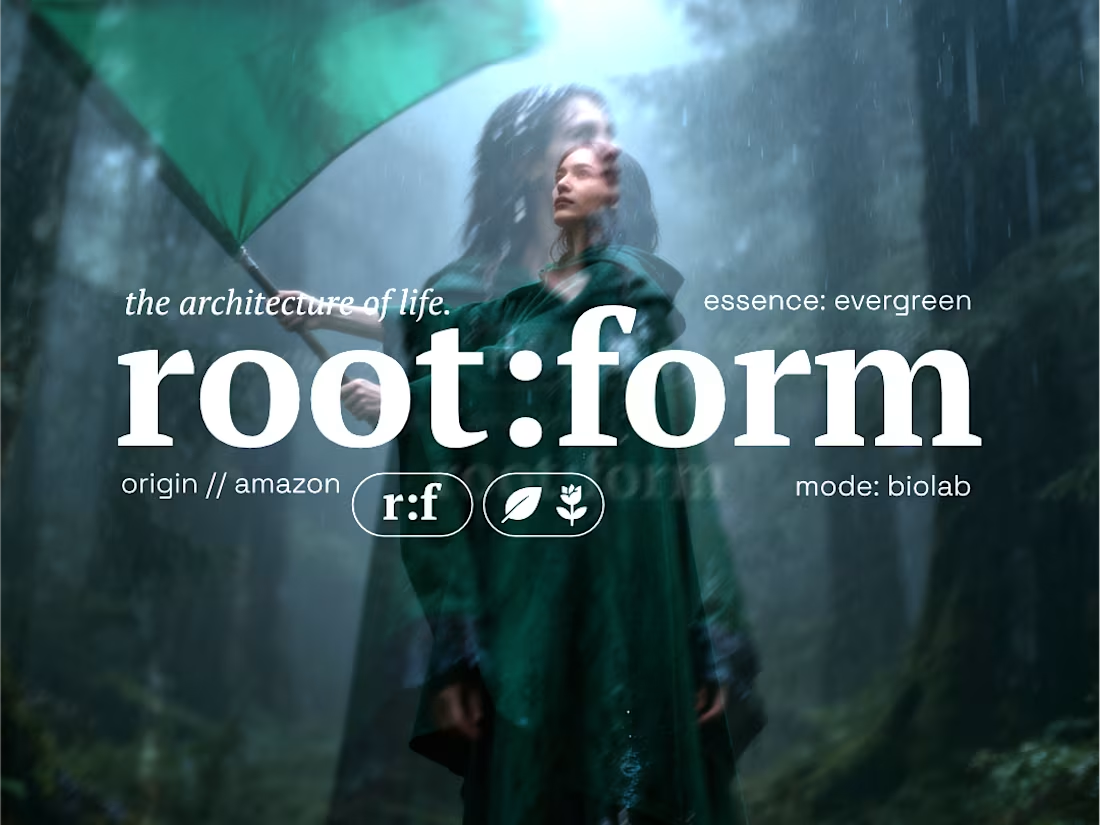
root:form
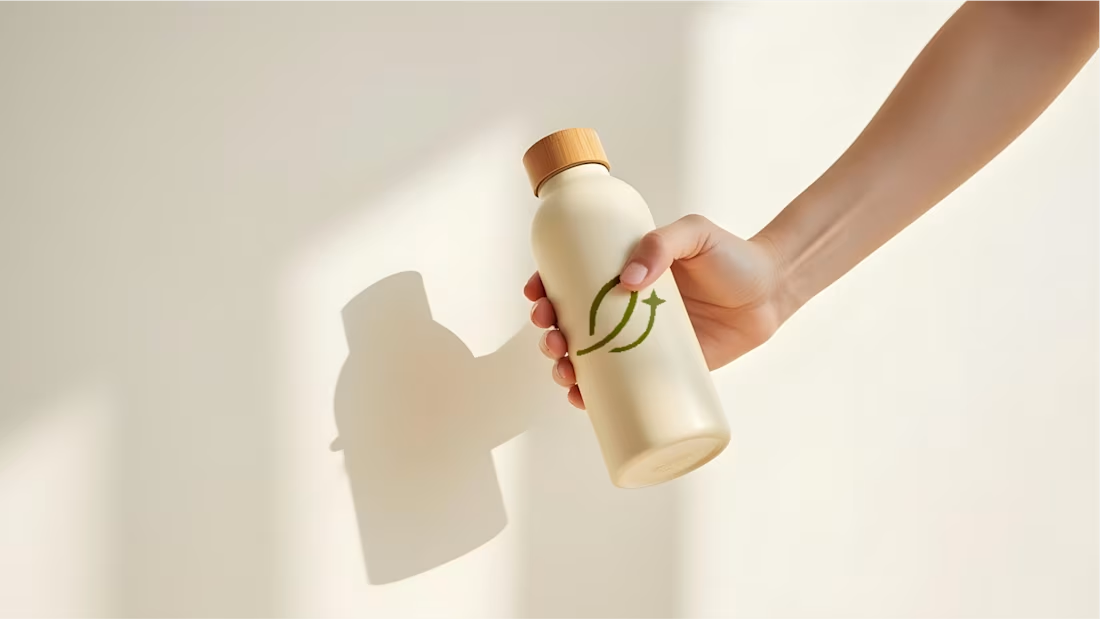
essence of the earth
0
78
MedSynk - Brand Identity Design
1
124
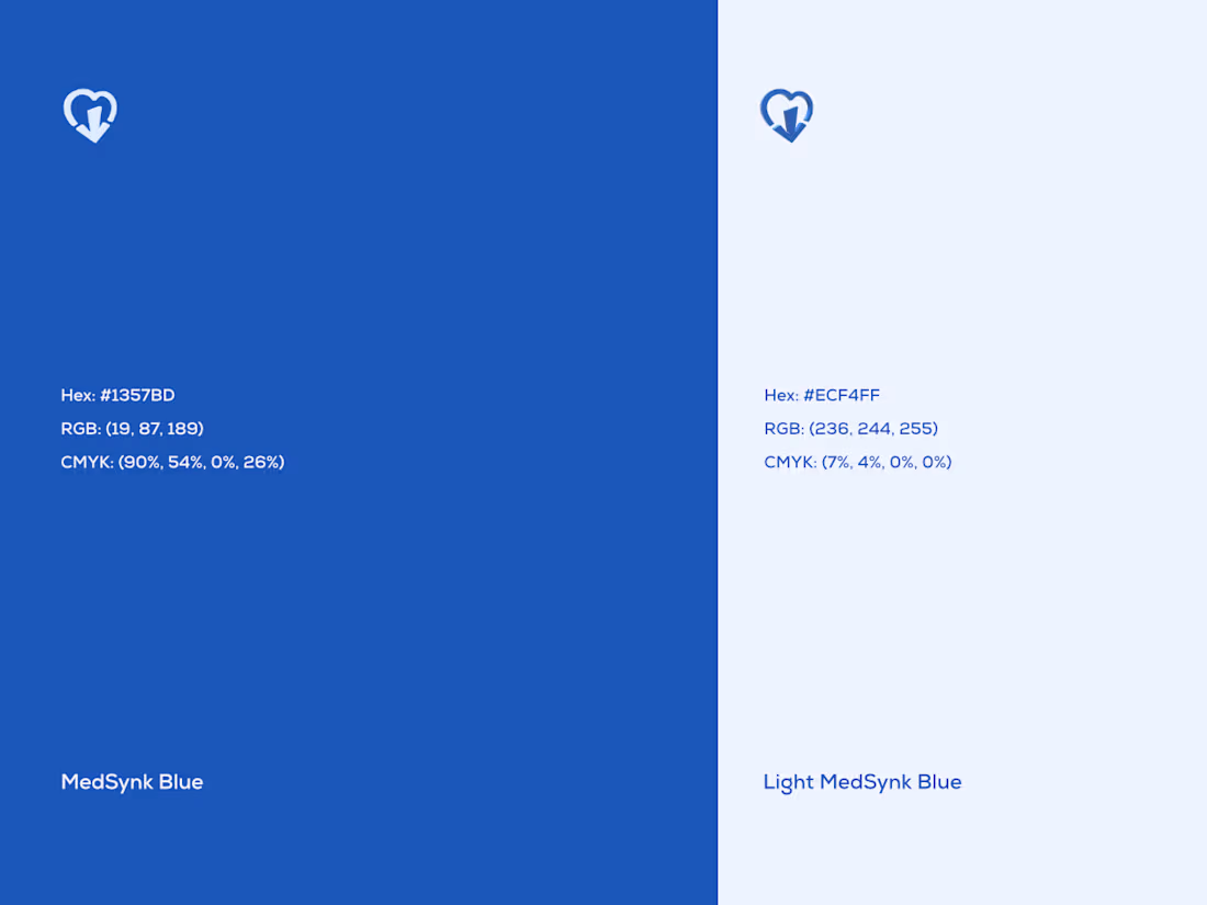
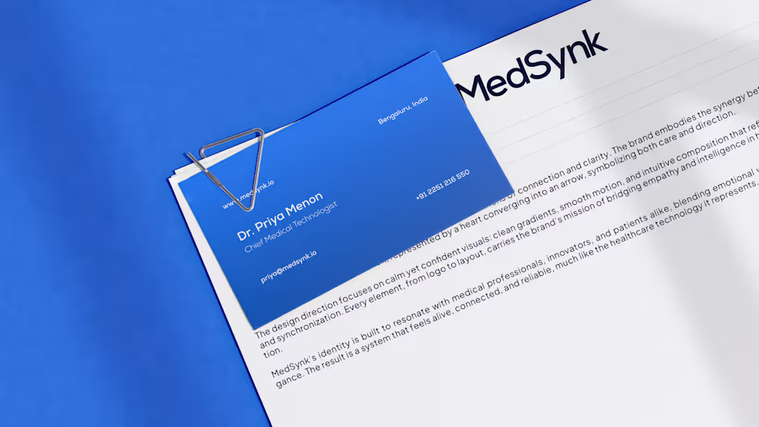
MedSynk’s visual language lives where clarity meets care.
Clean typography, calm blues, and modern geometry -all crafted to reflect trust, intelligence, and precision in healthcare. 💙
Design that feels human, yet built on logic. → Let’s craft your brand next.
1
116
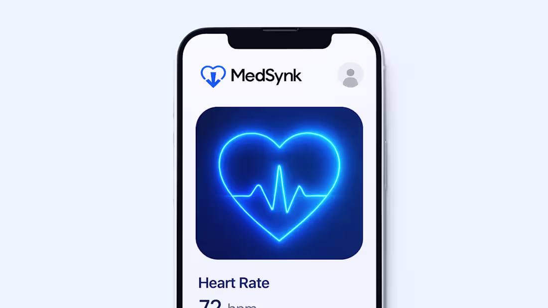
Where empathy meets intelligence.
The MedSynk identity brings human care and digital precision into one visual system - merging emotional warmth with data clarity.
Every detail - from the glowing heart symbol to the clean gradient tones - reflects trust, connection, and innovation in modern healthcare.
Let’s craft your next standout brand together → DM to work with me.
0
106
Every heartbeat tells a story - MedSynk listens.
This brand identity was designed to balance emotion and intelligence, symbolizing how modern healthcare connects us all.
29
270
How I Turned an Eco Brand From Forgettable to Investor-Ready.
0
11
Rijarc Renewables Product Campaign
1
50
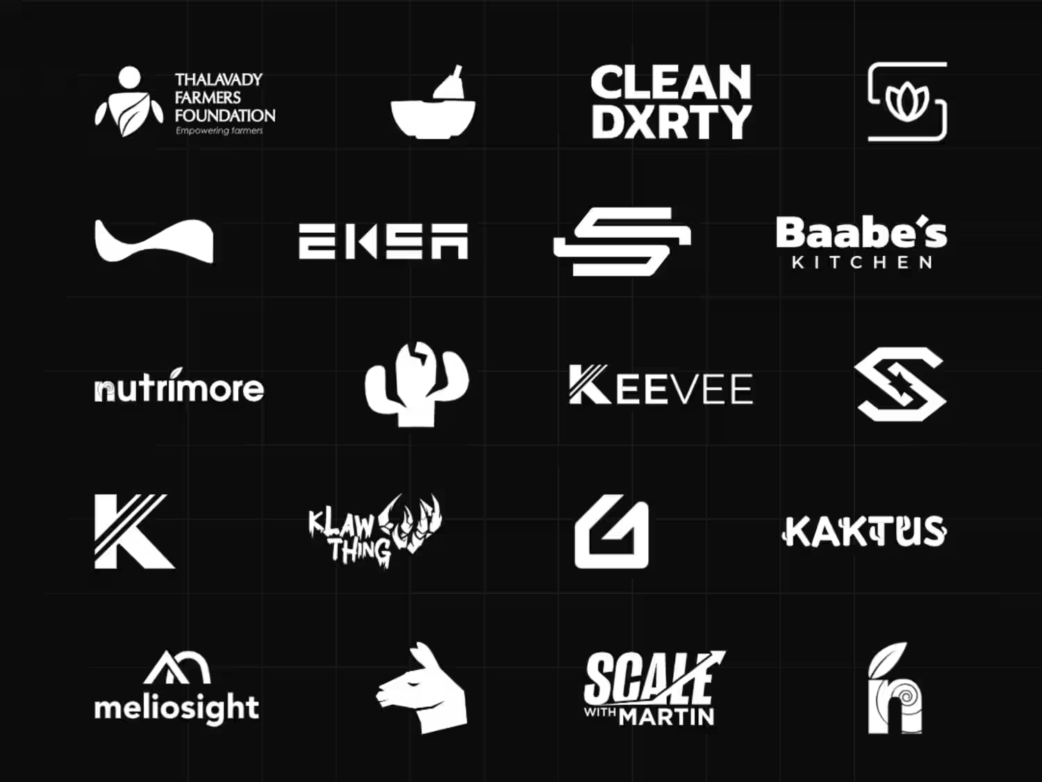
Thalavady Farmers Foundation & Farmfit Branding
1
9

Your logo isn’t just an icon - it’s a signal to investors.
When a brand looks investor-ready, it gets taken seriously before the first word of the pitch. Scale 360’s mark was designed to trigger one emotion - trust in growth.
You don’t need a prettier logo. You need a strategic one.
#casestudy #branding #logodesign
35
248
Bluemart Visual Identity Rebrand
0
14
Redefining Answers: A Calm Visual Strategy for Perplexity
1
24
Joint Hands Women Farmers Producer Company Limited
0
23
Branding for Meliosight
1
18