Redefining Answers: A Calm Visual Strategy for Perplexity
Kushi Subrahmanya
Redefining Answers: A Calm Visual Strategy for Perplexity
Discipline: Art Direction · Visual Identity System · Campaign Strategy
Project Type: Conceptual Ad Campaign
The Challenge
In a world obsessed with speed and attention-grabbing noise, how do you design intelligence that slows people down?
This campaign was born from a strategic question:
“What if AI could feel like wisdom?”
Perplexity, a search AI platform, needed a campaign that reflected:
Emotional clarity
Intellectual depth
Visual trust
My role was to build the entire campaign from scratch — concept, copy, layout system, and visual direction — without relying on loud design tropes.
Art Direction Philosophy
The core art direction was driven by a moodboard principle I call:
Calm Intelligence
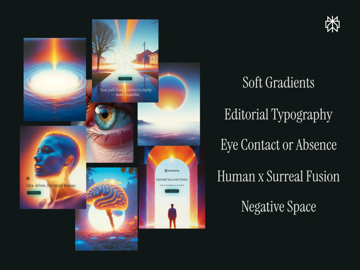
The color palette alternates between daydream blues, neural oranges, and human skin tones — a system inspired by both science and emotion.
Poster Narrative Structure
Rather than isolated visuals, each poster was part of a sequence — a conversation arc broken into 3 phases:
Phase 1: Foundational Beliefs
Posters #1–#3
Themes: Philosophy · Reframing · Poetic tone
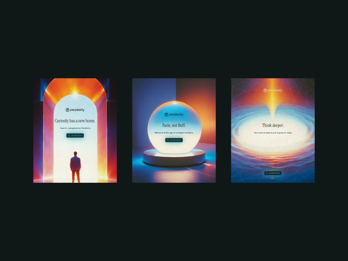
Phase 1: Foundational Beliefs
These introduce the brand's soul — positioning it as intelligent, calm, and intentional.
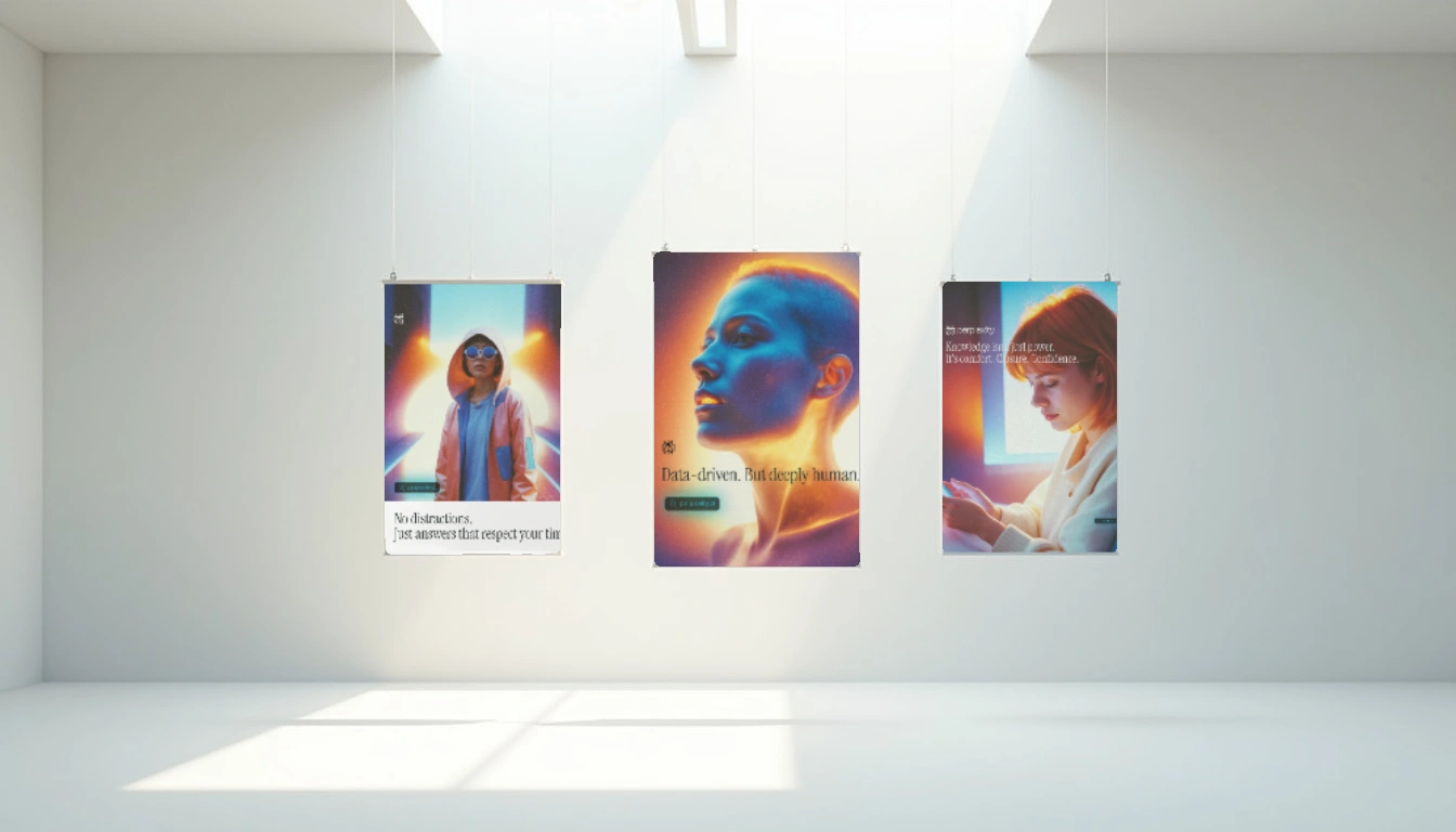
Phase 2: Emotional Resonance
Posters #4–#9
Themes: Human connection · Empathy · Understanding
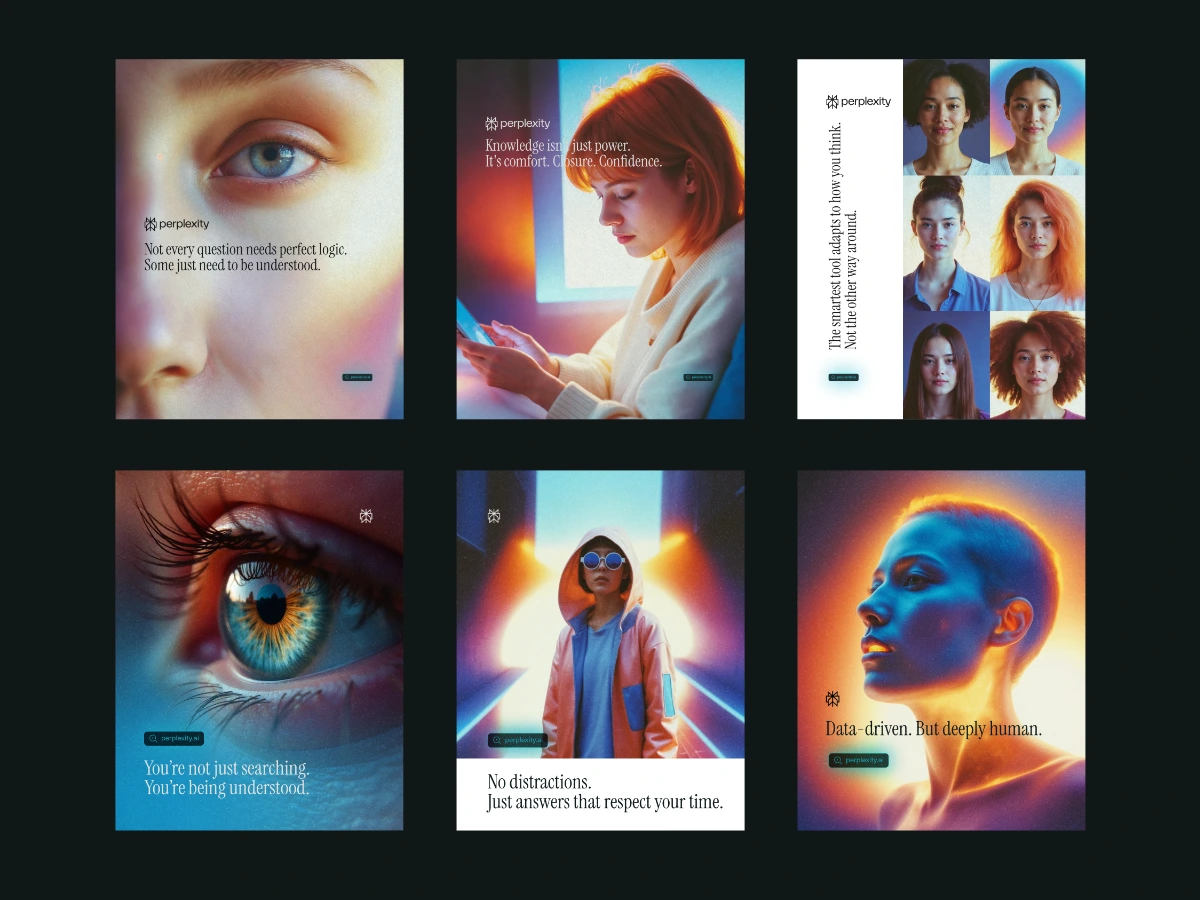
Phase 2: Emotional Resonance
This phase grounds the tech in human emotion.
Phase 3: Futuristic Expansion
Posters #10–#14
Themes: Visual metaphors · Intelligence system · Clarity
Phase 3: Futuristic Expansion
We close the loop between human intuition and future-forward intelligence.
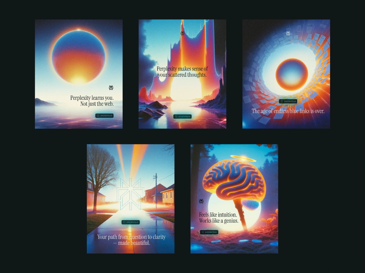
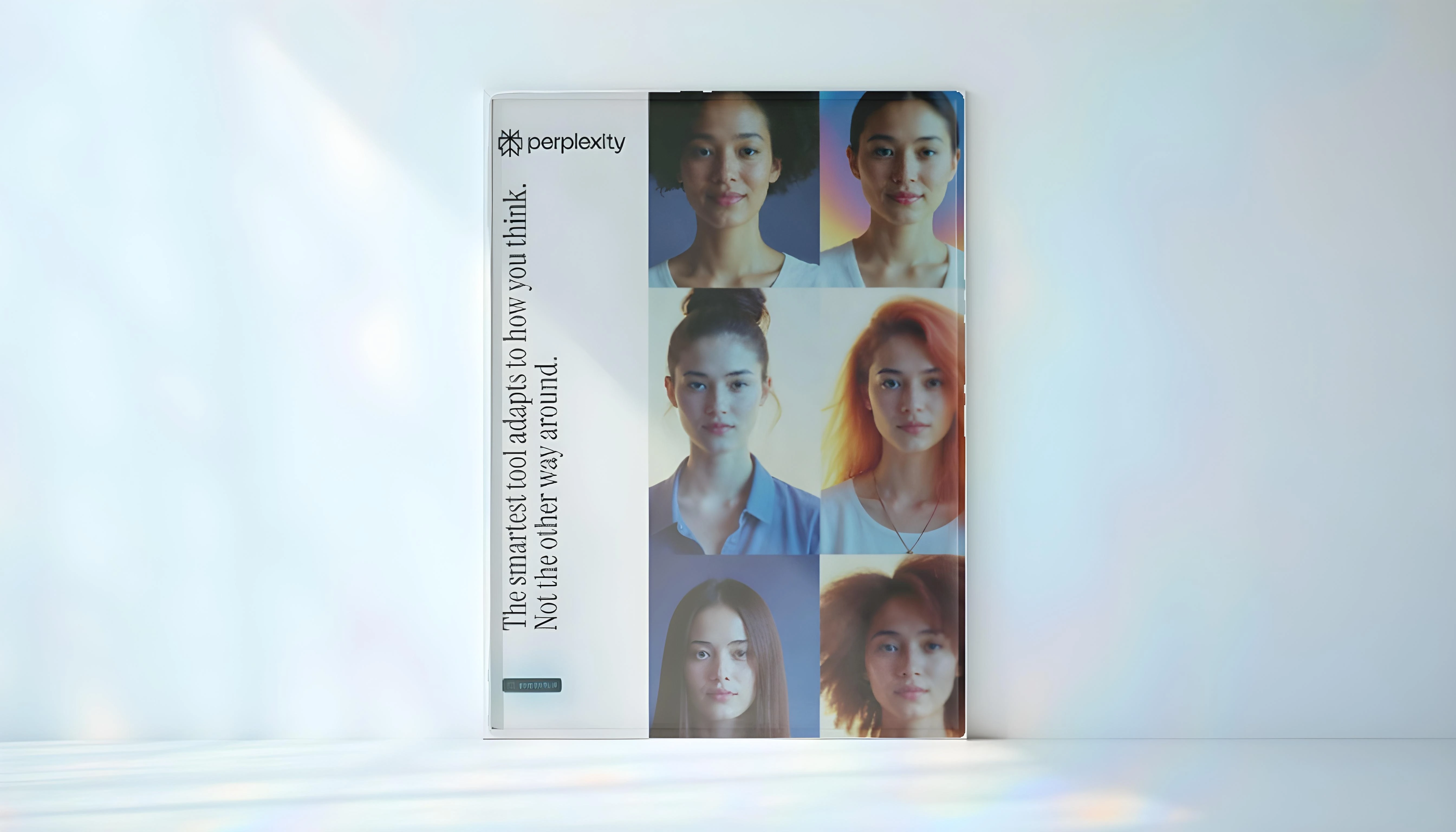
Poster Composition System
A modular structure was followed:
Aspect Ratio: 4:5 for all posters
Safe Zone: Rule of thirds for balance
Headline Focus: Single idea per frame
Texture: Soft light bloom or gradient overlays
Visual Hierarchy: Image > Headline > Signature > CTA (optional)
This allowed each poster to stand alone while harmonizing in a gallery set.
Mockup Strategy
To showcase real-world context, a few strategic mockups were generated using a curated prompt library focused on:
Minimal gallery spaces
Studio wall shots with natural shadows
Street installations (low-clutter, clean surfaces)
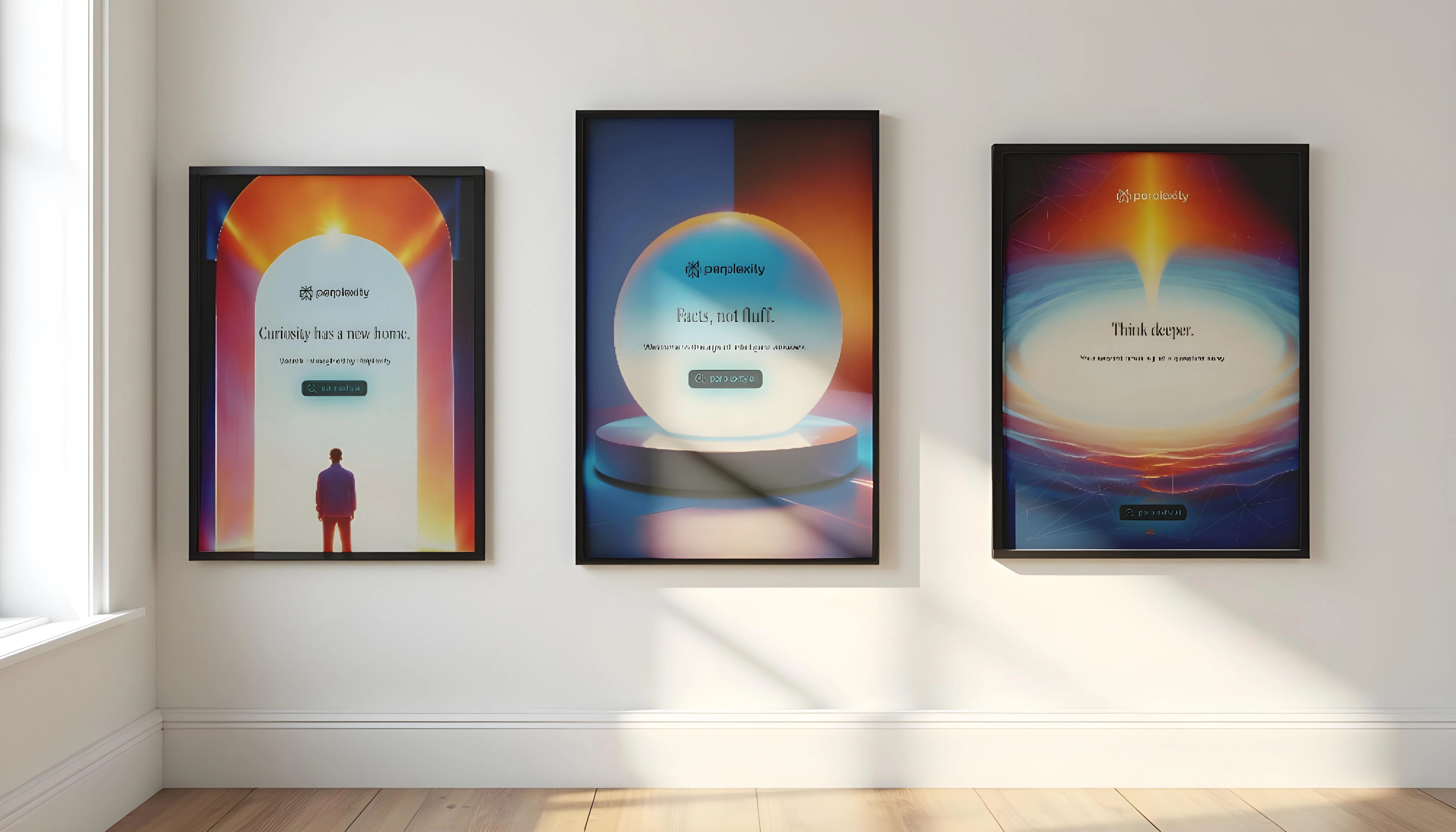
Note: All environments served the poster, never the other way around. The design always remained the focal point.
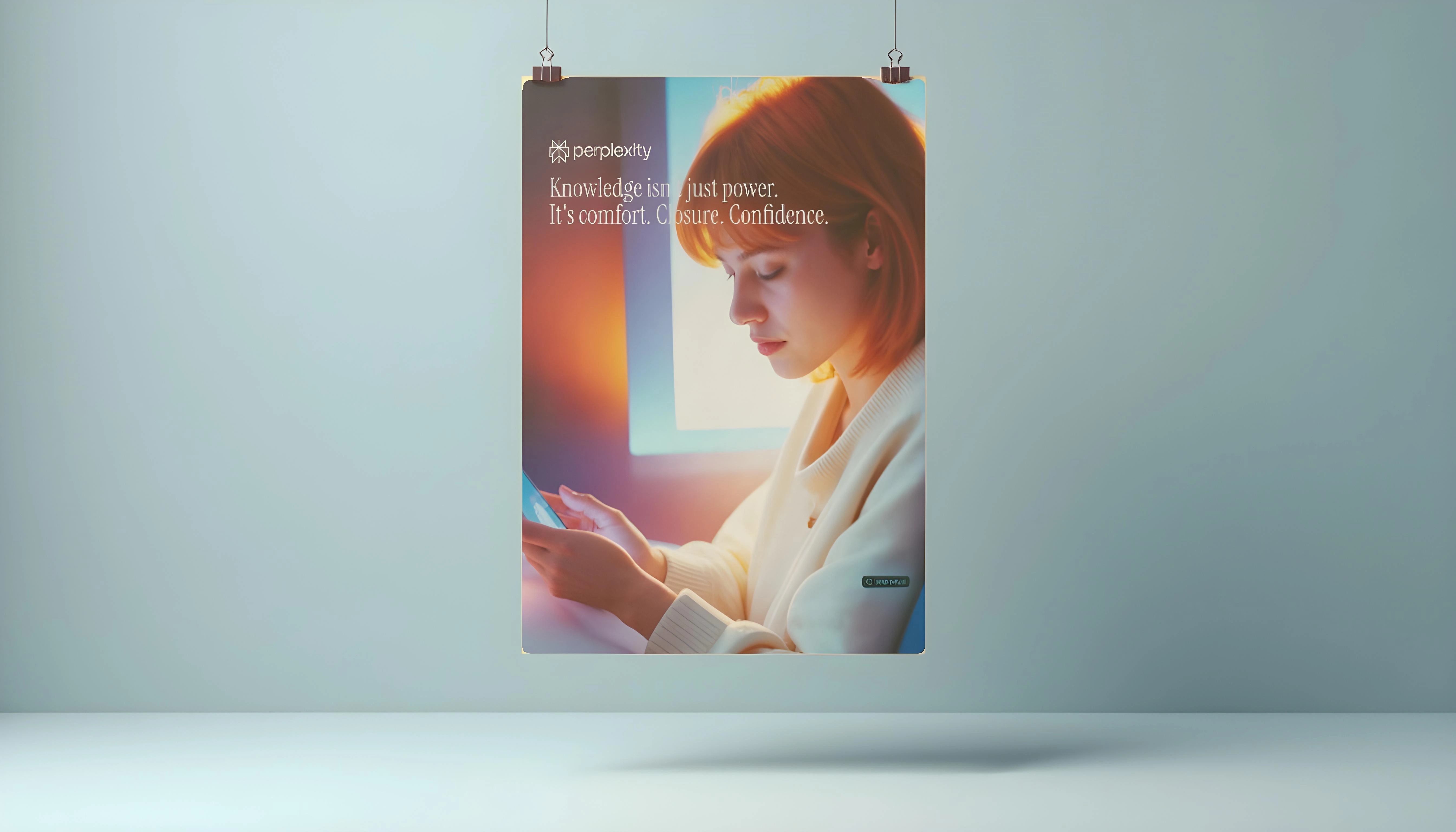
Copywriting Strategy
Headlines were crafted as gentle reframes, built on 3 principles:
Begin with Clarity – Short, calm, meaningful
Imply Depth – Let the reader lean in
Emotion without Fluff – Strategic feeling
Example:
“No distractions. Just answers that respect your time.”
Outcome & Reflection
This campaign was an exercise in restraint, clarity, and emotional intelligence — delivered entirely through:
Poster design
Art direction
Copy tone
Mockup storytelling
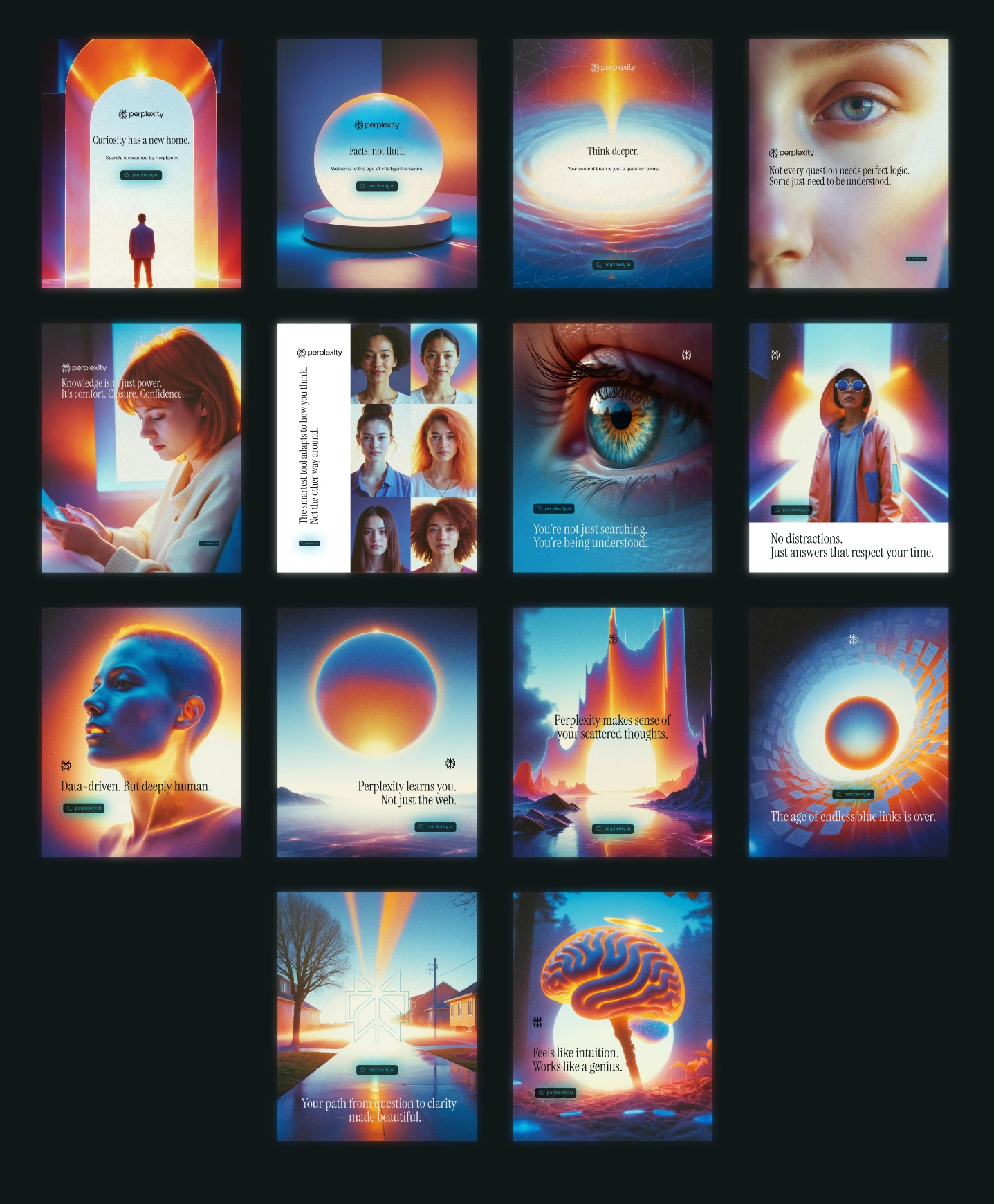
Set of all the 14 Posters designed for the Campaign
Let’s Redefine What Answers Feel Like
Whether you're building a product rooted in intelligence, emotion, or elegance —
I'm here to craft the visual system that makes your message unforgettable.
Looking for calm but powerful design direction?
Let’s collaborate on your next breakthrough campaign.
👉 Get in touch at kushigrafixxinquiry@outlook.com
Like this project
Posted Jun 12, 2025
Developed a calm, intelligent ad campaign for Perplexity AI.
Likes
1
Views
24
Timeline
Jun 1, 2025 - Jun 12, 2025
Clients
Perplexity