Rijarc Renewables Product Campaign
Powering Performance with Design – Rijarc Renewables Product Campaign
The Client & Campaign Context
Client: Rijarc Renewables LLP
Scope: Strategic design campaign for product visibility
Duration: 28 Days
Deliverables: 12 high-impact product posters, visual system, social content strategy
Goal: Increase product awareness and position Rijarc as a performance-first solar brand
Rijarc Renewables ®
Problem
Despite selling advanced solar components, Rijarc lacked a visually coherent and conversion-optimized product presence online. They needed a modern design system to cut through noise, communicate product performance, and build trust in a saturated market.
Technical products often overwhelm buyers who aren’t engineers
Existing product visuals lacked structure, hierarchy, and clarity
Needed to communicate "Why this product matters" at a glance
No streamlined, repeatable campaign system to promote each product line
Campaign Objective
To design a conversion-optimized, visually engaging 12-post campaign that:
Positions Rijarc as the go-to source for top solar products
Highlights benefits > specs for better sales engagement
Equips the brand with a repeatable format for future promos
Brings structure to their product storytelling
Solution Overview
We crafted a strategic product campaign centered around:
Clarity-driven design
Industrial-grade storytelling
A modular visual system that reinforced the brand's value pillars: efficiency, durability, and innovation
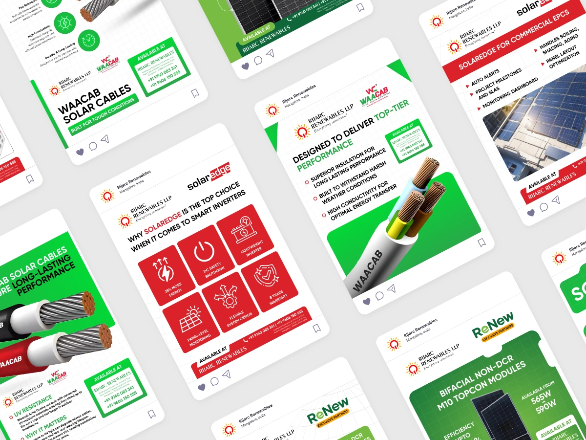
A click of the 12 post-campaign
Strategy & Execution Framework
Phase 1: Campaign Planning
Identified 3 core product categories: Inverters, Panels, Cables
Defined CTA structure: Available at Rijarc + Product Value
Built messaging strategy around 3 key pillars:
Trust – Brand reliability
Performance – Technical superiority
Simplicity – Easy decision-making
Phase 2: Visual Messaging System
Created bold, color-coded systems per category (Red = Inverters, Green = Cables, Black = Panels)
Designed each post to stand alone or work in series
Used iconography, benefit-led headlines, and clean product displays
Made technical data visually scannable
Phase 3: Multi-Use Asset Design
Formats built for social, email campaigns, pitch decks, and WhatsApp sharing
Designed for maximum reuse with minimal editing
Art Direction Strategy
Backed by 2 visual boards:
Fonts: Gilroy (power + modernity), Carella (elegance)
Tone: Clean, structured, conversion-focused
Colors: Inspired by solar energy (green/orange/red/black)
Shapes: Strong rectangles, product-callout ovals
Textures: Grid spheres → signal precision/tech
We also referenced FMCG and hardware ad layouts to bring a product retail vibe into the B2B solar space.
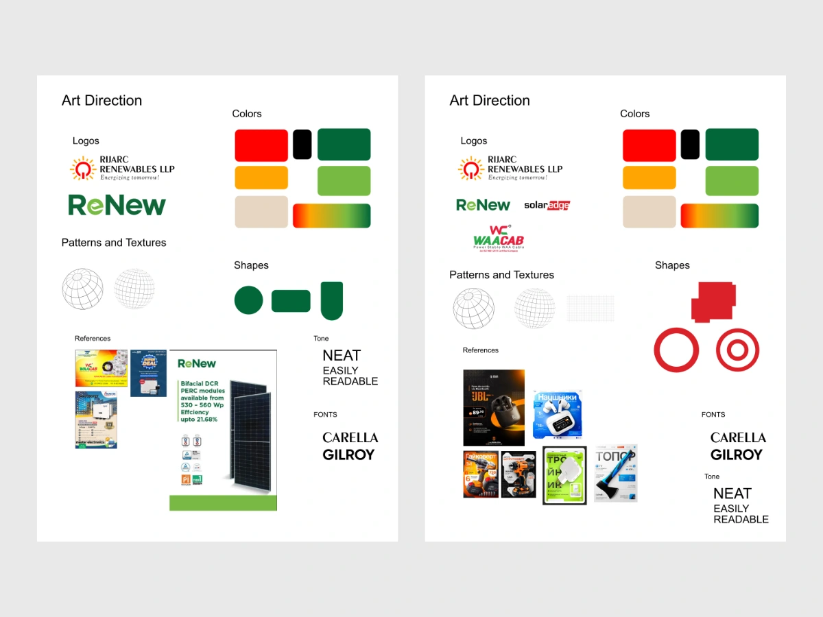
Art Direction Boards
Visual Design System
We created a poster framework that was:
Easily replicable for future product lines
Device-agnostic (mobile first)
Balanced between technical clarity and emotional engagement
Key Design Elements:
Modular layouts
Product highlights with large imagery
Stat blocks and certification badges
UI previews (for software products)
Consistent hierarchy and CTA zones
Execution: The 12 Poster Campaign
We divided the campaign into:
Product Value Posters (cables, modules, inverters)
Technical Insight Posters (specs, efficiency, warranties)
Software Interface Posters (monitoring dashboards)
Brand Storytelling Posters (innovation, scalability, ease-of-use)
Each poster included:
Bold headline → benefit first
Product visuals with clarity
Icons/stats to boost trust
CTA/reference to availability
“From raw copper wire to smarter solar analytics—we told the story of every watt.”
Results
Enhanced product credibility for WAACAB cables and SolarEdge inverters
Reduced content production time through a template system
Positioning as a tech-forward solar partner for B2B buyers
Reusable format for print, digital, email, and retail
Value Delivered
Systemized marketing collateral
Visual language is scalable across product launches
Instant trust triggers via product specs, visuals, and awards
Elevated perception → from a supplier to a solution provider
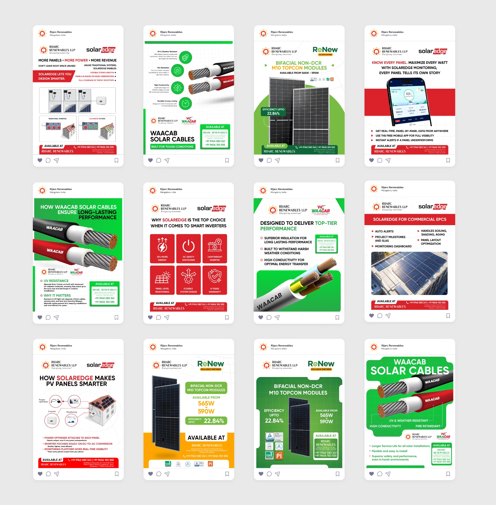
12 Posters
Reflection / Process Insight
“This wasn’t just design—it was conversion strategy wrapped in pixels. The key was balancing engineering depth with retail clarity, especially for a technical buyer persona.”
Working with Limited Raw Assets
Rijarc provided minimal resources — mostly low-res product photos and basic feature sheets.
We:
Manually cleaned and enhanced images for sharper detail
Built a consistent asset library from scratch
Created icons and UI representations to simulate app visuals and add depth
This forced us to rely heavily on layout logic, typography, and color to deliver impact.
Building Hierarchy Using Just Fonts & Colors
Without flashy animations or high-end renders, we focused on pure information design:
Used Gilroy’s geometric sharpness for headings and performance-driven tone
Leveraged Carella’s contrast to inject a softer, premium feel
Color-coded sections (e.g., orange = energy, green = performance, red = warning/alert)
Visual balance through spacing, modular zones, and grayscale control
Each poster felt readable, fast, and hierarchy-led, even without motion or complex effects.
Structuring Messaging for Technical Clarity
We applied a "what–why–proof" messaging structure across all poster types:
What is it? (Bold headline)
Why does it matter? (1-liner benefit or problem solved)
Proof it works. (Stats, certifications, or UI snap)
This made each poster work like a mini landing page — guiding buyers through awareness to interest without fluff.
If your product is technical, but your buyers aren’t, design is your best translator.
Let’s build your next product campaign.
Inquiries → kushigrafixxinquiry@outlook.com
Rijarc Renewables, 12 Poster Marketing Campaign, 2025
Like this project
Posted Jun 3, 2025
Designed a strategic campaign for Rijarc to boost product visibility and credibility in the solar industry.
Likes
1
Views
49
Timeline
Apr 1, 2025 - Apr 28, 2025

