
Joao Paulo Bastos
Brand Designer | Packaging | Motion
- $1k+
- Earned
- 1x
- Hired
- 5.00
- Rating
- 10
- Followers
Done Opera Music Video Production
0
0
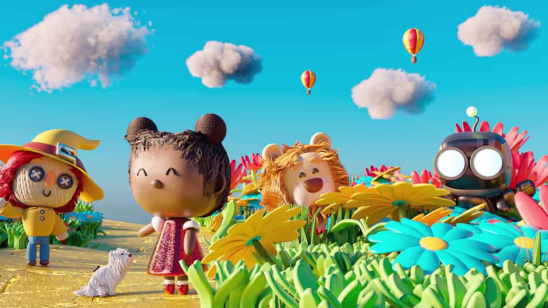
Strategic Visual Identity for Mágico de Oz School
0
3
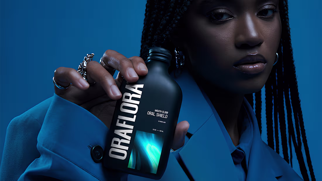
OraFlora Line
0
8
Logo Animation
0
3
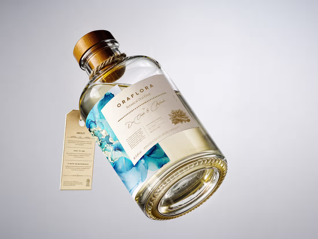
Oraé Elixir — Brand Identity & Packaging Design
0
2
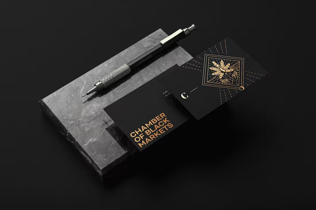
CBM Brand Identity Design
0
7
If there’s one thing I learned working in advertising agencies, it’s that design goes far beyond creating beautiful pieces.
The Meet Your New Art Director campaign comes from that mindset. It’s about bringing agency thinking, methods, and experience to founders, startups, and growing brands. Because often, the idea isn’t the problem — what’s missing is direction to make it real.
This project took two weeks of planning, production, filming, and editing. A reminder that strategy comes before visuals, and strong brands are never built by chance.
Today, this video is out in the world.
I hope it reaches you and inspires you to move your ideas forward.
0
170
Garimpei -Brand Design
0
2
Motion Graphics Design for Roldão Atacadista
0
7
This project was developed as a 3D commercial for Lifespan, focused entirely on product animation and three-dimensional visual storytelling.
The work involved product modeling, lighting, texturing, and animation, with the goal of presenting the product in a clear, premium, and visually engaging way. The animation highlights form, materials, and functionality, using movement to enhance realism and perception.
Art direction and branding principles guided the overall look of the piece, ensuring consistency in tone, composition, and visual language. The result is a product-driven 3D commercial where animation and lighting play a central role in communicating value and quality.
1
427
Sunstar Gum - Art Director
0
3
This logo animation was built using classic animation principles inspired by traditional animation. Techniques such as squash and stretch, anticipation, timing, and easing were applied to give the “G” a sense of weight, elasticity, and rhythm.
The movement feels smooth and intentional, guiding the eye naturally as the logo appears. Instead of relying on effects, the animation focuses on motion fundamentals, creating a result that feels playful and polished.
By applying traditional animation techniques to a modern logo, the animation feels expressive while remaining clean and easy to use across digital contexts.
0
306
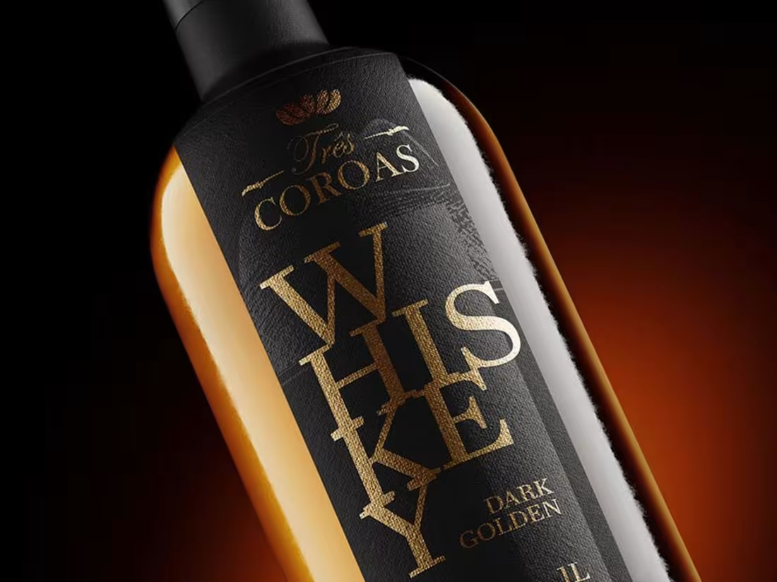
Três Coroas is a distilled spirits brand from the interior of Minas Gerais, known for the purity and authenticity of its sugar cane flavor. Founded in 1975, the brand went through a strategic repositioning, including a new visual identity and a redesigned bottle and packaging, aligning its heritage with a more contemporary and refined presence.
1
292
This logo animation was built using classic animation principles inspired by traditional animation. Techniques such as squash and stretch, anticipation, timing, and easing were applied to give the “G” a sense of weight, elasticity, and rhythm.
The movement feels smooth and intentional, guiding the eye naturally as the logo appears. Instead of relying on effects, the animation focuses on motion fundamentals, creating a result that feels playful, and polished.
By applying traditional animation techniques to a modern logo, the animation feels expressive while remaining clean and easy to use across digital contexts.
0
260
This animation explores fluid motion inspired by soda and carbonated drinks. Based on the curves and flow of classic beverage typography, the movement was designed to feel liquid, airy, and effervescent.
Fluid shapes, soft distortions, and bubble-like motion were used to suggest gas, pressure, and release. The animation aims to translate the physical sensation of a cold, fizzy drink into motion, where typography behaves almost like liquid.
The result is an expressive animation that connects type, motion, and sensory memory, bringing freshness, energy, and movement into the visual identity.
1
233
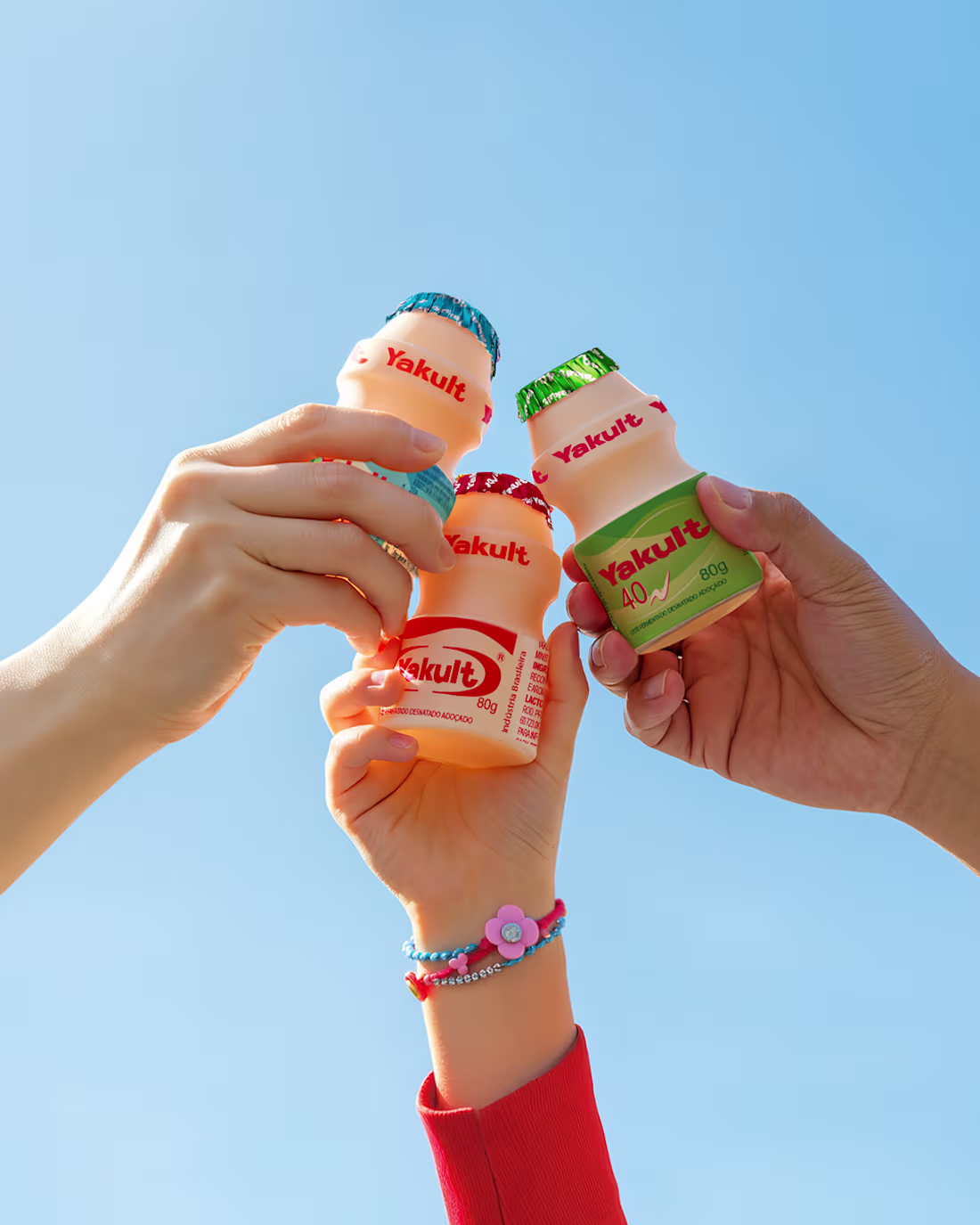
I worked as an Art Director on advertising campaigns for Yakult, one of the most recognized probiotic brands in the world. My responsibilities included creating visual assets for digital media, printed materials, and point-of-sale displays, ensuring consistency with Yakult’s iconic branding and health-focused messaging. Collaborating with copywriters, marketing teams, and other designers, I helped bring national campaigns to life, developing layouts for promotions, educational content, and seasonal initiatives that connected with both new and loyal consumers.
0
237
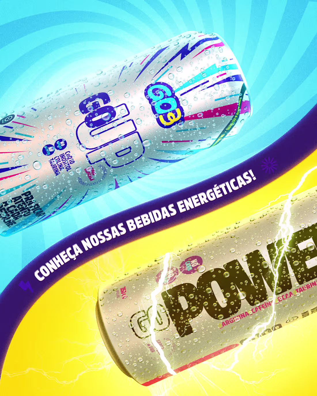
Go3 is a Brazilian health supplement brand that promotes a healthy lifestyle, focusing on the balance of body, mind, and spirit. As an Art Director, I was responsible for developing visual materials for their advertising campaigns across online and offline platforms. I created designs for social media, digital ads, printed pieces, and point-of-sale materials, ensuring every asset reflected the brand’s identity and health-driven positioning.
0
254
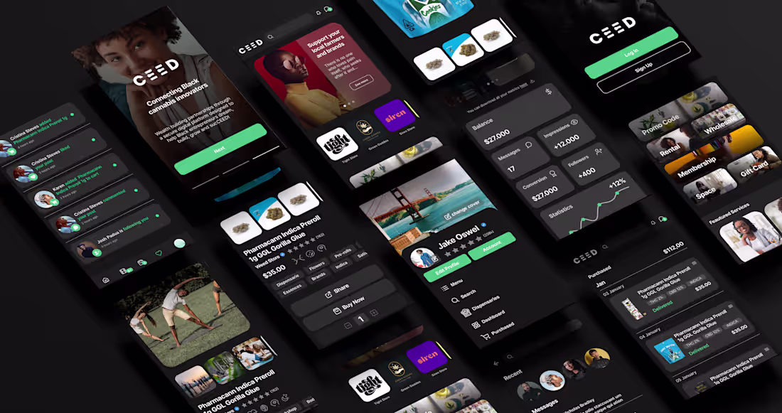
CEED aims to empower 3 million black entrepreneurs in the cannabis market by 2052, through an innovative digital ecosystem. It connects innovators to strategic resources and partnerships, with a focus on transparency and growth. Its design highlights this mission, offering an intuitive and efficient interface for users to navigate this technological and culturally engaged environment.
1
13
348
This logo animation was created frame by frame to give PetCloud a soft, friendly, and approachable personality. Each movement was drawn manually, allowing the motion to feel organic rather than mechanical.
The subtle timing variations and handcrafted transitions help reinforce a sense of care, warmth, and playfulness, reflecting the emotional connection between pets and their owners. The animation brings life to the logo without relying on effects, focusing instead on natural motion and rhythm.
0
200
This is one of my favorite parts of photo manipulation. It’s the fun part. No pressure to get it right, just moving elements around, testing ideas, adjusting scale, light, and texture, and seeing where things end up. Playing with possibilities until the image starts to take shape.
1
199
This Easter motion piece was created for out-of-home displays across different cities. The content was designed to run on multiple digital screens, adapting to urban environments with high visibility and quick viewing time.
The animation highlights the Easter moment while dynamically displaying the nearest Roldão stores based on each location. This approach helps connect seasonal messaging with real-world relevance, guiding people to the closest store in a clear and direct way.
Motion, color, and timing were optimized for large displays, ensuring legibility and impact even from a distance. The result is a seasonal OOH piece that combines celebration, location awareness, and brand presence in the city landscape.
0
160
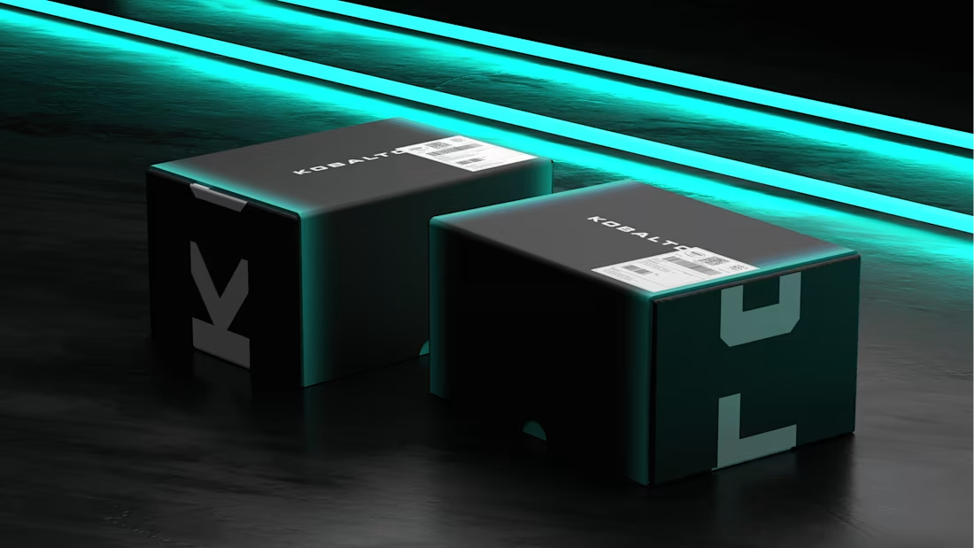
KOBALTO, more specifically, Lojas Kobalto, is a Brazilian electronics shop. Its focus is the sale of smartphones, mainly iPhones. The name refers to a chemical element, Cobalt, which is widely used in the composition of electronics, especially mobile phones and computers. It has a gray coloration. The writing of the name with K brings an impactful and beautiful look. Its origin comes from the German Kobalt. The pronunciation of the name is easy to memorize and strong. It brings personality and presence to the brand.
0
209
This motion piece was built around the idea that all the benefits customers look for are available inside the Roldão Mais app. The animation highlights features such as exclusive discounts, shopping convenience, home delivery, promotions, and special offers, presented as if the user were searching for them.
The concept plays with the logic of a search experience, where each query reveals a different benefit of the app. Motion and transitions guide this exploration, keeping the information clear and easy to follow.
A light and playful soundtrack inspired by supermarket ambience reinforces the concept, adding familiarity and rhythm. Combined with dynamic motion, the piece communicates the app’s value in a simple and engaging way for social media.
0
151
This logo animation focuses on clean motion design and technical precision. The animation explores timing, easing, scale, and opacity to create a smooth and controlled reveal of the logo.
Subtle motion principles such as anticipation, overlap, and rhythm are applied to give the animation flow without adding unnecessary effects. The movement is restrained and functional, designed to feel modern, lightweight, and consistent with digital platform branding.
The result is a logo animation that prioritizes clarity and usability, working seamlessly across intros, transitions, and digital environments.
0
139
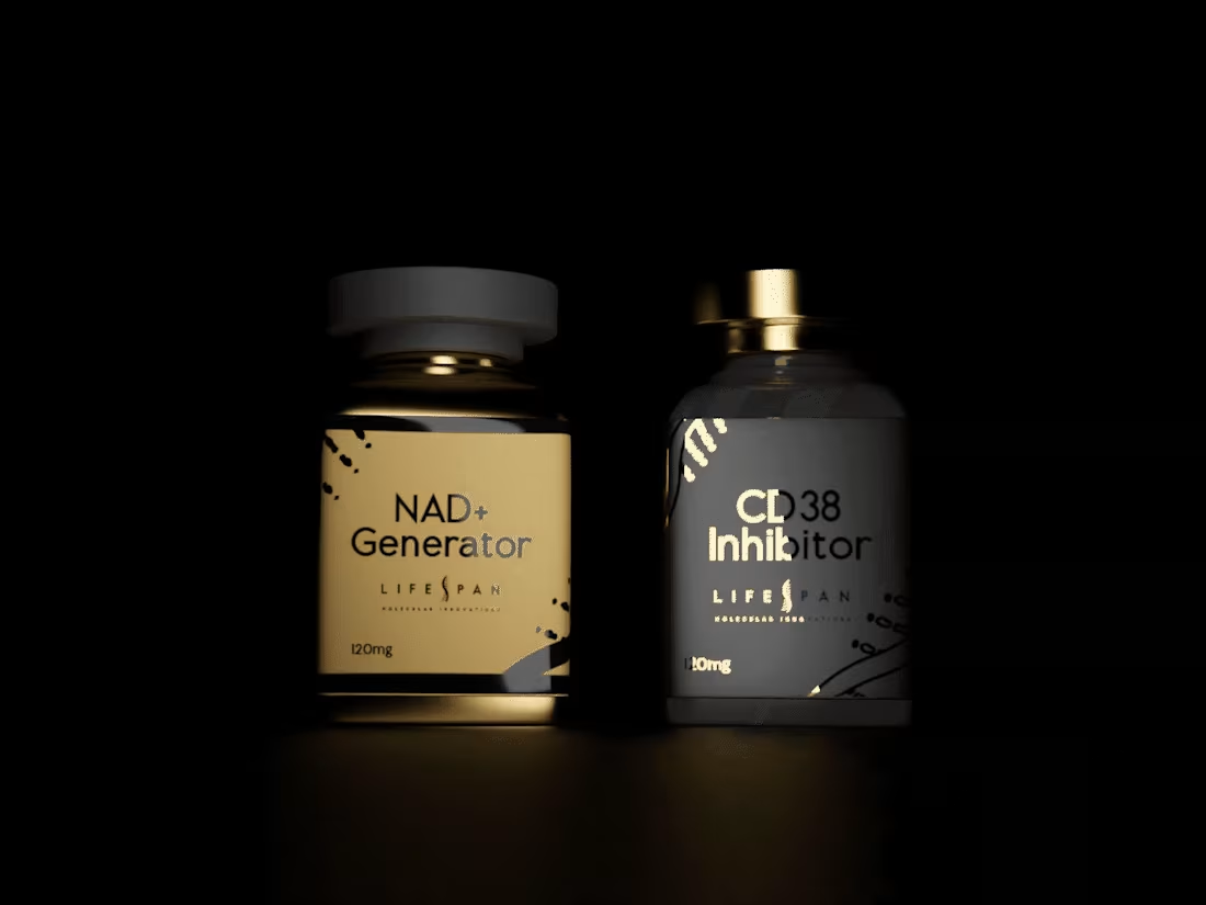
Lifespan is a high-standard supplement laboratory, strongly connected to molecular technology. The project involved creating the visual identity and packaging for its newest product, the NAD Generator and CD8 Inhibitor. The visual system was designed to reflect precision, innovation, and a refined, premium positioning aligned with advanced science.
0
208
This logo animation is driven by morphing techniques, where abstract shapes smoothly transform into the letters of the logo. The motion focuses on continuity, shape consistency, and visual flow, allowing elements to evolve naturally rather than appearing abruptly.
Classic animation principles such as timing, easing, anticipation, and overlap were applied to give the transitions weight and clarity. The morphing process creates a cohesive relationship between the elements and the final wordmark, making the animation feel intentional and fluid.
The result is a clean and controlled logo animation where transformation itself becomes the main visual language.
0
133
This social video was created as a summer tips piece, showing what to pack in a beach bag during the warmer months. Each item featured in the video represents a practical summer essential, such as personal care, sun protection, and everyday convenience products.
All the products highlighted are available at Coop Drogaria, reinforcing the idea that everything needed for a beach day can be easily found in one place. The content was designed to feel light, seasonal, and useful, focusing on clarity and quick recognition.
Motion and pacing help guide the list of items in a friendly and accessible way, making the video easy to consume and ideal for social media during the summer period.
0
115
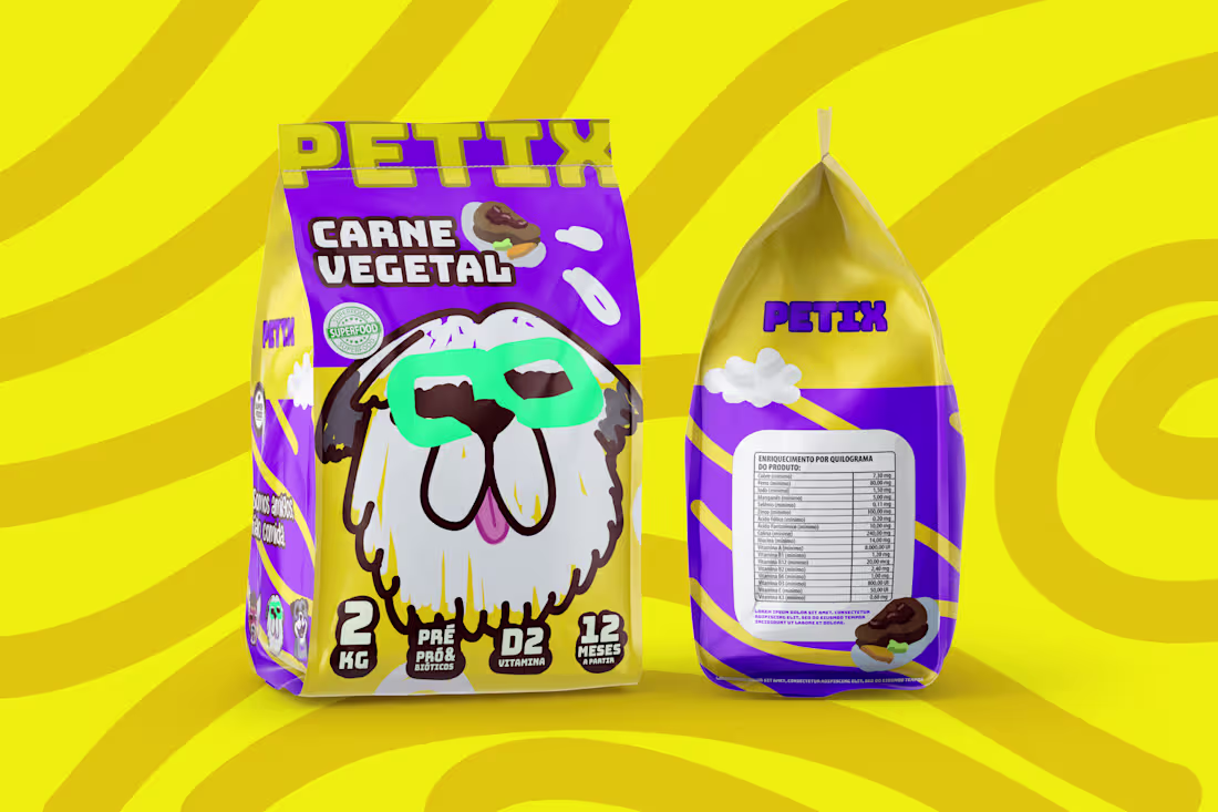
PETIX is a company of snacks for the pet market, your goal is to bring to the dogs, food based on SUPERFOODS. Snacks with HIGH PROTEIN INDEX and VITAMINS for PERFORMANCE and IMMUNITY.
0
159
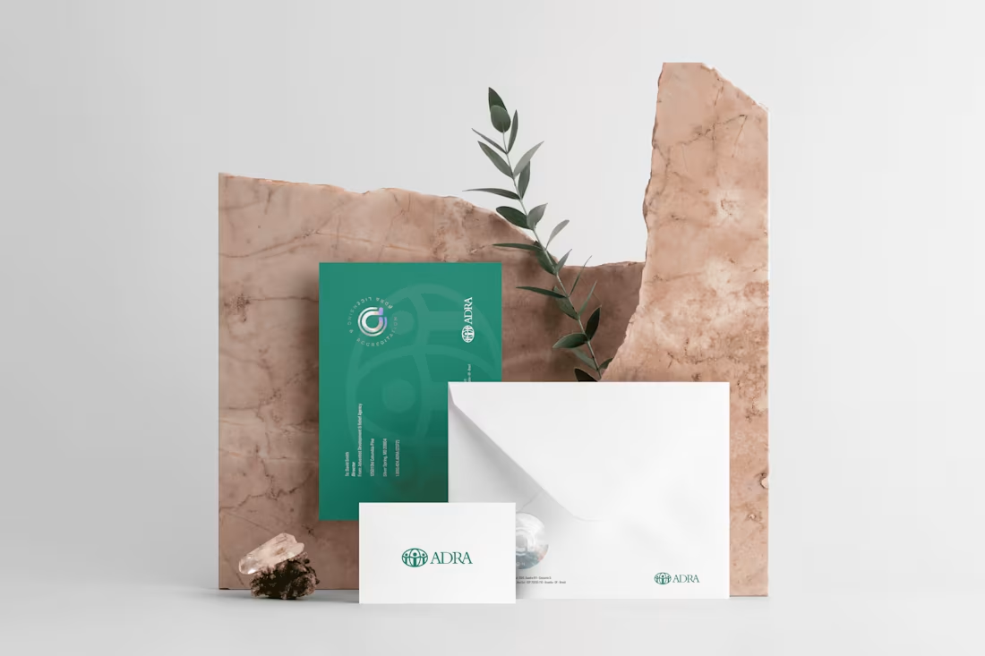
The Adventist Development and Relief Agency (ADRA) is a humanitarian agency that emerged with the purpose of collecting supplies, clothing and medicine for those afflicted by wars, natural disasters and other catastrophes. In its 2004 reports, ADRA reported assisting 24 million people, with approximately $159 million invested. It has on its staff more than 6000 employees. In 2007 it was operating in 125 countries. With such a large NGO, the responsibility became even greater. A seal was needed to prove the authenticity of those documents officially issued by ADRA.
0
148
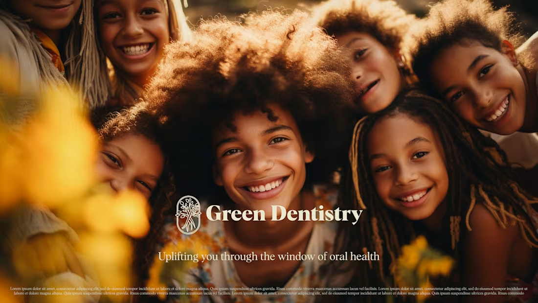
Green Dentistry Branding Design
0
4
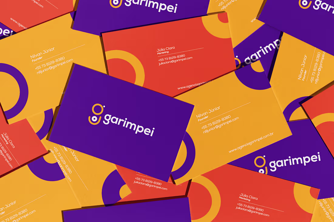
Garimpei is an agency born from its founder’s personality: direct, energetic, and genuinely fun. As an influencer, the founder built a strong connection with people through a hands-on, approachable way of teaching and sharing ideas.
This logo animation was designed to translate that same energy into motion. The looping animation represents how ideas start small, gain momentum, and connect people into a community. The playful timing and continuous movement reflect the agency’s dynamic method and light-hearted tone.
As the motion resolves into the “G” and the Garimpei name appears, the changing background colors reinforce the brand’s versatility. The animation helps carry the founder’s message and spirit into the brand itself, allowing the agency to communicate its identity beyond a single person.
0
133
These animated headers and footers were created for email marketing campaigns, using GIF animations to bring movement and attention to key messages inside the email layout.
The animations highlight benefits such as app features, promotions, discounts, and campaign messages, always aligned with seasonal themes. Motion is used in a subtle and strategic way, enhancing visibility without overwhelming the content or affecting readability.
Designed specifically for email environments, the animations prioritize lightweight files, clear hierarchy, and compatibility across platforms, helping campaigns stand out in crowded inboxes while remaining functional and easy to load.
0
78
This motion piece was developed to promote the Roldão Mais app on social media, encouraging users to download the app and activate exclusive offers.
The project covers the full motion workflow, including visual design, asset preparation, animation, and sound design. The visuals were designed to be clear, dynamic, and easy to understand, helping communicate the app’s benefits quickly in short-form content.
Motion, transitions, and visual hierarchy guide the viewer’s attention, while sound design reinforces key actions and moments, increasing clarity and engagement across social platforms.
0
98
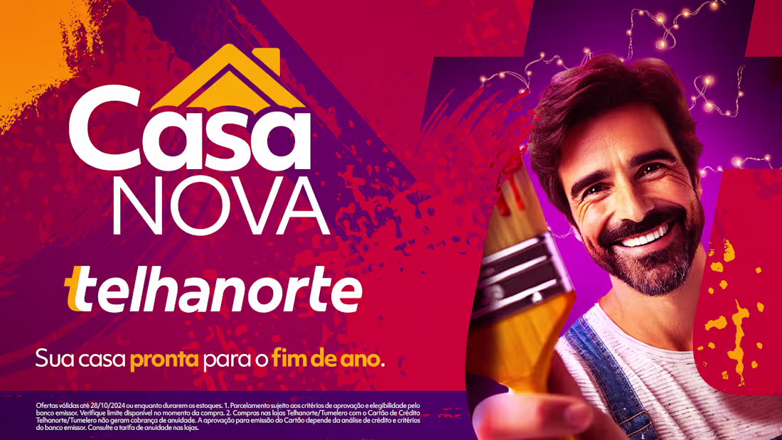
Telhanorte is one of Brazil’s largest home improvement retailers, known for its strong brand presence and signature vibrant colors. In this project, the Key Visual for the campaign “Casa Nova – Get Your Home Ready for the End of the Year” was developed for the holiday season. The campaign encouraged homeowners to refresh areas such as balconies, kitchens, and leisure spaces to welcome guests, highlighting special offers on paints and finishing products. The KV reflects a festive mood while staying aligned with Telhanorte’s visual identity.
2
1
150
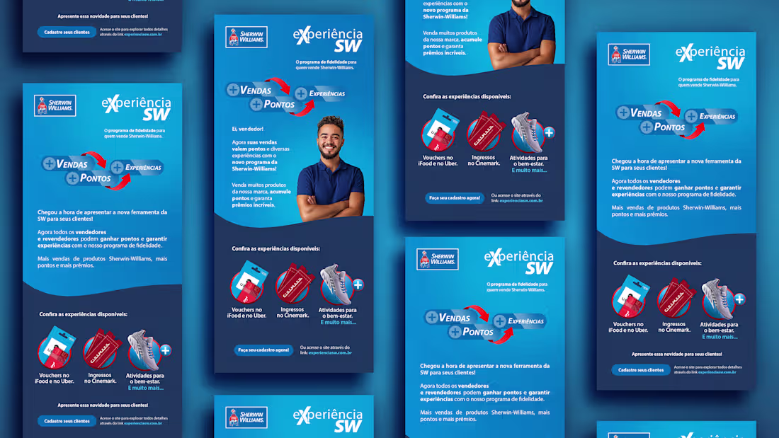
Sherwin-Williams Email Marketing Design
0
4