pro
Issam Eleyan
Art Director & Motion Designer | SaaS Videos & UI Animation
- $5k+
- Earned
- 4x
- Hired
- 4.9
- Rating
- 37
- Followers


I send clients rough work on purpose now, and it's saved me more time than any plugin ever has.
I used to spend two weeks polishing every frame of a video and send it over feeling proud. Then I'd get back something like "can we try a different direction?" Two weeks gone, and I...
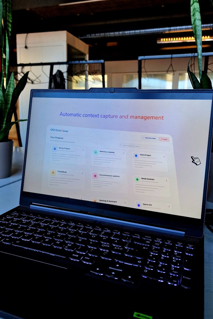
I've been scrolling motion design feeds lately, and everyone seems to be competing on who can add more. More glow, more 3D, more camera moves that have nothing to do with the message.
It looks amazing on Dribbble and gets a hundred likes from other designers. Then it goes on a...

Just wrapped a product video for BuildAspect 🎬
They help builders and interior designers manage product selections together. The challenge was speaking to both audiences in one video, so we followed a single selection from the designer's spec all the way to the builder's install.
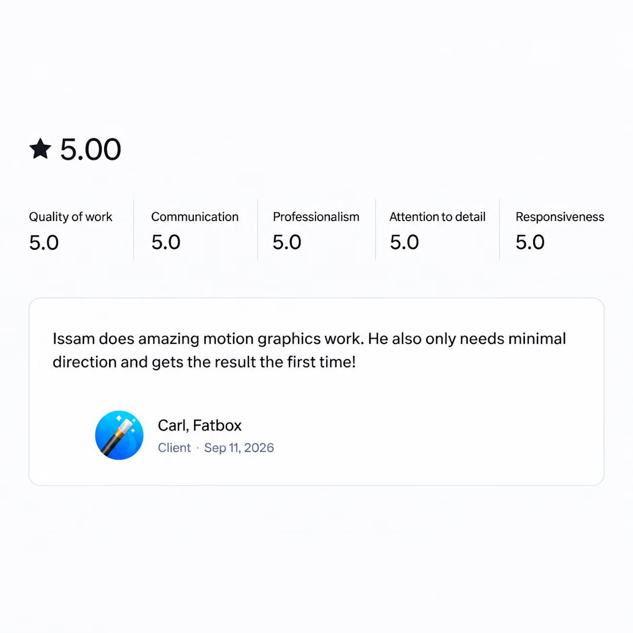
Got a review last week that made my day.
Wrapped a motion graphics project recently and the client said it only needed minimal direction and came out right the first time.
That's the part I'm grateful for. Not the compliment on the work itself, but the fact that the process...

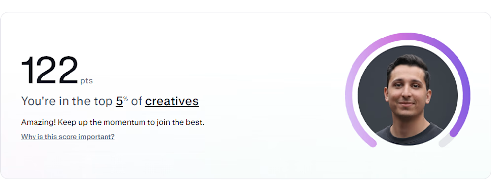
Apparently I'm top 5% on Contra now.
Ten years of making SaaS explainer videos and the animation is still the fastest part of the job. What eats the time is sitting with the product until I can say what it does in one sentence. A lot of the videos I get asked to fix skipped that...