Ganiyy Nafiu
Passionate Product & UI/UX Designer
Ready for work
Ganiyy is ready for their next project!
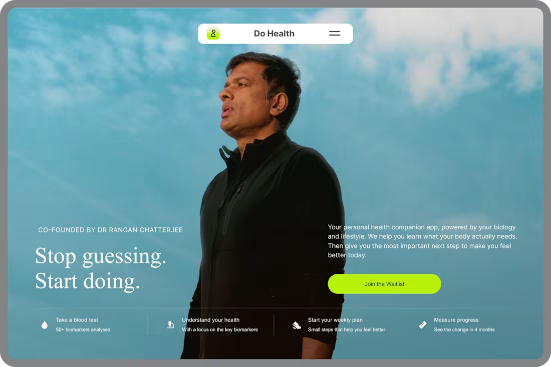
Do Health Landing Page UI Replication
Overview
I recreated the Do Health landing page as a UI design practice to sharpen my skills in crafting modern, conversion-focused web experiences.
Rather than simply copying the interface, I studied the design decisions behind it—understanding how typography, spacing, imagery, color, and layout work together to create a seamless user experience.
This exercise challenged me to pay close attention to every detail while recreating a polished, production-quality interface.
What I Focused On
Pixel-perfect layout recreation
Visual hierarchy
Typography and spacing
Responsive web design principles
Component consistency
Color system
Landing page structure
Healthcare SaaS UI patterns
Tools Used
Figma
Key Takeaways
Replicating exceptional products is one of the most effective ways to improve as a product designer. It helps develop a deeper understanding of design systems, layout composition, and the small details that make great interfaces feel intuitive and premium.
Disclaimer
This is a personal UI replication created solely for learning and portfolio purposes. The original design concept, branding, and intellectual property belong to the Do Health team. No commercial use is intended.
#UI Design #Product Design • Landing Page • Healthcare • SaaS • Figma • Design Practice • Web Design • UI Replication
3
14
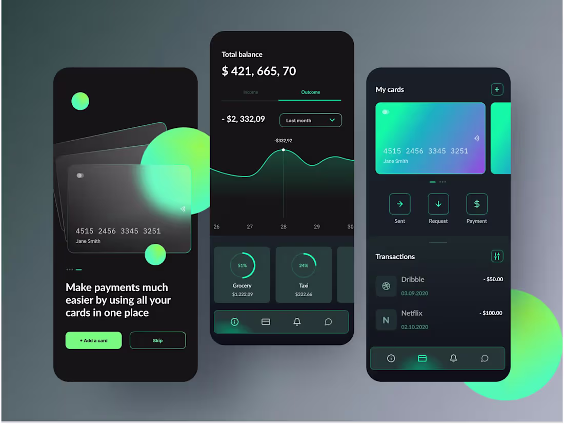
Finova Fintech Mobile App Design
1
0
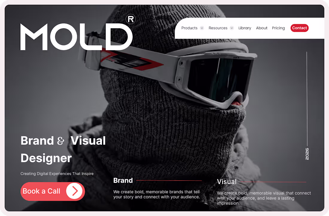
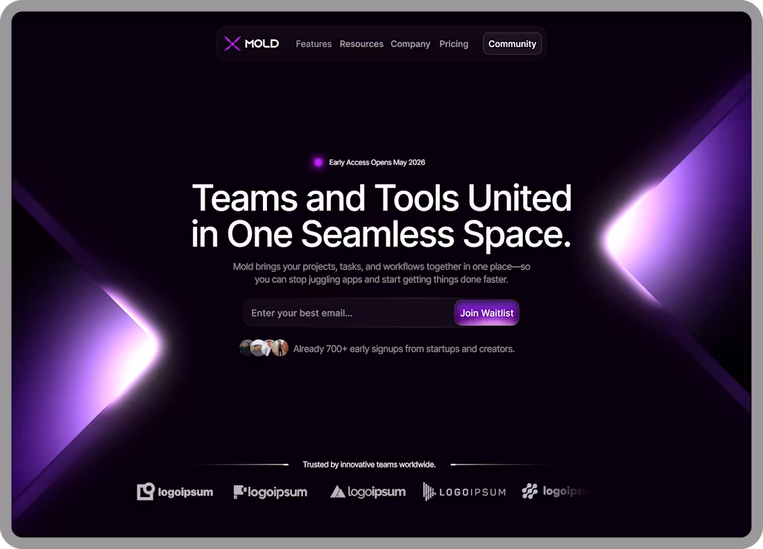
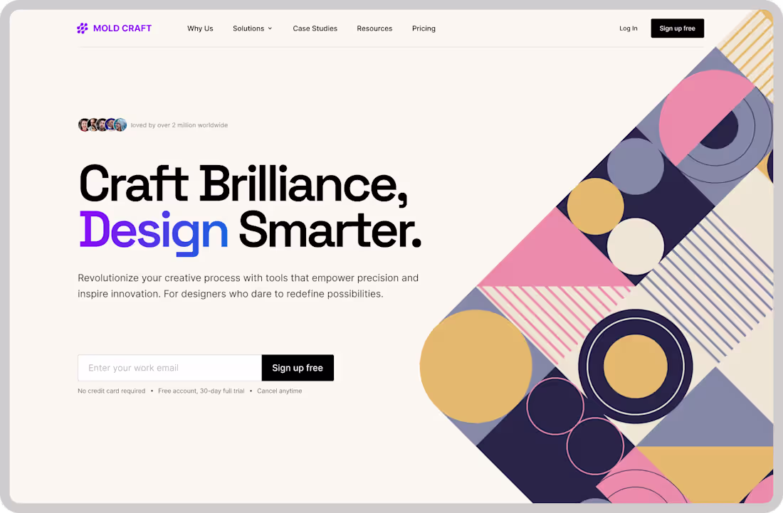
MOLD® — Brand & Visual Designer Portfolio Concept
Project Overview
MOLD® is a premium portfolio website concept designed for a Brand & Visual Designer. The goal was to create a bold, memorable digital presence that immediately captures attention while showcasing creativity, professionalism, and expertise.
Inspired by editorial layouts and luxury branding, the design combines striking imagery, oversized typography, and strategic use of whitespace to create an immersive first impression.
The Challenge
Many designer portfolios struggle to stand out in a crowded digital landscape. The challenge was to create a homepage that:
Establishes a strong personal brand
Communicates expertise within seconds
Creates an emotional connection with visitors
Encourages potential clients to take action
Balances creativity with usability
Design Approach
This concept focuses on delivering a premium visual experience while maintaining a clear user journey.
Key design decisions include:
✨ Oversized typography for strong brand presence
✨ Editorial-inspired layout structure
✨ High-impact hero imagery
✨ Strategic use of contrast and whitespace
✨ Clear call-to-action placement
✨ Modern portfolio aesthetics
Services Highlighted
Brand Design
Creating memorable brand identities that tell compelling stories and connect with audiences.
Visual Design
Designing impactful visual experiences that strengthen brand perception and leave lasting impressions.
Design Highlights
✔ Premium portfolio homepage
✔ Bold visual storytelling
✔ Strong typography hierarchy
✔ Conversion-focused CTA design
✔ Personal branding approach
✔ Modern and responsive-ready layout
Tools Used
Figma
Auto Layout
Design Systems
Responsive Design Principles
Visual Identity Design
What I Learned
This project reinforced the importance of balancing aesthetics with strategy. A successful portfolio isn't just about showcasing work—it's about communicating value, building trust, and creating opportunities for collaboration.
Looking for a Brand & Visual Designer?
I help businesses, startups, and personal brands create bold identities and digital experiences that stand out and drive results.
Let's build something memorable together.
1
26
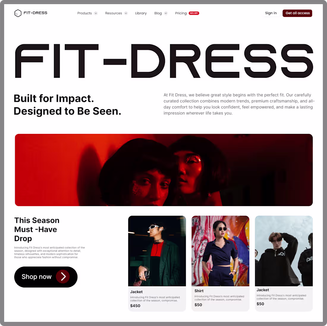
🚀 Fashion Meets Digital Experience
Excited to share my latest UI/UX design concept for FIT-DRESS, a modern fashion e-commerce landing page designed to elevate online shopping experiences through bold visuals, clean layouts, and conversion-focused design.
The goal was to create a digital storefront that reflects the confidence, style, and sophistication of today's fashion brands while making it easy for customers to discover and shop featured collections.
Key Design Highlights
✨ Bold and memorable typography
✨ Editorial-inspired fashion aesthetic
✨ Clean and intuitive user experience
✨ Product-focused layout
✨ Strategic call-to-action placement
✨ Responsive-ready design approach
This project challenged me to blend fashion branding with modern web design principles, creating an experience that feels both premium and functional.
As a designer, I enjoy exploring how great design can help brands tell their stories, connect with their audience, and drive business results.
I'd love to hear your thoughts:
What element stands out most to you—the typography, imagery, or overall layout?
1
39
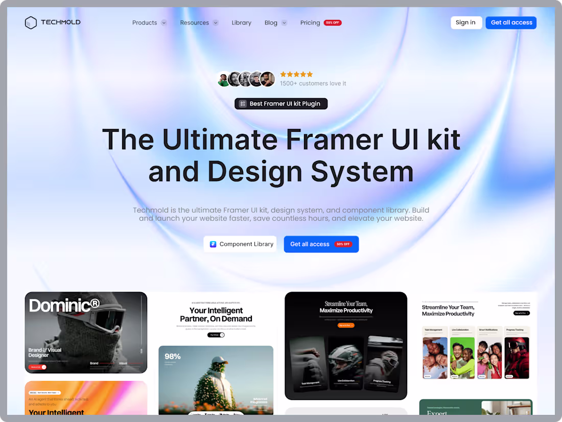
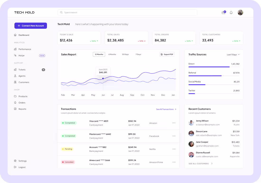
🚀 Tech Mold – Landing Page Design Concept
Excited to share one of my latest web design explorations for Tech Mold — a modern UI Kit and Design System landing page crafted to balance aesthetics, usability, and conversion.
The goal was to create a premium SaaS-inspired experience that immediately communicates value through clean typography, visual hierarchy, social proof, and compelling call-to-action elements.
Project Highlights
✨ Modern and minimal interface
✨ Strong visual hierarchy
✨ Conversion-focused layout
✨ Premium gradient background treatment
✨ Responsive-ready design system
✨ Product showcase section for credibility
Design Approach
I focused on creating a landing page that feels trustworthy, scalable, and visually engaging while ensuring users can quickly understand the product offering and take action.
The combination of spacious layouts, bold typography, and subtle visual effects helps guide attention to the most important content without overwhelming the user.
Tool Used
• Figma
I'm constantly exploring ways to create digital experiences that are both visually appealing and strategically effective.
Feedback and collaboration opportunities are always welcome.
#WebDesign #UIDesign #UXDesign #ProductDesign #Figma #LandingPageDesign #DesignSystem #SaaSDesign #ResponsiveDesign #TechMold #CreativeDesign #DigitalProductDesign #ContraDesigner #OpenToWork
2
42
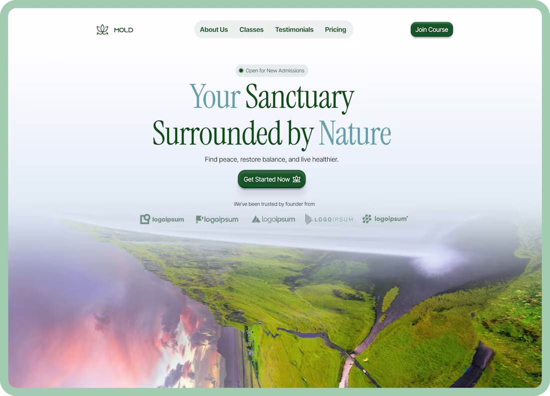
Wellness Landing Page Design Concept
A modern wellness-focused landing page concept designed to create a calm, immersive, and premium digital experience.
This project combines elegant typography, soft nature-inspired visuals, and a clean conversion-focused layout to help wellness brands build trust and connect emotionally with users from the very first screen.
What I focused on:
Clean visual hierarchy
Modern premium UI
Nature-inspired aesthetic
Conversion-focused CTA placement
Soft atmospheric depth & immersive visuals
Elegant typography pairing
Responsive-ready layout structure
Tools Used
Figma
Photoshop (mockup presentation)
Ideal For
Wellness brands
Meditation platforms
Health startups
Yoga studios
Retreat websites
Lifestyle SaaS products
The goal was to design an interface that feels peaceful, modern, and visually memorable while still maintaining strong usability and clarity
2
48
Modern SaaS Waitlist Landing Page Design for Startups & AI Products
Your landing page shouldn’t just look modern — it should create anticipation, communicate value instantly, and turn visitors into early users.
I design high-converting SaaS and startup landing pages focused on waitlists, product launches, and early-access campaigns that help founders capture attention and build momentum before launch.
Whether you’re launching an AI tool, Web3 product, startup MVP, or productivity platform, I create clean, conversion-focused interfaces designed to make your product feel premium and trustworthy from the very first screen.
1
44
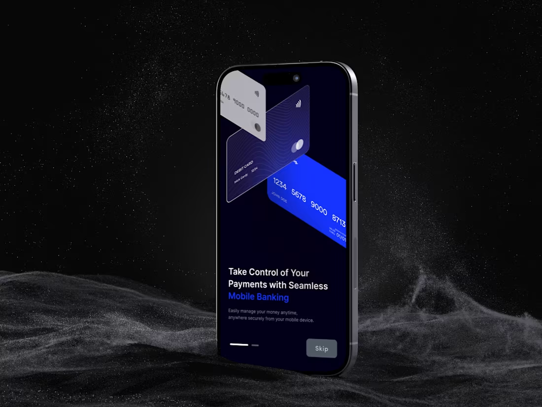
For this project, the goal was to design a high-fidelity onboarding sequence for a modern banking and lending platform. The focus was on creating a "SaaS-modern" aesthetic that balances security with a fluid, accessible user experience.
Key Deliverables & Execution
Visual Direction: Implemented a sophisticated dark mode palette utilizing deep charcols and emerald-tinted accents to establish a premium feel.
3D Visuals: Utilized layered, floating card components to create depth and a tactile sense of interaction within the mobile interface.
UX Strategy: Developed a clear onboarding flow with distinct progress indicators and high-contrast typography to ensure seamless user transitions.
Branding Integration: Adapted the visual language to fit a professional fintech environment, ensuring elements like the "Skip" functionality and CTAs were balanced and intuitive.
#FintechDesign #UXUI #ProductDesign #DarkMode #MobileApp #SaasDesign
1
39
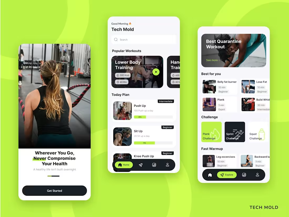
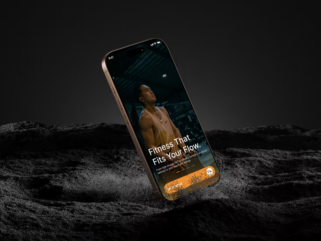
Tech Mold Fitness App — Mobile UI/UX Design
I designed a modern fitness mobile app focused on helping users stay consistent with their workouts through a simple, structured, and intuitive experience.
The goal of this project was to reduce the complexity commonly found in fitness apps and create a system that clearly guides users through their daily routines—from onboarding to workout tracking.
The design emphasizes clarity, ease of use, and engagement, ensuring users can quickly understand what to do next without feeling overwhelmed.
💡 What I Did
Mobile UI/UX Design
User flow structuring
Wireframing
High-fidelity interface design
Design system creation
🎯 Key Features
Clean onboarding experience with strong first impression
Structured home dashboard for daily workout plans
Categorized workout discovery (Explore section)
Progress tracking with visual feedback
Simple and intuitive navigation
🎨 Design Approach
I focused on creating a balance between visual appeal and usability.
The interface uses a modern, minimal layout combined with an energetic color system to keep users motivated while maintaining clarity.
Every design decision was made to:
Reduce friction
Improve user engagement
Encourage consistency
🛠 Tools
Figma
📈 Outcome
The result is a clean, scalable mobile experience that simplifies fitness routines and helps users build sustainable habits through structured guidance and intuitive design.
👋 Let’s Work Together
If you’re building a mobile app or digital product and need a clean, conversion-focused design, feel free to reach out.
1
25
Merging rugged tech with lifestyle aesthetics. ⌚✨
I’ve been refining the landing page concept for the OLA Street X. My goal was to create a hero section that feels as premium as the hardware itself.
What’s under the hood:
Dark-mode optimized UI.
Strategic use of "Signal Red" for primary CTAs.
Responsive-ready layout for high-end e-commerce.
Available for new design inquiries! Check out my services if you're looking to elevate your product's digital presence.
2
42
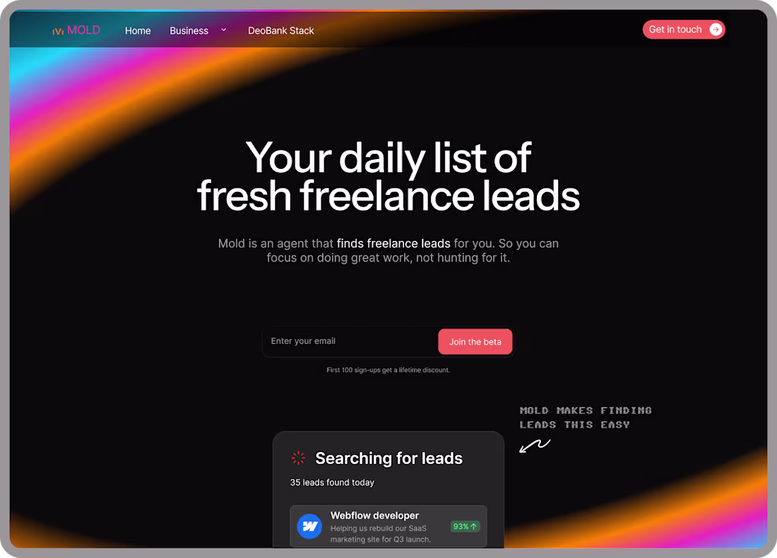
I designed a modern, conversion-focused landing page for a SaaS product that helps freelancers get fresh, high-quality leads daily.
The goal was simple:
Make the product instantly clear, visually engaging, and optimized to convert visitors into early users.
This wasn’t just about aesthetics—it was about turning a complex idea into a simple, compelling experience.
1
39

Mold — Premium Deobank Landing Page (Fintech / Web3 UI Design)
1
2
High-Converting SaaS & Web3 Landing Page Design for Fintech Platform
Designed a high-converting landing page for a fintech/Web3 platform, turning complex product features into a simple, intuitive, and trust-driven experience.
2
4
75
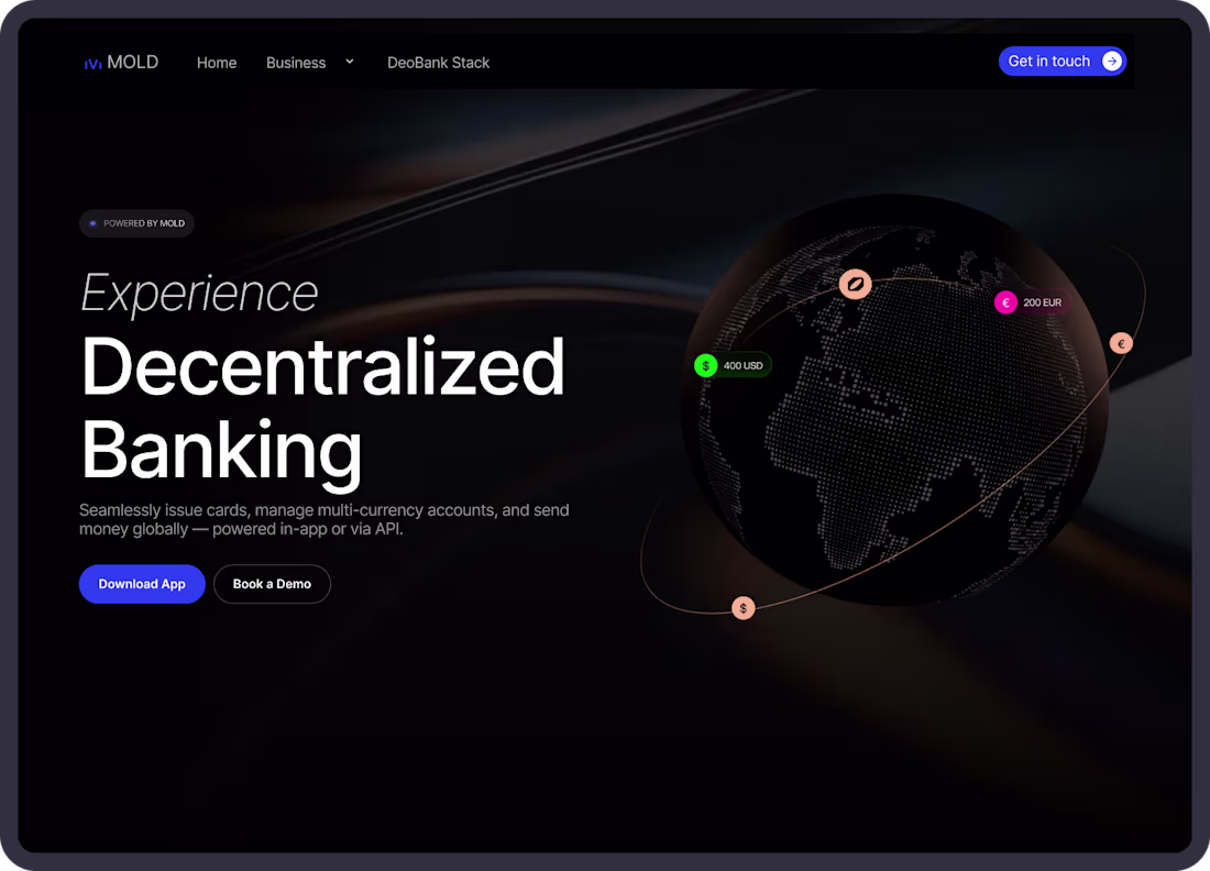
Fintech Landing Page Design — Deobank (Web3 UI/UX)
Project Description
I designed a modern, conversion-focused landing page for a Web3 fintech (Deobank) platform. This project explores how digital banking products can communicate trust, clarity, and control through a clean and premium user experience. The goal was to create a landing page that not only looks modern but also guides users toward action.
What I Focused On
Clear product positioning and messaging
Strong visual hierarchy
Conversion-driven layout structure
Premium fintech UI (dark mode + subtle glow system)
Realistic product interface (dashboard UI)
Key Sections
Hero with strong value proposition
Features grid for quick scanning
Product showcase (dashboard preview)
Social proof for credibility
Call-to-action for conversion
Outcome
A clean, modern fintech landing page that:
Communicates value instantly
Builds user trust
Enhances product perception
Improves conversion potential
1
30
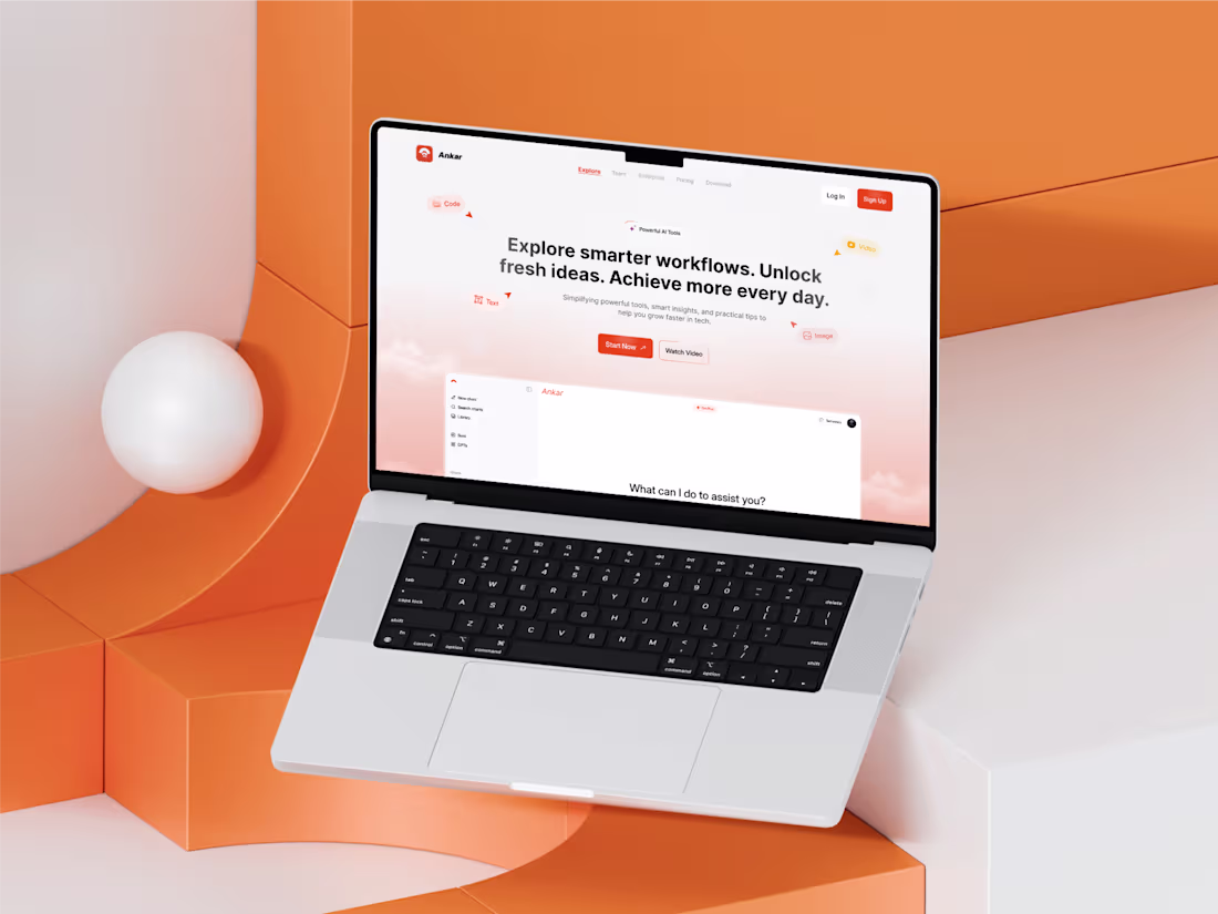
Modern AI SaaS Landing Page Design – Ankar
This project is a modern SaaS landing page concept designed for an AI-powered platform focused on improving productivity and workflows.
The goal was to create a clean, engaging, and conversion-focused hero section that communicates value instantly while maintaining a strong visual identity.
The design combines a light UI aesthetic with subtle gradients, structured layouts, and interactive elements to create a modern product experience.
1
63
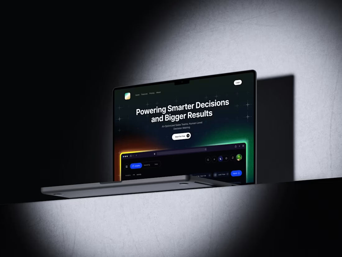
Modern AI SaaS Hero Section Design
Designed a modern hero section for an AI-powered SaaS platform focused on helping sales teams make smarter decisions using data and AI insights.
1
3
129
SaaS Landing Page UI/UX Design (Conversion-Focused)
I design modern, high-converting SaaS landing pages that balance visual storytelling, clarity, and usability.
Whether you’re launching a new product or redesigning an existing one, I help you turn visitors into users through clean UI, strong hierarchy, and strategic CTAs.
Perfect for startups, founders, and SaaS teams who want a landing page that looks premium and actually converts.
1
2
73
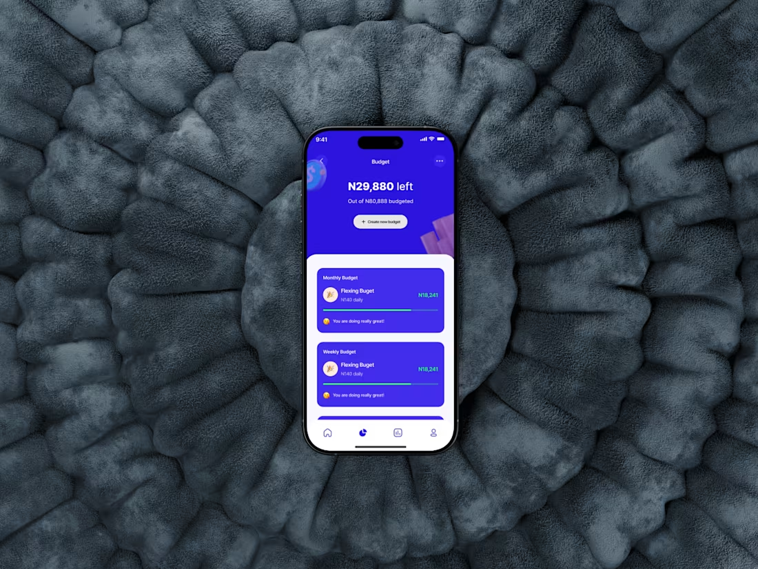
Budgeting for the "flex," literally. 🥂
I’m working on a flow that tracks your daily spending limit without the headache. Stay on track, keep the green bar green. 📈
#Fintech #MobileApp #UX
2
64
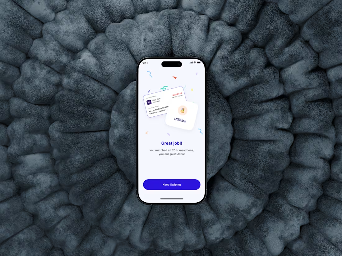
Gamifying Transaction Auditing in Banking Apps
1
1
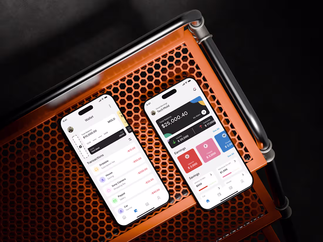
The Modern FinTech Experience: High-End Mobile Banking UI/UX
I designed a comprehensive FinTech mobile experience focused on clarity, financial empowerment, and modern aesthetics. This project showcases the balance between dense financial data and a clean, approachable user interface.
Key Features I Focused On:
Hierarchy-First Dashboard: Prioritizing high-level data like "Total Balance" while providing quick access to granular earnings and savings goals.
Visual Storytelling: Using distinct color-coded cards for earnings categories to reduce cognitive load for the user.
Modular "Savings" Components: Interactive progress tracking for specific financial milestones (e.g., MacBook, iPhone 13).
Dark Mode Utility: High-contrast dark cards for primary financial summaries to ensure readability in various lighting conditions.
3
61
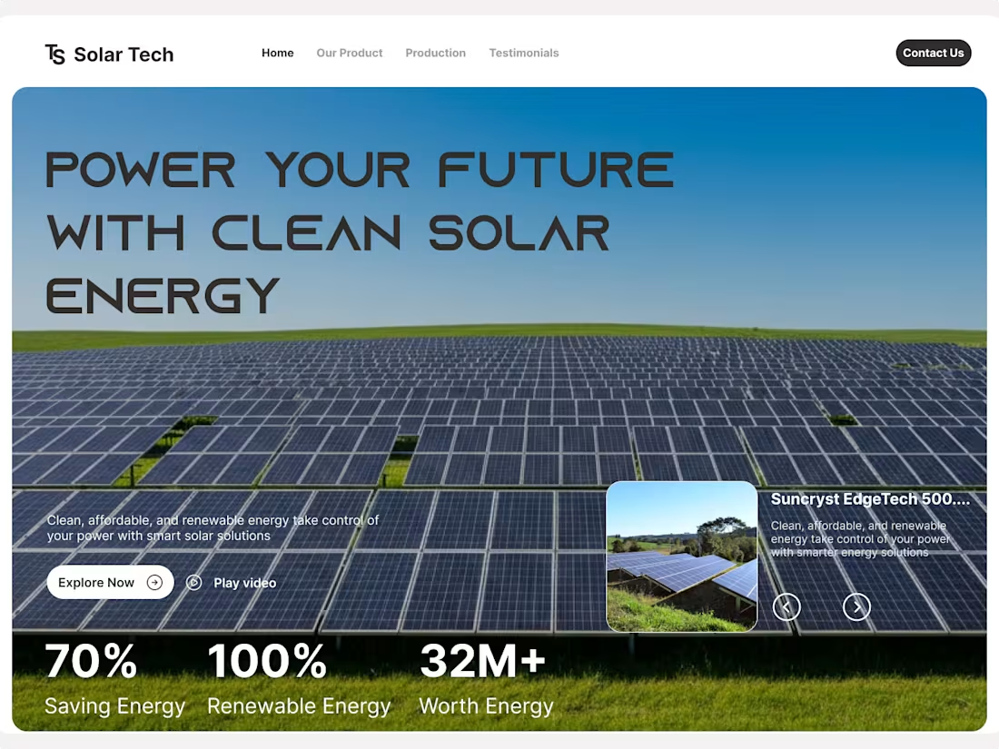
Clean. Green. Tech-focused. ☀️
Latest hero section exploration for a solar energy concept. Focused on bold typography and high-impact data visualization to build immediate trust.
What do we think of the wide typeface?
1
52
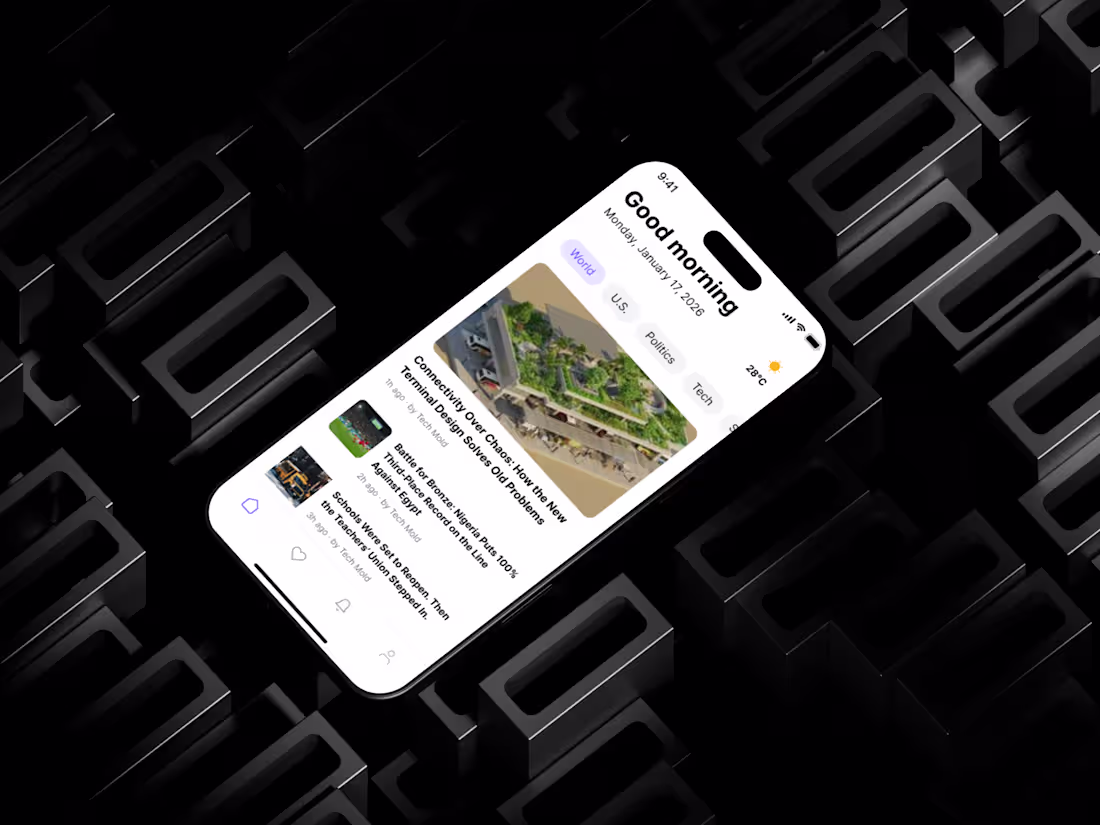
News App UI Design
1
1
Custom SaaS Dashboard & Data Visualization Design
1
48
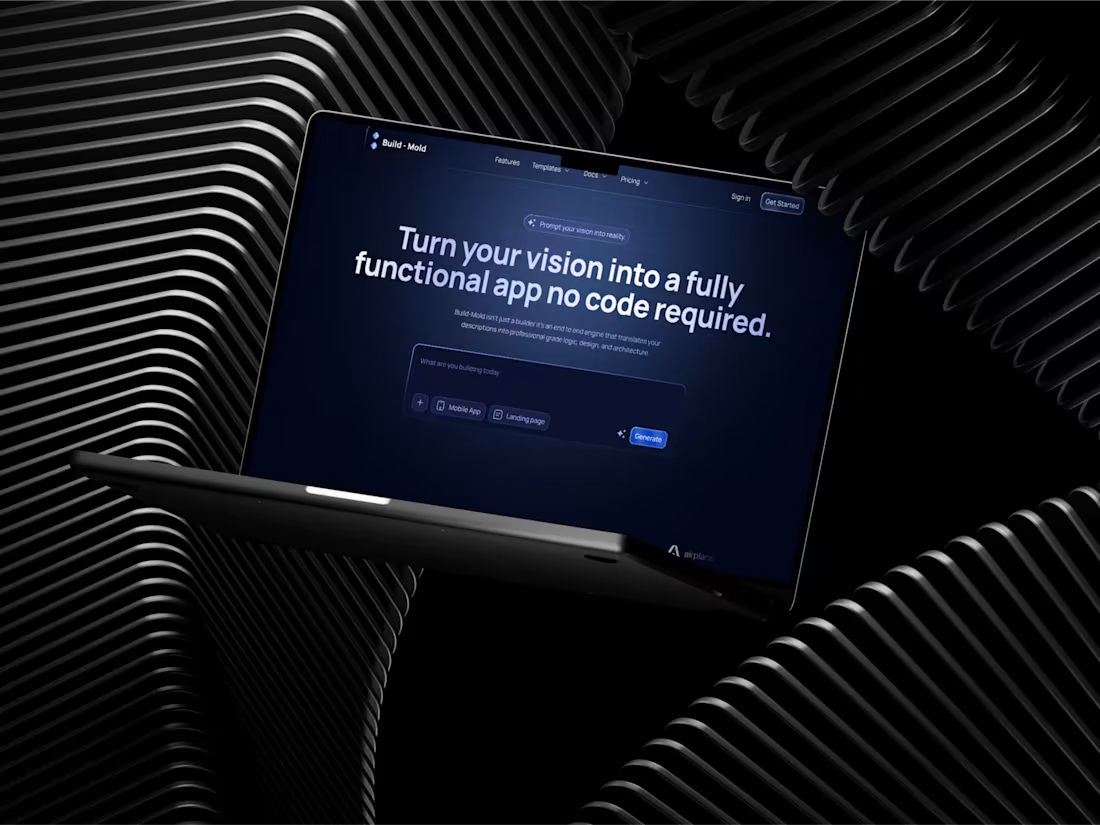
From Prompt to Product: Reimagining the No-Code Workflow Body: I’ve been working on the visual identity and UX for Build-Mold, an AI-powered engine that bridges the gap between a simple description and a functional app.
The goal was to create an interface that feels as powerful as a code editor but as accessible as a chat box.
The Stack: Logic, Design, and Architecture handled via NLP.
The Design: High-contrast dark mode to reduce eye strain and focus on the "Generate" moment.
2
70
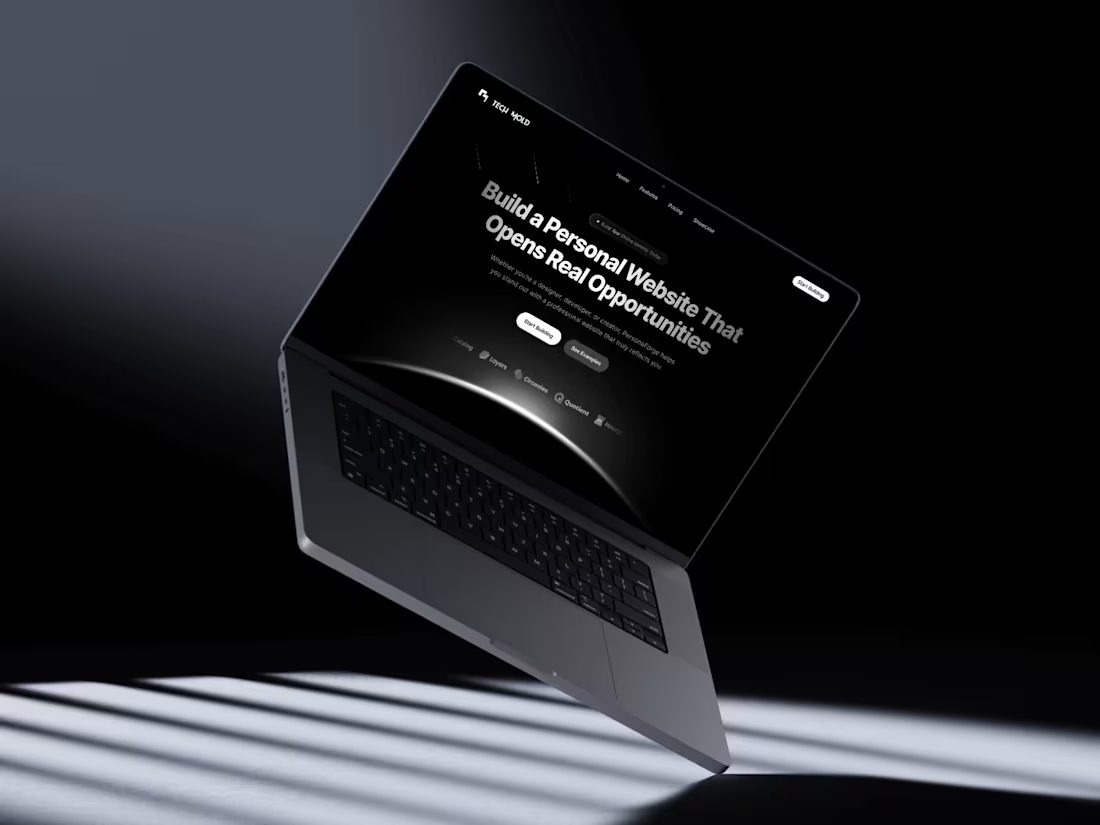
Build a Personal Website That Opens Real Opportunities. 🚀
A recent concept for a high-end personal brand platform. Clean, moody, and built for the modern independent.
✨ Available for new web design projects.
2
3
74
Tech Mold Premium Fitness App Design
1
3
Interactive E-Bike Experience — Motion & UX Prototype
Overview
I designed this high-energy landing page concept to demonstrate how interactive motion can elevate a product’s digital presence. For this e-bike showcase, the goal was to create a seamless transition between product variants while maintaining a strong visual focus on technical specifications.
Key Features
Dynamic State Transitions: Used Figma Smart Animate to create fluid color-shifting backgrounds that match the product aesthetic.
Interactive Specs: Integrated a "hover-reveal" mechanic for key performance metrics (Kinetic, Ignition, Velocity) to keep the UI clean yet informative.
Brand Identity: Focused on a bold, tech-forward aesthetic tailored for the e-mobility market.
The Tech Stack
Design & Prototyping: Figma
Techniques: Component Sets, Smart Animate
2
3
95
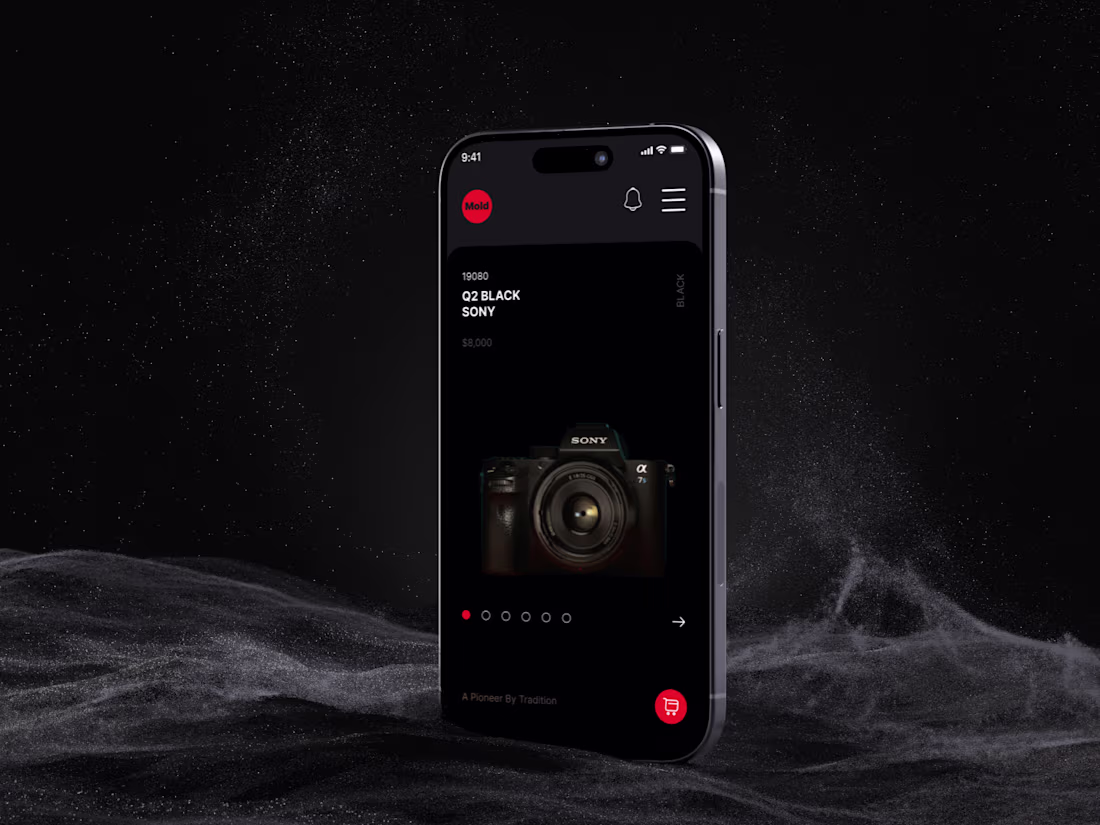
Design isn’t just about visuals — it’s about experience. And the right UI can turn a simple product page into a premium, memorable moment.
I explored a dark, cinematic interface for a camera e-commerce concept — focusing on ✨ high-end aesthetics ✨ clear hierarchy ✨ strong product focus ✨ intentional lighting and contrast
The goal was simple: Make the user feel the quality of the product before they even touch it.
From the floating layout to the red accent highlights, every detail was crafted to create a bold, immersive shopping experience for creative professionals.
What do you think — would you shop from an interface like this? 👇
2
8
62
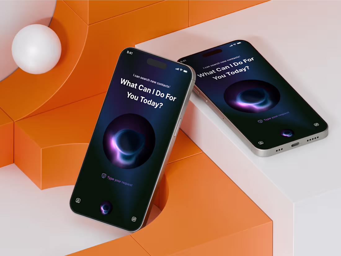
AI Assistant App UI Concept Design
1
6
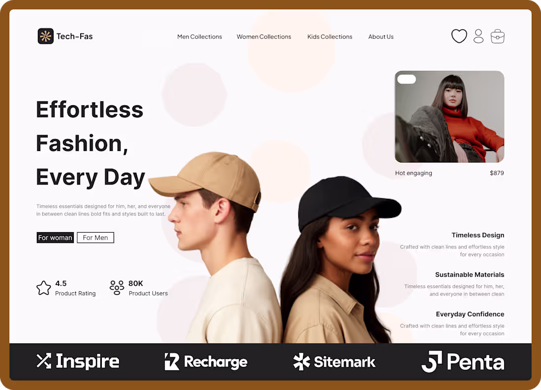
🧥 Tech-Fas — Fashion Landing Page
Effortless fashion, every day.
A clean and minimal e-commerce landing page designed for a modern fashion brand that blends timeless design, sustainable materials, and everyday confidence.
💡 Goal: Create a balanced, gender-inclusive layout that feels bold yet soft — showcasing fashion pieces through clean typography, subtle color contrast, and visual hierarchy.
🎨 Design Focus:
Bold and modern hero section
Clear product segmentation (Men/Women)
Minimal, editorial-inspired layout
Engaging visual storytelling
🛠 Tools Used: Figma
2
63
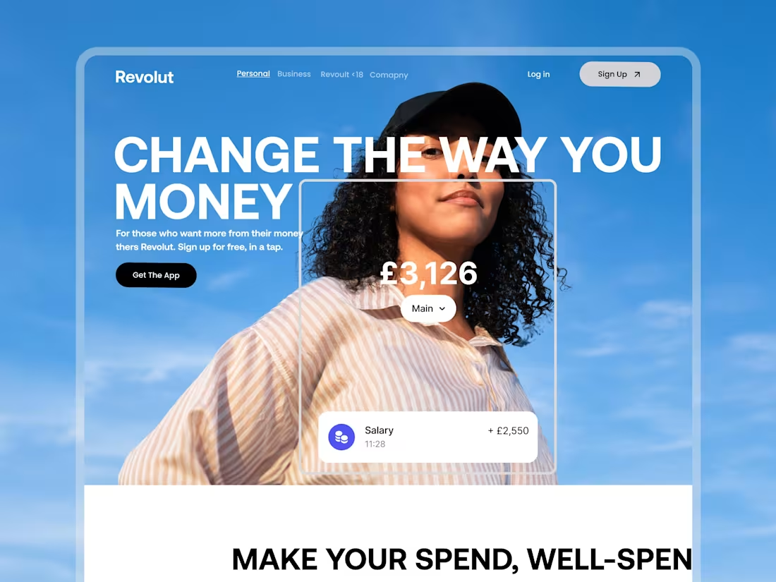
Revolt — Landing Page Replication
1
1
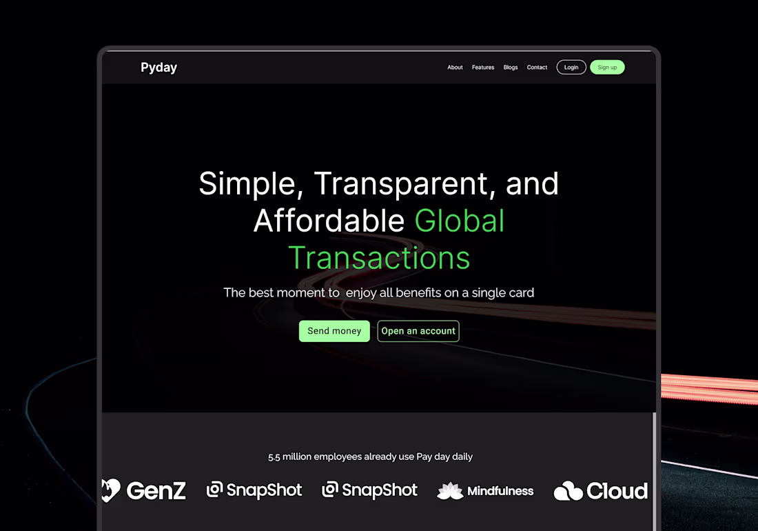
Pay Day — Seamless Global Payments
1
5
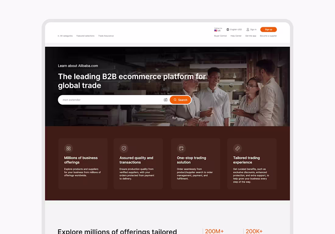
ALIBABA — Landing Page Replication
1
7