News App UI Design
Ganiyy Nafiu
News App UI
Category: Mobile UI/UX Design
Platform: iOS
Role: UI/UX Designer
Contra is a modern news application concept focused on clarity, speed, and premium reading experience. The goal was to design a clean, intuitive interface that helps users consume news effortlessly while maintaining a high‑end visual appeal.
Problem Statement
Many news apps feel cluttered, overwhelming, and visually noisy. Users often struggle with:
Poor content hierarchy
Information overload on the home feed
Distracting UI elements that reduce reading focus
The challenge was to design a news experience that feels calm, readable, and premium, without sacrificing functionality.
Design Goals
Create a minimal and elegant news reading experience
Establish a clear visual hierarchy for headlines and content
Improve readability and focus during article consumption
Maintain a modern iOS-native feel
Design Process
1. Research & Inspiration
I analyzed popular news platforms such as Apple News, Medium, and Substack to understand:
Effective content hierarchy
Typography choices for long-form reading
Card-based layouts for news feeds
Key insight: Less UI noise leads to better reading engagement.
2.Wireframing
Low-fidelity wireframes were created to define:
Home feed layout
Category navigation
Article reading flow
This ensured content flow felt natural before visual styling.
3.Visual Design
The final UI focuses on:
Large headlines for quick scanning
Soft shadows and rounded cards for depth
Generous white space to reduce cognitive load
Neutral color palette to keep attention on content

Key Screens
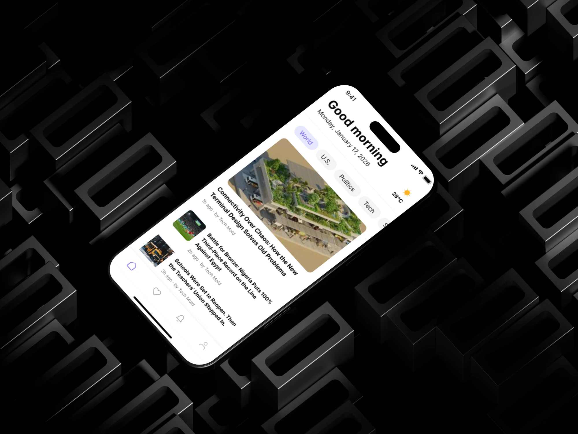
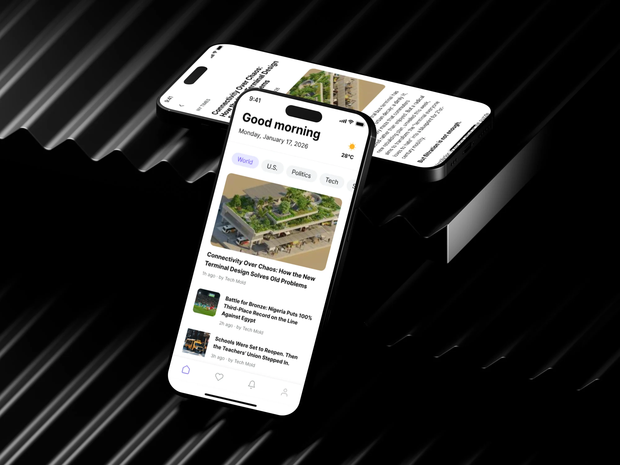
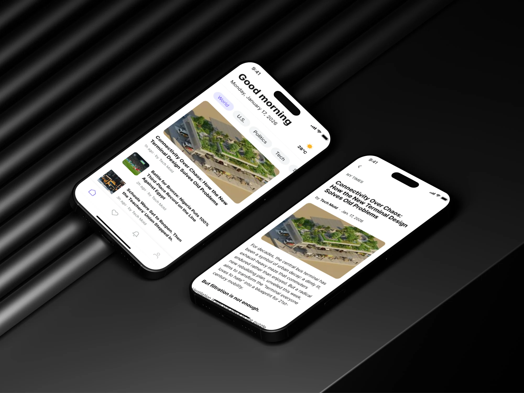
Home Feed
Personalized greeting
Category filter chips for quick navigation
Card-based article previews with featured imagery
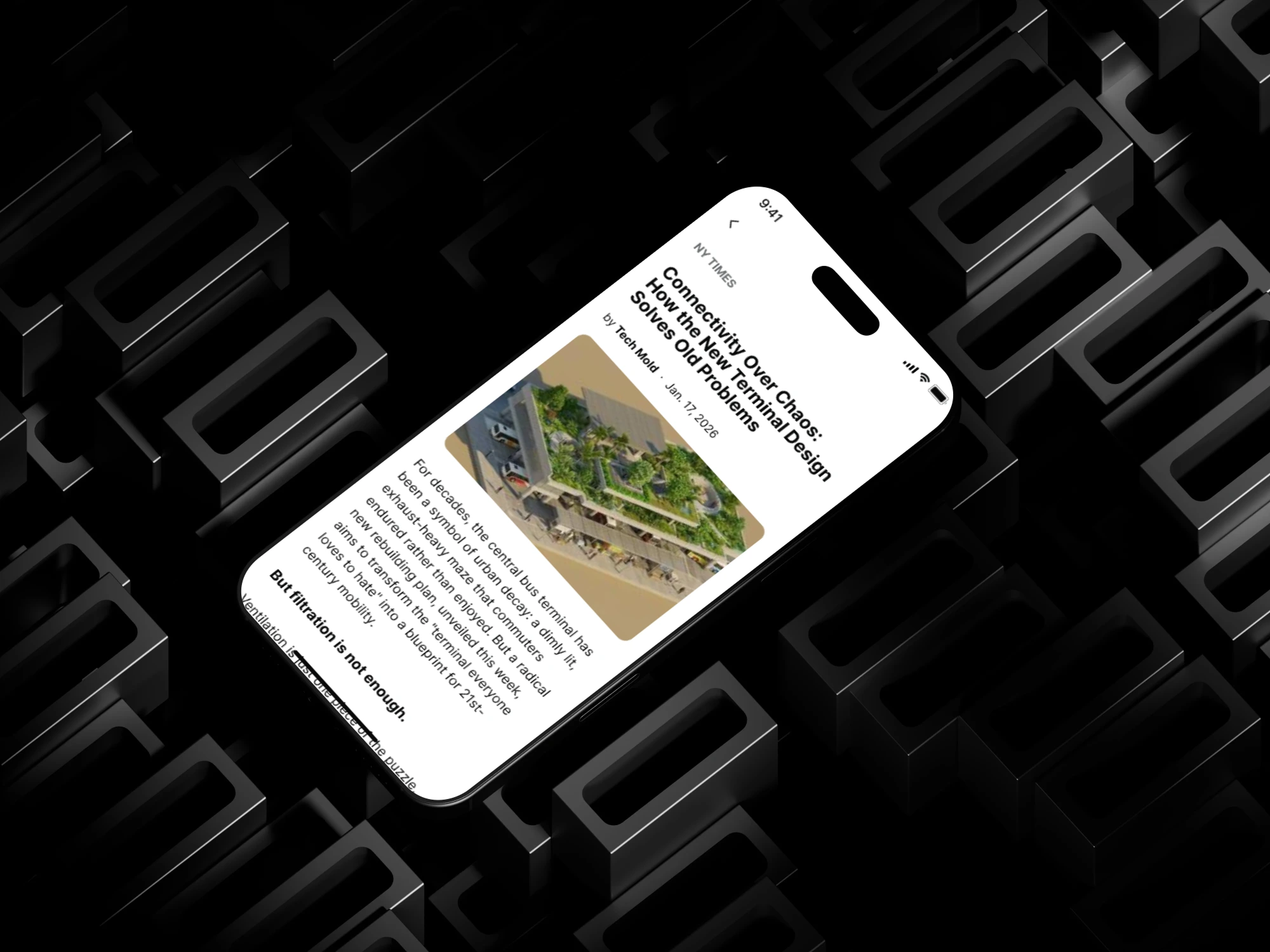
Article View
Distraction-free reading layout
Prominent hero image
Optimized line spacing and font size for long reads

Typography & Colors
Typography: San‑serif system font optimized for readability
Colors: Neutral whites and blacks with subtle gray accents
Accent: Minimal use to maintain editorial tone
Design Outcome
The Contra News App UI delivers:
A premium editorial experience
Improved content discoverability
A calm, focused interface that encourages longer reading sessions
This concept demonstrates how thoughtful UI design can transform information-heavy products into enjoyable digital experiences.
outcome
Learnings
White space is a powerful design tool
Content should always lead the design, not UI elements
Simplicity increases perceived product value
Tools Used
Figma
iOS Design Guidelines


Like this project
Posted Jan 17, 2026
Designed a clean, intuitive news app UI focusing on readability and visual appeal.
Likes
1
Views
1