Gamifying Transaction Auditing in Banking Apps
Ganiyy Nafiu

Reimagining Financial Literacy through Micro-Interactions
The Hook: Most people hate looking at their bank statements. I designed a way to make transaction auditing feel like a game rather than a chore.
The Challenge (The "Why")
Users often feel overwhelmed by long, messy transaction lists. Traditional banking apps make "categorizing expenses" feel like homework, leading to poor financial awareness.
Goal: Increase user engagement with spending data.
The Problem: Low retention in "Budgeting" tabs due to cognitive overload.
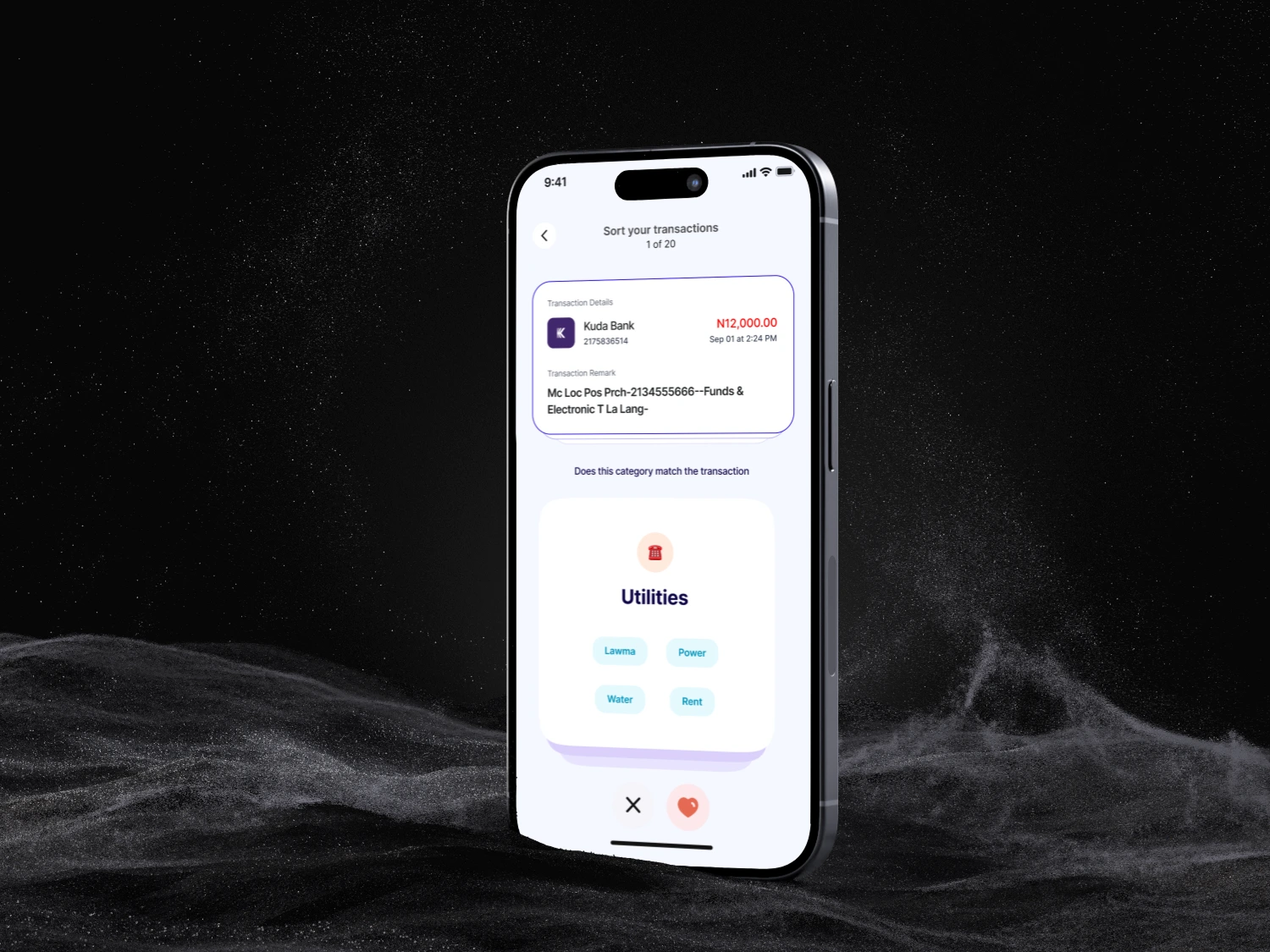
The Solution: The "Tinder-for-Transactions" Flow
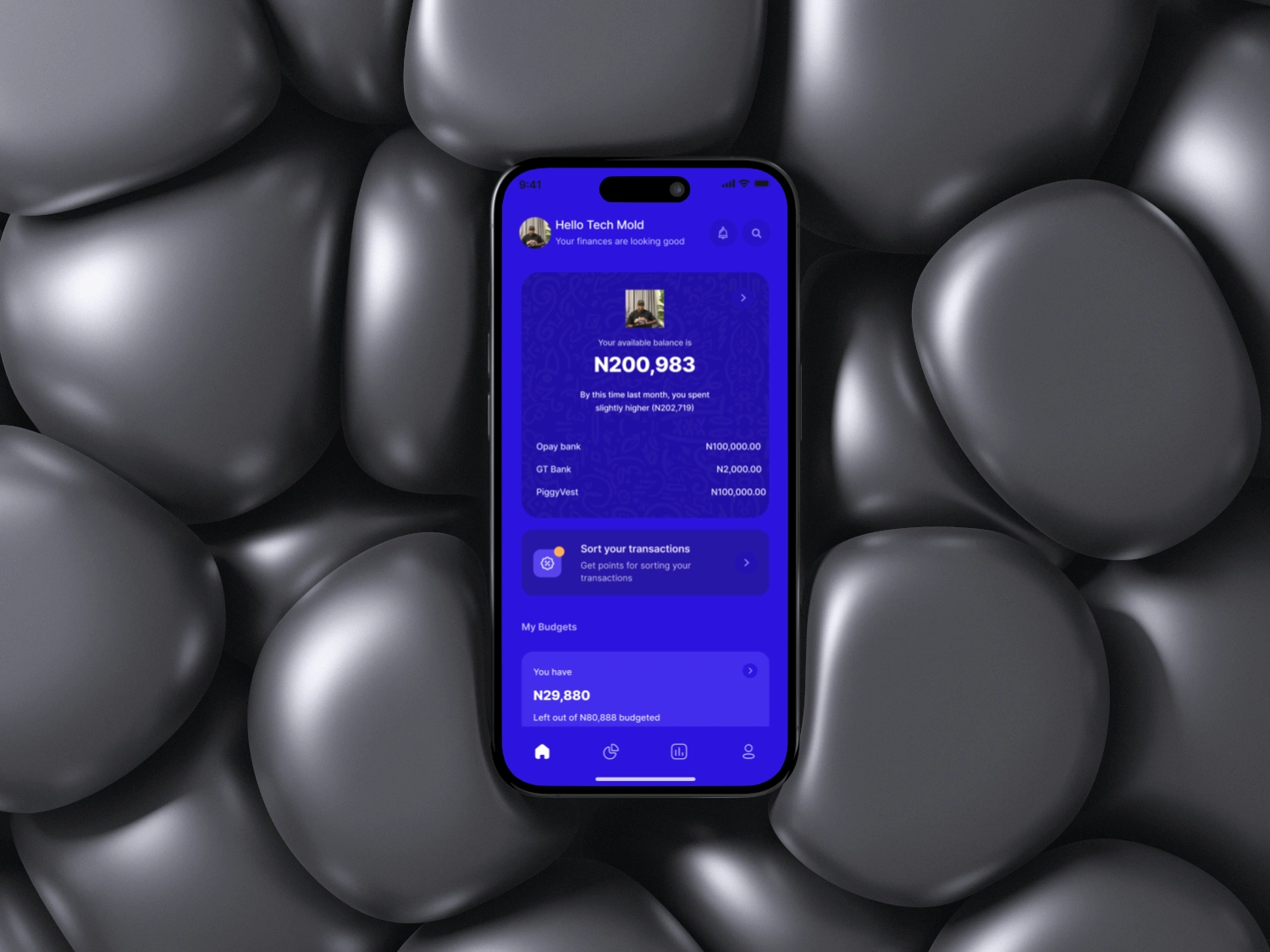
Focus on the iPhone 16 Pro (8, 9, 10) screens here.
Feature: A dedicated "Sort Your Transactions" queue.
The Logic: Instead of a list, users are presented with a stack of cards. Swipe to categorize, tap to split, or ignore.
Value: It turns 10 minutes of scrolling into 30 seconds of intentional interaction.
Design Deep Dive
FeatureDesign ChoiceUX BenefitDark Mode AestheticHigh-contrast neon accents.Reduces eye strain during night-time "financial check-ins."Dynamic Charting Curved line graphs with "Daily Avg."Provides immediate context without needing to do math.Micro-InteractionsLarge, tactile "Confirm" buttons.Reduces friction and "fat-finger" errors on the go.
Visual Highlights
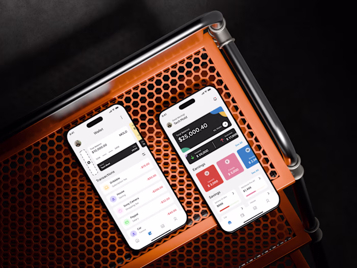
The "Spending Snapshot" (iPhone 15 Pro 5): Notice the clear separation between Income and Expenses using green/orange glows. This uses color psychology to signal health vs. caution immediately.
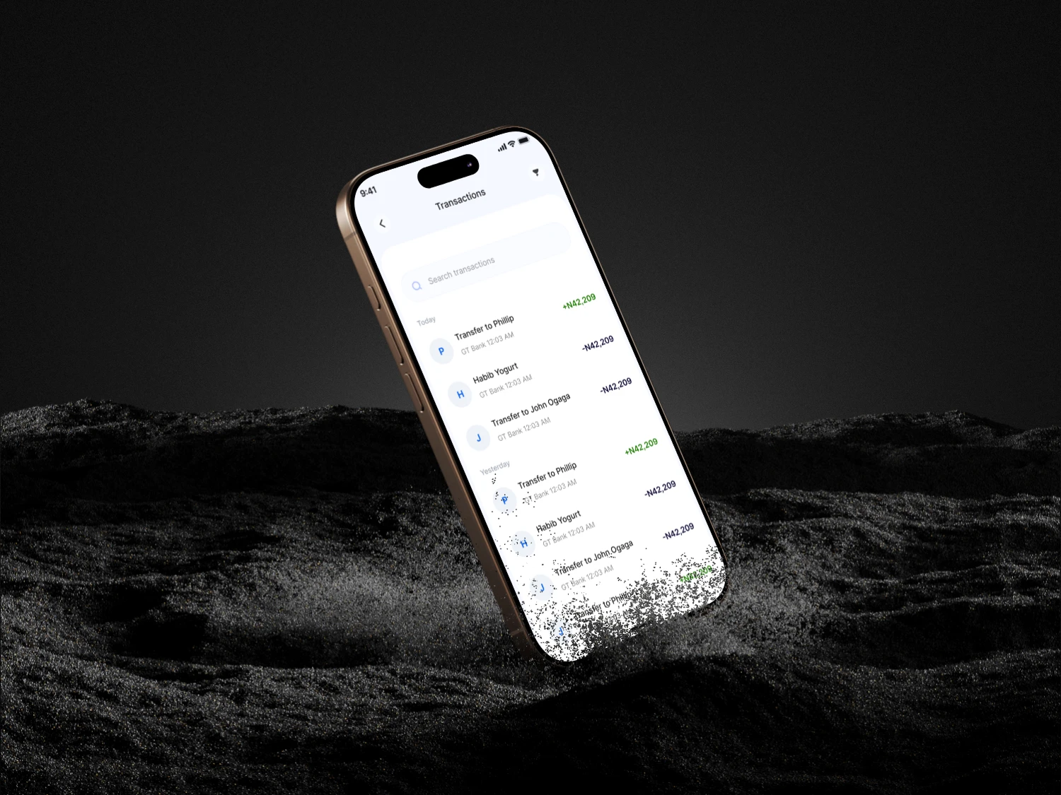
The Transaction Card: Use of brand logos (Netflix, Starbucks) reduces the cognitive load of reading text.
Results & Takeaways
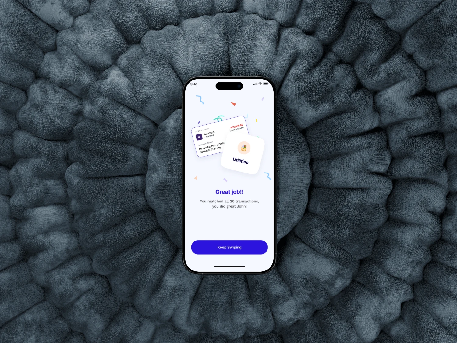
Gamification works: By making the "Audit" phase interactive, users are more likely to categorize 100% of their spending.
Accessibility: (Self-critique) Mention that you prioritized large tap targets for one-handed use on larger devices like the iPhone 16 Pro Max.


Like this project
Posted Jan 29, 2026
Designed a gamified transaction auditing system for banking apps.
Likes
1
Views
1