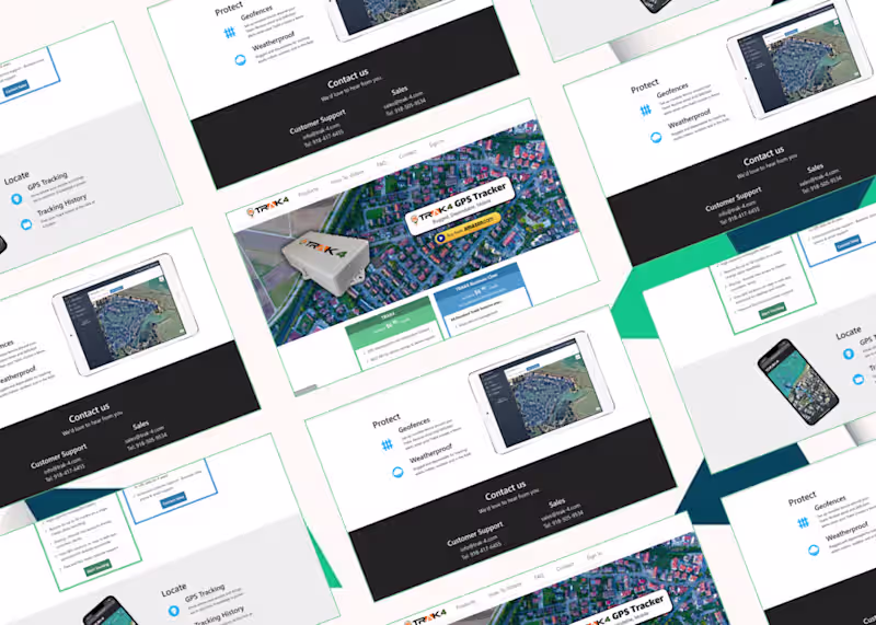
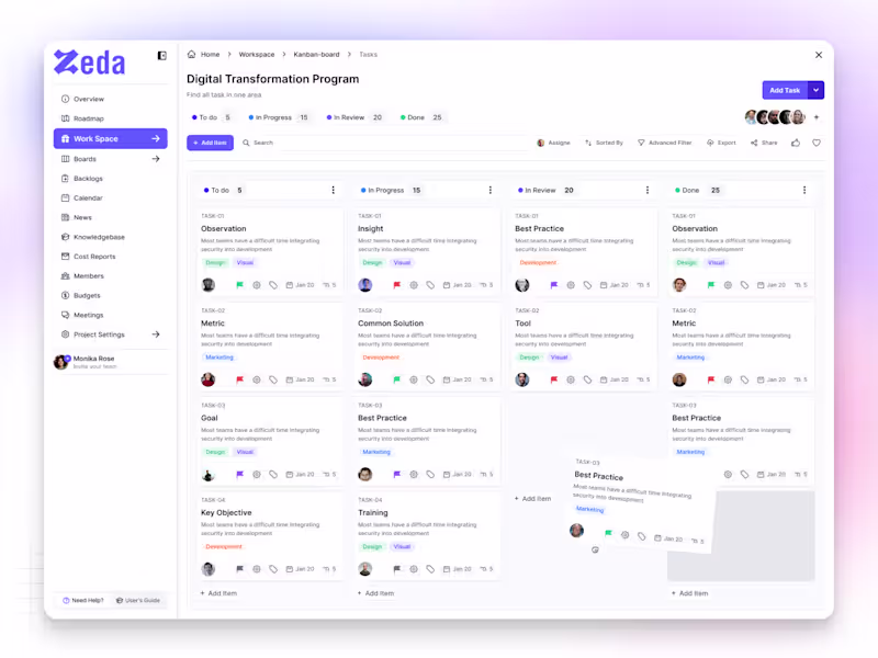
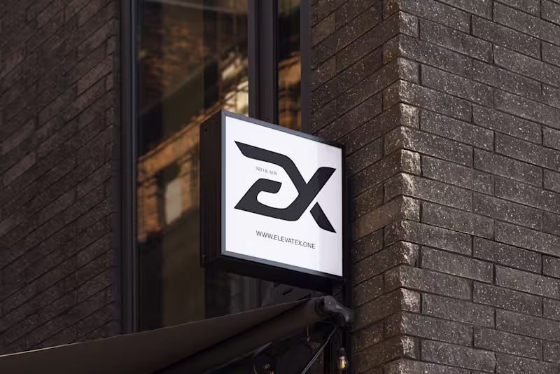
Premium design: brand/logo, UI/UX/web, print, presentations+
- $10k+
- Earned
- 3x
- Hired
- 5.0
- Rating
- 36
- Followers
Premium design: brand/logo, UI/UX/web, print, presentations+

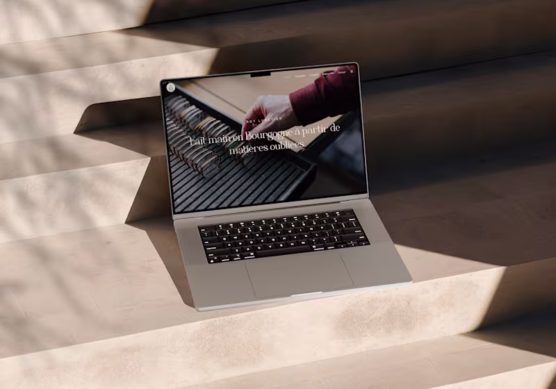
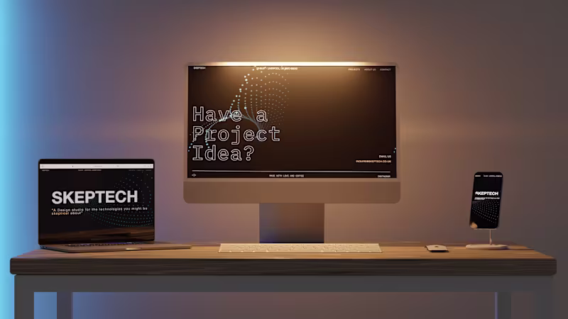
Next.js Frontend Engineer with Sanity Expertise
- 5.0
- Rating
- 4
- Followers
Next.js Frontend Engineer with Sanity Expertise

View more →
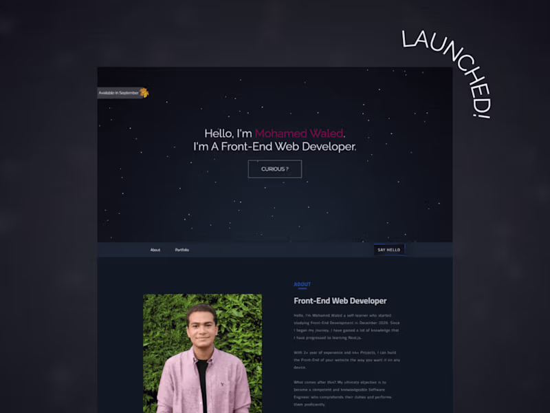
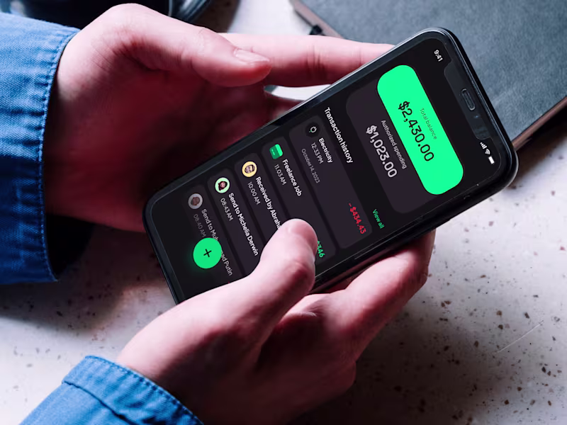
Front-end engineer with a strong focus on UX

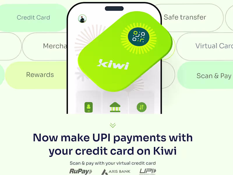
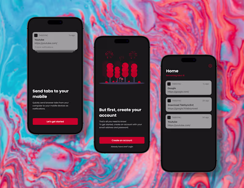
Senior AI & Software Engineer | CTO-Level Product Builder
Senior AI & Software Engineer | CTO-Level Product Builder
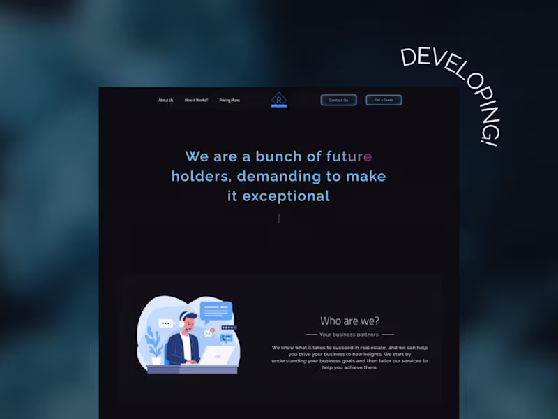
Creating websites that exceed expectations
Creating websites that exceed expectations

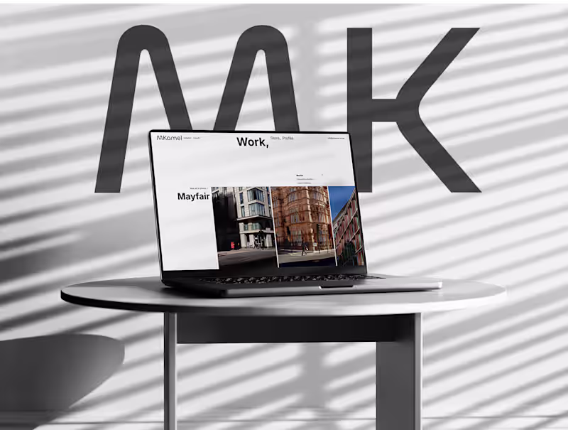
UI/UX Designer building for humans, not just for screens.
- 22
- Followers
UI/UX Designer building for humans, not just for screens.
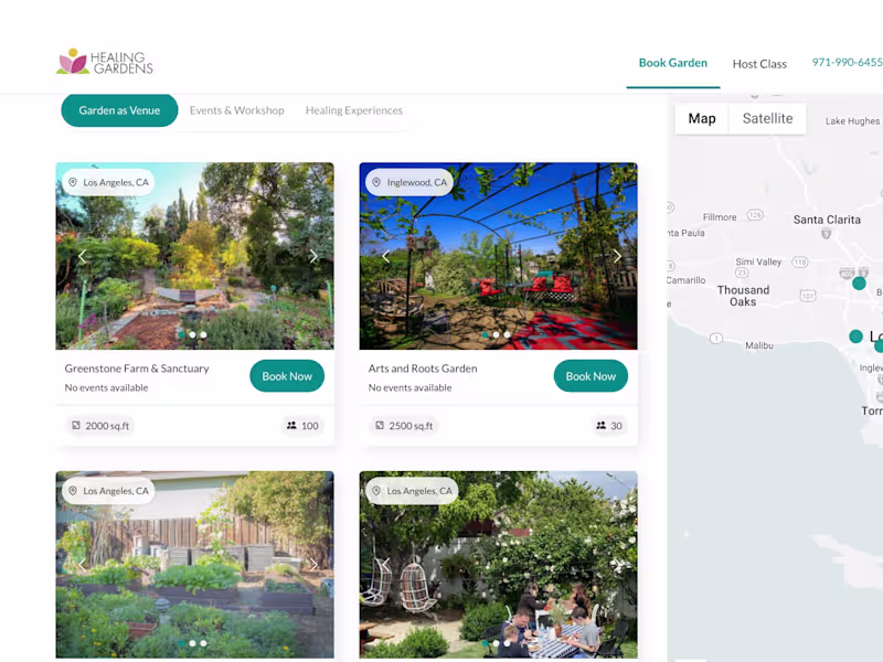
UI/3D Designer & Frontend Engineer
UI/3D Designer & Frontend Engineer

WordPress Engineer
WordPress Engineer