Travel Freely Website Design and Development
Todd Hogan
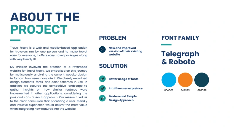
Travel Freely is a web and mobile-based platform designed to simplify the travel experience by offering easy-to-use tools and intuitive UI. The project focused on revamping their existing website with a modern and user-centric approach. Through extensive research, we analyzed the original design, studying how users interacted with navigation, fonts, and content layouts. Our goal was to enhance usability while maintaining the brand’s recognizable identity.
The redesign process involved developing structured wireframes to map out content, customer journey, and user experience. We refined typography by using Telegraph and Roboto, ensuring legibility and a clean, professional feel. The color palette combines vibrant blue (#00ADEE) to symbolize trust and freedom, deep teal (#0F4559) for sophistication, and energetic orange (#F48020) to highlight important elements, maintaining an engaging and warm visual identity.
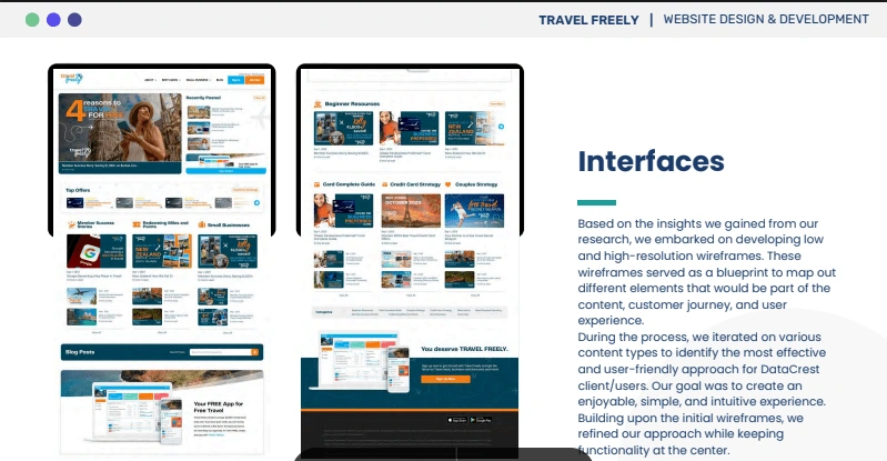
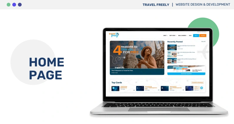
I incorporated a structured content layout, emphasizing accessibility and ease of navigation. The final website design balances aesthetics with functionality, offering a seamless experience for travelers. Through iterative testing, we optimized for clarity, efficiency, and mobile responsiveness. Travel Freely’s new design now delivers a more enjoyable and informative experience, reinforcing its mission to make travel planning accessible to everyone.
Like this project
Posted Oct 15, 2024
Revamped Travel Freely’s website with an intuitive UI, bold typography, and a modern layout, enhancing usability for seamless travel planning.