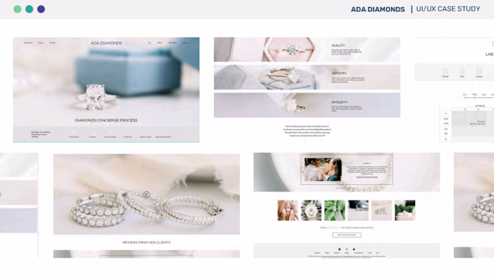
Rhizome Data UI/UX Case Study
Todd Hogan
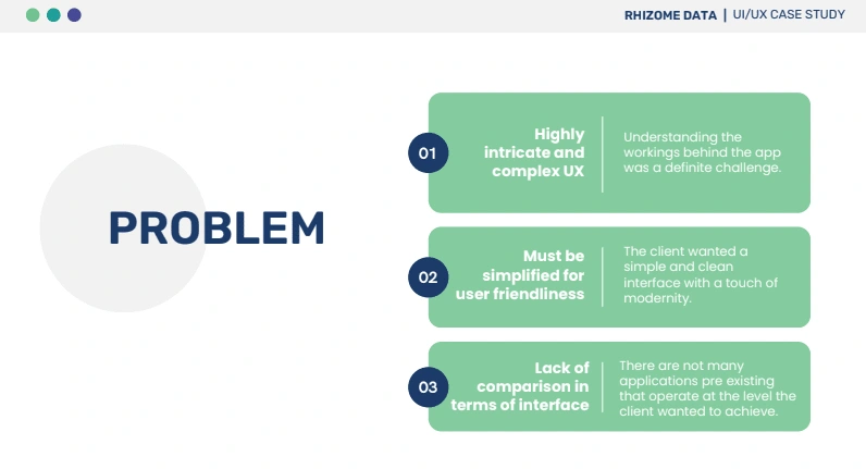
Rhizome Data is a SaaS platform that quantifies the economic and social impacts of infrastructure investments to enhance climate resilience. The company required a comprehensive UI/UX redesign to simplify complex data visualizations and improve user engagement. The primary challenges included an intricate interface that was difficult to navigate, a lack of comparative models in the market, and the need for a cleaner, more modern aesthetic.
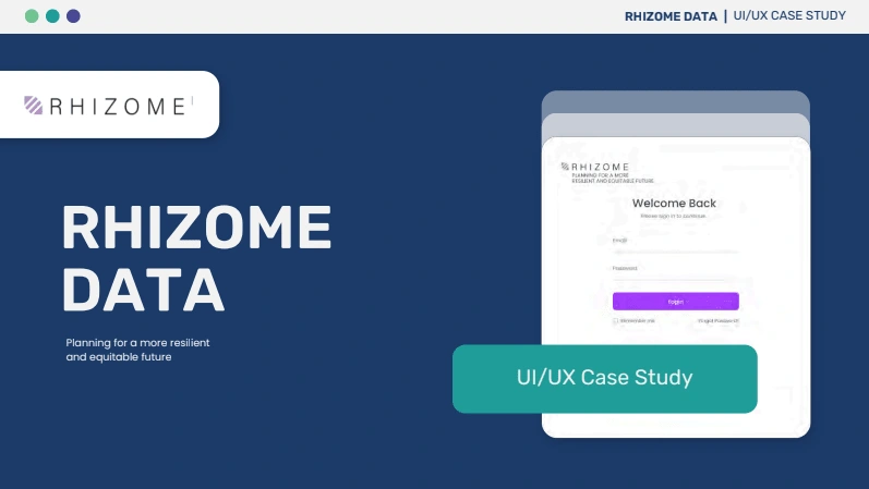
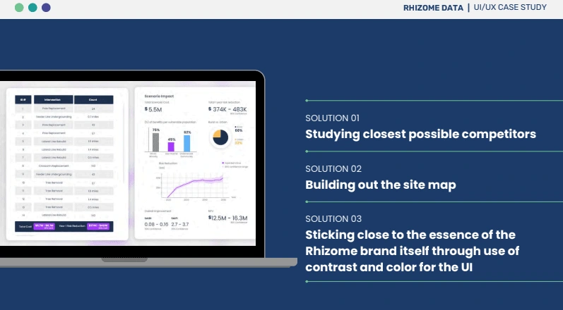
To address these challenges, I conducted extensive research, analyzing the closest industry competitors to understand best practices. The site map was restructured to enhance navigation, making it easier for users to access key features without feeling overwhelmed by information. Additionally, I focused on maintaining Rhizome’s brand essence, using a strategic contrast of colors to highlight crucial data points while keeping the overall design minimalistic and functional.
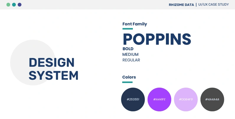
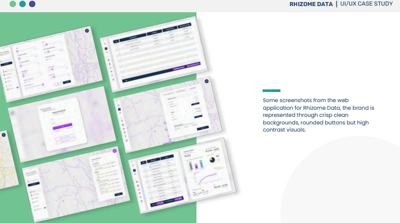
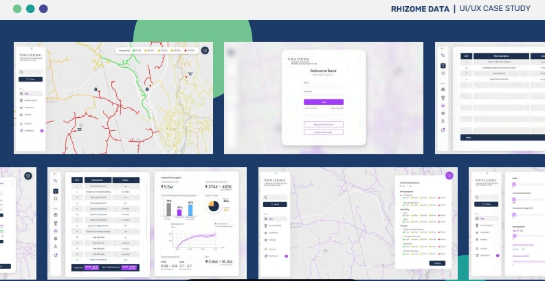
The design system incorporated Poppins as the primary typeface, offering a clean and readable interface. The color palette featured deep navy (#253551) for trust and stability, contrasted with vibrant purple (#4441FE) and soft lavender (#DDB4F9) to add visual interest. Light grays and whites were used to maintain a balanced, high-contrast layout. Crisp, rounded buttons and high-contrast data cards were implemented to create a user-friendly interface that enhances readability and engagement.
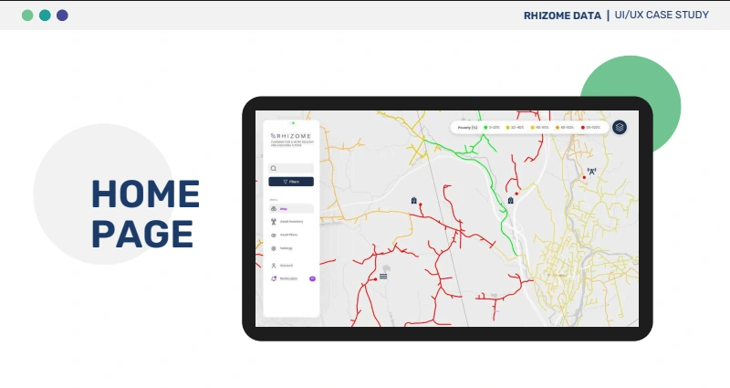
The final UI design offers a seamless and modernized experience, improving data comprehension and interaction for users dealing with climate risk analysis. Through thoughtful design choices, intuitive navigation, and a refined visual hierarchy, Rhizome Data now provides a streamlined platform that effectively communicates complex information while maintaining accessibility and usability at its core.
Like this project
Posted Oct 14, 2024
Revamped Rhizome Data’s UI/UX with a clean, data-driven interface, using bold contrasts and structured navigation for an intuitive climate risk platform.
Likes
0
Views
5