UI/UX for Smooth Job Hunt
Todd Hogan
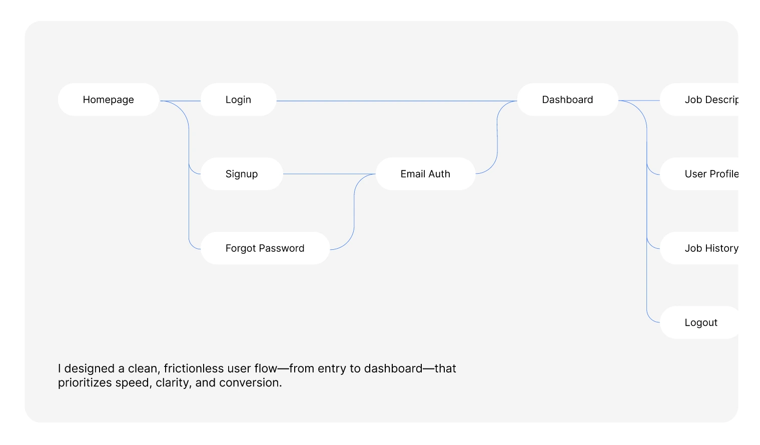
I jumped into designing Cheeki with one goal: make job hunting feel effortless and actually fun. I mapped out every click—from landing to dashboard—so candidates breeze through without any confusion. It was all about clarity, speed, and keeping things delightfully simple.

Designing the Core Experience
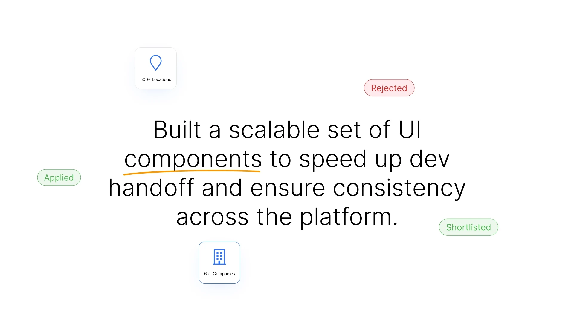
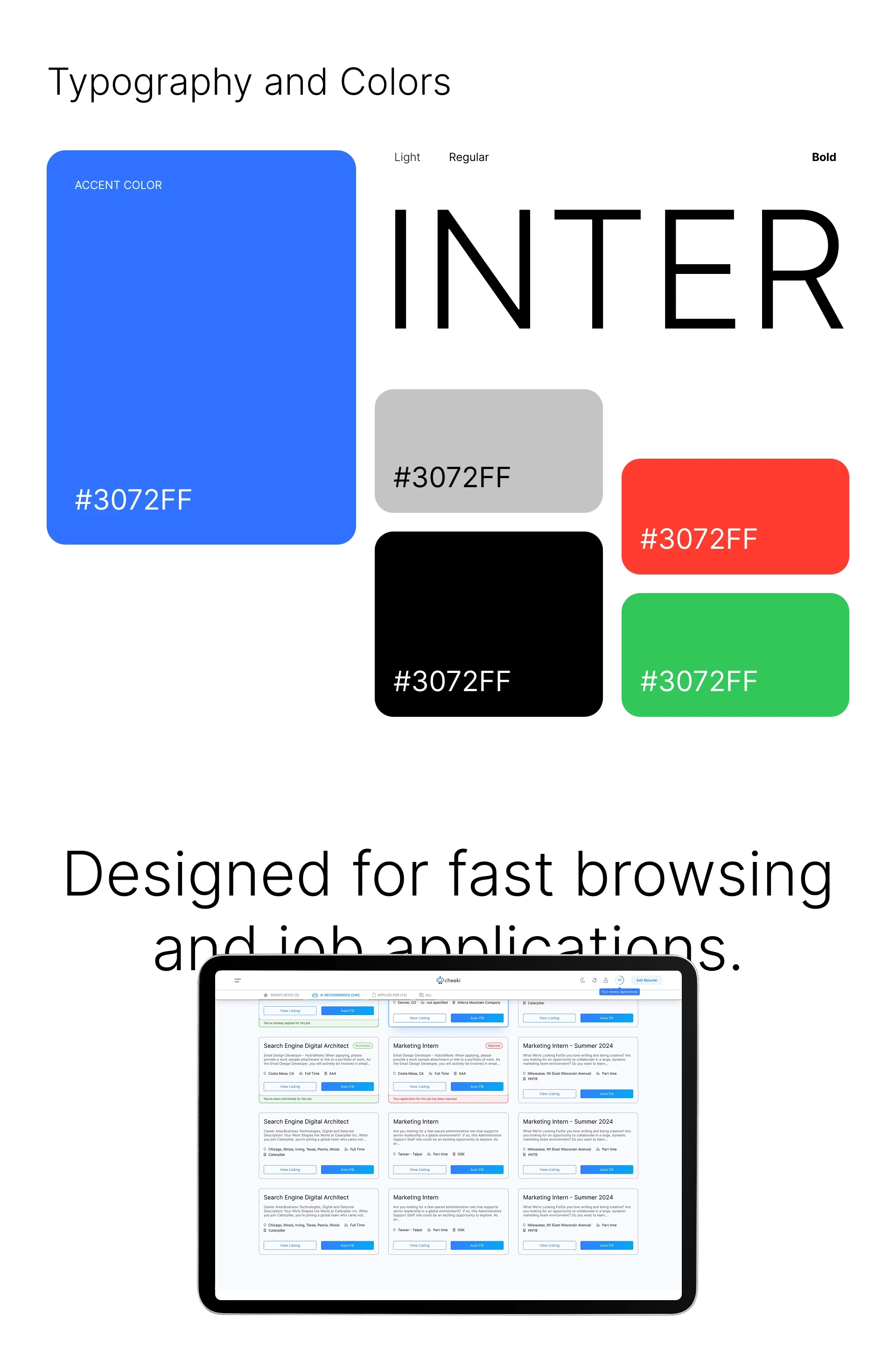
I crafted reusable interface pieces that developers could plug in instantly. This meant faster handoff and a unified look across the site. By focusing on modular components, I cut down build time and kept the visual vibe consistent, so every screen felt part of the same story.I crafted reusable interface pieces that developers could plug in instantly. This meant faster handoff and a unified look across the site. By focusing on modular components, I cut down build time and kept the visual vibe consistent, so every screen felt part of the same story.
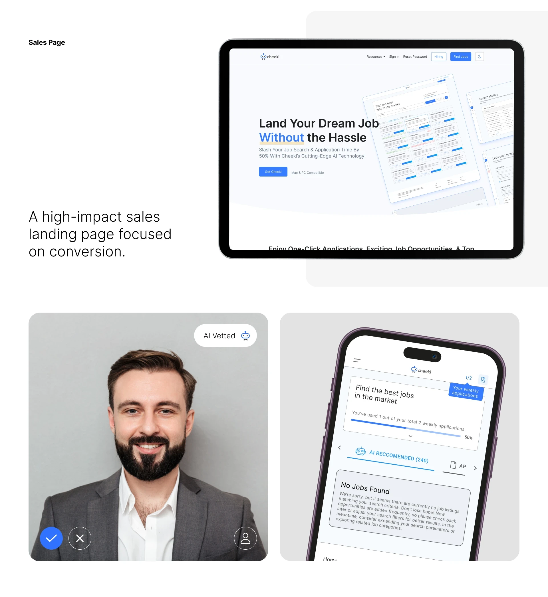
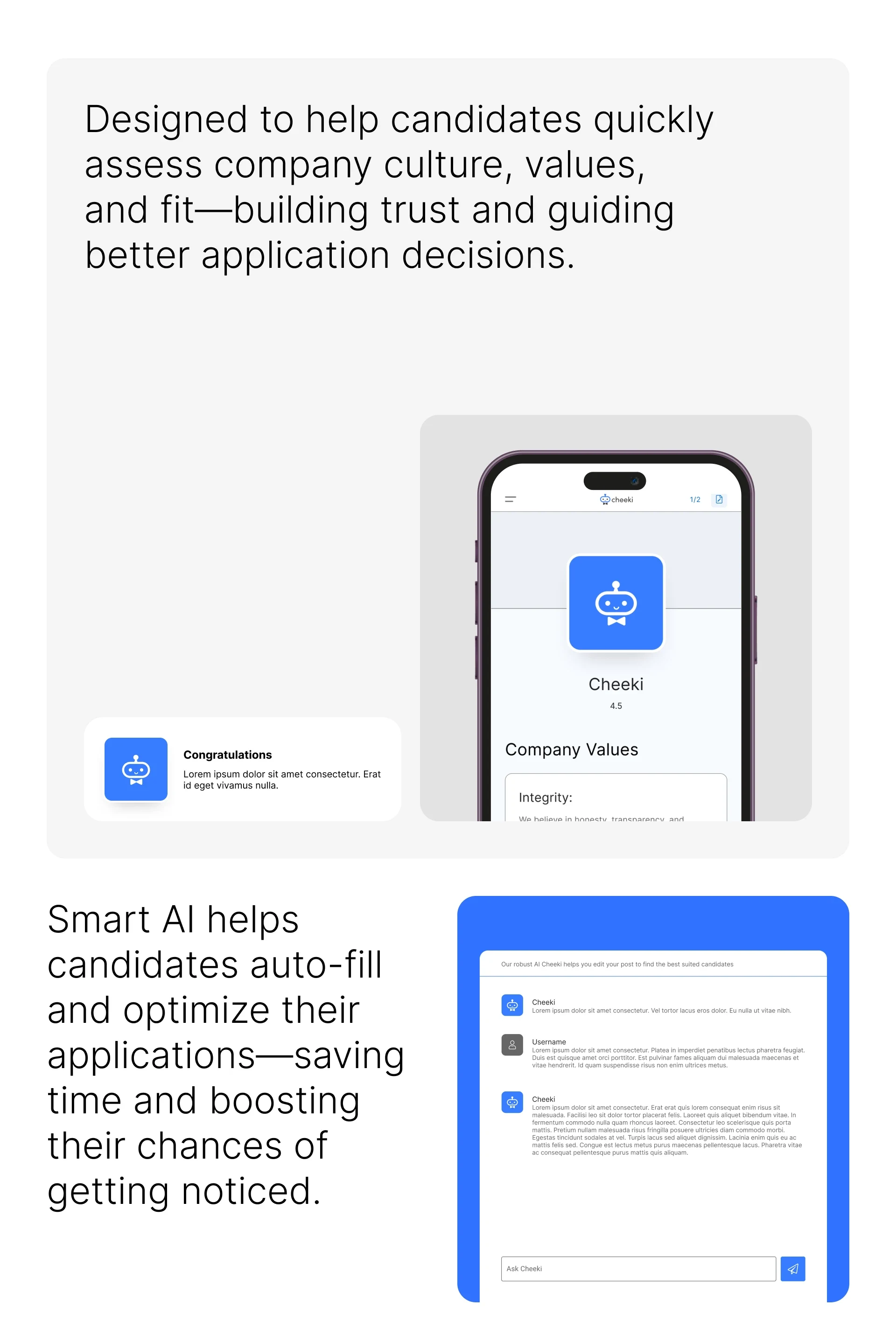
Building for Conversions and Trust
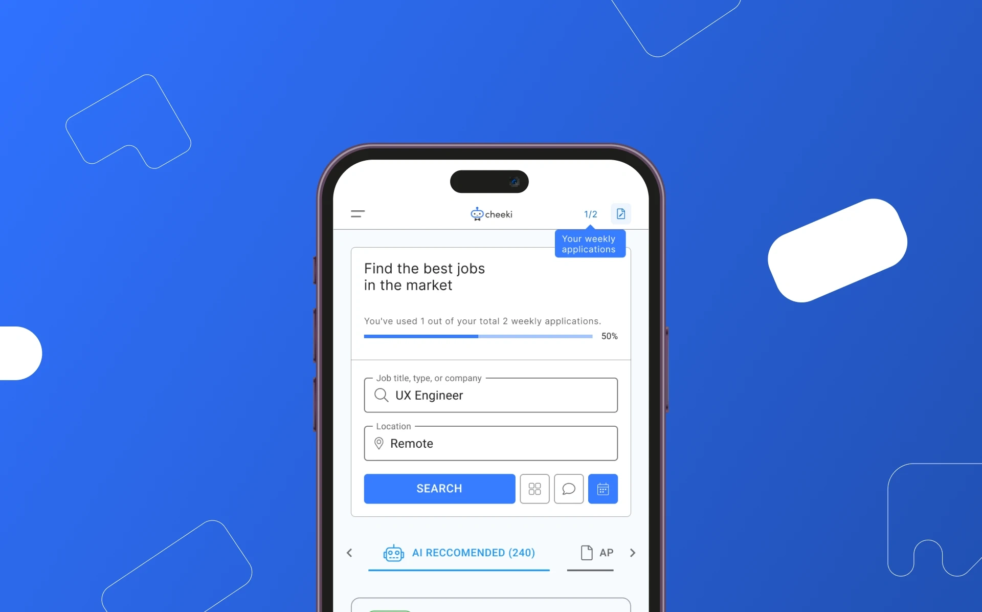
Next, I tackled the sales page and profile previews. I wanted users to instantly sense each company’s personality, so I leaned into subtle visual cues and data highlights. Meanwhile, candidate tools got a glow-up—smart autofill tips, progress nudges, and clear calls to action that nudge applications forward.
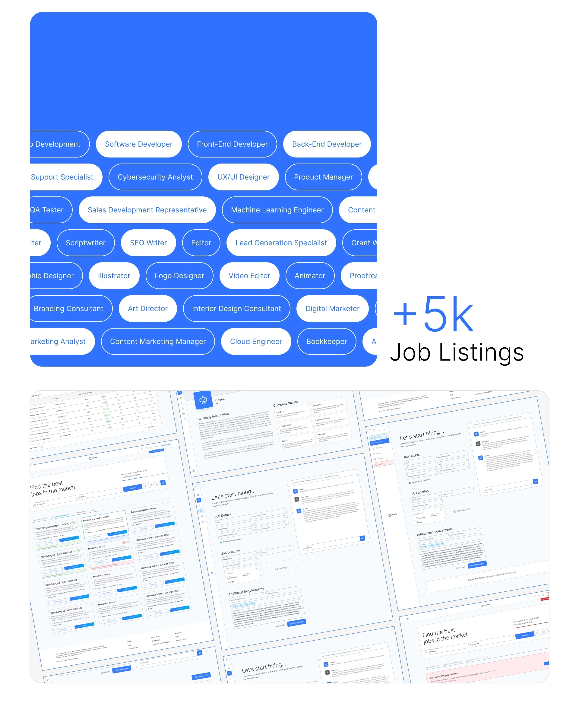
Wrap-Up and Takeaways
Wrapping it all up, I fine-tuned interactions based on feedback and real-world usage patterns. Seeing sign-up rates climb and application times drop was the cherry on top. Ultimately, Cheeki became more than a site—it transformed into a smooth, trustworthy companion on the hunt for the perfect gig.

Like this project
Posted Jul 3, 2025
Reimagined job search with clean UI/UX and intuitive interactions. Modular components and nudges guide candidates effortlessly through applications.
Likes
1
Views
18