✍️ 7-Figure Writer & Substack Growth Marketer
✍️ 7-Figure Writer & Substack Growth Marketer

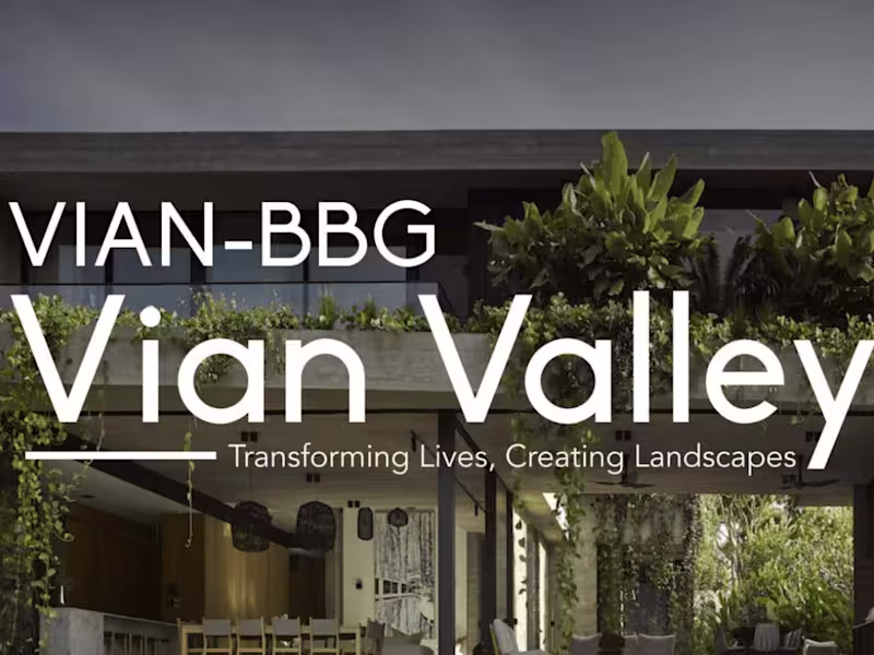
Branding+copy solutions for early stage founders
Branding+copy solutions for early stage founders

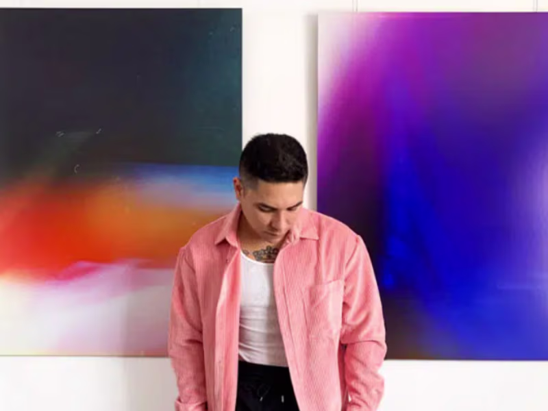
Art-centric content writer
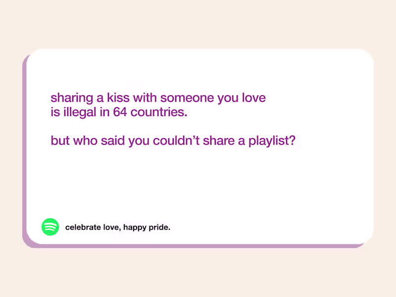
Conversational, bright, and efficient writing services
Conversational, bright, and efficient writing services


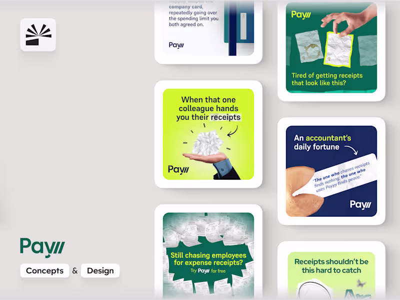
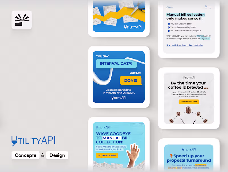
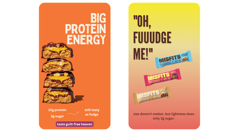
Ad design for B2B SaaS (Concepts + Design)
- $1k+
- Earned
- 1x
- Hired
- 5.0
- Rating
- 7
- Followers
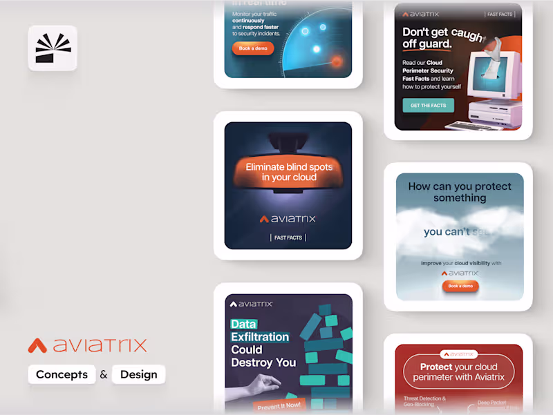
Ad design for B2B SaaS (Concepts + Design)
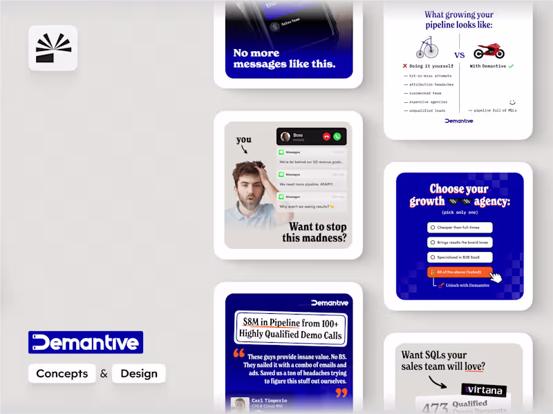
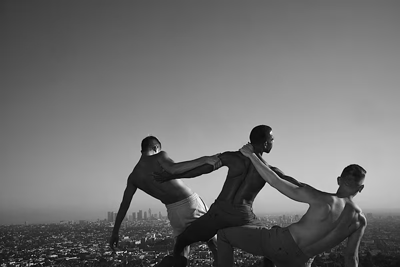
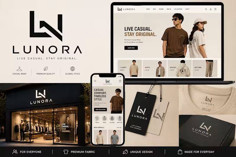
Designing modern brands through UI/UX, web & visual content
- 9
- Followers
Designing modern brands through UI/UX, web & visual content

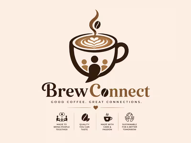

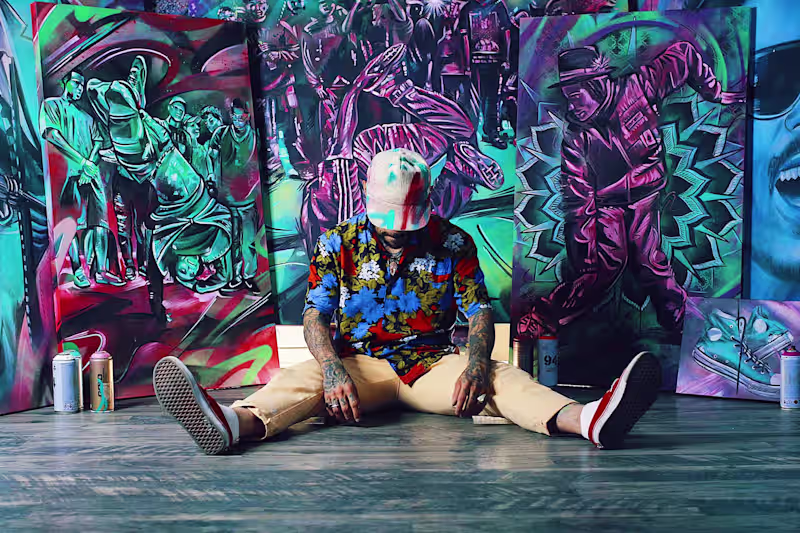
Brand Storyteller 🧡
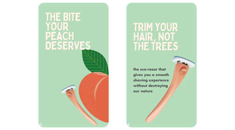
Building brands people feel something for